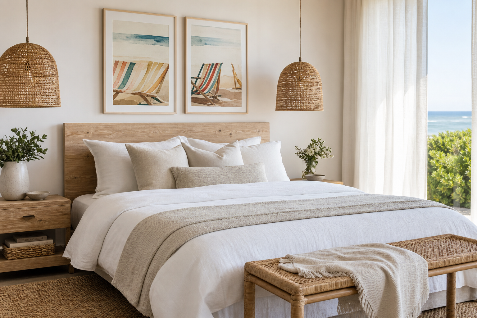
A beach chair poster print does one job exceptionally well: it slows a room down. The image usually has a simple horizon line, open sky, and one familiar object placed in quiet space. That combination gives the eye a clear resting point, which is why coastal subjects feel calmer than busy city scenes or high-contrast graphics.
Why a Beach Chair Print Feels So Relaxing
A beach chair print carries nostalgia without looking sentimental. It suggests long afternoons, salt air, and time away from schedules. Even when the colours are bright, the subject itself is uncomplicated — one or two chairs, a stretch of sand, and water beyond. That visual simplicity makes it easy to live with for years.
Coastal imagery also works because it introduces distance into a room. A framed seaside view creates a sense of depth, which can make a compact bedroom or narrow hallway feel less enclosed. If you already like airy subjects from our photography collection or quieter compositions from the fine art prints selection, a beach chair poster print sits naturally within that same calm, open mood.
For a slightly more travel-led coastal look, a scene with shoreline context works well in shared living spaces.
Choosing the Right Colour Mood
The most versatile palette is soft sand, faded blue, and off-white. These tones work with oak, rattan, linen, and white walls without competing for attention. In practical terms, if your room is already 70% neutral, a beach chair poster print in sandy beige and sea-glass blue will blend in rather than dominate.
Blue-and-white rooms benefit from sharper coastal contrast. Navy cushions, white bedding, and striped textiles pair well with beach imagery that has clearer sky and water separation. If you want that crisp holiday-house look, combine your main print with subtle wave-inspired pieces such as Textured Waves — Minimalist Print or fluid pieces from our abstract wall art collection.
Warmer interiors need a different version of coastal style. Choose prints with sun-washed beige, dune gold, coral accents, or weathered wood tones rather than icy blues. This suits homes with jute rugs, terracotta ceramics, antique brass, or cream upholstery. A beach chair image with late-afternoon light will usually feel more connected to these materials than a cool midday seascape.

If you prefer a fresher summer mood, introduce one brighter accent — turquoise, sunny yellow, or striped red — while keeping the rest of the room restrained. One colourful print can carry that energy by itself. When every accessory repeats the same brightness, the room starts to feel themed rather than edited.
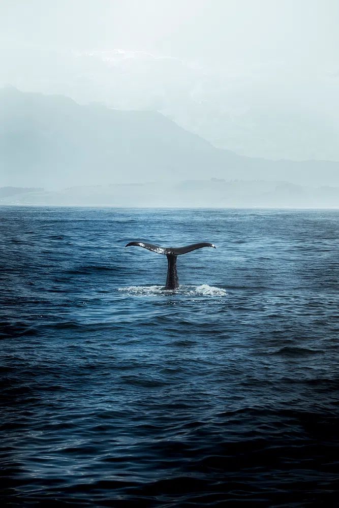
A good companion image for cooler coastal colour schemes is water photography with reflective light and movement.

Best Rooms for a Beach Chair Poster Print
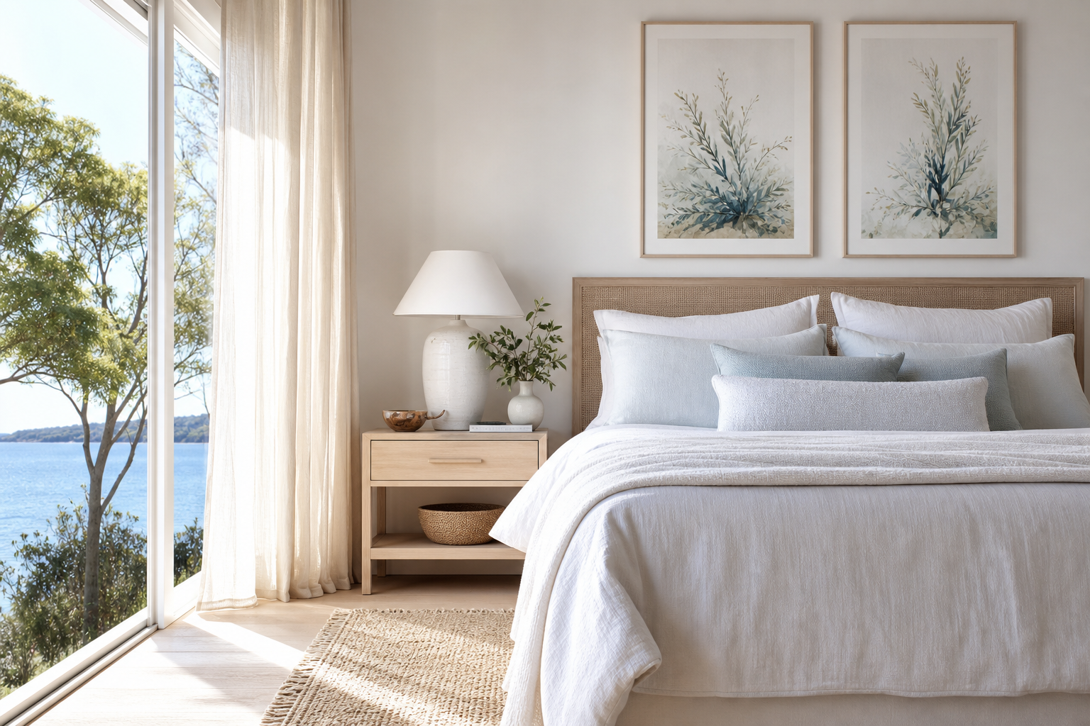
Bedrooms are the easiest place to use this subject. Hang one larger piece above the bed — typically 50x70 cm or 70x100 cm for a double or king-size bed — and keep the bedding simple. A beach chair scene supports rest because the composition is not visually demanding. Pair it with pale timber, white lampshades, and soft striped textiles for an understated coastal finish.
Bathrooms also suit beach-inspired art, especially if the walls are plain tile or painted in white, warm grey, or muted blue. Here, a smaller 30x40 cm or 40x50 cm print is usually enough. Choose a frame finish that matches your fittings — black for modern bathrooms, oak for softer Scandinavian spaces. If you enjoy water-led subjects beyond the chair motif, Sunlit Water Surface — Photography Print and pieces from our nature art collection build the same mood without overcrowding a compact wall.

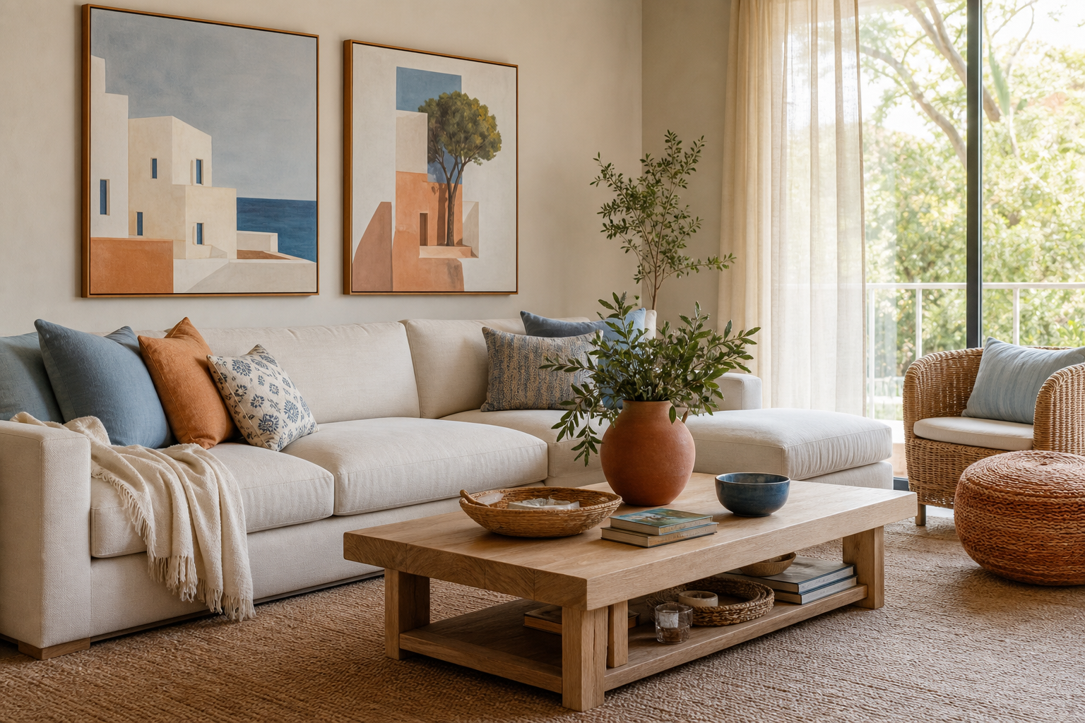
Living rooms benefit from a beach chair poster print when the furniture is low and the wall has space to breathe. Above a sofa, leave 15 to 25 cm between the top of the sofa and the bottom of the frame. The artwork should cover roughly 60% to 75% of the sofa width, so a 180 cm sofa works well with art around 100 to 135 cm wide, either as one statement piece or a balanced pair.
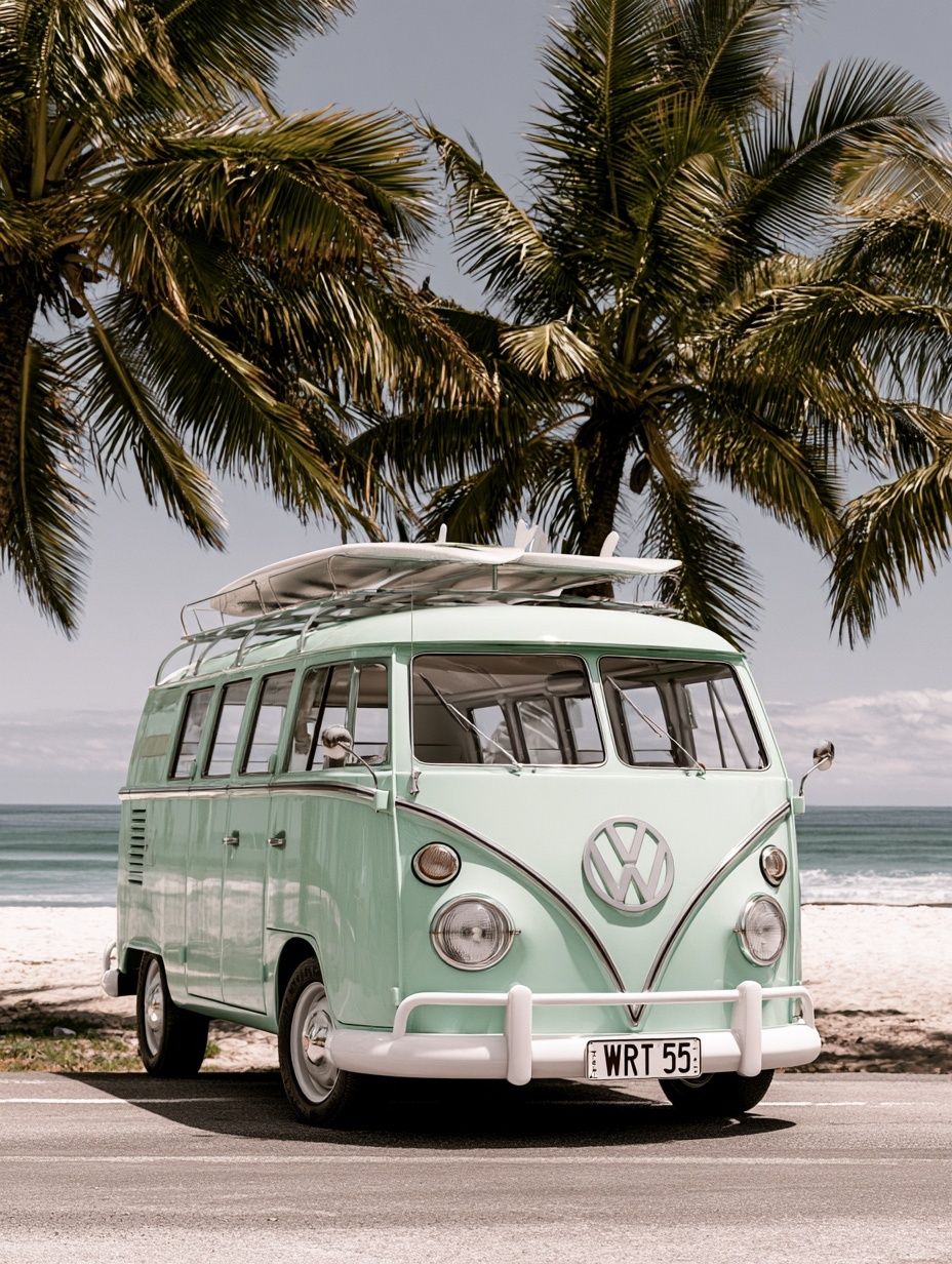
Hallways and holiday homes are ideal if you want the subject to feel welcoming rather than private. In an entry, a beach chair print instantly signals ease and escape. In a second home, it reinforces the reason the space exists in the first place — slower mornings and lighter routines. Travel-adjacent coastal pieces like Mint VW Camper Van Beach Poster can also work in these more playful areas.
How to Style It with Other Wall Art
The easiest pairing is with other seaside photography. Keep one image as the anchor — usually the beach chair poster print — then add two or three supporting works with related colours or horizon lines. Good matches include water textures, distant shoreline scenes, or marine subjects that stay visually light.


Typography can work, but it needs restraint. If you add text-based or graphic travel art, keep it to one piece and make sure it does not overpower the softer coastal image. A gallery wall should have a clear ratio: one dominant print, two medium pieces, and one small accent piece is often enough for a wall above a console or sideboard. More than four or five frames on a medium wall can dilute the calm effect that makes beach imagery appealing.
For a softer, more decorative arrangement, mix in painterly works rather than only photographs. A light piece such as Woman with a Parasol — Impressionist Print can echo summer light and open air without turning the wall into a literal beach story. If your room leans natural and tactile, details from our bohemian art prints can add warmth through muted earthy tones and handcrafted textures.

Frame and Size Ideas That Work
Oak frames are the safest choice for coastal rooms because they repeat the warmth of sand, driftwood, and woven textures. White frames feel crisp and fresh in blue-and-white interiors, while black frames sharpen the image and suit more modern homes with cleaner lines. If the print itself is soft and faded, a narrow frame — around 1 to 2 cm wide — usually looks better than a heavy moulding.
Size matters more than many buyers expect. A small 21x30 cm print can disappear above furniture unless it is part of a pair or a grid. For a reading nook, guest room wall, or bathroom shelf area, 30x40 cm is a reliable starting point. For above a bed, sofa, or sideboard, 50x70 cm and 70x100 cm are stronger and more proportionate.
If you are styling a wide wall, use one larger print rather than several unrelated small ones. A single horizontal coastal scene often feels quieter than a busy cluster. Where you want texture and motion without adding another recognisable subject, Textured Waves — Abstract Print or minimalist wall art can support the main image with less visual noise.
A final styling detail is glazing and finish. In bright rooms with large windows, position framed art so glare does not hit the image directly at eye level. Matte paper often gives coastal subjects a softer, more natural look than high gloss, especially when the palette is muted.
Shop Tips for a Beach Chair Poster Print
Choose the image first, then the room, then the frame. Many people reverse that order and end up buying a print that matches the sofa but does not create the mood they wanted. A beach chair poster print should feel spacious and easy from across the room — if the image looks cluttered in thumbnail size, it will rarely feel calmer on the wall.
Test placement before buying your final size. Tape kraft paper cut to 30x40 cm, 50x70 cm, or 70x100 cm on the wall and view it from the doorway and from where you sit. This takes 10 minutes and prevents the two most common mistakes: choosing art that is too small, or hanging it too high.

Paper quality matters in subjects with sky, sea, and sand because those images rely on tonal transitions. Better paper holds subtle colour shifts more cleanly, so pale blues do not flatten and sandy neutrals stay distinct. If you are shopping for a holiday home, consider how much natural light the room gets through the year — bright sun can make low-quality prints look washed out much faster.
Final thoughts
A beach chair poster print works because it is specific but not demanding. It brings a recognisable coastal reference into a room while keeping the atmosphere light, open, and easy to style with natural materials, pale colours, and a few carefully chosen companions.
The best results come from restraint — one strong beach image, a fitting frame, and enough wall space around it. When the composition has room to breathe, the whole room feels calmer.
Frequently Asked Questions
What frame colour works best with a beach chair print?
Oak is the most flexible for coastal interiors, while white looks crisp in blue-and-white rooms. Black works best if your furniture and lighting already have strong modern lines.
Can I use a beach chair print in a small bathroom?
Yes — choose a compact size like 30x40 cm and hang it away from direct steam if possible. A sealed frame with proper backing helps protect the print over time.
Should coastal wall art be centred exactly over furniture?
Usually yes, but visual balance matters more than strict measurement. If a lamp, shelving, or tall plant shifts the weight on one side, adjust the artwork by 5 to 10 cm to compensate.
What other materials pair well with this look?
Linen, jute, pale oak, cane, brushed nickel, and matte ceramics all support the relaxed coastal feel. Keep shiny finishes limited so the room stays soft rather than glossy.
How do I know if the print is too small for my wall?
If it covers less than half the width of the furniture below it, it will often look undersized. For a stronger presence, aim for roughly 60% to 75% of the furniture width.