Why a Bison Poster Works in Modern Interiors
A bison poster brings weight to a room without making it feel busy. The subject is naturally strong, but the silhouette is soft enough to work with modern furniture, quiet palettes, and open wall space. In rooms that already have straight lines — low-profile sofas, black metal lamps, floating shelves — a bison image adds an organic counterbalance.
The appeal also comes from color. Most bison artwork sits comfortably in browns, charcoal, oat, sand, and muted sky tones, which makes it easy to place near wood, stone, leather, and natural textiles. If you already like our Animals collection, a bison is one of the easiest subjects to introduce because it reads as both rugged and refined.
A good bison poster can also soften minimal interiors. In a room with white walls and only a few materials, one large animal print keeps the space from feeling flat. This works especially well if you choose a composition with negative space around the figure — it gives the wall breathing room while still creating a focal point.

Choosing the Right Style: Vintage, Minimal, or Illustrated
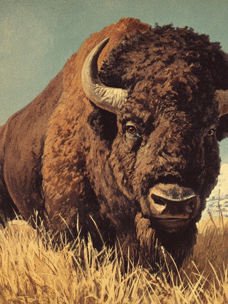
A vintage bison print creates the most historical character. It pairs well with walnut, aged brass, tobacco leather, and darker paint colors like olive or warm grey. If you want that collected, heritage feel, explore our vintage art prints and look for pieces with softer contrast and slightly aged tones.
Minimal bison art feels cleaner and more architectural. A simple side profile, limited palette, or high-contrast photograph can sit beautifully in Scandinavian or modern rustic rooms. This direction works best when the rest of the room is already quiet — think one boucle chair, one oak bench, one ceramic vase, and generous empty wall around the frame.
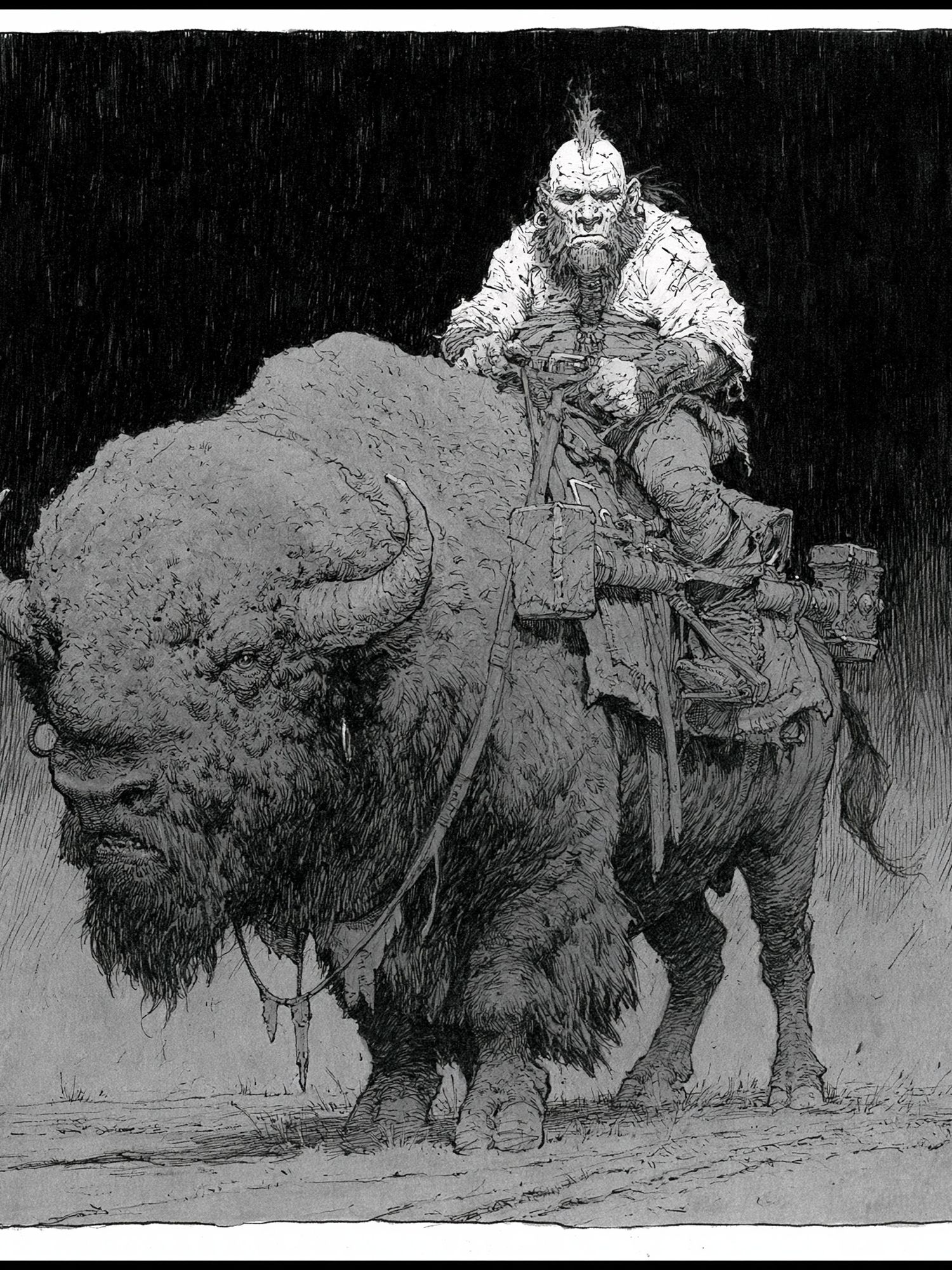
Illustrated styles offer the most flexibility. They can lean playful, painterly, or graphic depending on line work and color. In family homes, creative studios, or less formal spaces, illustration helps a bison poster feel lighter and more expressive. If you like a drawn or ink-based finish, our illustration collection has options that bring movement without visual clutter.
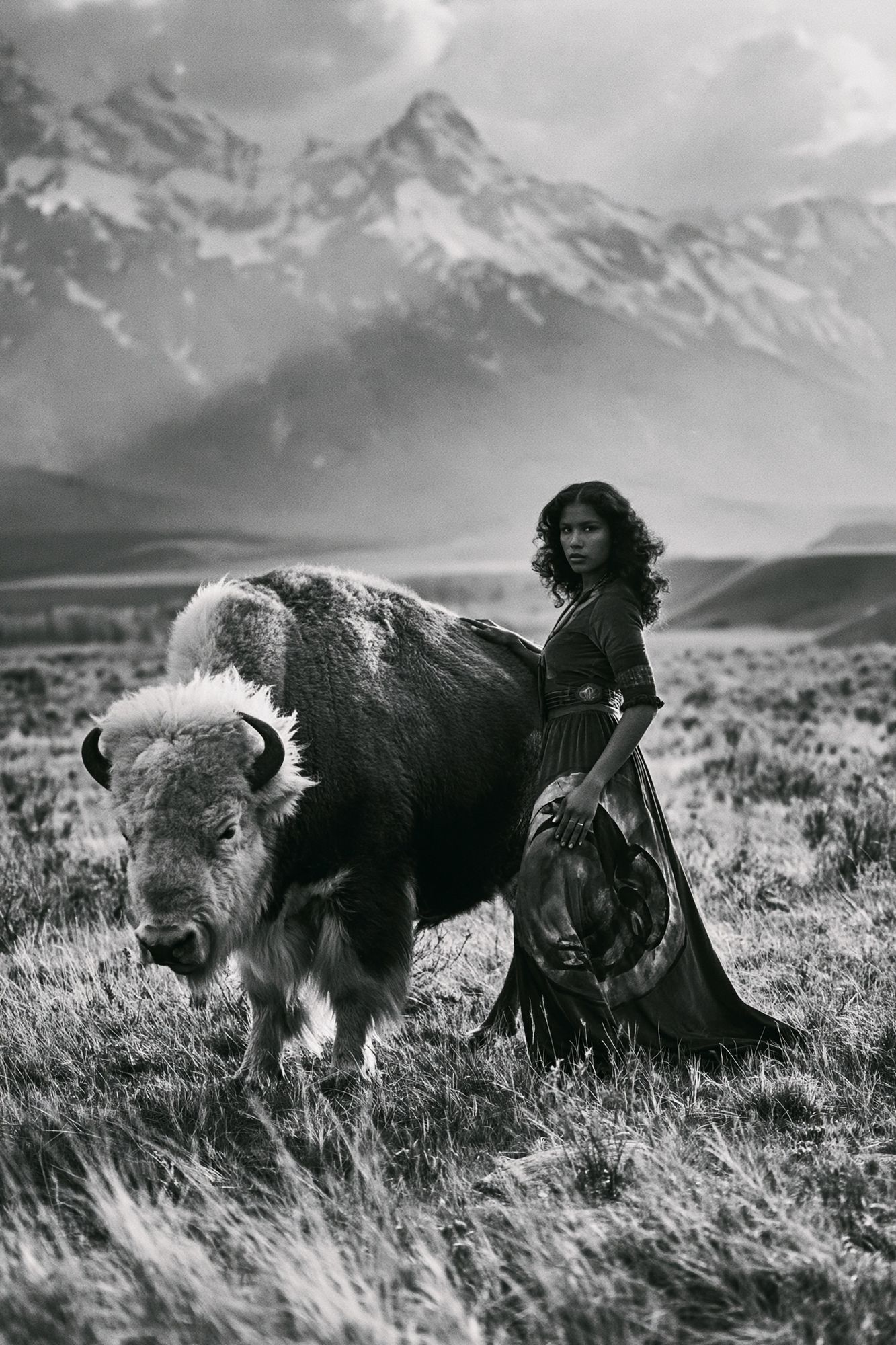
For a more dramatic look, photography is the strongest choice. A close-up portrait adds detail, fur texture, and shadow — ideal in spaces where you want the art to feel grounded and substantial. Browse animal photography prints if you want a sharper, more contemporary mood.
Best Rooms for a Bison Poster
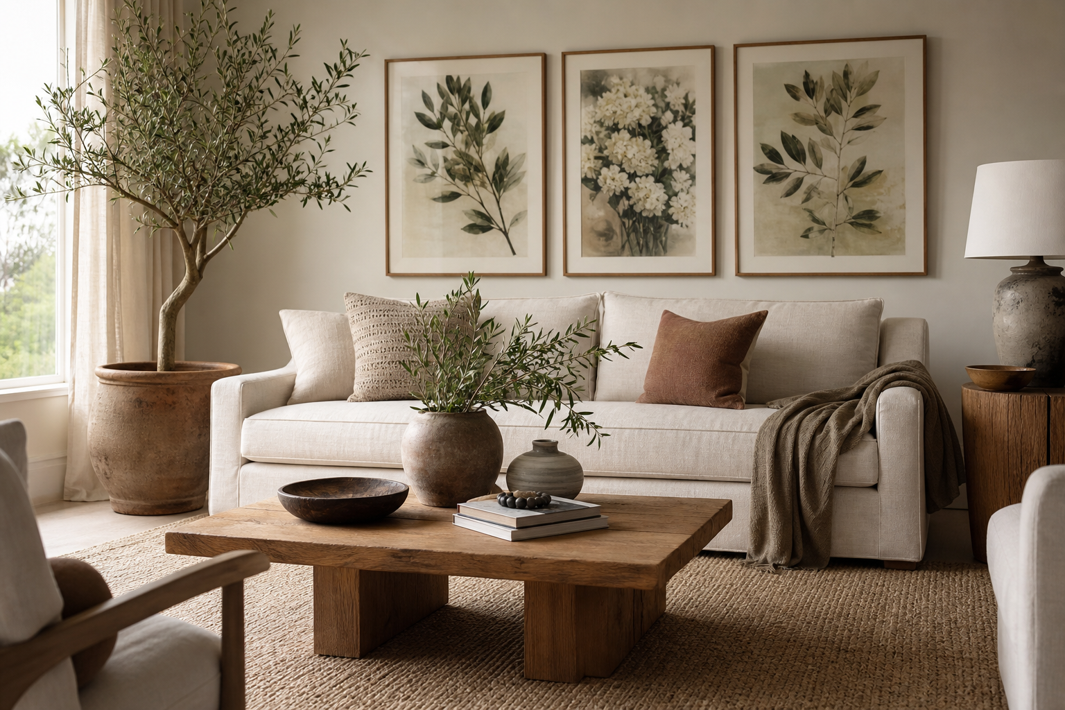
Living rooms are the easiest place to start. Above a sofa, a bison poster in 50x70 cm or 70x100 cm usually gives enough scale to anchor the seating area. If your sofa is 200 to 240 cm wide, the artwork should span about 50 to 75 percent of that width for a balanced look. One large piece often works better than a cluster here because the subject already carries visual presence.
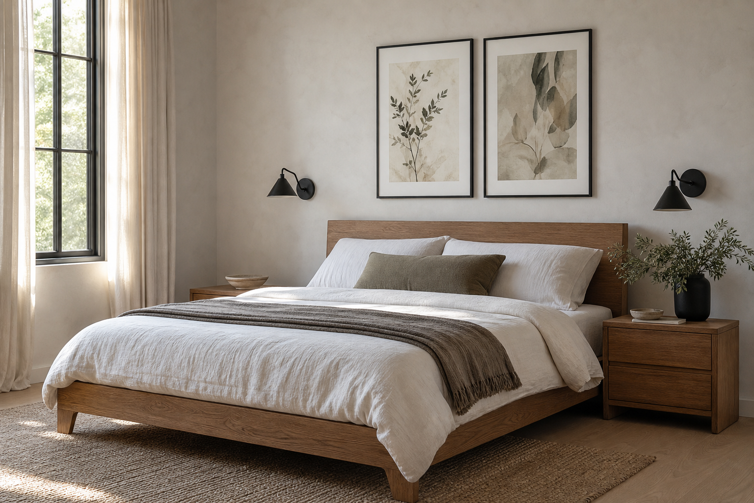
Bedrooms suit bison art when the palette is calm. Place it above the headboard, opposite the bed, or on the wall beside a dresser if you want a quieter effect. In bedrooms, softer pieces from our fine art collection tend to work better than very high-contrast images because they support a more restful atmosphere.

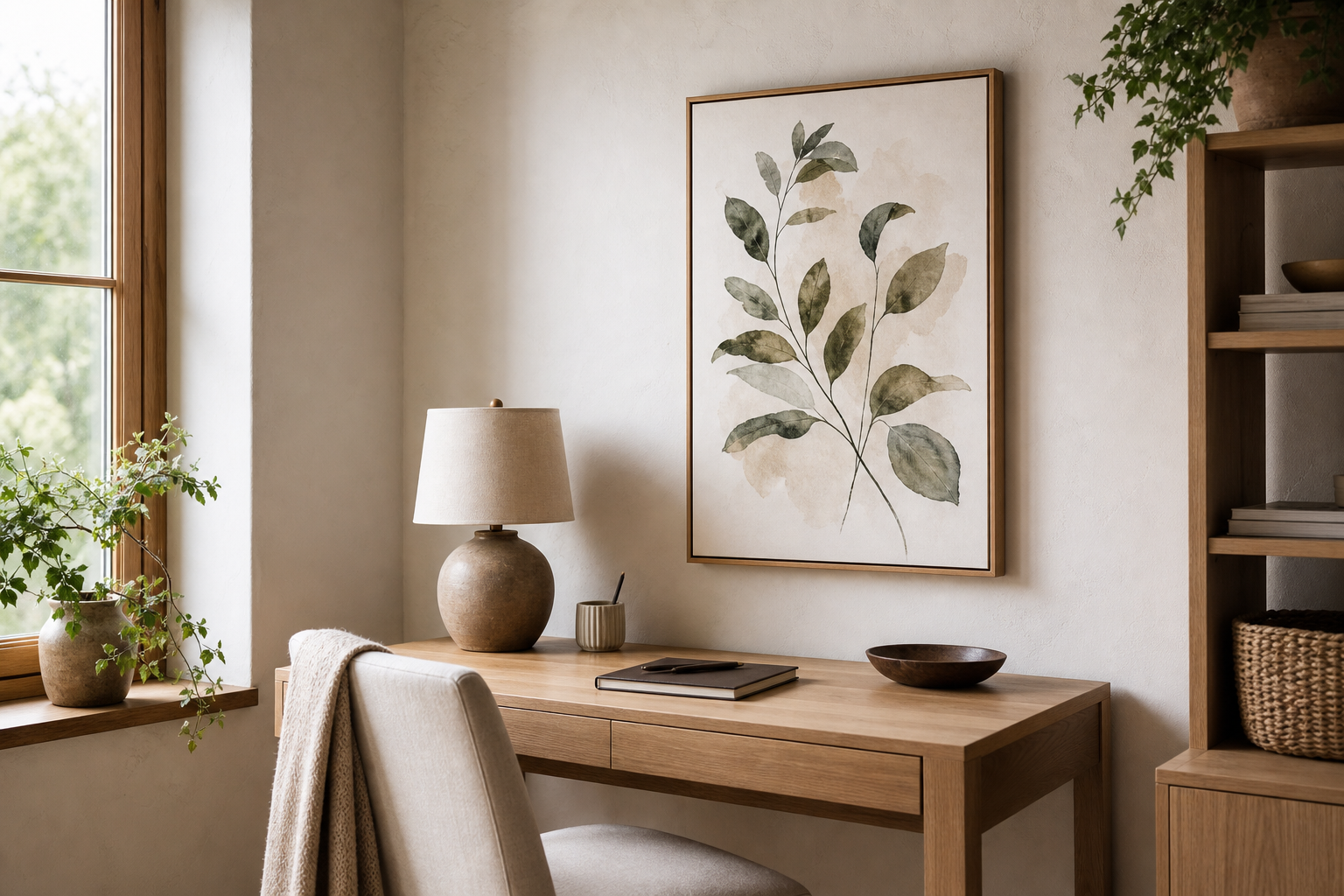
Hallways and home offices benefit from narrower formats or medium-size prints around 30x40 cm or 40x50 cm. In an office, a bison image can add focus and steadiness without becoming decorative filler. A hallway, on the other hand, is a good place for a small series — one bison piece paired with landscape or prairie imagery from our nature wall art creates an easy visual story.
Cabins and rustic homes can handle more texture and a slightly larger scale. That said, avoid making the room too literal. A bison poster looks stronger when mixed with contemporary elements like a matte black sconce, a simple bench, or clean-lined storage, rather than only reclaimed wood and themed accessories.
Size, Framing, and Placement Tips
The most common mistake is choosing art that is too small. Over a console table, aim for at least 40x50 cm. Over a sofa or bed, 50x70 cm is often the minimum that still feels intentional. If you have ceilings above 260 cm, 70x100 cm usually looks more proportional.
Frame finish changes the tone immediately. Black frames make a bison image feel crisp and modern. Oak frames soften it and connect well to Nordic, rustic, or Japandi interiors. Dark walnut adds depth and works especially well with vintage-style pieces. If the artwork includes lots of shadow or a dark background, use a mount to give it 3 to 6 cm of visual breathing room.
Hang the center of the piece at roughly 145 cm from the floor in standard rooms. Above furniture, leave 15 to 25 cm between the frame and the top edge of the sofa, headboard, or sideboard. If you are building a small arrangement, keep 5 to 8 cm between frames so the grouping reads as one unit instead of separate floating objects.
Colours and Materials That Pair Well with Bison Art
The easiest palette is built from earthy neutrals: sand, mushroom, camel, warm white, charcoal, and muted olive. These colors echo the natural tones in most bison artwork and help the piece settle into the room rather than sit on top of it. If you want stronger contrast, add one dark accent — matte black, espresso brown, or deep forest green.
Materials matter just as much as color. Oak, ash, walnut, leather, boucle, wool, linen, and stone all support the texture of a bison image. A bison poster beside polished acrylic or glossy lacquer can feel disconnected unless the artwork itself is highly graphic. In most homes, matte and tactile finishes create a better match.

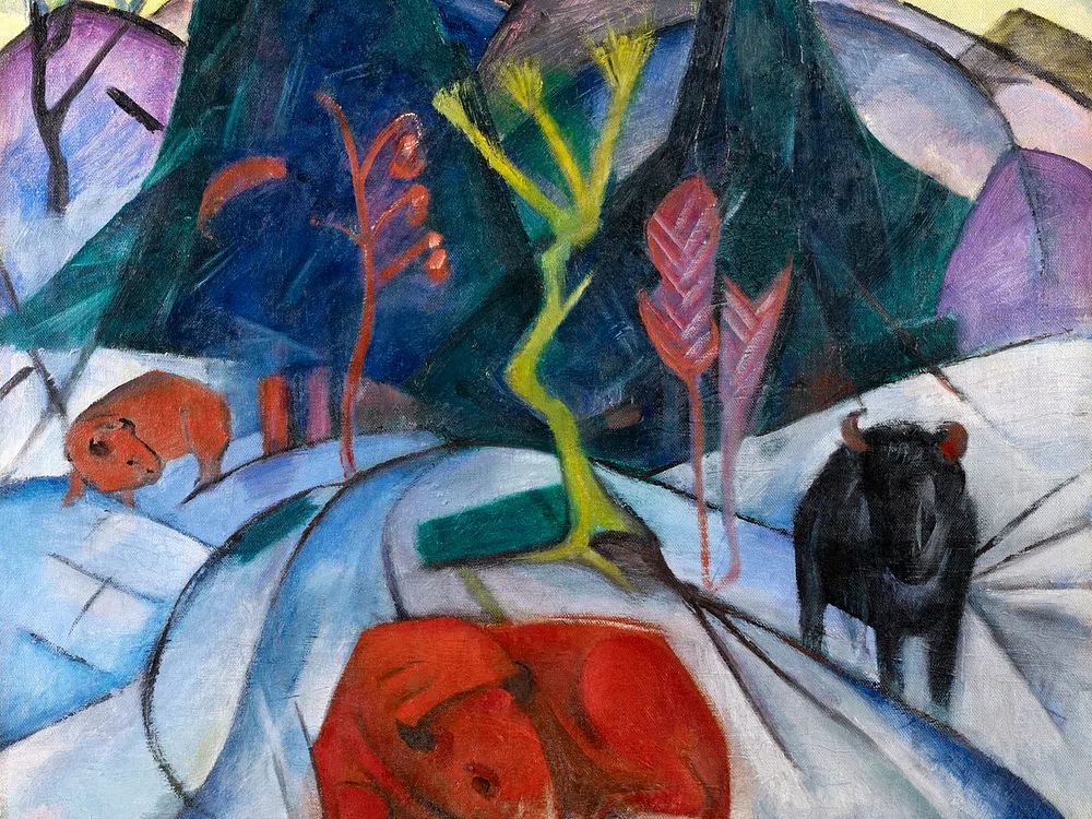
If you want a lighter version of the look, use pale plaster walls, bleached wood, and oatmeal textiles, then introduce the artwork as the main point of contrast. If you want more depth, layer rust, tobacco, and slate blue around it. Pieces like Majestic Bison Illustration Poster or Bison winter (red bison) (1913) can steer that palette in very different directions.
How to Build a Cohesive Look Around One Statement Piece
Start with the bison poster as the anchor, then repeat one or two of its tones elsewhere in the room. If the print has warm brown fur and pale sky, echo that with a tan cushion and off-white curtains. If it has black shadow and beige ground, repeat those with a black lamp and natural wool rug. Limiting yourself to two repeated tones keeps the space consistent.
You do not need every accessory to match the wildlife theme. In fact, the room will feel more refined if the subject appears only once or twice. Pair the main artwork with abstract landscapes, restrained line work, or one secondary animal piece rather than filling the wall with similar motifs. A product like Bison Portrait Photography Poster works especially well when surrounded by simpler forms because the detail becomes the focal point.

For gallery walls, combine one medium bison piece with three smaller works. A reliable formula is 50x70 cm for the main art plus three 30x40 cm companions. Keep the bison off-center rather than dead middle — that arrangement feels less rigid and more editorial.
Shop Tips: Finding a Bison Poster That Lasts
Print quality is what makes a bison image feel rich rather than muddy. Look for clean shadow detail, visible texture in the fur, and enough tonal range that dark browns do not collapse into one flat block. This matters most in photographic and fine-art pieces.
Paper stock changes the finish. A matte paper is usually the strongest choice for a bison poster because it handles earthy tones well and reduces glare in living rooms and bedrooms. If the artwork is highly detailed, heavier paper helps it stay crisp and substantial once framed.
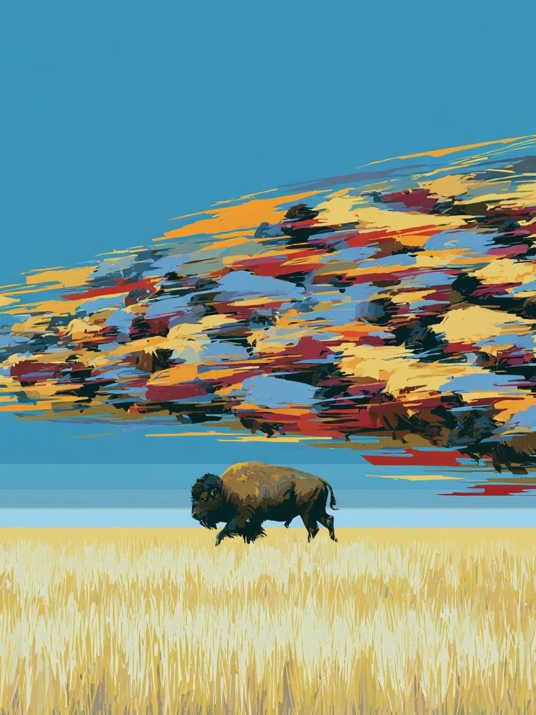
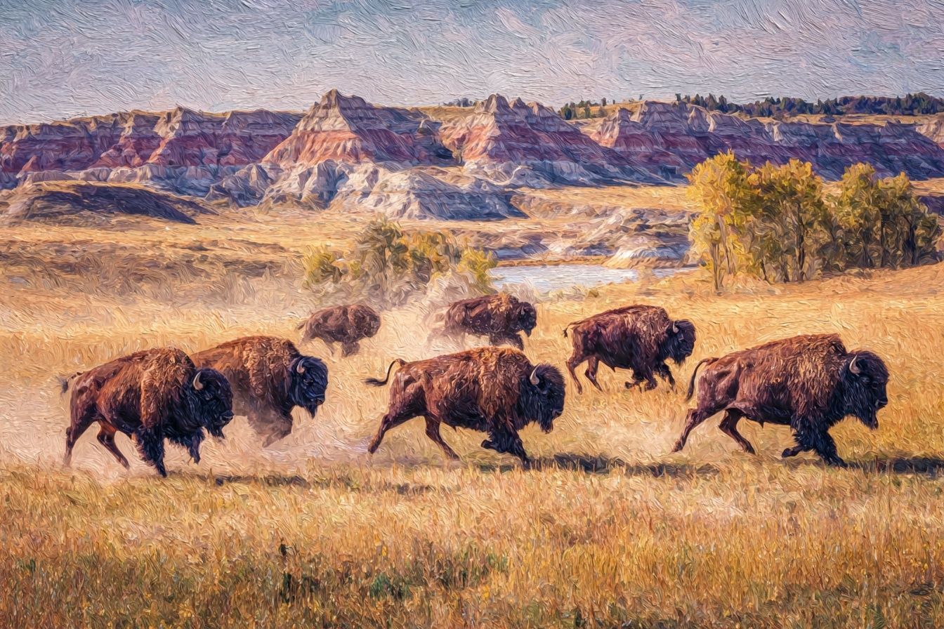
Also check how versatile the piece will be over time. The best option is one that can move rooms as your home changes — from office to hallway, or living room to bedroom — without feeling too theme-specific. Prints such as Bison Prairie Sky Illustration Poster or Bison Herd on the Prairie Print tend to stay adaptable because they include both subject and landscape.
Final thoughts
A bison poster works best when you let it do one clear job: anchor the room, add texture, or introduce a grounded natural note. Choose the style first, then match the frame, palette, and scale to the furniture already in place.
If the room is simple, a bison image adds depth. If the room is rustic, it adds structure. That balance is what makes a bison poster such a reliable statement piece at home.
Frequently Asked Questions
What frame color works best for a bison print?
Black is best for a crisp modern look, while oak and walnut feel warmer and more natural. Match the frame to your furniture finish if you want the piece to blend in more easily.
Can I hang a bison artwork in a small room?
Yes — just choose a tighter composition or a size like 30x40 cm. In small rooms, one medium piece usually looks better than several small frames.
Should I use glass or acrylic in the frame?
Acrylic is lighter and easier to handle for larger sizes like 70x100 cm. Glass offers a slightly sharper finish, but it is heavier and more fragile.
What other prints pair well with bison art?
Landscape scenes, abstract neutrals, and restrained line drawings pair well. Keep the companion prints quieter than the bison so the main piece stays dominant.