Beer poster poses work because they suggest a mood before you notice any detail. A raised glass reads social, a slow pour feels tactile, and a seated tasting scene brings in ease. The best beer poster poses do not just show a drink — they show gesture, rhythm, and the kind of room energy you want to live with.
In practical terms, posed drink imagery suits spaces where people gather for 20 minutes or two hours: kitchens, dining corners, home bars, game rooms, and relaxed living rooms. If you already like the look of our Food Drink collection, beer imagery fits naturally beside other beverage and tabletop subjects because the colors tend to be warm — amber, cream, black, brass, and deep green.
What Makes Beer Poster Poses So Appealing?
A good pose gives the image a focal point. Hands around a pint, two glasses meeting at a diagonal, or a bottle tilted during a pour all create visual direction. That matters on a wall because images with a clear line of movement are easier to read from 2 to 4 meters away than static still-life compositions.
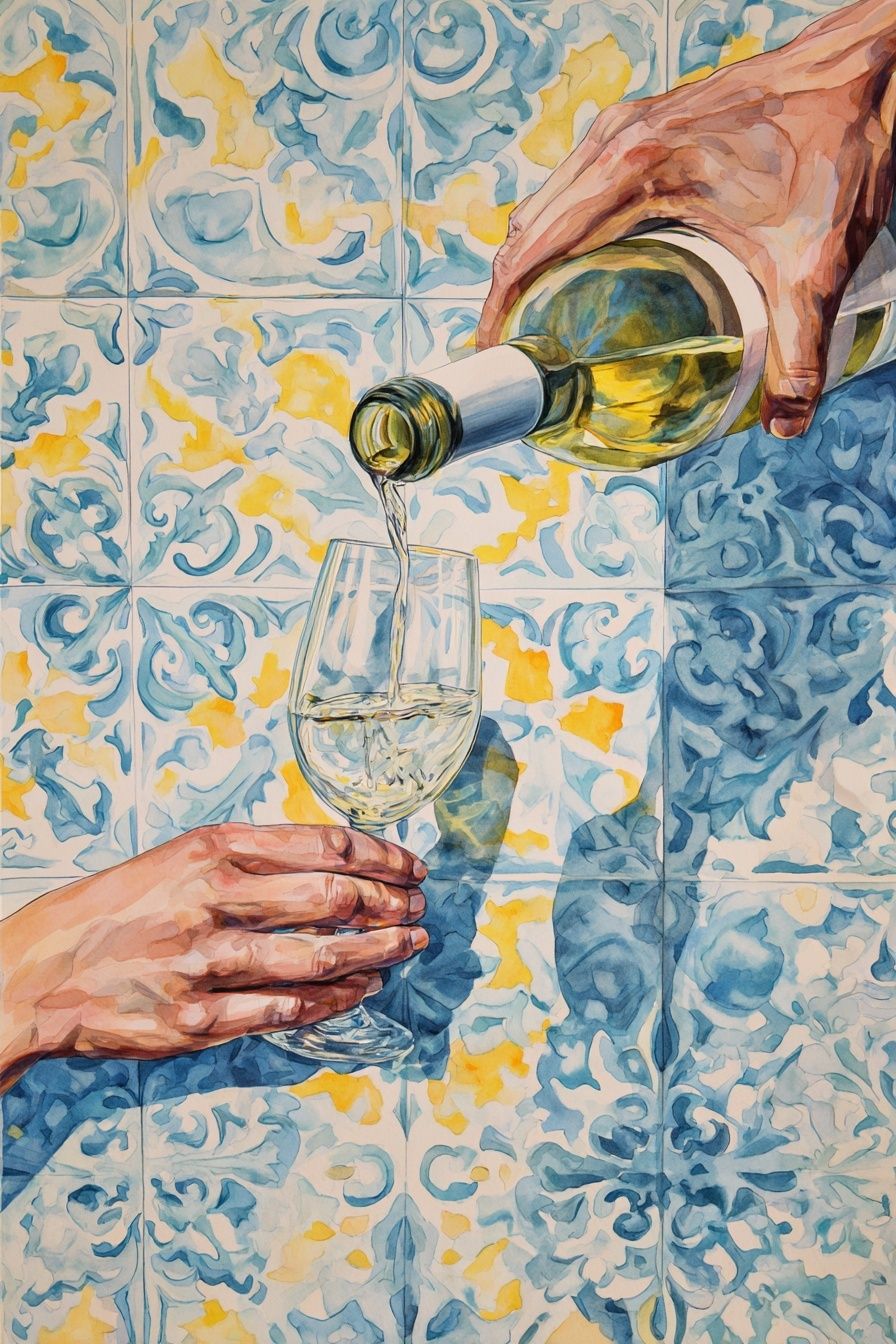
Beer imagery also tends to soften a room that feels too serious. In a modern kitchen with flat-front cabinets and stone surfaces, one or two drink-focused prints add personality without changing the architecture. If you want that effect with a more painterly look, pieces from Wine Pouring — Watercolor Print or Whiskey Glass — Digital Art Print show how liquid motion and glass highlights can make a wall feel more alive.
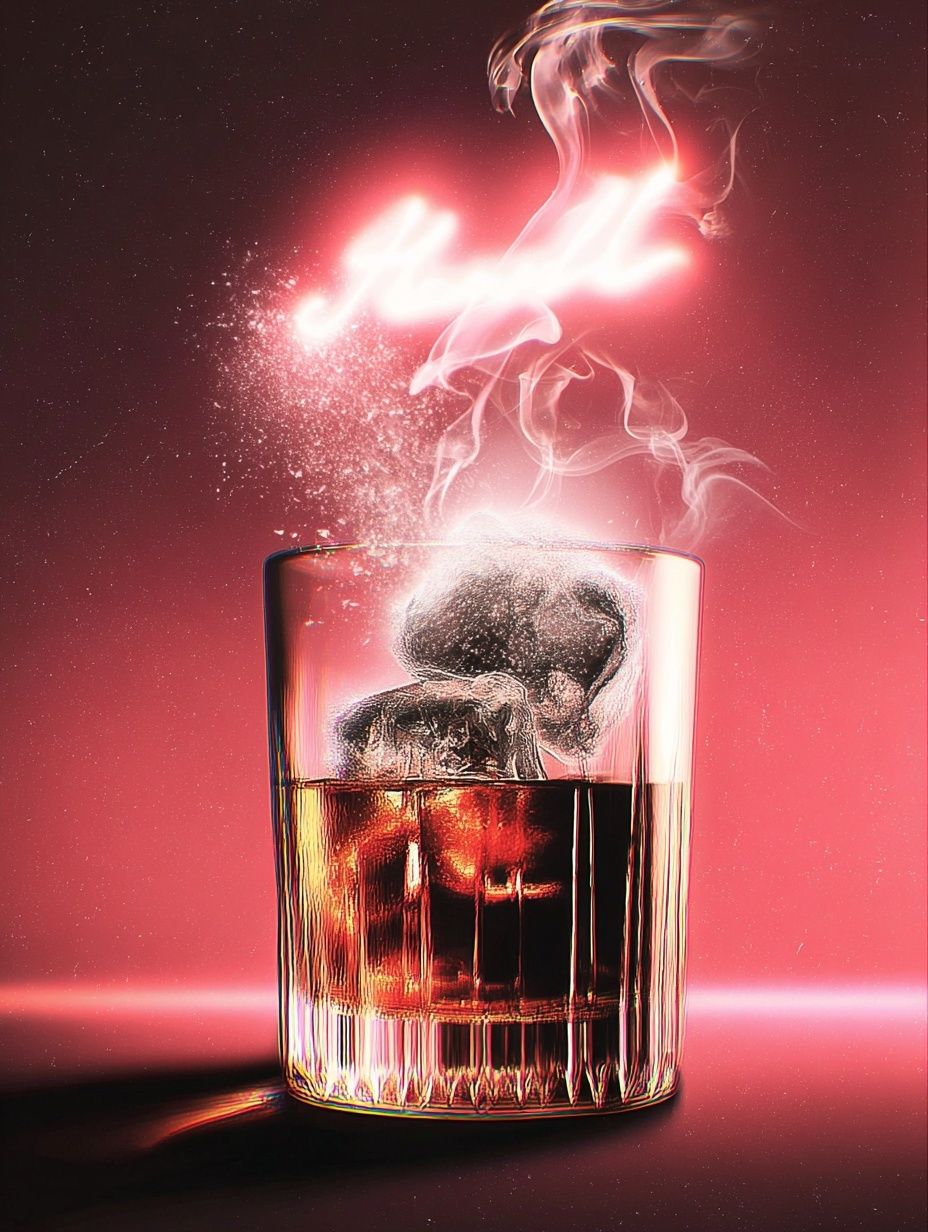
Another reason beer poster poses are so effective is scale contrast. A close crop of a hand, foam line, or glass rim feels intimate on a small wall, while a wider bar-scene composition works above a sideboard or banquette. If your goal is a casual, social atmosphere rather than a decorative filler piece, choose imagery with people implied through posture or gesture, not only bottles on a shelf.
The Most Popular Beer Poster Poses to Look For
The classic "cheers" pose remains popular because it has instant clarity. Two or three glasses angled toward the center create a strong triangular composition, which is one of the easiest shapes to place above furniture. Over a 140 cm dining bench or a 120 cm bar cart, that kind of image feels balanced and deliberate.
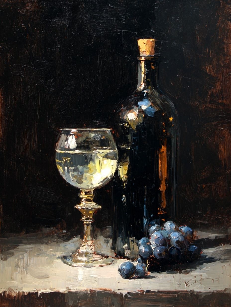
The second strong option is the candid pour. Tilted bottle, visible foam, and a hand in motion bring in texture and movement. This pose works especially well when the room already has reflective materials such as steel, glass, or lacquer, because the image echoes those surfaces. If you like that fluid look, Wine Bottle and Glass — Still Life Print offers a similar table-and-glass composition with a quieter, more classic tone.
A third pose to look for is the relaxed tasting scene — someone seated with a beer in hand, shoulders low, body turned slightly off-center. These compositions feel less performative than a direct toast and suit living rooms or reading corners better than game-day spaces. They also age well, because they are built around atmosphere rather than novelty.
Vintage pub gestures have a different charm. A server carrying drinks, a figure leaning at the bar, or a half-profile social scene can make the wall feel collected rather than theme-heavy. That is where our Vintage collection becomes useful. Even if the subject is not literally beer, the mood language of old hospitality art pairs beautifully with beer poster poses.

How to Match Pose Style with Your Room
In a sleek modern kitchen, choose beer poster poses with clean backgrounds and one dominant action — a single pour, a cropped glass, or a minimalist cheers moment. Limit the palette to 3 or 4 core tones such as amber, black, cream, and stainless grey. That keeps the space polished instead of themed.
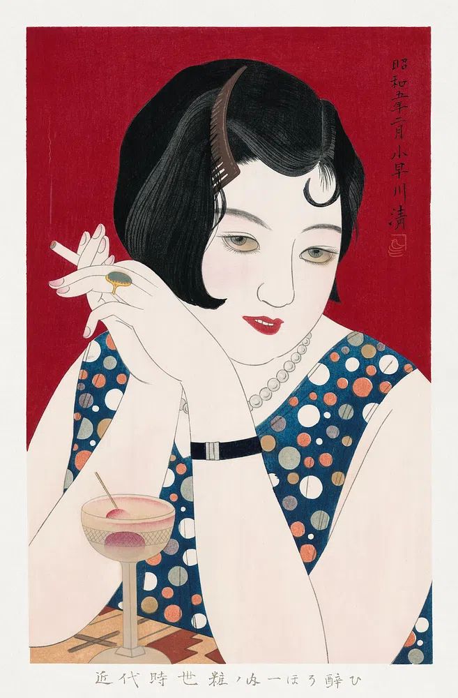
In a rustic game room or basement bar, you can use more expressive scenes. Wider compositions, vintage-inspired pub gestures, and darker backgrounds hold up well against brick, wood paneling, leather, and metal shelving. If your room already includes aged textures, a product like Elegant Woman with Cocktail — Vintage Print can sit comfortably near beer-themed pieces because it shares the same lounge-like atmosphere.
For apartments with open-plan living and dining, think in terms of distance. A wall viewed from 5 meters needs bigger shapes and higher contrast. Beer poster poses with clear silhouettes — glasses lifted, bottle angled, shoulders turned — stay legible from across the room. If the wall is narrow, use a vertical piece between 40 x 50 cm and 50 x 70 cm. If it sits above a console or bench, a horizontal arrangement spanning roughly 60 to 75 percent of the furniture width looks more settled.
Dorm rooms and smaller rentals need a lighter approach. One medium print can do more than six tiny ones. Pair one beer-related image with one playful text piece from our Typography collection or a quirky accent from our Funny prints to make the setup feel intentional rather than improvised.
Choosing Colours, Framing, and Scale
Color is where many drink-themed walls go wrong. Too many saturated reds, yellows, and logos can make the area feel commercial. A stronger formula is 60 percent neutral, 30 percent warm mid-tones, and 10 percent accent. In practice, that means black or oak frames, off-white mats if needed, and imagery led by amber, caramel, olive, smoke, or burgundy.
Frame finish should match the room hardware within one step, not perfectly. Black metal frames look sharp with matte faucets and industrial shelving. Medium oak works better with shaker kitchens, cane stools, and lighter dining furniture. Walnut gives beer poster poses a richer lounge quality, especially when the art includes darker shadow and brown glass tones.
Size matters more than subject. For a standard bar cart wall around 90 to 120 cm wide, one 50 x 70 cm print or two 30 x 40 cm prints usually look right. Above a sofa or long sideboard, aim for a total arrangement width of 100 to 140 cm. If the image includes a small hand gesture or glass detail, do not print it too small — subtle poses lose impact below 30 x 40 cm.

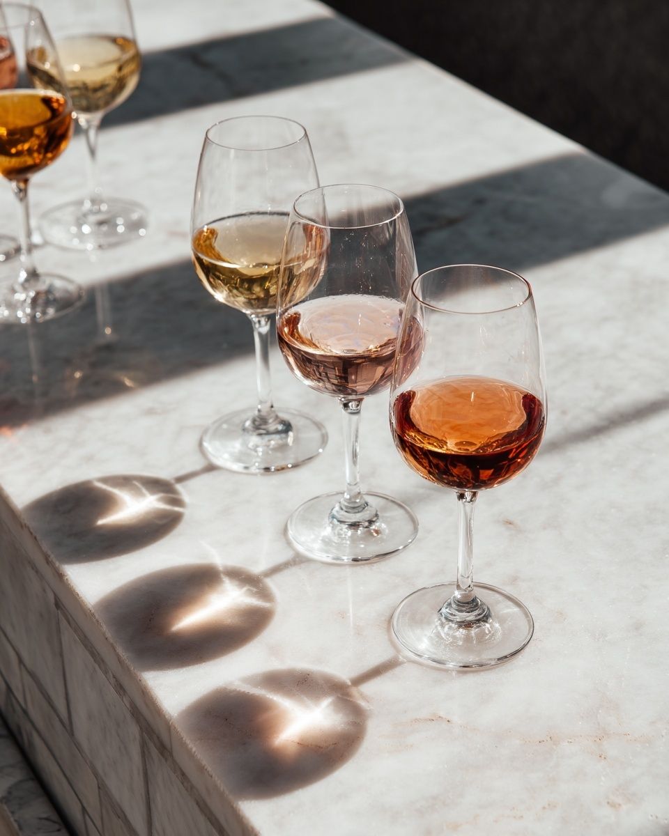
If you want a softer interpretation of beverage wall art, White Wine and Flowers — Photography Print and Wine Glasses on Marble Table — Photography Print show how elegant glassware scenes can bridge the gap between social imagery and refined interiors.
Mixing Beer Posters Into a Gallery Wall
Beer poster poses are strongest in a gallery wall when they are not all doing the same thing. Mix one action image, one quieter tabletop piece, one vintage-inspired hospitality work, and one typography print. That gives you movement, pause, character, and structure in a single arrangement.
A simple four-piece formula works well above a bar console: one 50 x 70 cm anchor print, two 30 x 40 cm supporting works, and one text-led accent. Keep gaps between 5 and 8 cm. If every frame is black, vary the subject scale inside the frame so the wall does not flatten out.

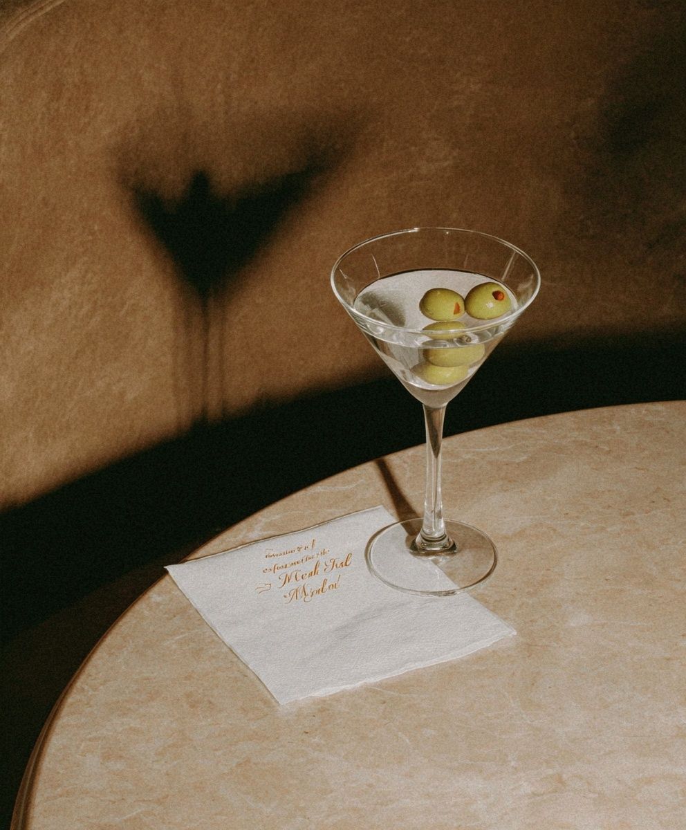
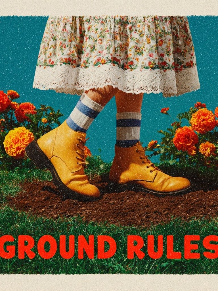
For example, a beer-centered wall can sit comfortably beside Ground Rules — Retro Typography Print because the retro letterforms reinforce a pub-like mood. If you want a more graphic contrast, include one piece from Martini Cocktail — Vintage Print or a polished still-life from Wine and Grapes Still Life Poster to break up repeated human gestures.
Shop Tips for Picking the Right Beer Poster
Start with authenticity. The pose should feel observed, not staged beyond recognition. Natural wrist angles, believable glass proportions, and realistic liquid detail make a huge difference once the piece is enlarged to 50 x 70 cm or bigger. Beer poster poses should suggest real social ease, not advertising noise.
Next, check clarity at distance. If the focal gesture disappears in thumbnail view, it will struggle on the wall unless printed large. Look for one dominant element per print — a raised glass, a pour line, a relaxed seated figure, or a bar-edge crop. That simplicity makes the artwork easier to place and easier to live with for years.
Finally, buy for the room, not just the subject. A great beer image in the wrong palette will feel louder than it needs to. If your space already has enough visual texture, choose pared-back compositions from the Food Drink range and mix in just one stronger accent from the Vintage category or Typography prints.
Final thoughts
The best beer poster poses bring personality through gesture, not gimmicks. A toast, a pour, or a relaxed tasting moment can make a wall feel warmer and more social while still looking considered.
Choose images with clear movement, keep your palette controlled, and size the arrangement to the furniture below it. Done well, beer poster poses feel less like themed decor and more like smart, character-rich wall art.
Frequently Asked Questions
What frame glazing works best for beer-themed wall art in a kitchen or bar area?
Acrylic glazing is lighter and safer than glass, especially near stools, doors, or busy corners. If the wall gets strong daylight, choose anti-reflective glazing to cut glare.
Can I mix beer art with wine or cocktail prints?
Yes — keep the connection in mood, not just drink type. Shared tones like amber, black, cream, and burgundy make mixed beverage walls feel cohesive.
How high should I hang art above a bar cart?
Leave 15 to 25 cm between the top of the bar cart and the bottom of the frame. That spacing keeps the setup visually connected without feeling cramped.
Are mats a good idea for darker drink prints?
Yes, especially with detailed or low-light imagery. A white or warm off-white mat gives dark compositions breathing room and makes the print look more finished.