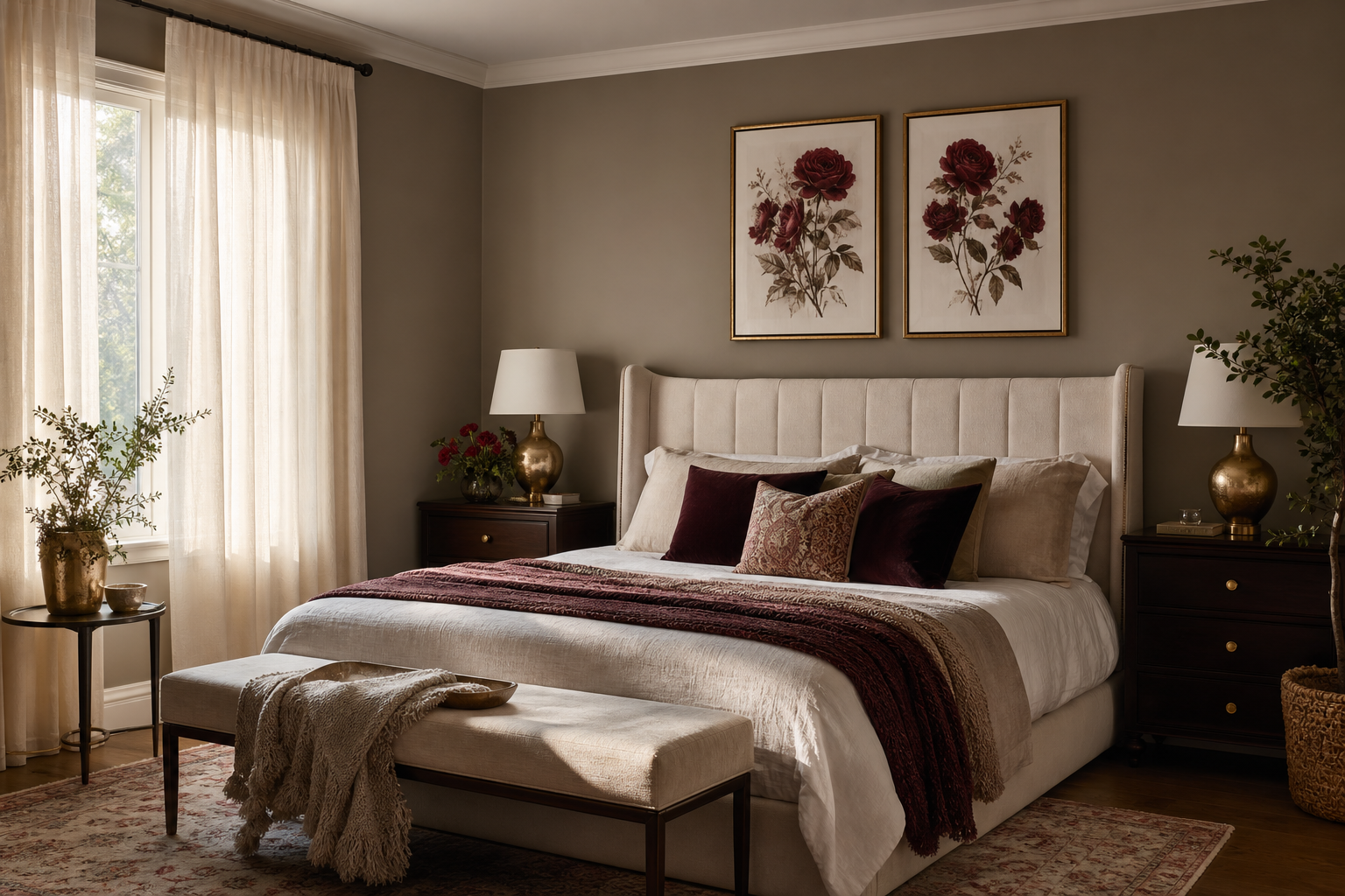
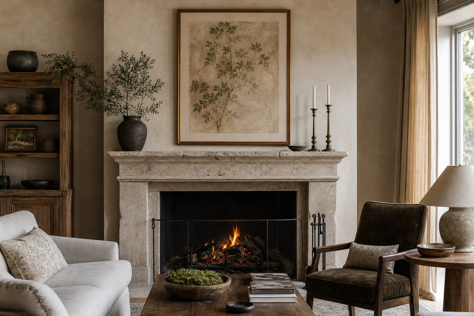
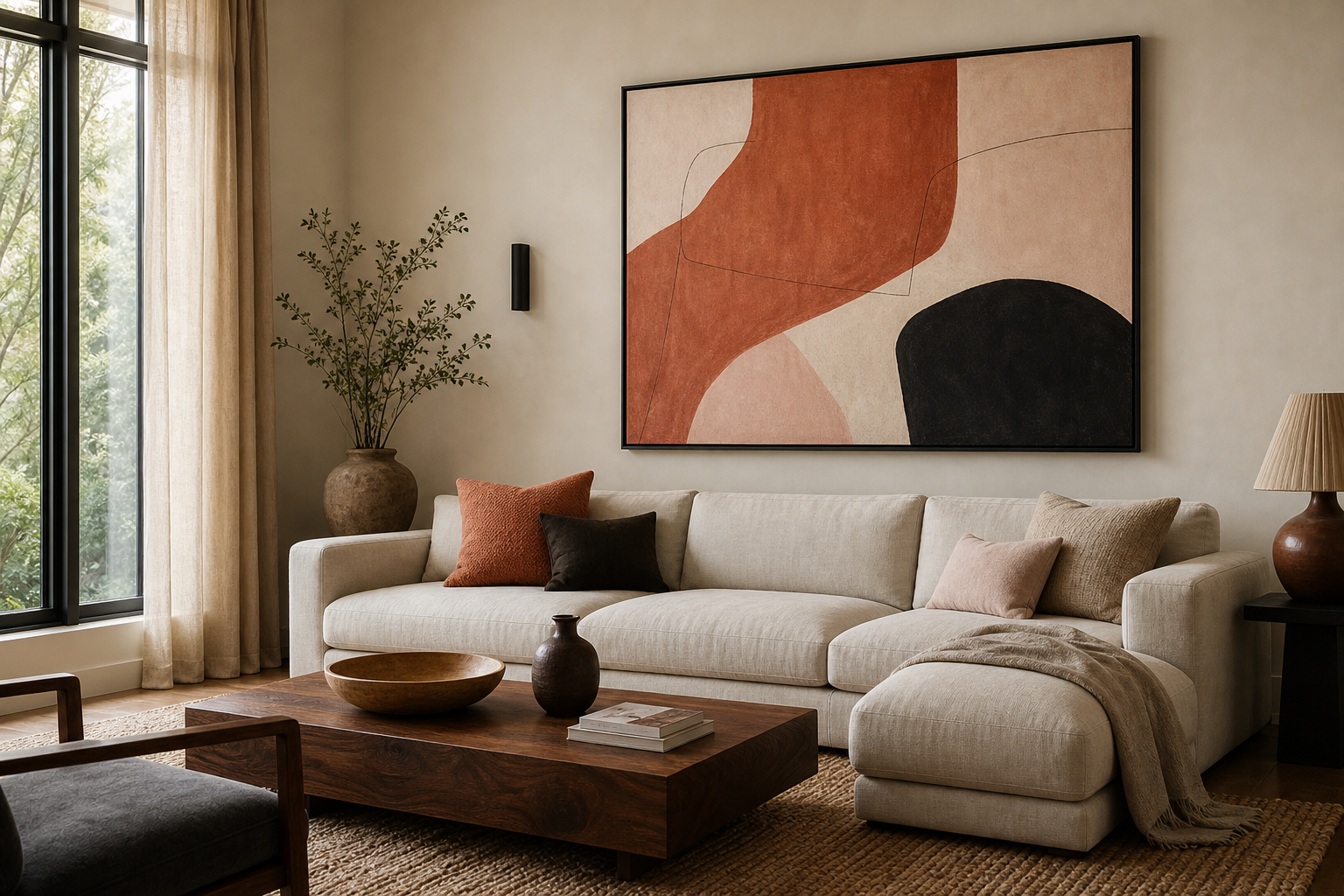
A bathing poster print works best when it brings visual quiet to a room. The strongest versions usually share three cues: water, gentle human presence, and soft tonal contrast. That could mean ripples, a pool surface, a relaxed figure, or a vintage scene with an intimate, ritual feel. The result is less about literal bathing and more about pause, privacy, and slow movement.
What Makes a Bathing Poster Print Feel So Calming?
Images linked to water lower visual tension because they avoid hard edges and crowded detail. A bathing poster print with pale blues, sandy neutrals, faded creams, or warm stone tones will read as calmer than one packed with sharp black contrast or saturated red. If you want the room to feel spa-like rather than playful, keep the artwork within a restrained palette of two to four main colours.
Print style matters too. Photography often feels crisp and modern, especially when the subject is water texture or tiled pool detail, while our vintage art collection gives bathing imagery a softer, more romantic direction. If you prefer something more meditative than figurative, pieces from our mindfulness collection can create a similar mood through stillness rather than narrative.
A good example is a print that focuses on water itself instead of a busy scene. Light moving across a surface instantly suggests cleansing and calm.
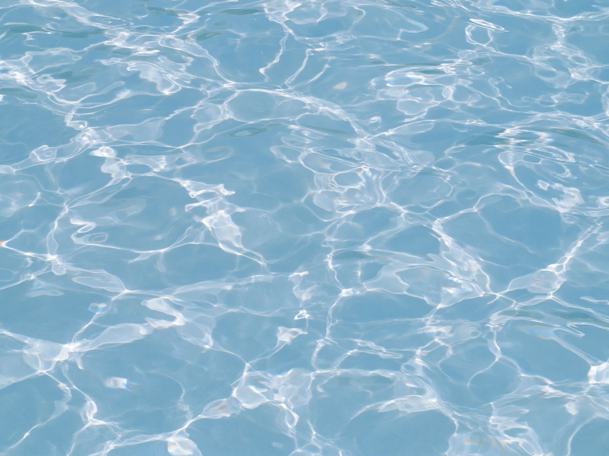
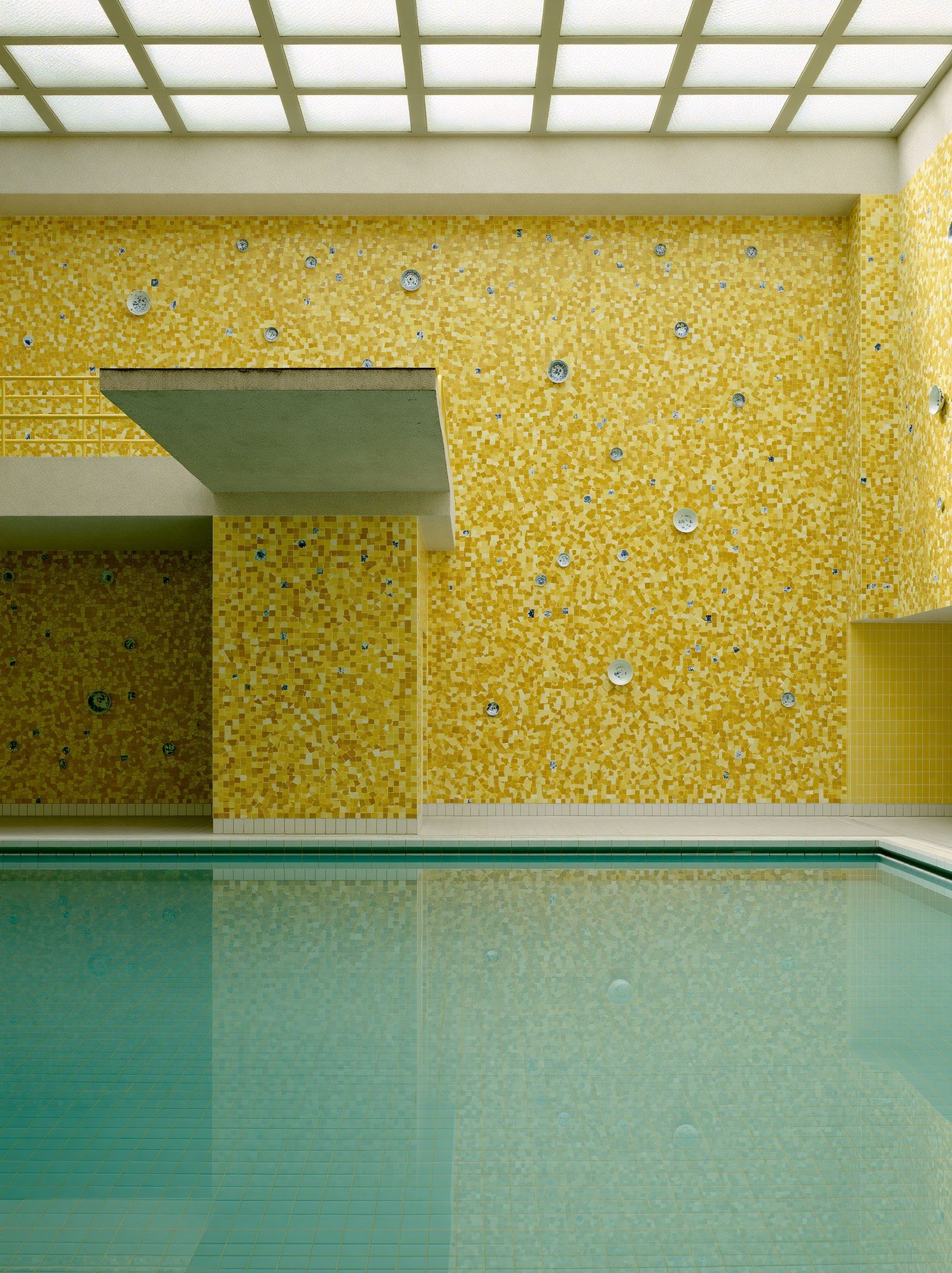
If you want a slightly more architectural take, pool imagery can give a bathing theme a polished, hotel-like finish. Yellow Mosaic Pool is a strong choice for bathrooms with tiled surfaces, brass fittings, or creamy limestone tones because it repeats the room's materials instead of fighting them.
Where to Hang It for the Best Effect
The most natural place for a bathing poster print is above a bathtub, beside a vanity, or on the wall opposite the mirror so it becomes part of the room's first sightline. In a standard bathroom, art hung with the centre point at roughly 145 cm from the floor usually feels balanced. Above a bath, leave 20 to 25 cm between the rim line and the bottom of the frame to avoid a cramped look.
Humidity matters. In a family bathroom with regular steam, hang the print at least 60 cm away from a shower enclosure or direct splash zone. If the room has poor ventilation, place the art in an adjoining dressing area or en-suite entrance instead. A bathing image still makes sense there because the association with routine and care remains intact.

Bedrooms and dressing spaces are often better than bathrooms for larger frames. A 50 x 70 cm print above a chest of drawers or beside a full-length mirror feels elegant, especially if the image has a softer, more personal tone. In these rooms, you can also pair it with Window with Sheer Curtain or browse our fine art collection for pieces that echo fabric, light, and quiet interiors.
For a calmer corner, place the print near a reading chair, towel ladder, or vanity shelf rather than in the room's busiest traffic line. The image should feel discovered, not shouted. That is especially true in smaller bathrooms under 5 square metres, where one carefully placed frame usually looks better than three small ones.
Choosing Colours, Sizes, and Finishes
Match the print to the room's undertone first. Cool bathrooms with white tiles, chrome, and grey grout suit blue-based water imagery and monochrome photography. Warm bathrooms with travertine, beige paint, oak, or brass are better with faded creams, honey tones, and vintage bathing references. That is why a bathing poster print can look completely different depending on the frame you choose.
For size, use the 60 to 75 percent rule. If you're hanging art above a bath, bench, or console, the frame width should cover about 60 to 75 percent of the furniture or fixture width below it. Over a 170 cm freestanding tub, a 70 x 100 cm print or a pair of 50 x 70 cm pieces usually looks proportionate. In compact powder rooms, 30 x 40 cm and 40 x 50 cm formats keep the wall from feeling crowded.
Frame finish changes the mood fast. Thin black metal sharpens modern photography. Natural oak softens pool blues and sandy neutrals. Brushed gold works well with vintage feminine subjects and warm stone palettes. If the room already has strong hardware finishes, match one of them rather than introducing a fourth surface.
Paper and glazing are worth checking before you buy. In humid rooms, glazed frames are easier to wipe down, while matte-finish prints often reduce glare opposite mirrors or windows. If your bathroom gets strong daylight, avoid placing highly reflective glass directly across from the window unless you want the art to compete with glare for half the day.
How to Build a Relaxed Gallery Wall Around It
A bathing poster print works best as the anchor, with three or four supporting pieces that repeat either the palette or the mood. Keep the spacing tight — around 5 to 7 cm between frames — so the arrangement reads as one visual story rather than scattered leftovers. If your anchor print is figurative, pair it with simpler companions such as water studies, stones, or quiet interior details.

This four-piece mix gives a bathing theme depth without becoming too literal:
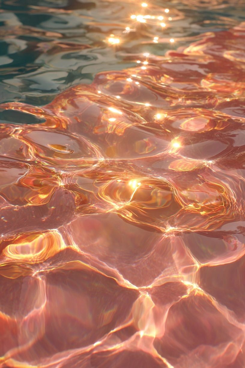
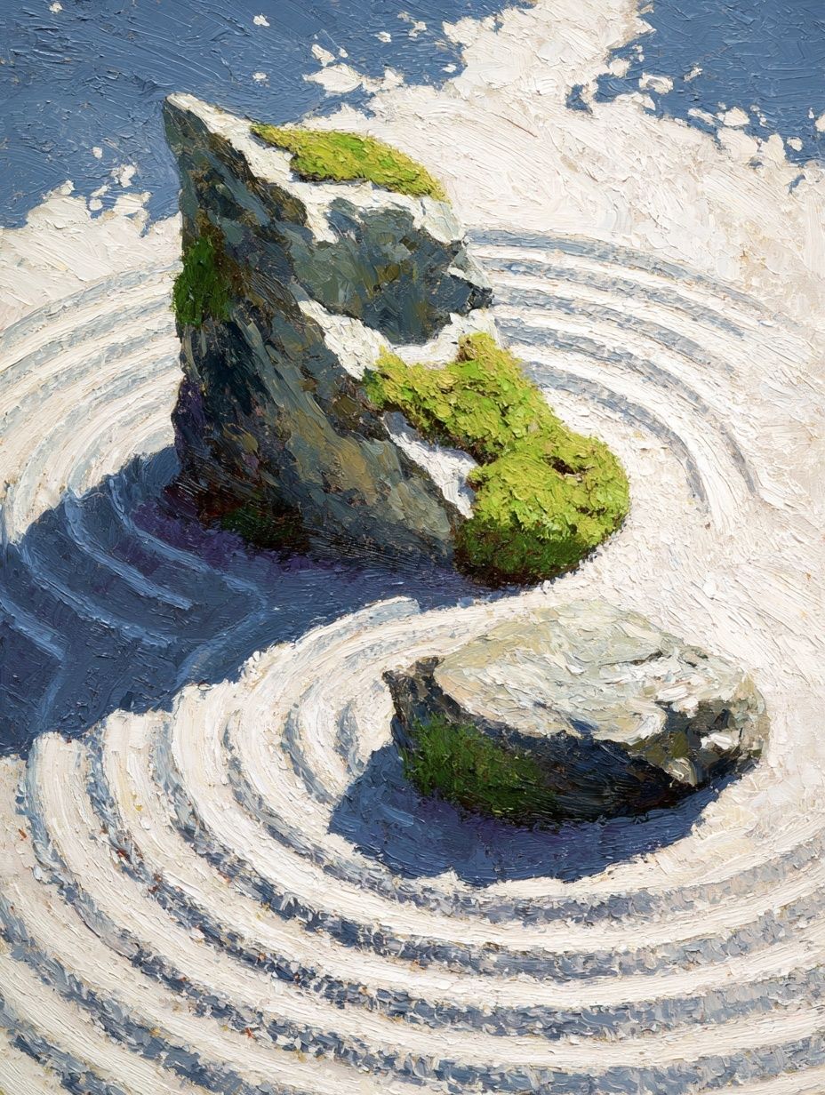

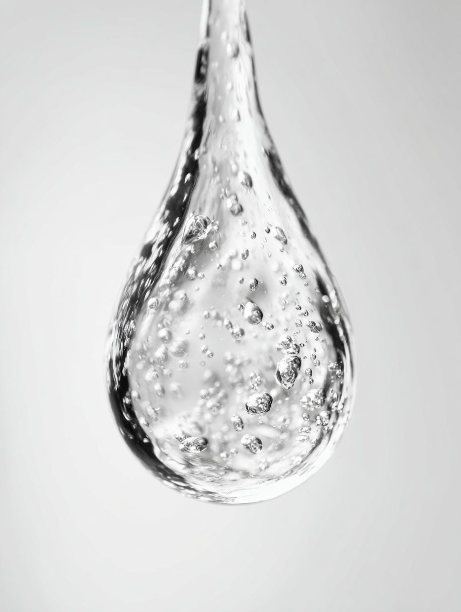
Notice the balance: one human reference, two nature-based textures, one close-up detail. That formula keeps the wall refined. If you want a more feminine, vintage-led arrangement, Elegant Woman Silhouette pairs well with Zen Garden Stones because the curves of the figure contrast nicely with grounded mineral texture.
You can also create a looser arrangement in a bedroom by placing the largest frame slightly off-centre above a bench or vanity, then stacking smaller works vertically beside it. That layout feels more relaxed than a rigid grid and suits homes with softer styling — linen curtains, rounded mirrors, limewash walls, and open shelving.
Styling Ideas for Different Interiors
Minimalist interiors need restraint. Choose one oversized bathing poster print with plenty of negative space, then repeat only two materials in the room — for example, white walls, pale stone, and black or oak framing. Water photography from our photography collection tends to work especially well here because the subject is calm but the finish stays clean.

Vintage interiors can lean into story. A bathing image with a classic female subject, faded colour, or editorial elegance feels right at home with antique brass, marble tops, pleated lampshades, and painted wood furniture. Radiant Woman is a good example of how portrait-led art can support a bathing mood without needing a literal bathroom scene.

Modern spa interiors benefit from tonal layering. Combine watery blues, misty whites, sandy beige, and muted sage across the art, towels, ceramics, and bath mat. Add one darker note — charcoal, espresso, or deep bronze — through the frame or a small accessory so the room does not wash out visually. If you want a more contemplative angle, Floating Stones Meditation sits naturally beside water-led imagery.
Neutral interiors often need texture more than colour. In those spaces, pick art that shows reflection, tile, stone, steam, or fabric. The image should add surface interest while staying within a quiet palette. That is why water photography, soft vintage portraiture, and selected pieces from our bohemian wall art can all work — the key is keeping saturation low and materials tactile.
A Few Shop-Worthy Tips Before You Buy
Choose the image for the room you will still want in two years, not for a short trend cycle. The safest long-term route is a bathing poster print that suggests ritual and stillness rather than novelty. Water texture, elegant silhouettes, pool tile detail, and serene portraiture tend to date more slowly than overtly styled novelty scenes.
Measure the wall first, then the sightline. In a bathroom, you often view the print from 1.5 to 2.5 metres away, so small details disappear quickly. If you love a subtle image, size up rather than down. If the wall already includes a mirror, sconce, towel rail, and tile lines, simplify the art so the room does not become visually chopped.
Framing protection is practical, not optional. Look for a sealed back, stable hanging hardware, and glazing that can handle regular cleaning. In high-moisture rooms, open paper edges and flimsy clip frames age fast. A solid frame with proper backing will keep the print flatter and cleaner over time.
Final thoughts
A bathing poster print is most successful when it supports the rhythm of the room — slow mornings, evening routines, a quiet reset. Start with mood, place it where the eye naturally lands, and keep the palette closely tied to the finishes already in the space.
If you treat the print as part of the room's materials rather than a last-minute accessory, it will feel integrated from day one. Calm imagery, correct scale, and a frame that suits the hardware are usually all you need.
Frequently Asked Questions
Can I hang wall art in a bathroom with no window?
Yes — but use a well-ventilated space with an extractor fan, and keep the frame away from direct steam or splash zones. Sealed framing helps the print last longer.
What frame colour works best with brass bathroom fittings?
Brushed gold, warm oak, and thin black frames all work with brass. Pick one based on the room's overall temperature — oak for softer warmth, black for more contrast.
Should bathroom art be centred on the wall or aligned with the bath below?
Above a bath or vanity, align the art to the fixture below rather than the full wall width. It looks more intentional and keeps the composition visually grounded.
Do water-themed prints work in a bedroom too?
Yes — especially above dressers, vanities, or reading corners. In bedrooms, softer and larger pieces usually feel more elegant than small high-contrast prints.