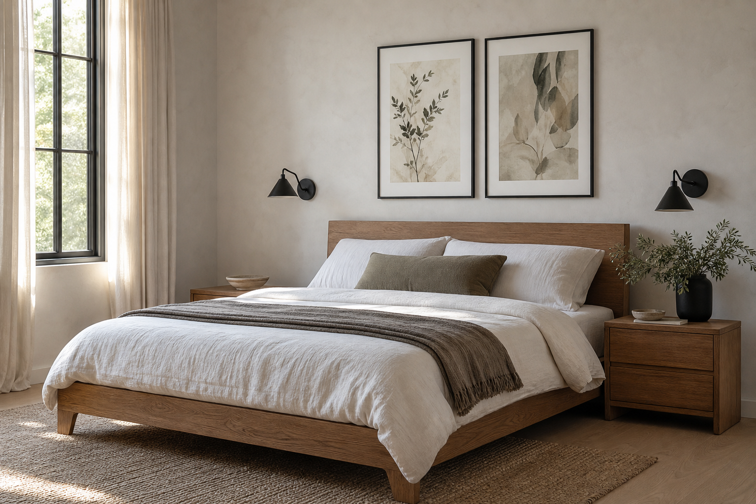
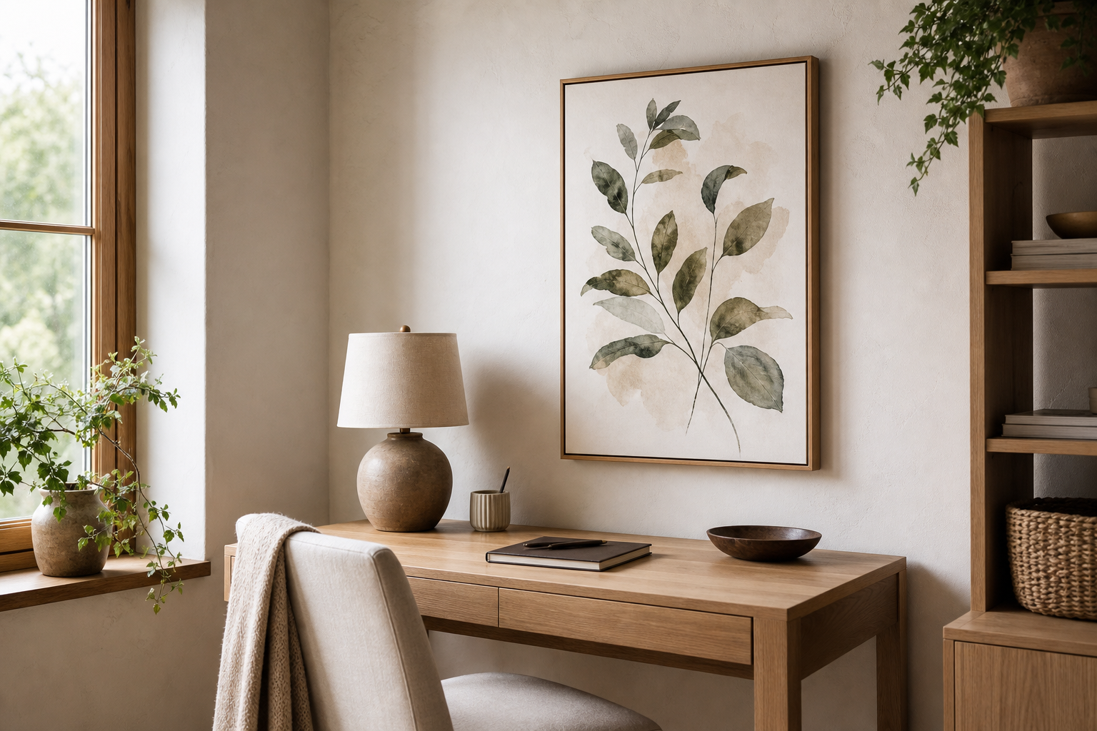
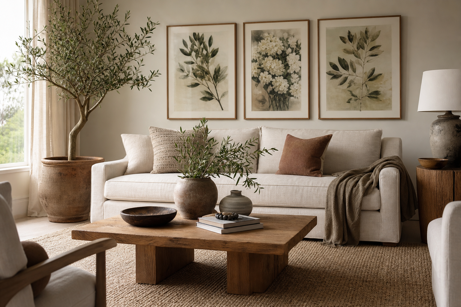
An autumn leaves poster does one job exceptionally well: it introduces warmth fast. Even in a room with white walls and simple furniture, foliage imagery brings in oranges, ochres, russets, and deep olive tones that make the space feel more layered. That is why an autumn leaves poster works beyond one short season — it adds the same grounded character that people often look for in wood furniture, woven textiles, and soft ambient lighting.
Why Autumn Leaves Work So Well in Home Decor
Leaves have natural variation, and that makes them easy to live with. Unlike very graphic art with hard edges or high contrast, foliage imagery carries movement through curved stems, irregular shapes, and tonal shifts. In practical terms, that means it softens straight-lined furniture like boxy sofas, platform beds, and slim metal shelving. If you already like the look of our botanical collection or the quieter mood of nature art prints, autumn imagery sits right between the two.
Warm colour is only part of the appeal. Autumn scenes also suggest texture — dry leaves, bark, branches, and fading grass — so the artwork feels richer than a plain block of colour. This is especially useful in homes that rely on neutral foundations such as beige, stone, cream, taupe, or soft grey. In those spaces, one framed seasonal print can create contrast without making the room feel busy.
A second strength is flexibility. An autumn-themed print can read rustic, classic, vintage, or even minimal depending on what surrounds it. Pair it with dark walnut, black metal, and charcoal textiles, and it looks more refined. Pair it with linen, oak, boucle, and terracotta ceramics, and it turns relaxed and cosy.
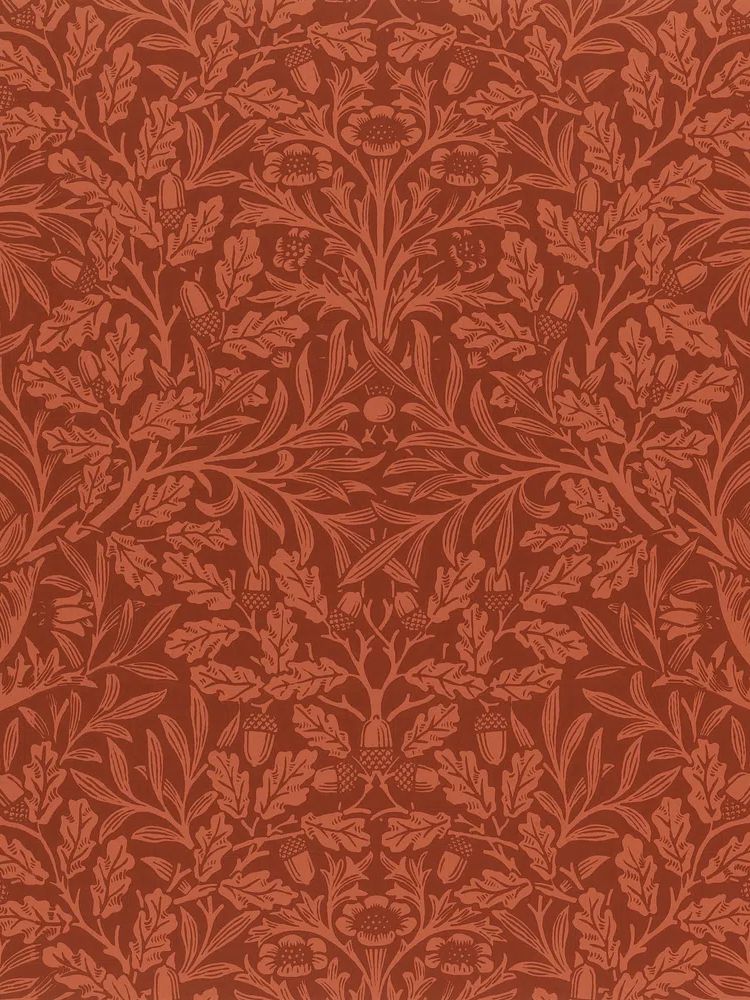
The most convincing autumn rooms tend to use nature in more than one place. If your wall art shows leaves or acorns, repeat that theme subtly with branch cuttings, a wood tray, or a wool cushion in a similar tone. Keep the repetition to two or three touchpoints — enough to create cohesion, not so much that the room starts to feel staged.
Choosing the Right Colour Palette
The easiest way to style an autumn leaves poster is to pull 2 or 3 colours from the print and repeat them across the room. A balanced palette often looks like this: 60% base neutral, 30% warm secondary tone, 10% accent. For example, use warm white walls and beige upholstery as the base, add rust or camel through cushions and a throw, then bring in a small olive or dark brown accent through a vase, frame, or side table.
If your room already has grey upholstery, choose autumn art with muted amber, faded gold, and olive rather than bright orange. Grey can make saturated orange look harsh, while softer earth tones feel more integrated. In cream or greige spaces, you can go deeper — burnt sienna, cinnamon, chestnut, and antique gold all work well.

For homes with stronger existing colour, think in complements rather than exact matches. Forest green upholstery pairs naturally with amber and copper foliage. Navy works well with ochre and tobacco. Even soft blush can work if the artwork includes muted beige and brown undertones. If you want a cleaner, more editorial finish, add one quieter companion piece from our abstract collection — something with terracotta or ochre rather than another detailed landscape.
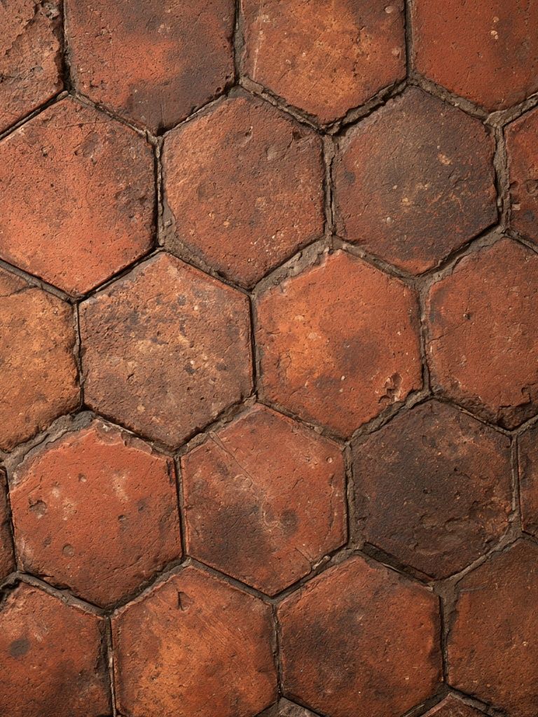
Vintage autumn imagery is especially effective when you want warmth without a trendy look. Pieces like Autumn in Eiraku or Autumn Suburban Street already contain the softened, timeworn colours that sit comfortably with natural materials. They are easier to blend into established interiors than very glossy or hyper-saturated prints.
Finding the Best Size and Placement
Scale matters more than subject. Above a sofa, your autumn leaves poster or art grouping should span roughly 60% to 75% of the sofa width. For a 200 cm sofa, aim for art measuring about 120 to 150 cm across in total. That could be one large 70 x 100 cm print, two 50 x 70 cm frames, or a gallery arrangement with even spacing of 5 to 8 cm between frames.
In an entryway, use a smaller vertical format if the wall is narrow — 30 x 40 cm or 40 x 50 cm works well above a console or bench. This is one of the best locations for seasonal art because it sets the tone immediately. A warm-toned print beside a mirror, lamp, and tray for keys makes a small practical zone feel considered rather than temporary.
Bedrooms suit quieter placement. Hang the piece above a dresser, opposite the bed, or offset near a reading chair instead of directly over the headboard if the room is already visually full. A softer autumn scene like Walking in the Misty Forest works well in bedrooms because it keeps the palette subdued.

Shelves need a different approach. Lean a 30 x 40 cm or 40 x 50 cm frame against the wall and layer it behind a smaller object — a candle, a vase, or a stack of books. Keep at least one-third of the artwork visible so it still reads clearly from across the room. That gives an autumn leaves poster a more casual look than wall mounting, which suits living rooms and home offices with open shelving.
Framing Ideas That Elevate the Print
Frame finish changes the entire mood. Oak and light wood bring out the organic side of leaf imagery and work best in Scandinavian, rustic, and relaxed contemporary rooms. Black frames sharpen the artwork and make muted autumn colours feel more graphic. Walnut is the richest option — ideal if your room already includes darker woods, leather, or brass.
Matting is useful when the artwork has intricate detail. A white or warm off-white mount gives the image visual breathing room and can make a 40 x 50 cm piece feel more substantial. As a rule, a mount width of 5 to 8 cm suits most medium-sized prints. If the image is already delicate or faded, skip a heavy mount and use a slim frame so the piece does not lose impact.

Vintage botanical works respond particularly well to traditional framing. Acorns oak leaves design (1880) looks polished in walnut or black with a mount, while decorative pieces from the botanical category can take lighter oak if you want a fresher feel. If you prefer a less formal room, use thinner frames and keep nearby styling looser — stacked books, uneven branches, handmade ceramics.
How to Build a Seasonal Gallery Wall
A strong autumn gallery wall mixes subject and pace. Start with one hero piece — your autumn leaves poster — then add three supporting works that vary in scale or detail. The safest formula is 1 detailed botanical, 1 landscape or vintage scene, 1 abstract warm-toned print, and 1 lighter piece with open space. This combination keeps the wall from looking flat.
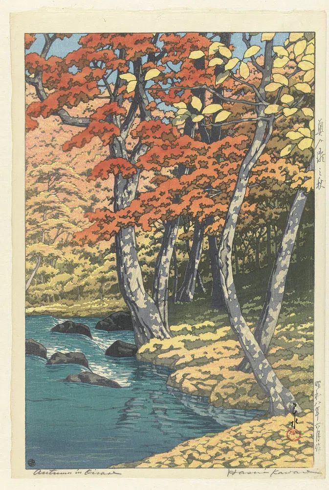
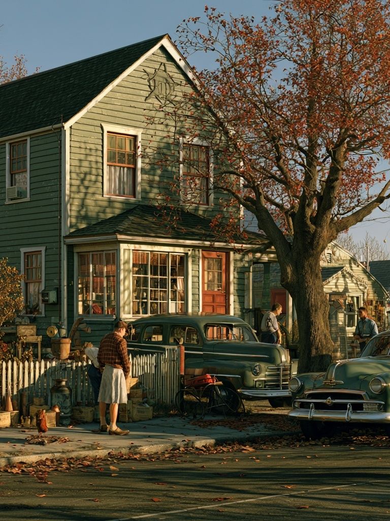
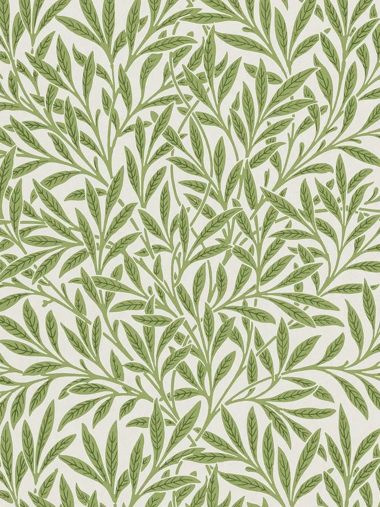

Hang the center of the arrangement at around 145 cm from the floor in living spaces, then adjust slightly for ceiling height and furniture placement. Keep gaps consistent — usually 6 cm is enough for a neat composition. If the wall sits above a console or sofa, let the arrangement echo that furniture width rather than spreading too far beyond it.
You do not need every piece to be explicitly autumnal. In fact, a better result often comes from combining seasonal imagery with quieter companions from our fine art prints or restrained works from the minimalist collection. The contrast gives the wall longevity, so it still feels relevant in late winter and early spring.
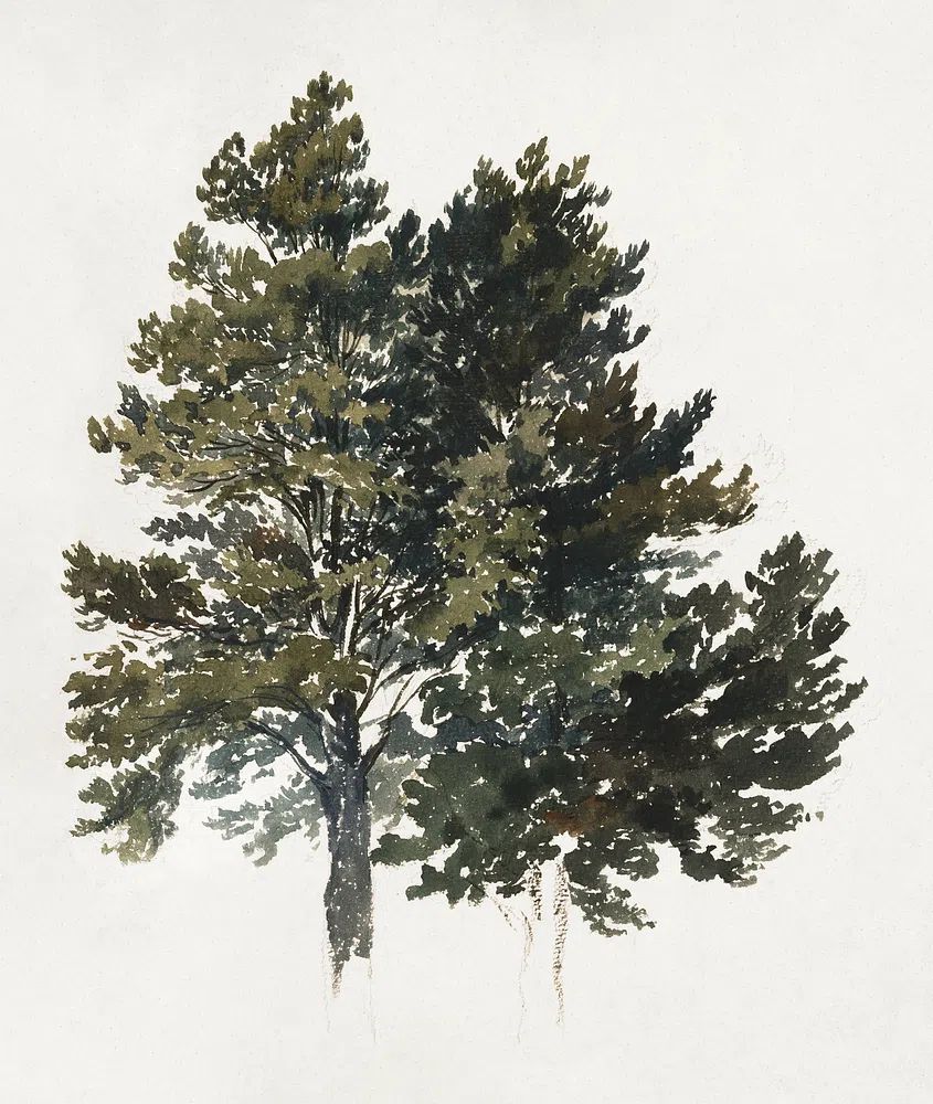
For a more heritage look, pair foliage with pattern-rich botanicals such as Marigold by William Morris or William Morris's vintage willow leaves. For a cleaner look, limit the gallery to two warm-toned pieces and two neutral companions, then use matching frames throughout.
Styling Tips for a Warm, Cohesive Finish
The final layer should support the art, not compete with it. Around an autumn leaves poster, use tactile materials with low sheen: washed linen, wool, boucle, raw wood, stoneware, smoked glass. These surfaces catch light softly and echo the natural quality of the imagery. One or two candles, a wood bowl, or a branch arrangement is enough. More than that, and the setup starts to feel theme-heavy.
Repeat colour in small amounts at different heights. If your artwork contains amber and olive, place an olive vase on the floor or shelf level and an amber glass accent on a table. That vertical repetition makes the room feel pulled together. In practical styling terms, try one dark anchor, one warm textile, and one natural organic element near the artwork.

If you are shopping for companion pieces, stay within a narrow tonal range. Warm neutrals, muted greens, deep browns, and terracotta are easier to style than bright red or sharp yellow. One well-chosen seasonal print will usually do more than several weaker ones. That is the value of an autumn leaves poster — it delivers colour, movement, and mood in a single move.
Final thoughts
Autumn styling works best when it feels anchored rather than temporary. Choose artwork with earthy colour, place it at the right scale, and repeat its tones through texture and material instead of obvious themed accessories.
A carefully framed autumn leaves poster can warm an entry, settle a bedroom, or give a living room more depth in minutes. Keep the palette controlled, the spacing clean, and the surrounding decor natural — the result will feel seasonal, but still refined.
Frequently Asked Questions
What frame size should I choose if I want the art to look larger?
Pick a print with a mount and a frame 10 to 16 cm larger overall than the artwork. A 40 x 50 cm print in a 50 x 70 cm frame often looks more substantial without needing a bigger wall.
Do autumn-toned prints work on white walls?
Yes — white walls make rust, gold, and olive stand out clearly. Add one or two warm materials nearby, such as oak or linen, so the art does not feel isolated.
Can I mix autumn artwork with black furniture?
Yes, and it usually looks sharp. Choose prints with some darker detailing or use a black frame to visually connect the art to the furniture.
What type of glass is best for framed wall art?
Acrylic is lighter and easier to handle for larger sizes, while glass gives a slightly crisper finish. In bright rooms, anti-reflective glazing is worth considering for better visibility.