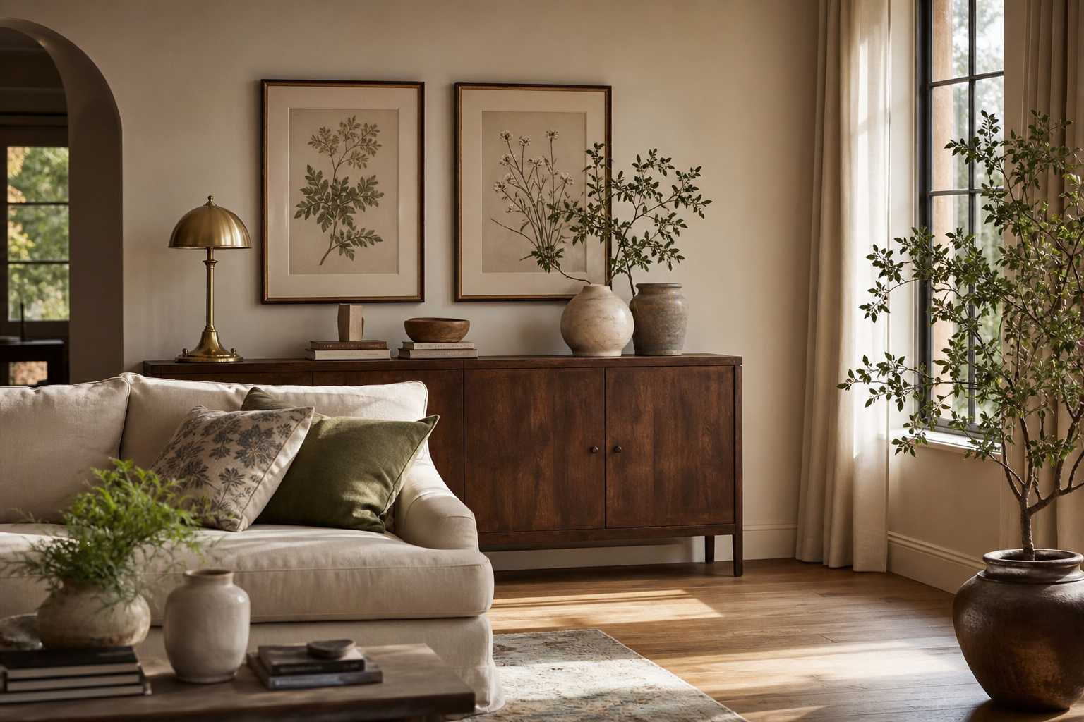
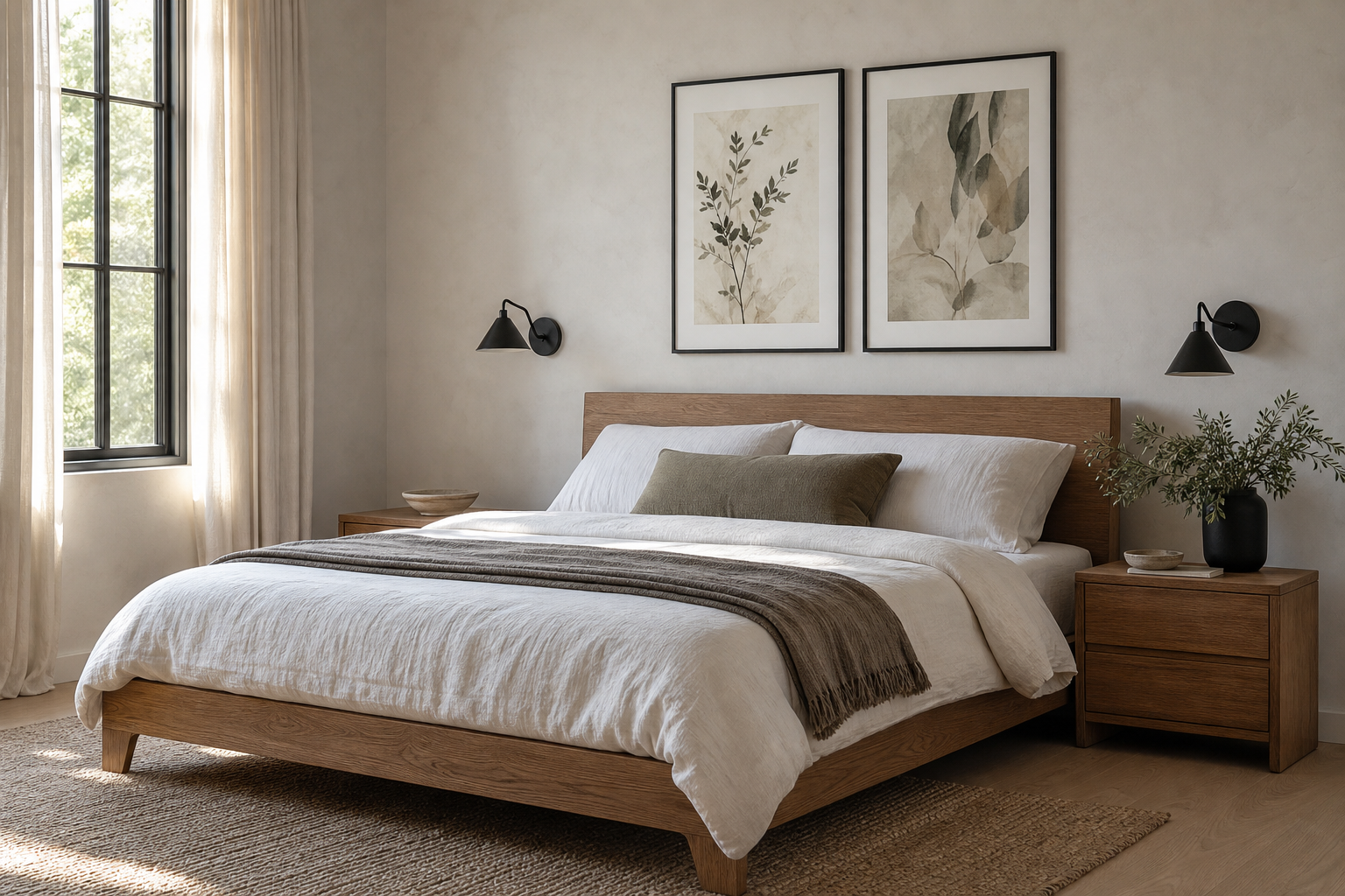
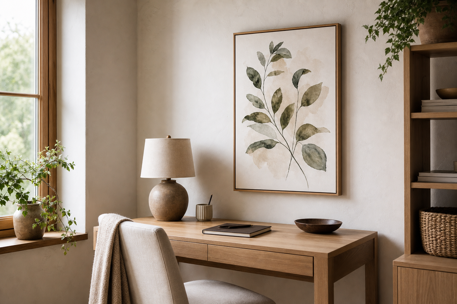
An art vintage poster brings two things modern rooms often lack: history and softness. Even when the print is newly made, the aged palette, illustrated detail, and slightly nostalgic mood can make a clean interior feel more layered. That matters in spaces dominated by hard lines, pale walls, and fast furniture.
Why Art Vintage Posters Feel So Timeless
Vintage artwork tends to use colors that sit comfortably in a home for years rather than one season. Muted ochre, tobacco brown, dusty blue, deep olive, and faded black are easier to live with than high-chroma brights because they blend into wood, linen, stone, and neutral upholstery. That is why an art vintage poster from our vintage collection often feels settled from day one.
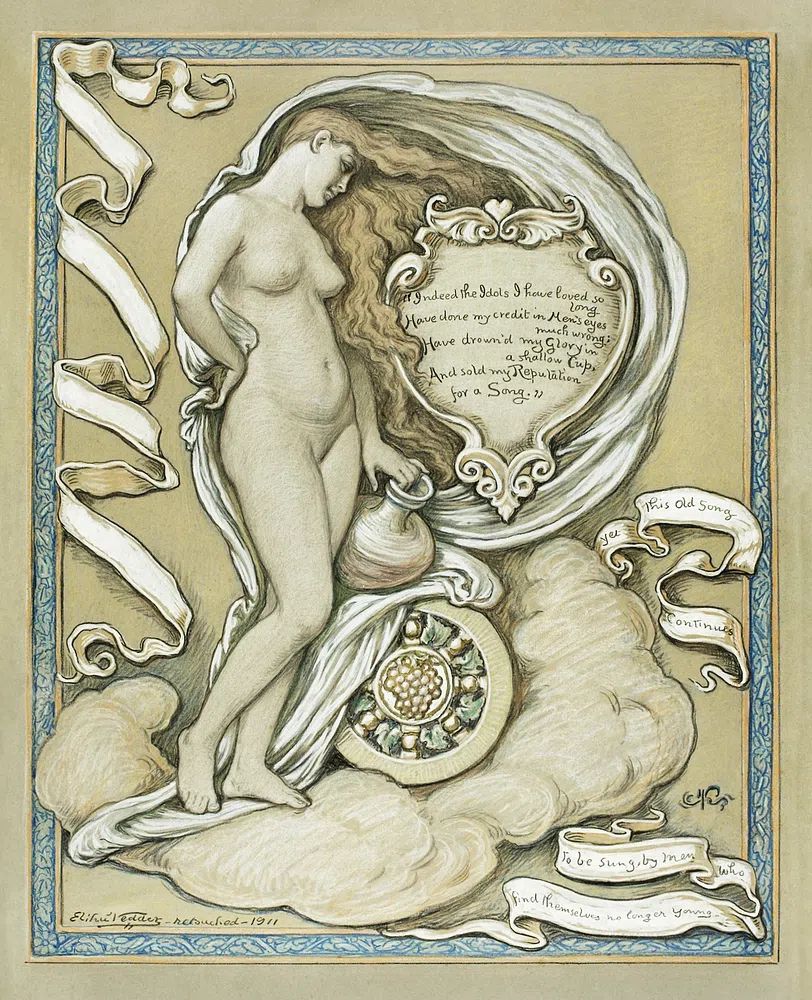
A second strength is subject matter. Portraits, travel imagery, still lifes, and old-world scenes carry built-in narrative. They suggest a place, a person, or a period, which gives a room personality without forcing a theme. If your home leans classic, fine art prints with painterly detail work well. If your space is cleaner and more graphic, mid-century modern art prints can deliver the same sense of age with sharper shapes.

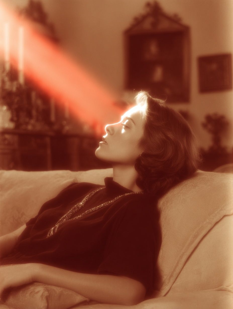
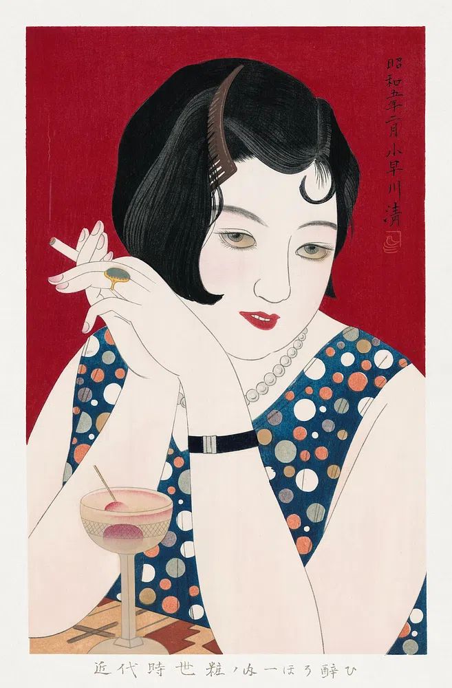
Portrait-based pieces are especially effective because they anchor a wall quickly. A single figure creates focus in a way abstract work sometimes does not, especially in small rooms where you want one decisive visual element rather than many competing accents.

Choosing the Right Poster for Your Space
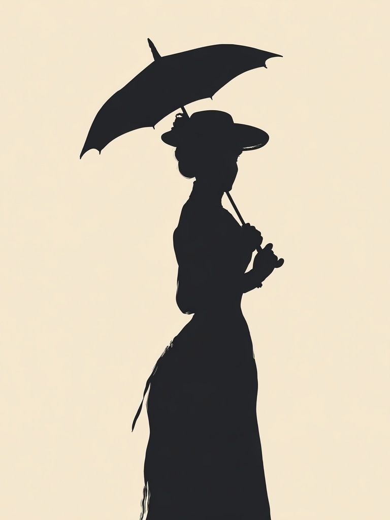
Start with the room mood, not the empty wall. In a calm bedroom, choose soft compositions and restrained contrast. In a hallway or dining nook, you can push bolder sepia tones, stronger silhouettes, or darker backgrounds because people move through those spaces rather than sit in them for hours.
Scale is the next decision. For a sofa around 200 to 230 cm wide, one large piece in 50x70 cm or 70x100 cm feels intentional. For a narrow console or entry bench, 30x40 cm to 40x50 cm is usually enough. A common mistake is choosing a print that covers less than 40% of the furniture width beneath it — that tends to look undersized. Aim for 50% to 75% coverage for a balanced look.
Color matching should be practical. Pull one or two tones from the print and repeat them elsewhere in the room — a rust cushion, an antique brass lamp, a black frame, or an olive throw. If your walls are white or warm greige, almost any art vintage poster will work. On darker walls, choose pieces with cream margins or lighter central figures so the art does not disappear.
For a more decorative room, figurative pieces and elegant silhouettes pair beautifully with bohemian wall art and natural materials like rattan, linen, and raw wood. If your style is more curated than relaxed, try mixing vintage imagery with illustration prints that share similar line quality or subdued color.
Framing Choices That Elevate the Look
A frame can shift a print from casual to collected in minutes. Thin black wood suits graphic or portrait-led images and works well in contemporary homes. Medium walnut or dark oak softens the presentation and is particularly good with sepia, cream, and faded green tones. Gold can work too — but keep it narrow and slightly brushed rather than glossy, especially if the artwork already has ornate detail.
Matting gives the image room to breathe. For a 30x40 cm print, a mat around 5 to 7 cm wide creates a gallery-style finish. For 50x70 cm and above, a wider mat can make the piece feel more significant. If the artwork is busy, a mat helps isolate it visually. If the composition already has plenty of negative space, you can frame edge-to-edge for a stronger vintage effect.
Glass choice matters more than people think. In bright rooms, acrylic or anti-reflective glazing reduces glare, which is useful opposite windows. In lower-light rooms, standard clear glazing is often enough. If you are styling an art vintage poster in a kitchen or hallway, choose easy-clean glazing because grease, dust, and fingerprints build up faster there than in a bedroom.

If you want one piece that already carries strong presence, look for imagery with visual depth and classic tonal contrast.
Where to Hang It: Room-by-Room Ideas
In the living room, place the center of the artwork around 145 cm from the floor, or 15 to 25 cm above the sofa back. That keeps the piece connected to the furniture rather than floating too high. One larger print works best if the rest of the room already has patterned textiles, books, and ceramics.
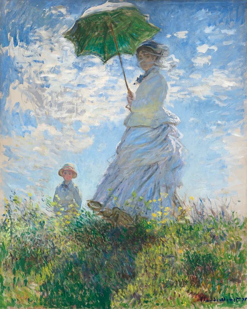
In bedrooms, hang art above the headboard only if the width relationship feels right. A print or grouping should usually span about two-thirds of the bed width. Soft figurative or floral-adjacent vintage work is effective here because it brings character without overstimulating the room. If you like painterly pieces, Woman in Yellow Flowers adds warmth with gentle color transitions.
Kitchens suit smaller framed pieces — think 30x40 cm above a breakfast table, shelf, or sideboard. Still lifes and lifestyle-led vintage imagery feel at home here. A home office can handle more structured or intellectual subjects, including historical or travel-inspired work. For that look, Aeronautics Vintage Print gives a study or desk wall a clear focal point without looking heavy.
Hallways are ideal for narrower arrangements because people view them while moving. Use two or three vertically aligned works with 6 to 8 cm between frames. In compact spaces, consistent frame color matters more than matching subject matter.

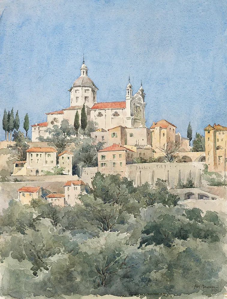
For a room with stronger classical character, Starry Night or Charming Italian Village can bridge vintage mood and recognizable fine art heritage.
How to Build a Vintage-Inspired Gallery Wall
A gallery wall works best when one piece leads and the others support it. Use your main art vintage poster as the anchor — usually the largest item or the one with the strongest figure — then add three to six surrounding pieces in complementary tones. The easiest formula is 1 large, 2 medium, and 2 to 4 small works.
Mix media carefully. Combine vintage portraits with painterly scenes, line-based illustrations, or one restrained typography piece. Too many ornate works can feel theatrical; one or two cleaner pieces create balance. If you want contrast, Ground Rules — Retro Typography Print can sharpen a soft vintage grouping, especially in a hallway or home office.
Keep spacing tight: 5 to 8 cm between frames is enough in most homes. Wider gaps make pieces feel unrelated. Before hanging, arrange everything on the floor and photograph it from above. If one corner feels visually heavy, swap a dark piece for a lighter one rather than shifting the whole layout.

This kind of layered arrangement works especially well when you combine portraiture with one more expansive scene.
Finishing Touches and Styling Tips
The best styling around vintage wall art is usually restrained. Repeat one metal finish — black, brass, or aged bronze — across frames, lamps, and hardware. Then add texture through linen, wool, wood, or ceramics rather than more color. A room with 3 strong materials often looks more expensive than a room with 10 decorative accents.
Lighting changes everything. A picture light or directional wall sconce set 20 to 30 cm above the frame adds depth in the evening and makes the display feel permanent. If the wall gets strong direct sun for more than 3 to 4 hours daily, avoid hanging valuable-looking pieces there long term, even with protective glazing, because fading is gradual and often uneven.
Plants, books, and sculptural objects should support the artwork, not block it. Keep tall branches or lamps offset to one side, and leave at least 10 cm of visual breathing room around the frame edges. If you are styling shelves beneath the art, stack items low so the wall piece remains the focus.
Final thoughts
An art vintage poster works best when it feels connected to the room through scale, color, and framing. Choose a subject that suits the space, size it to the furniture beneath, and frame it with enough care that it reads as collected rather than temporary.
The strongest results usually come from simplicity — one beautiful piece in the right place, or one lead print supported by a few quieter companions. That is how vintage-inspired wall art adds character without making a room feel staged.
Frequently Asked Questions
What frame color is safest for an art vintage poster?
Black, walnut, and dark oak are the most versatile choices. Black looks crisp and modern; walnut and oak feel warmer and slightly more traditional.
Can I hang vintage-style art in a bathroom?
Yes, but only if the room is well ventilated. Use sealed framing and avoid placing the piece where steam hits it directly every day.
Should all the frames in a gallery wall match?
No — but they should share at least one common element, such as color, thickness, or material. That keeps the arrangement cohesive rather than random.
What size mat should I choose for a smaller print?
For 30x40 cm artwork, a 5 to 7 cm mat is a reliable range. It adds presence without overwhelming the image.
What decor pairs best with vintage wall art?
Natural wood, linen, brass, leather, and ceramic pieces all work well. These materials echo the depth and age suggested by vintage imagery.