Why Black and White Posters Work Everywhere
Art posters black and white work because they solve two design problems at once: they add contrast and they reduce visual noise. In a room with layered colors, monochrome art gives the eye a place to rest. In a neutral room, it creates definition fast—especially against white, greige, taupe, or pale wood finishes. That balance is why black-and-white pieces sit just as comfortably in a clean apartment as they do in a classic townhouse or a compact home office.
They also age well. Strong monochrome imagery rarely feels locked to one trend cycle, so you can change cushions, rugs, or paint colors without replacing the wall art. If you like interiors that evolve slowly, black-and-white pieces are one of the safest long-term choices. A single photograph from our photography collection or a restrained piece from our minimalist art prints can stay relevant for years because the palette already feels edited.
Choosing the Right Style of Artwork
The style matters more than the color palette alone. Black-and-white photography tends to feel architectural, calm, and slightly more formal. It works well in living rooms, hallways, and offices where you want crisp lines and a composed mood. If you want that effect, browse black-and-white photography prints and look for strong silhouettes, water textures, or documentary-style portraits rather than overly busy scenes.
Abstract and geometric work feels more graphic. It suits modern spaces with cleaner furniture profiles—think a 3-seat sofa with slim arms, a black side table, and one or two materials repeated across the room. Pieces from our abstract wall art collection are useful when the furniture is simple and the walls need rhythm rather than narrative.

Line-led minimalist prints are softer than bold abstracts and easier to mix into bedrooms or quiet corners. A design like White Flower Silhouette brings shape without harshness, while tonal pieces from our minimalist collection create depth through texture instead of high contrast. For a more collected look, vintage-inspired monochrome art from our fine art collection can add character—especially in homes with older wood furniture, brass details, or traditional moldings.

Sizing and Placement That Feel Intentional
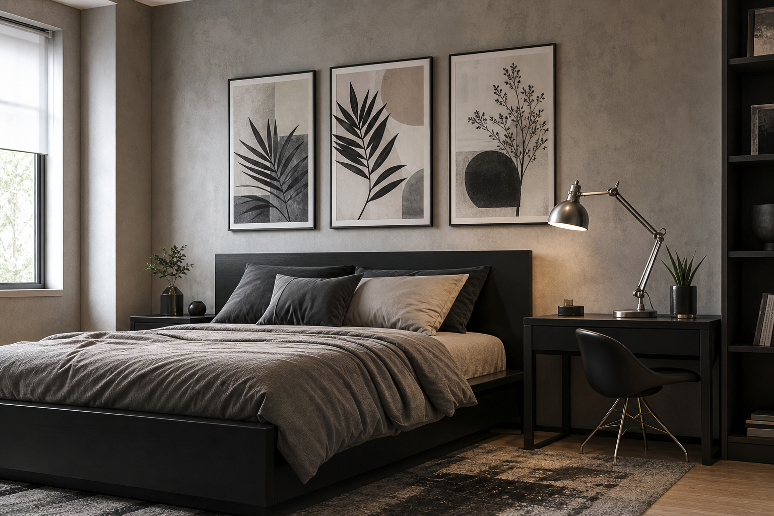
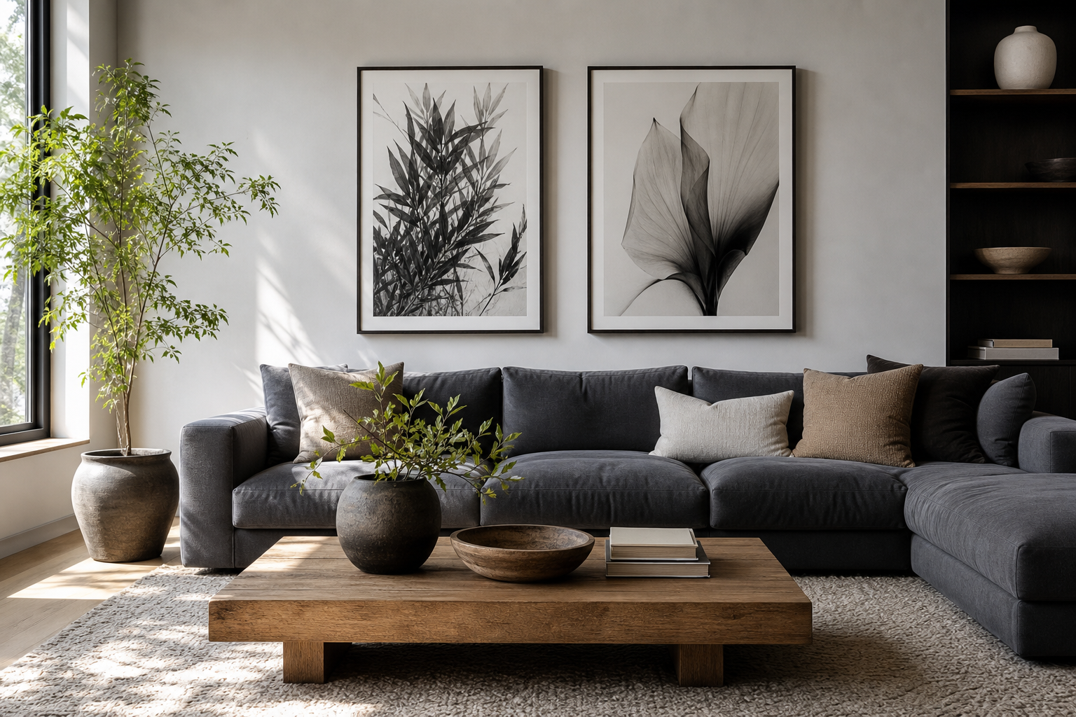
Good placement is what makes art posters black and white look styled rather than accidental. Above a sofa, your overall arrangement should cover about 60 to 75 percent of the sofa width. If the sofa is 200 cm wide, aim for a composition between 120 and 150 cm across. Above a bed with a 160 cm headboard, a total art width of around 96 to 120 cm usually feels balanced.
For a single statement piece, common sizes like 50x70 cm or 70x100 cm work well on blank walls and over console tables. For pairs, try two 50x70 cm frames with 7 to 10 cm between them. For a gallery arrangement, keep spacing consistent—5 to 8 cm is a reliable range. Consistency matters more than symmetry; even varied prints look deliberate when the gaps match.
A narrow hallway benefits from vertical formats because they lift the eye. A home office often works best with one medium piece centered above the desk rather than a large, distracting cluster. Kitchens usually need smaller formats—30x40 cm or 40x50 cm—especially if they sit between shelves, windows, or cabinets.




If you are hanging over furniture, leave 15 to 25 cm between the frame bottom and the top of the furniture. That short distance visually connects the pieces to the object below. If you hang them too high, even excellent art starts to float.
Framing and Finishing Touches
Frame choice changes the tone immediately. Black frames sharpen contrast and suit modern, industrial, or gallery-like interiors. White frames feel lighter and are often better in soft Scandinavian rooms, especially when paired with pale oak, boucle, or washed linen. Natural wood frames sit in the middle—they warm up stark monochrome and stop the room from feeling too cold.
Matting is useful when the artwork has fine detail or lots of negative space. A white mat of 5 to 8 cm can make a 30x40 cm print feel more substantial, especially in an entryway or bedroom. If the artwork is already bold and graphic, skip the mat and keep the frame slim—around 1.5 to 2 cm wide—for a cleaner edge.

Texture deserves attention here. Monochrome art looks richer when at least one element nearby has visible surface—brushed metal, oak grain, boucle, plaster, linen, or ribbed glass. That is why pieces like Textured Concrete Wall or Textured Waves pair so well with modern interiors: the wall art echoes the materials already in the room.

Pairing Black and White with Color and Texture
Black and white does not mean colorless. It works best when the room includes two or three supporting materials or accent tones. Warm woods, camel leather, olive branches, rust ceramics, smoked glass, and matte brass all soften monochrome without weakening it. Even a small accent—like one moss-green cushion or a walnut bench—can stop the scheme from feeling flat.
In cool interiors, pair black-and-white art with chrome, concrete, charcoal upholstery, and crisp white paint for a sharper look. In warmer interiors, add linen, travertine, oak, and soft beige textiles. The goal is contrast with depth, not contrast alone. A stark black frame on a white wall looks better when something nearby repeats the black—lamp stem, chair leg, cabinet handle, or window frame.
For softer contrast, choose tonal imagery instead of pure black-heavy pieces. Elegant White Fabric and Sunlit Water Surface are good examples of monochrome with a gentler gradient, which works especially well in bedrooms and reading corners.
Room-by-Room Ideas for a Monochrome Look
In the living room, use one of two formulas: a large centered piece above the sofa, or a horizontal set of two to three frames. If the furniture is low and modern, bold graphic shapes from our abstract black-and-white designs create stronger structure. If the room already has many lines—open shelving, a media unit, striped textiles—pick quieter artwork instead.

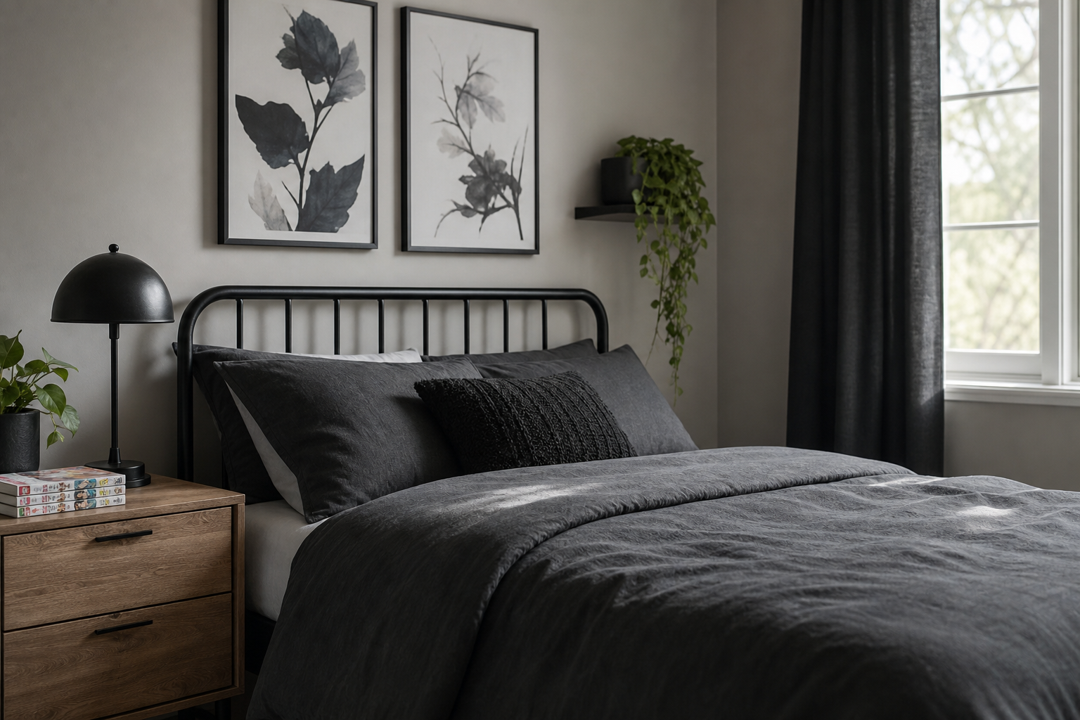
In the bedroom, softer monochrome is usually better than high drama. Textural minimalism, floral silhouettes, and water photography create calm without making the room feel severe. Hang art 15 to 20 cm above the headboard, and keep the total width around two-thirds of the bed for a stable composition.

In hallways, create rhythm with repeated frame sizes—three 30x40 cm prints or four 40x50 cm prints aligned at the same height. This approach makes narrow spaces feel longer and more considered. In a home office, one piece centered above the desk can improve focus better than a dense gallery wall. Look at Sleek Black Watch if you want a cleaner, more tailored office mood.
Kitchens benefit from restraint. One small print near a breakfast nook or two stacked pieces on a free wall are often enough. Fine art can work well here when the rest of the space is streamlined—something like Window with Sheer Curtain adds atmosphere without introducing extra color.
Final Styling Tips for a Cohesive Display
Start with one anchor piece, then build around it using either shared spacing, matching frames, or a clear tonal range. If every piece is black-and-white but one is highly glossy, one is ornate, and one is oversized, the display will feel inconsistent. Repetition is what makes monochrome arrangements look confident.
The easiest route is to choose two styles max—such as photography plus minimalist texture, or abstract forms plus fine art—and repeat one frame finish across the whole wall. That keeps art posters black and white crisp, calm, and intentional in almost any room size.
Frequently Asked Questions
What wall color works best with black and white art?
Soft white, warm greige, pale gray, and muted taupe are the easiest matches. Pure bright white gives the sharpest contrast, while warmer neutrals create a softer gallery look.
Should all frames match in a black-and-white arrangement?
No—but limit yourself to one dominant finish. A mix of black and oak can work well if the proportions are consistent and the spacing is uniform.
Can I mix black-and-white art with colored prints?
Yes, but keep color to about 20 to 30 percent of the arrangement. One muted accent piece among three or four monochrome works usually feels balanced.
What is the easiest way to hang a straight gallery wall?
Use painter's tape to mark the full outer dimensions first, then place paper templates on the wall. Measure from the centerline, not from the ceiling, especially in older homes where ceilings may be uneven.