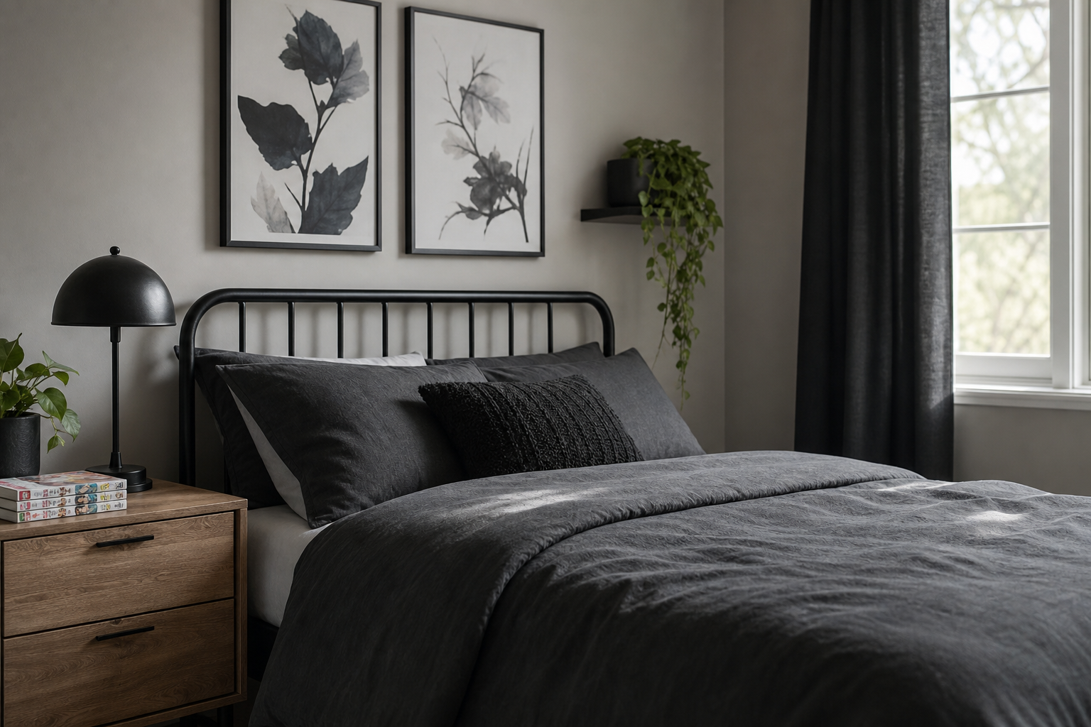
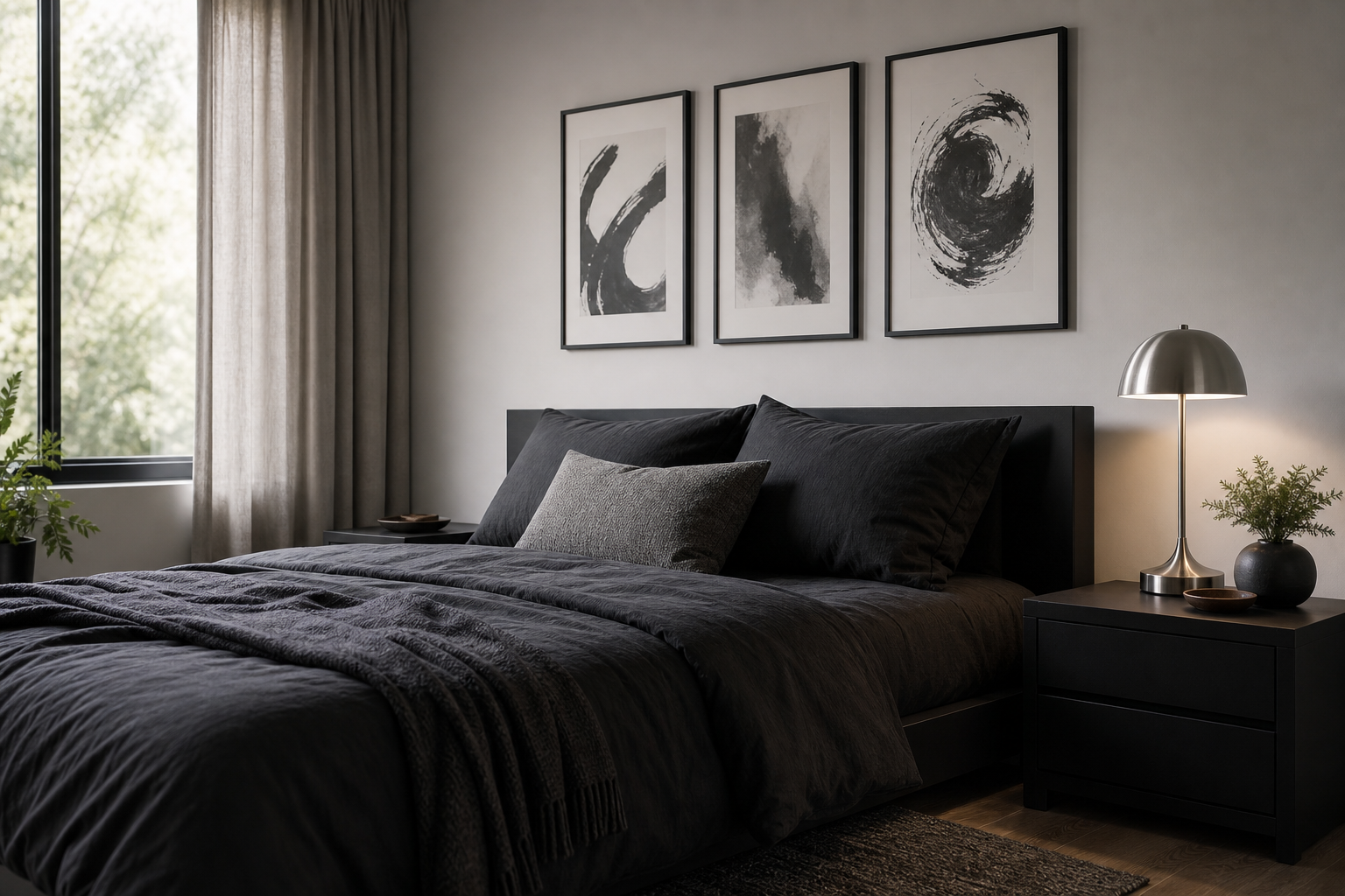
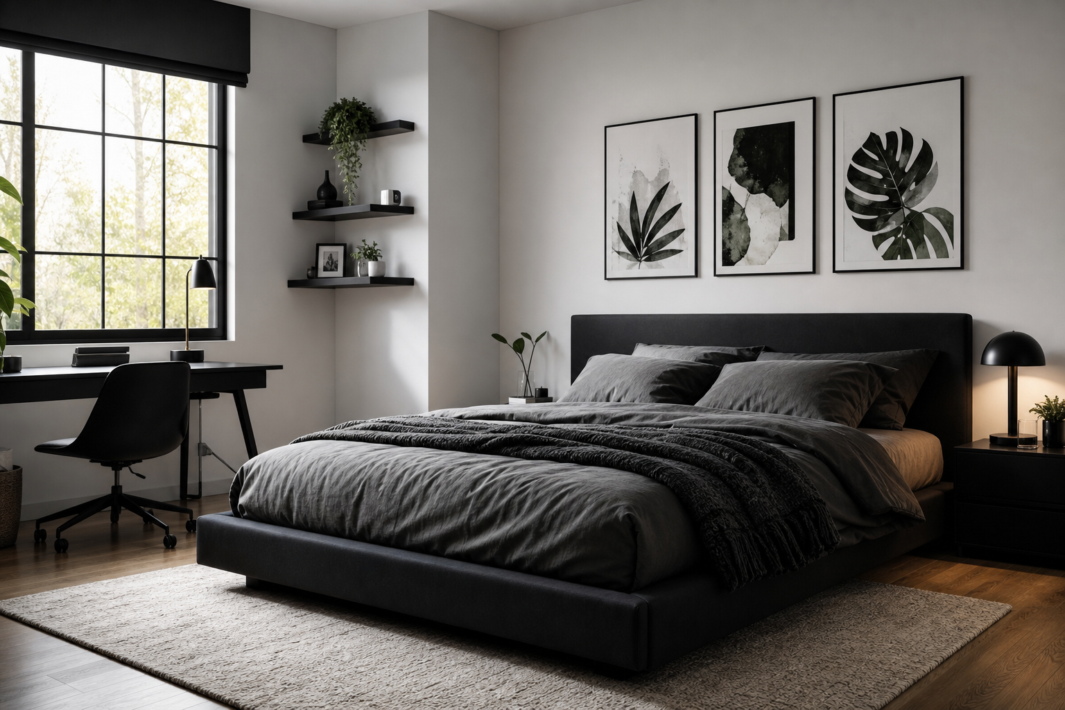
Anime posters black and white work because they deliver maximum character with minimal visual noise. Strong contrast makes line work sharper, expressions more dramatic, and action scenes easier to read from across the room. In practical terms, monochrome art also slips into more interiors than full-color fandom decor — especially spaces with black furniture, oak shelving, white walls, or industrial finishes.
Why Black and White Anime Works So Well
Black and white anime art has the same advantage as classic photography — it simplifies the image to shape, shadow, and composition. That gives even detailed illustrations a cleaner look. If your room already has a lot going on, such as open shelving, gaming gear, or patterned bedding, monochrome pieces keep the wall from feeling chaotic. That is why anime posters black and white suit both creative bedrooms and more restrained adult spaces.
Another strength is flexibility. A sharp portrait can sit comfortably beside minimalist wall art or mix with pieces from our fine art collection without looking out of place. If you want a bolder anime-led display, start with the contrast-heavy works in our anime collection and keep the rest of the room edited — 2 to 3 colors in the furnishings is usually enough.

Choosing the Right Characters and Scenes
Start by deciding what mood you want the wall to carry. Quiet portraits create focus and feel more refined in bedrooms or study corners. Action-heavy scenes add energy and work better in studios, gaming rooms, or walls with more negative space. A useful rule is to keep all pieces within one emotional lane — calm, dark, heroic, or kinetic — so the arrangement feels curated rather than random.
For a sleek, composed look, a character-led piece with strong silhouette works best. Dark Elegance — Anime Art Print is a good example of a print that reads as graphic wall art first and fandom art second. If you prefer tension and motion, Digital Demon — Anime Art Print or Samurai Robot — Anime Print can anchor the room with more edge.
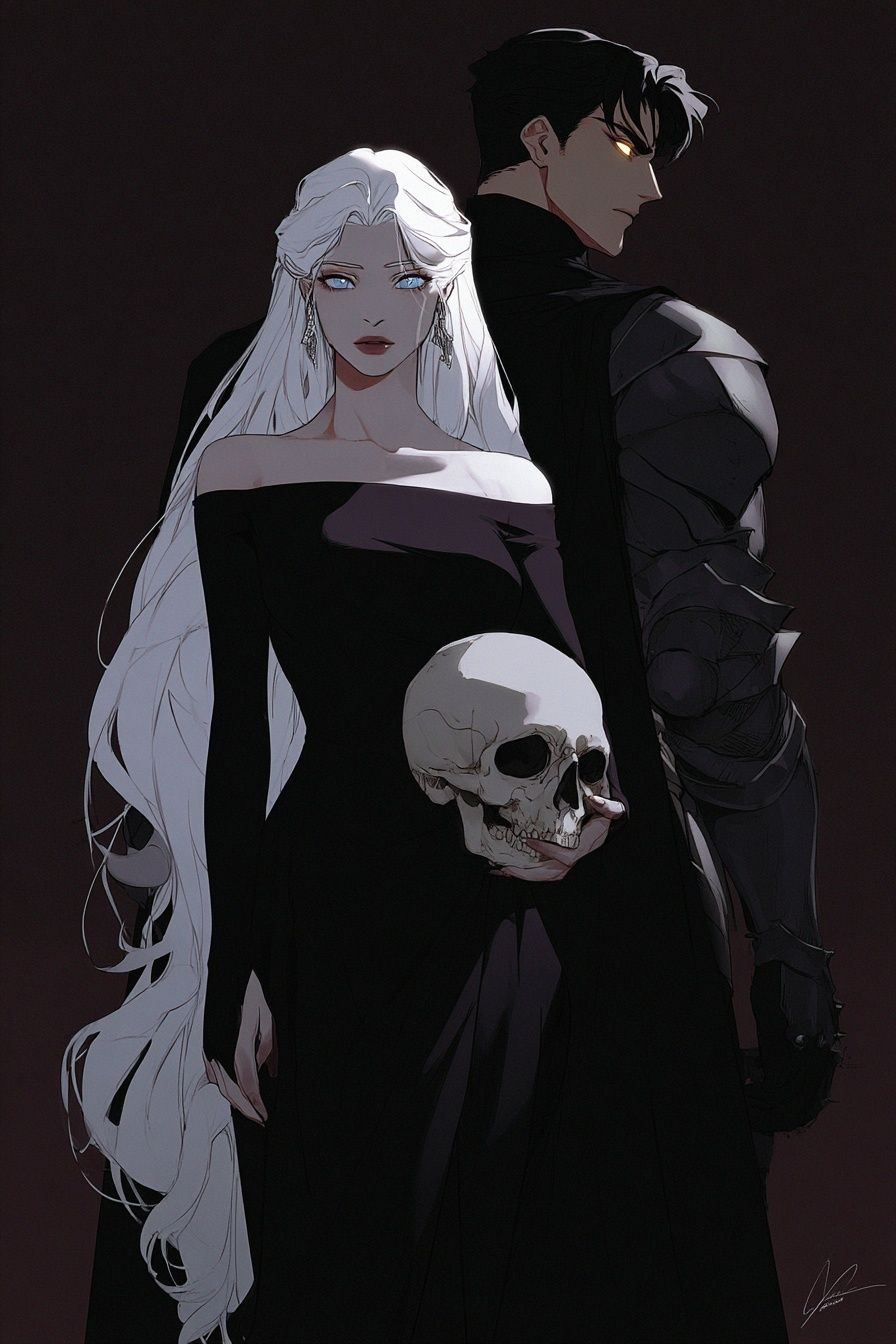
Iconic scenes also matter more than quantity. One strong image with memorable posture, costume, or gaze will outperform four weak ones. If your room is small — under 120 square feet — choose art with clear outlines and less background detail so the wall still reads clean at a glance.
Best Sizes and Layouts for Your Wall
The fastest way to make anime wall art look intentional is to match the size to the furniture below it. Above a bed, aim for artwork covering roughly 50% to 70% of the headboard width. Above a desk, 24 to 36 inches wide is usually enough. Above a sofa, a single large print at 50x70 cm or 61x91 cm works well if the room is already busy with books, plants, or equipment.
Pairs are ideal when you want symmetry. Two 30x40 cm prints spaced 5 to 7 cm apart create a tidy, graphic arrangement above nightstands, desks, or dressers. For a gallery wall, use four pieces in matching frames and keep the outer edges aligned. That gives even dynamic anime imagery a disciplined structure.
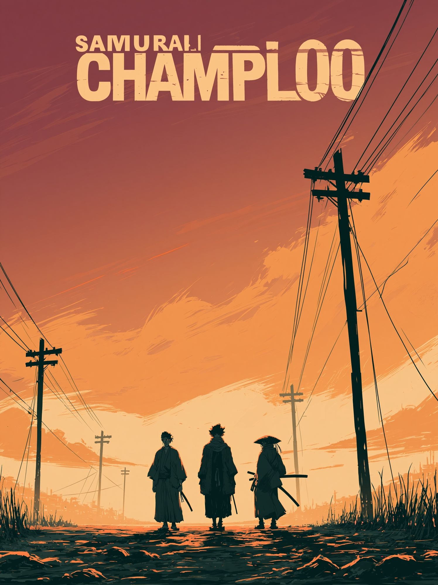
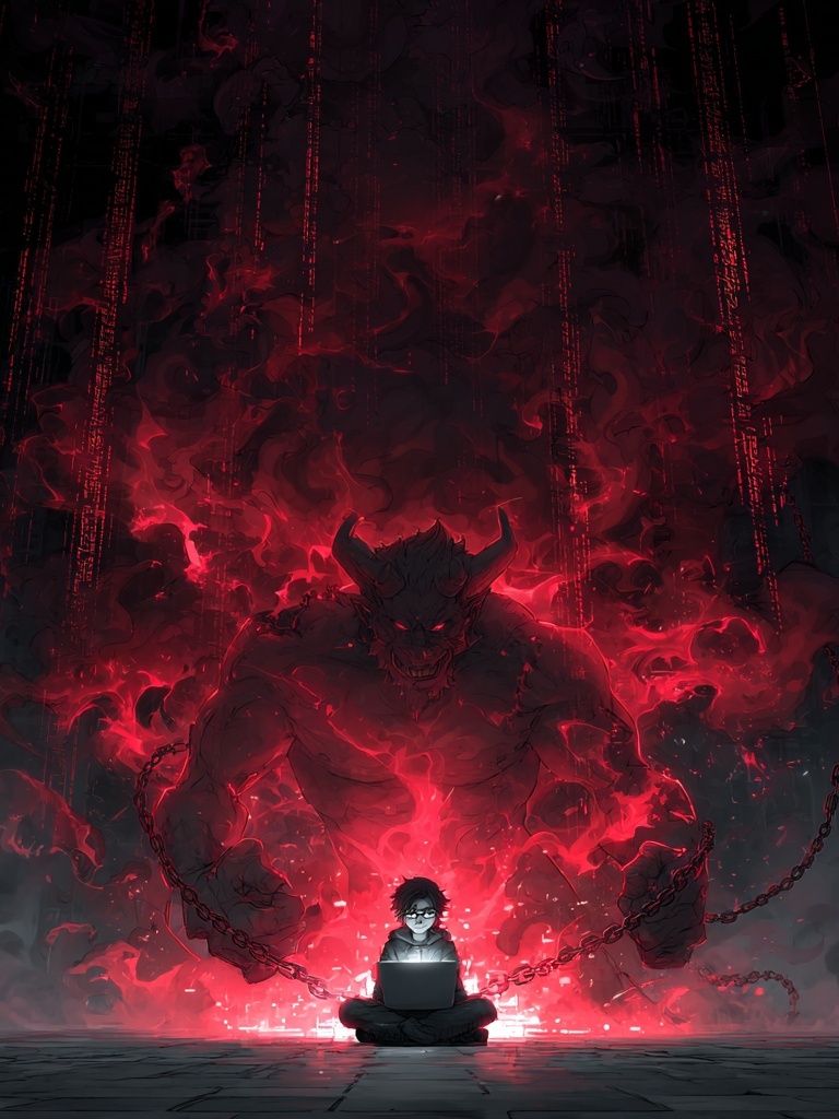

A simple 2x2 grid is one of the safest layouts for monochrome anime art because it balances detail with order. If you want something looser, place one large central print with two smaller companion pieces offset to one side — but keep spacing consistent at 6 to 8 cm. In tighter rooms, leave at least 15 cm between the top of your furniture and the bottom frame edge so the display has breathing room.
Framing, Matting, and Finish Ideas
Frame choice changes the tone immediately. Matte black frames sharpen contrast and give the most graphic result. White frames soften the look and work well on darker walls. Natural oak introduces warmth, which is helpful if the art feels severe against concrete, black metal, or gray paint.
Mats are useful when the artwork is visually intense. A white mat between 4 and 8 cm wide gives line-heavy anime pieces more space and makes them feel more gallery-like. This is especially effective if you are pairing anime imagery with Torn Paper Black and White Poster or other quieter monochrome pieces to build a mixed arrangement.
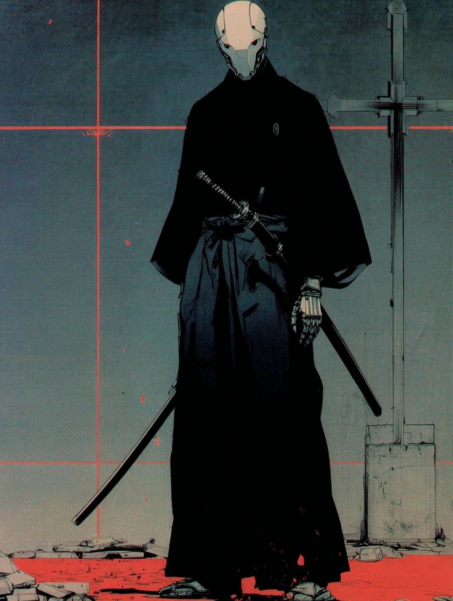

If you want the print to feel premium, slim frames of 1.5 to 2 cm usually look cleaner than chunky borders. Avoid ornate moulding — it competes with the drawing style. In most interiors, a smooth matte finish is easier to live with than glossy surfaces because it cuts glare from desk lamps, LED strips, and windows.
How to Style Them in Bedrooms, Studios, and Living Rooms
In a bedroom, keep the setup restful. One large piece above the bed, or two medium prints centered over the headboard, is enough. Use black, white, gray, and one muted accent such as forest green or dusty blue in bedding and cushions. If you want a more character-driven room, pair anime art with plain textiles rather than patterned duvets so the wall remains the focal point.

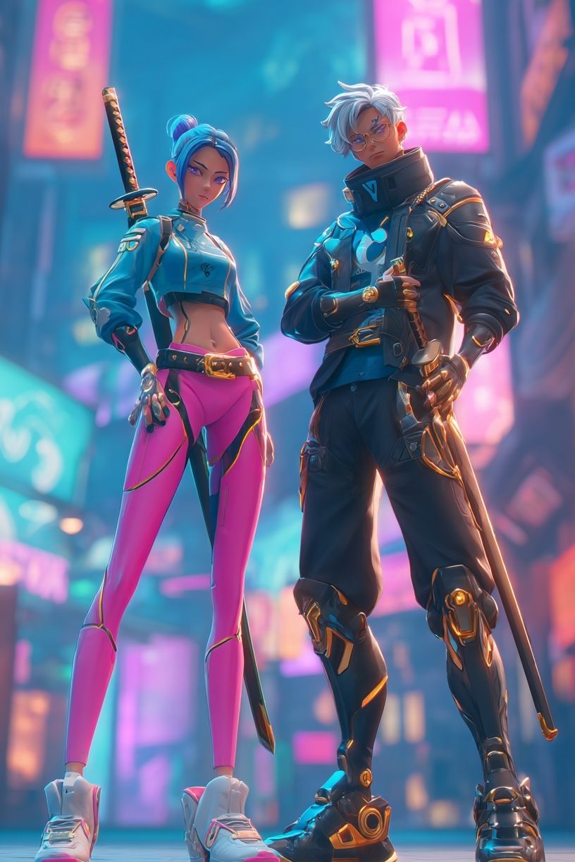
In a studio or gaming setup, you can push contrast harder. Try a trio of medium prints above the monitor wall, with one central hero image and two supporting works. Cyberpunk Duo — Digital Art Print and Neon Samurai Silhouette Poster are useful references if you want pieces that still feel sharp and architectural, even when styled near screens and tech.
Living rooms need more restraint. Choose anime pieces that read as illustration and composition, not pure fan merchandise. A sophisticated option is to combine one anime portrait with one or two quiet monochrome works from adjacent styles. That bridge makes the display feel at home next to a linen sofa, walnut table, or sculptural lamp.
Palette Pairings That Make Monochrome Pop
Monochrome art looks best when the room offers texture rather than more contrast. Light oak, walnut, brushed steel, smoked glass, concrete, and ribbed textiles all help black and white imagery feel richer. If the room is flat white from wall to furniture, add at least one warm material so the setup does not feel clinical.
Muted colors also support black and white well. Deep olive, slate blue, rust, and tobacco leather are stronger partners than bright red or neon purple. If you already own colorful furniture, keep the art itself tightly monochrome and use black frames to hold the composition together.

A useful styling ratio is 70/20/10 — 70% neutral base, 20% secondary texture or wood tone, 10% accent color. That formula gives anime wall art room to stand out without making the whole interior feel themed. If you like mixing genres, you can also layer anime pieces with Brave Soldier — Anime Art Print on one wall and quieter graphic work on another to keep the room balanced.
Final Tips for Building a Clean, Collected Look
Buy with the full wall in mind, not one image at a time. Pick a dominant mood, repeat the same frame finish, and vary scale instead of style. One 50x70 cm statement piece plus two 30x40 cm companions often looks more polished than three prints of equal visual weight. Before hanging, lay everything on the floor and test spacing at 6 cm first — then widen to 8 cm if the art feels cramped.
The best monochrome anime setup feels personal but controlled. Use pieces you genuinely connect with, pull in support from anime wall art with strong graphic contrast, and let negative space do some of the work. Clean lines, consistent framing, and careful spacing are what turn fandom into interior style.
Frequently Asked Questions
What frame color is safest for black and white anime art?
Matte black is the most versatile choice because it sharpens contrast and works with both white and dark walls. Natural oak is a close second if you want a softer, warmer finish.
Should I use glass or acrylic for larger prints?
Acrylic is lighter and easier to hang for bigger sizes like 50x70 cm or 61x91 cm. Glass gives a crisper feel but adds weight and can reflect more light.
How high should I hang anime prints above a desk or bed?
Leave 15 to 25 cm between the furniture and the bottom of the frame. That keeps the art connected to the furniture without feeling crowded.
Can black and white anime art work on colored walls?
Yes — especially on muted green, charcoal, navy, or taupe walls. Add a white mat if you want extra separation between the artwork and the paint color.
What is the easiest way to keep a gallery wall looking neat?
Use matching frame sizes, align the outer edges, and keep spacing consistent at 5 to 8 cm. Plan the arrangement on the floor first before making any holes.