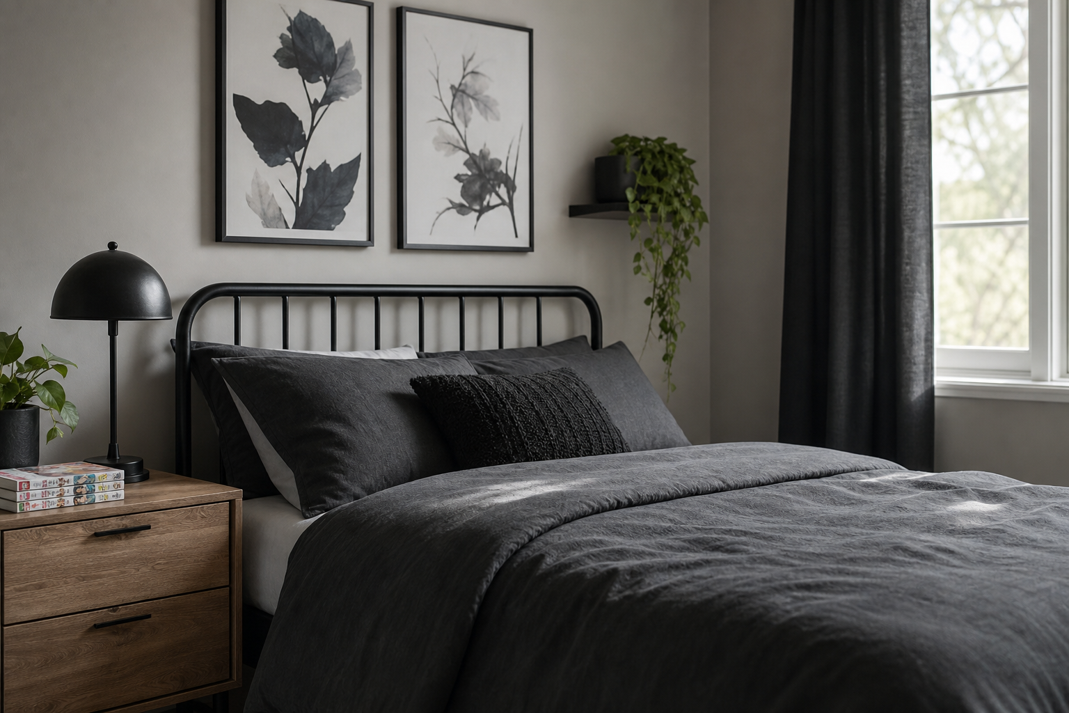
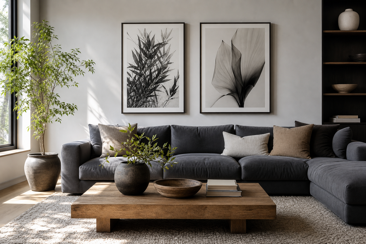
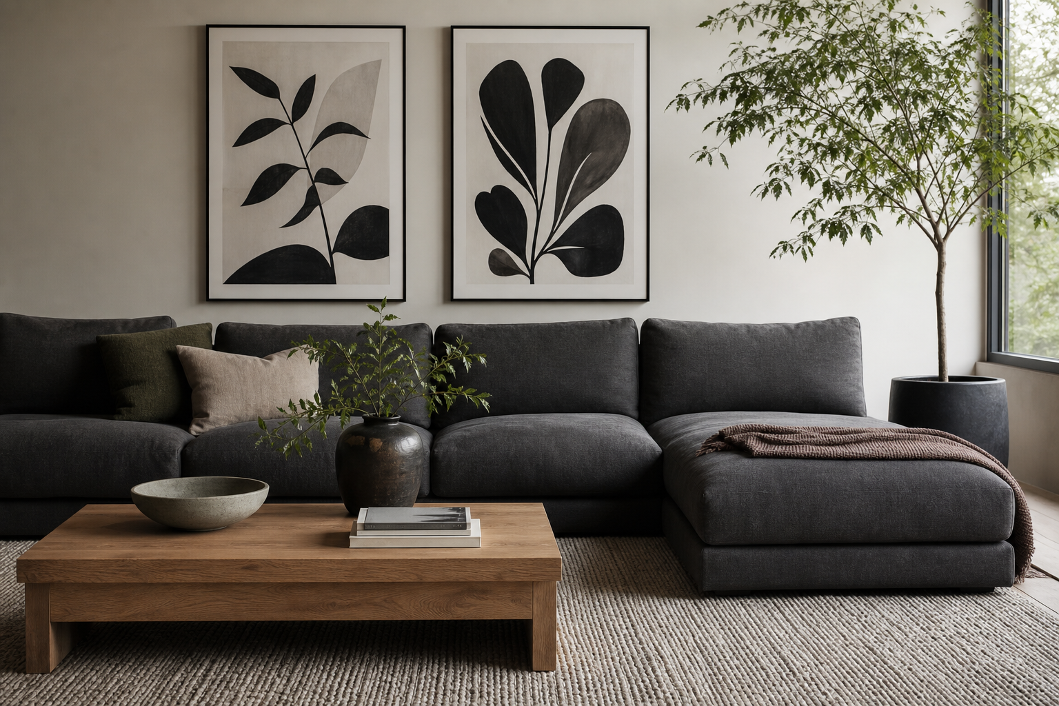
A strong anime poster black and white setup gives a room sharper contrast than full-colour art and usually looks more considered from day one. Monochrome anime imagery pulls focus to line work, facial expression, silhouette, and composition — the exact elements that make manga and anime art feel dramatic. In smaller rooms, that matters: black and white art creates visual impact without introducing five extra colours that need to be balanced elsewhere.
Why Black and White Anime Posters Work
Black and white anime posters read cleaner than highly saturated prints, especially in bedrooms, study corners, and compact apartments. They fit easily with black furniture, white bedding, oak desks, chrome lamps, and grey textiles, which already make up a large share of modern interiors. If you want a room to feel more grown-up, an anime poster black and white arrangement is often the fastest route because it strips the look back to contrast and form.
Monochrome also makes intense subjects easier to live with. A dramatic portrait, a sword pose, or a shadow-heavy character scene can feel refined rather than chaotic when the palette stays limited. That is why many people mix anime with minimalist wall art or even graphic pieces from our comics collection — the common thread is bold line and strong contrast, not loud colour.
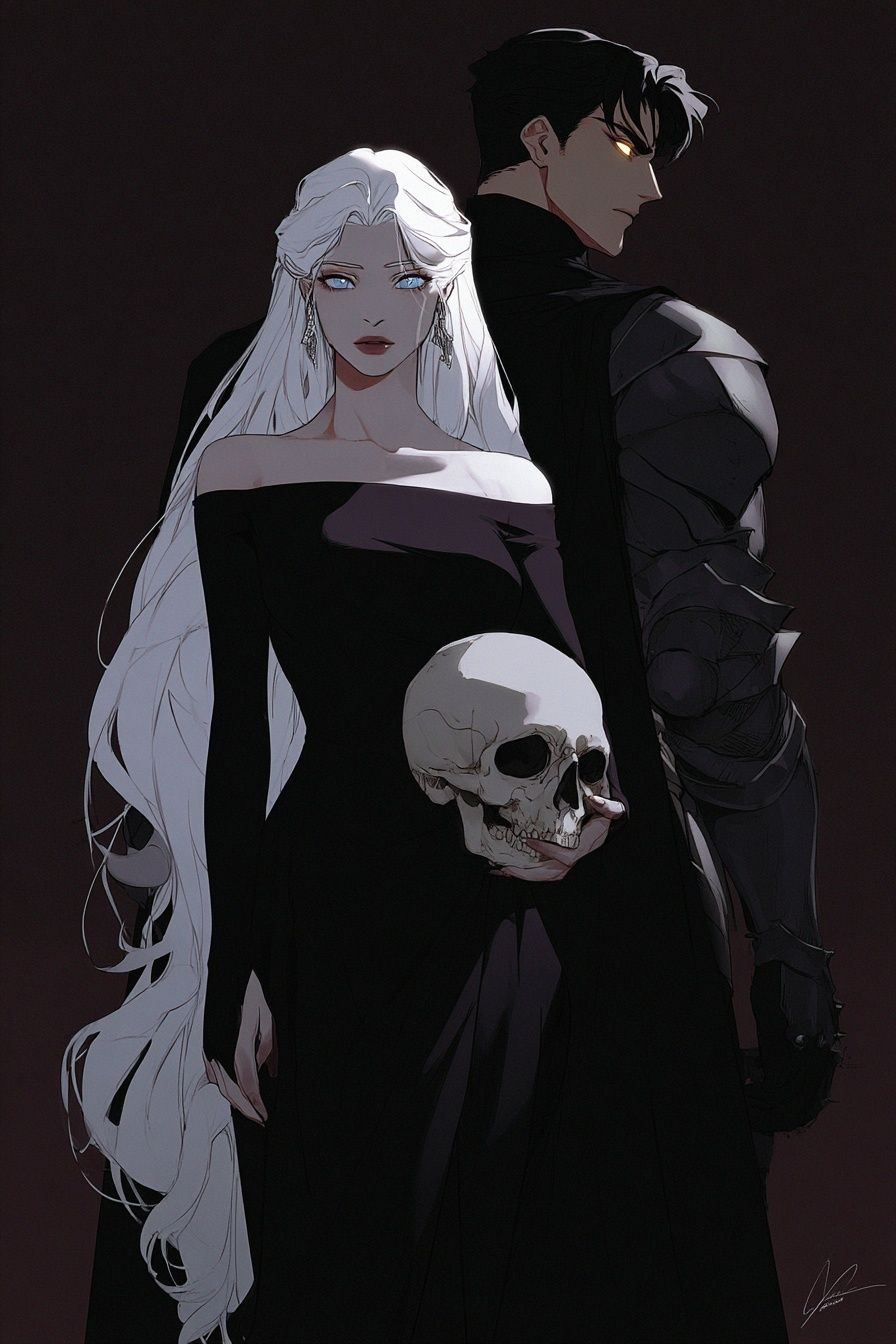
If you prefer artwork with a darker, moodier edge, choose pieces with heavy shadow and negative space rather than busy backgrounds. A design such as Dark Elegance — Anime Art Print works well in this format because the monochrome mood already feels intentional.
Choose the Right Style for Your Space
Not every monochrome anime print creates the same atmosphere. Character portraits feel intimate and focused, making them ideal above a desk, vanity, or narrow chest of drawers. Action scenes feel wider and more kinetic, so they suit the wall above a bed or sofa better, where you need movement across a larger horizontal area. Manga-style line art feels lighter and often works well in rented spaces because it does not dominate the room.
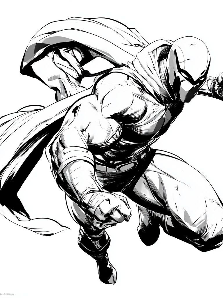
For a sleek, urban look, combine anime prints with graphic illustration and noir-influenced pieces from our Anime collection and illustration prints. If you like sharper ink work, a comic-inspired piece can bridge the gap between anime and monochrome design — for example Masked Superhero Ink Poster has the same high-contrast energy as black-and-white character art.

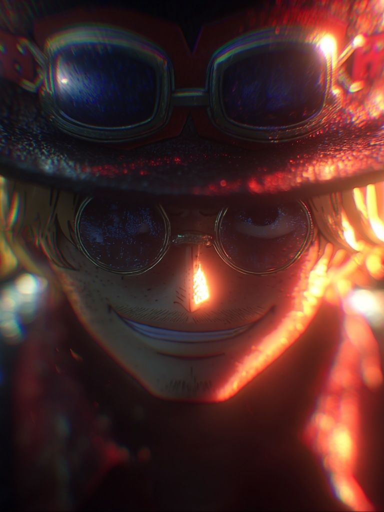
Portrait-led pieces also suit rooms that need calm. One central face or figure gives the eye a place to land, unlike collage-style art that demands attention from every angle. If you want that effect, Anime Character Portrait — Digital Art Print is the kind of piece that works best on its own or as the visual anchor in a small pair.

Finding the Best Size and Placement
The most common mistake is choosing prints that are too small for the wall. Above a standard double bed, aim for artwork that spans 60 to 75 percent of the headboard width. If your bed is 140 cm wide, your total arrangement should land around 84 to 105 cm. That could mean one 70x100 cm statement print, two 50x70 cm frames side by side, or a three-piece layout made from 30x40 cm and 40x50 cm sizes.
Above a desk, keep the composition narrower — usually 50 to 90 cm wide total. That prevents the wall art from overpowering the workspace. In dorm rooms or smaller bedrooms, a vertical print around 30x40 cm or 40x50 cm often feels sharper than trying to force a large gallery wall into limited space. If your desk is placed beside a window, hang the artwork 15 to 20 cm above the top edge so the area still feels connected.

If you want one hero piece, centre it at eye level — usually 145 cm from the floor to the middle of the frame. If you are building a series, keep gaps tight and consistent at 5 to 8 cm. That spacing helps separate the images while still letting them read as one unit. For a more architectural feel, align the outer edges; for a softer look, align the centre line.
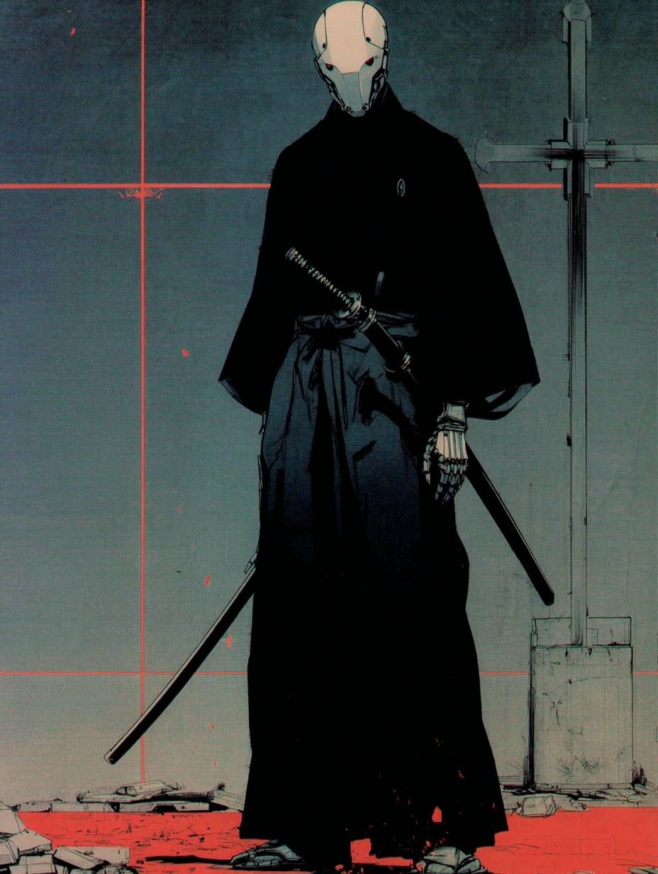
A print with a strong figure and clean background often performs best as the single focal point. Samurai Robot — Anime Print is a good example of artwork that can carry a wall alone when sized properly.
Pairing Black and White Posters with Colour
The easiest way to keep monochrome anime art from feeling stark is to repeat one accent colour two or three times around the room. Deep red, forest green, muted violet, and steel blue all work well with black-and-white imagery because they add mood without competing with the artwork. Think one throw, one desk object, and one small lamp base — not ten separate colour notes.
Neutral schemes are even simpler. Black and white anime prints look especially polished with warm greige walls, walnut wood, oatmeal bedding, and brushed metal details. The room feels layered because the colour comes through materials rather than graphics. If you want more edge, add one charcoal wall or a black shelf below the frames.
A useful trick is to mix one monochrome anime print with one purely graphic print so the wall feels curated rather than themed. Pieces from our minimalist collection can soften anime art by adding empty space and texture. Torn Paper Black and White Poster works especially well in this role because its abstract form breaks up character-heavy compositions.
Framing Ideas That Elevate the Artwork
Frame choice changes the entire read of monochrome wall art. Thin black metal frames feel crisp and contemporary, especially with high-contrast anime portraits or ink-heavy scenes. Oak or ash frames warm up the look and stop black-and-white art from feeling too cold. If your room already has black furniture, wood frames can create better balance than adding more black lines.
Matting is worth the extra border. A white mat of 4 to 8 cm around a black-and-white print gives the artwork breathing room and makes even a 30x40 cm print look more expensive. For larger 50x70 cm or 70x100 cm formats, a mat also helps the art feel cleaner on busy walls with shelving or lighting nearby. Choose matte glass or anti-reflective acrylic if the piece faces a window or desk lamp — glare can flatten fine line work.

Paper finish matters too. Smooth matte stock suits sharp line art and digital portrait work because it keeps blacks rich without mirror-like reflection. Slightly textured fine-art paper works better for softer ink drawings and painterly monochrome illustrations. If you are mixing several pieces, keep either the frame finish or the paper look consistent so the wall does not feel random.
How to Build a Cohesive Anime Wall
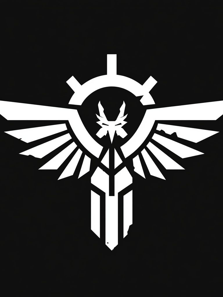
A cohesive wall usually follows one of three structures: same size frames, one large anchor with two smaller companions, or a salon-style cluster built around a visual centre. For most bedrooms, the second option is easiest. Use one statement anime piece in the middle, then flank it with simpler supporting works — abstract monochrome, emblem graphics, or lighter illustration.
Theme matters as much as colour. If one print feels futuristic, one historical, one romantic, and one comic, the wall can become disconnected fast even if everything is black and white. Instead, build around a shared mood such as noir, cyber, elegant, or sketch-like. Our Cyberpunk Duo — Digital Art Print and Digital Demon — Anime Art Print both suit a darker, tech-led arrangement, while softer portrait pieces fit calmer setups.

If you are hanging four to six frames, limit yourself to two orientation types — for example, all verticals plus one horizontal centrepiece. Keep your total wall coverage to roughly two-thirds of the available width, and leave at least 20 cm clear from wardrobes, curtain lines, or shelving edges. White space is part of the composition.
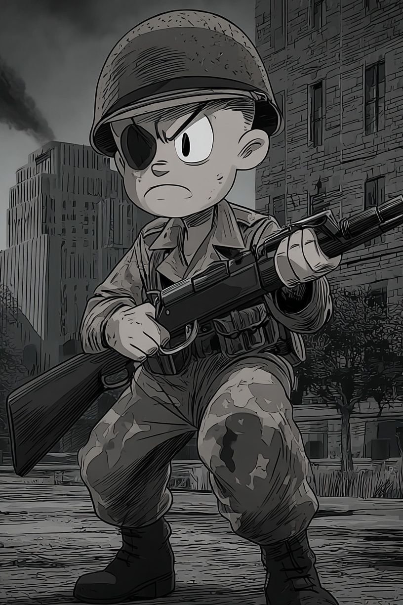
For collectors who want one more high-impact piece, a dramatic figure print like Brave Soldier — Anime Art Print can add weight at the outer edge of a gallery wall without making it feel cluttered.
Final Styling Tips and Poster Picks
The best anime poster black and white arrangement starts with one clear decision: do you want a calm focal point or a high-contrast wall statement? Once that is set, the rest follows quickly — one style family, one frame finish, and one accent colour are usually enough to make the room feel deliberate. Start with one strong piece, test the placement with paper templates, and only expand into a gallery if the wall still feels underdressed.
If you want the space to stay versatile over time, lean on monochrome anime art supported by graphic pieces from comic art prints or restrained designs from our black-and-white minimalist range. That mix keeps the room personal without locking it into a single theme too heavily.
Frequently Asked Questions
What frame size should I choose for a small bedroom wall?
For compact walls, 30x40 cm and 40x50 cm are the safest choices. If you want one statement piece, 50x70 cm usually fits above a desk or narrow dresser without crowding the room.
Do black and white anime prints work with coloured walls?
Yes — they look especially good on soft grey, muted green, dusty blue, and warm beige walls. Very bright wall colours can overpower fine line work, so keep saturation moderate.
Should I use matching frames for every print in a gallery wall?
Matching frames create the cleanest result, especially with monochrome art. If you want variation, mix only two finishes — for example black and oak — and keep the frame width similar.
How do I hang prints without damaging a rental wall?
Use removable picture strips for lighter frames and always check the weight rating first. For a more secure setup, lean smaller framed prints on a shelf or desk instead of hanging them.
What other art pairs well with black and white anime wall art?
Abstract black-and-white designs, ink-style comics, and restrained illustration work pair best. They add contrast and texture without introducing a competing colour story.