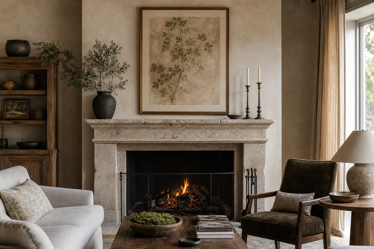
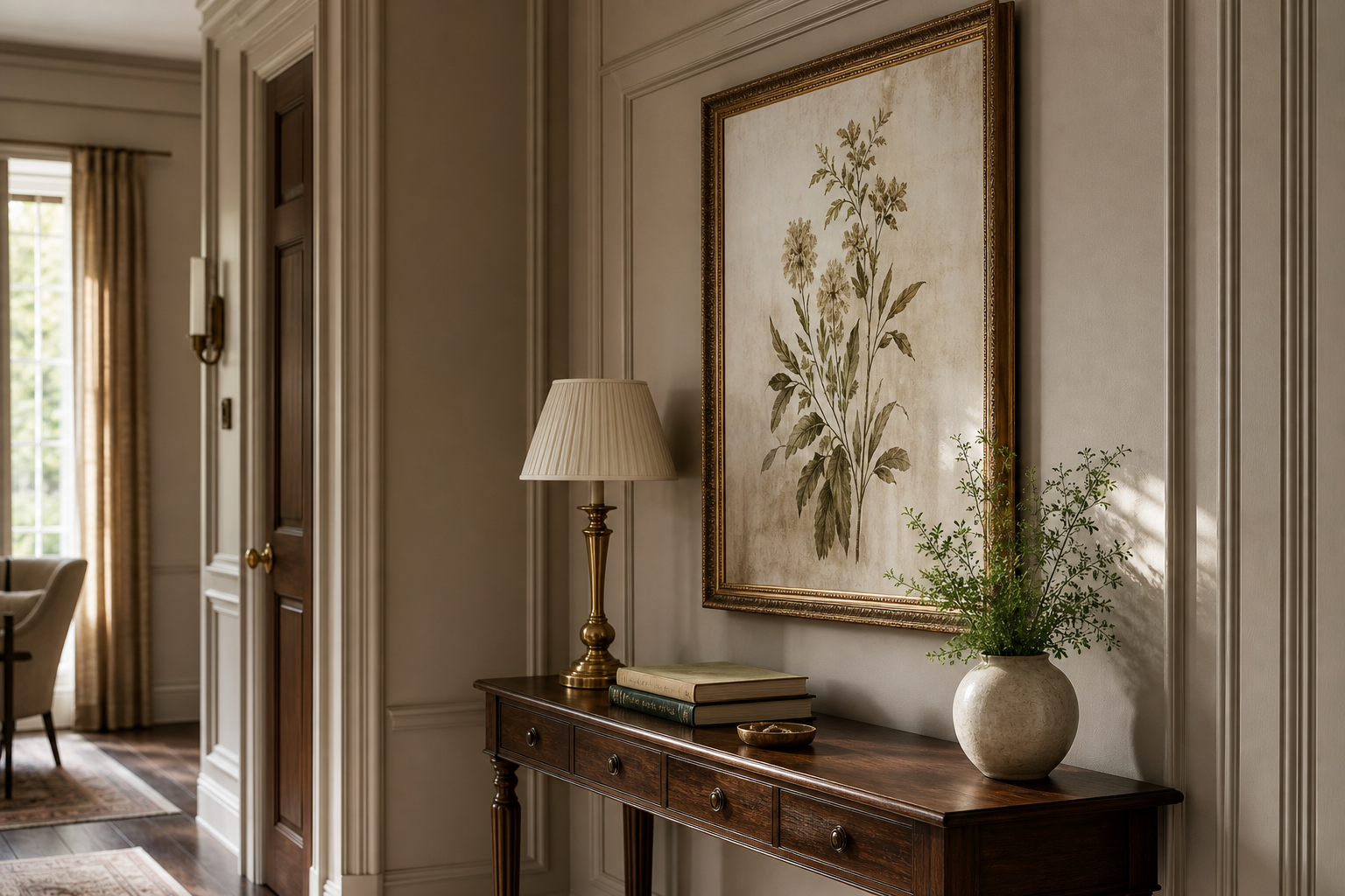
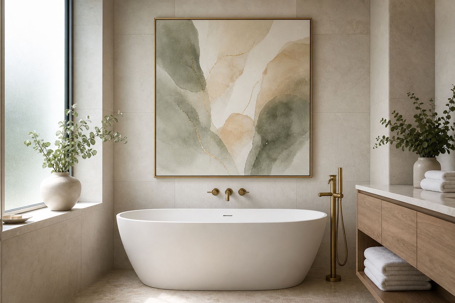
The antique style iii poster print works because it brings age, texture, and restraint into a room without making the space feel heavy. Instead of sharp contrast or loud colour, this kind of artwork usually leans on softened tones, timeworn detailing, and balanced composition. That makes it easy to place in homes that mix classic and modern pieces — especially spaces with natural wood, linen, brushed brass, or stone.
A good antique-inspired piece also avoids looking costume-like. The strongest versions feel edited rather than theatrical, which is why the antique style iii poster print suits contemporary interiors so well. It can anchor a room on its own, or act as a quiet bridge between bolder furniture and more decorative accessories from our Vintage collection.
What Makes Antique Style III Stand Out
Antique-style wall art tends to stand out through patina rather than scale. You often get faded neutrals, parchment-like backgrounds, delicate line work, and imagery that feels archival rather than trendy. In practical terms, that means the print has visual interest at close range, but still reads as calm from 2 to 3 metres away.
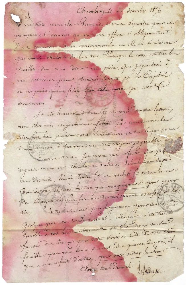
If you like artwork that feels historical without becoming dark, look for pieces with open negative space and warm undertones. Prints such as Antique letter show how a softly aged surface can add character without overpowering surrounding furniture. Likewise, portrait-led works from our Fine Art collection often bring the same timeless quality with a slightly more painterly finish.
Another reason this style lasts is flexibility. Antique-inspired prints sit comfortably with traditional millwork, but they also soften cleaner architecture like white walls, black metal lighting, and modern oak furniture. If your room already has straight lines and minimal shapes, one vintage print can stop it from feeling sterile.
Where It Works Best at Home
The best placement for antique-style artwork is where people naturally pause. A living room mantel, an entry console, the wall at the end of a hallway, or the space above a reading chair all give the print enough visual breathing room. In these spots, medium formats such as 40x50 cm or 50x70 cm tend to feel proportionate without disappearing.

In a living room, hang the piece so its centre sits around 145 cm from the floor, or about 15 to 20 cm above a mantel or console. Over a sofa, the total artwork width should cover roughly 60 to 75% of the furniture width. That rule prevents a single frame from looking undersized against a large seating piece.
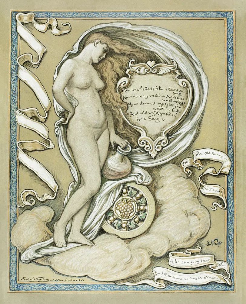
Bedrooms suit antique styling especially well when the palette is quiet. Above a chest of drawers or on the wall opposite the bed, the print adds depth without creating visual noise. Pieces like Ethereal Woman with Pot work well in calmer spaces because they keep the mood soft and elegant rather than dramatic.
Hallways are another strong option because vintage imagery gives narrow spaces a destination point. One 50x70 cm frame can finish the end of a corridor, while a pair of smaller prints — each around 30x40 cm — can make a slim wall feel intentional.
Colour Palettes That Suit the Print
Antique-inspired art looks strongest against warm, low-contrast colours. Think chalky beige, muted taupe, mushroom, soft olive, dusty clay, or off-white with a creamy undertone. Stark brilliant white can make an aged print feel disconnected, while warmer paint helps the paper tones feel natural.
Textiles matter just as much as wall colour. Linen curtains, wool throws, cotton upholstery, and jute or faded Persian-style rugs all reinforce the antique effect. If the room has too many glossy surfaces — lacquered sideboards, high-shine chrome, polished tile — the print can lose some of its depth. Adding even one matte material, such as a linen lampshade or oak frame, usually restores balance.
For colour pairings, keep to a 70/20/10 ratio: 70% foundational neutrals, 20% secondary earthy colour, and 10% accent. For example, a room could use warm ivory walls, camel upholstery, and small accents in oxblood or antique gold. That formula keeps the artwork integrated rather than isolated. You can also mix in selected pieces from our Illustration collection if they share the same subdued palette and vintage mood.
Framing Ideas for an Antique Finish
Frame choice changes the character of the print more than most buyers expect. For an antique look, the safest options are dark walnut, weathered oak, muted gold, or narrow black wood with a matte finish. Avoid glossy black, bright white, or extra-thick acrylic frames if your goal is period character.
A mount or mat board can make a major difference. For 30x40 cm prints, a 5 cm mat gives the image room to breathe; for 50x70 cm, a 6 to 8 cm mat usually feels balanced. Choose warm white rather than cool white, since blue-based mats can make antique tones look flat.

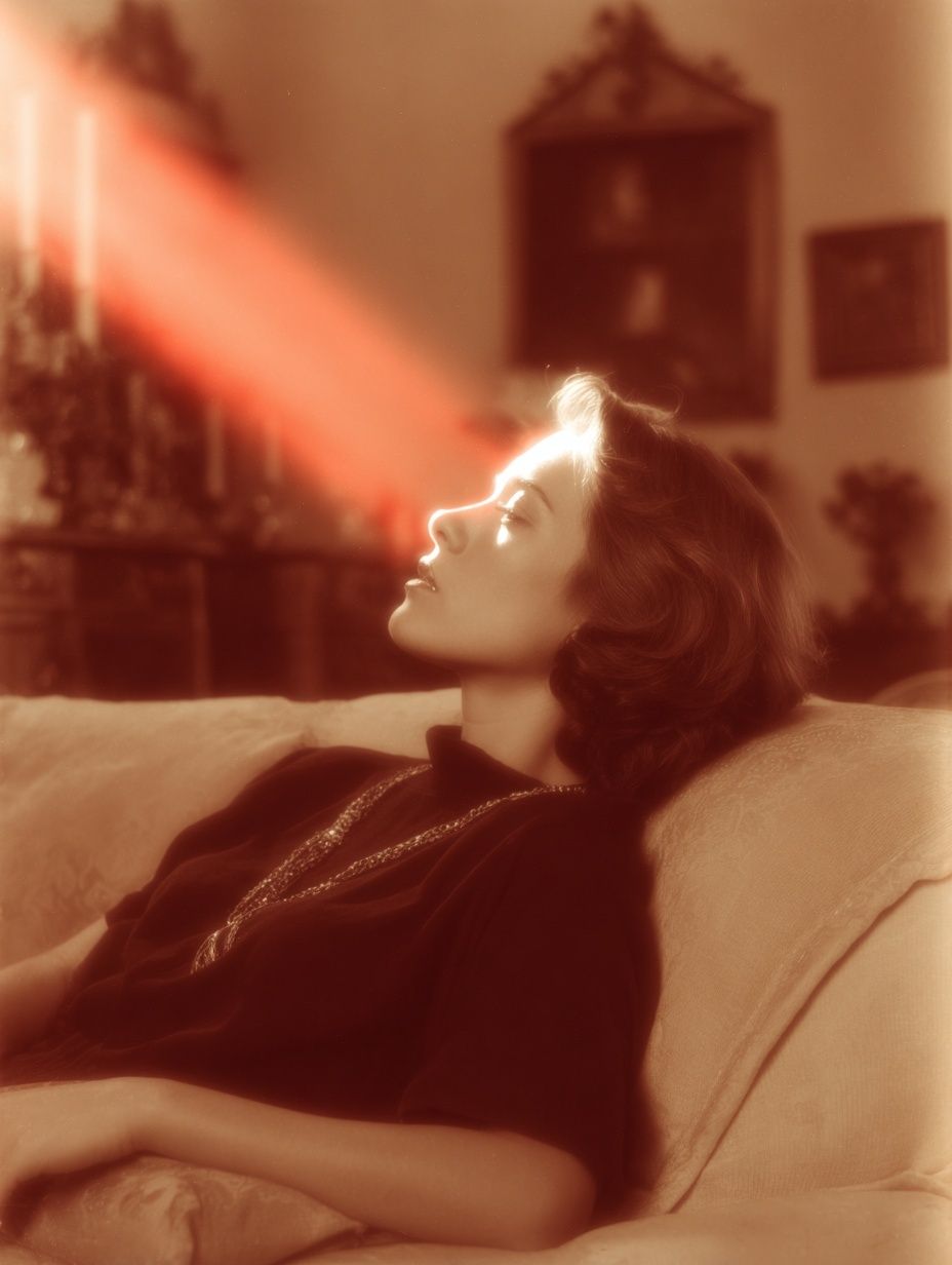
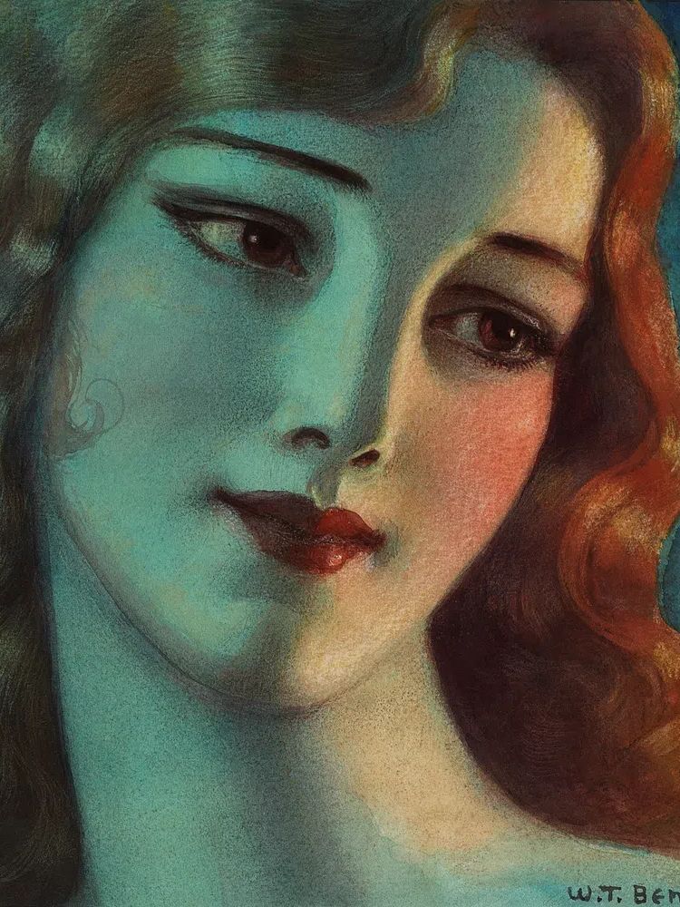
If the print itself has a lot of detail, keep the frame profile slim — around 1.5 to 2.5 cm wide. If the artwork is quieter or more minimal, you can go slightly more decorative with carved edges or aged gold leaf. A richly toned frame suits works like Elegant Woman Portrait because it strengthens the classic mood without fighting the image.
Glass finish is worth considering too. In bright rooms with multiple windows, anti-reflective glazing helps preserve the softer details. In low-light spaces such as hallways, standard clear glazing is usually enough, especially if you add a picture light above the frame.
How to Style It in a Gallery Wall
A gallery wall built around one antique-inspired print works best when the surrounding pieces share either tone, era, or subject matter. The simplest formula is one hero piece at 50x70 cm, paired with three to five supporting prints in 21x30 cm or 30x40 cm formats. Keep spacing consistent — 6 to 8 cm between frames is a reliable standard.
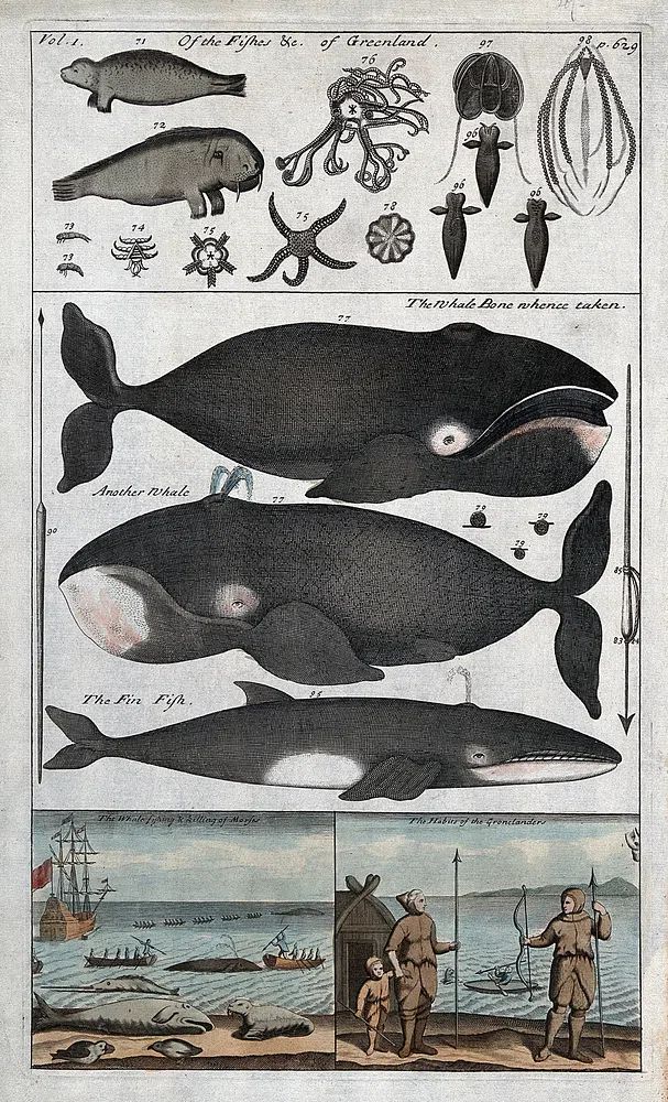
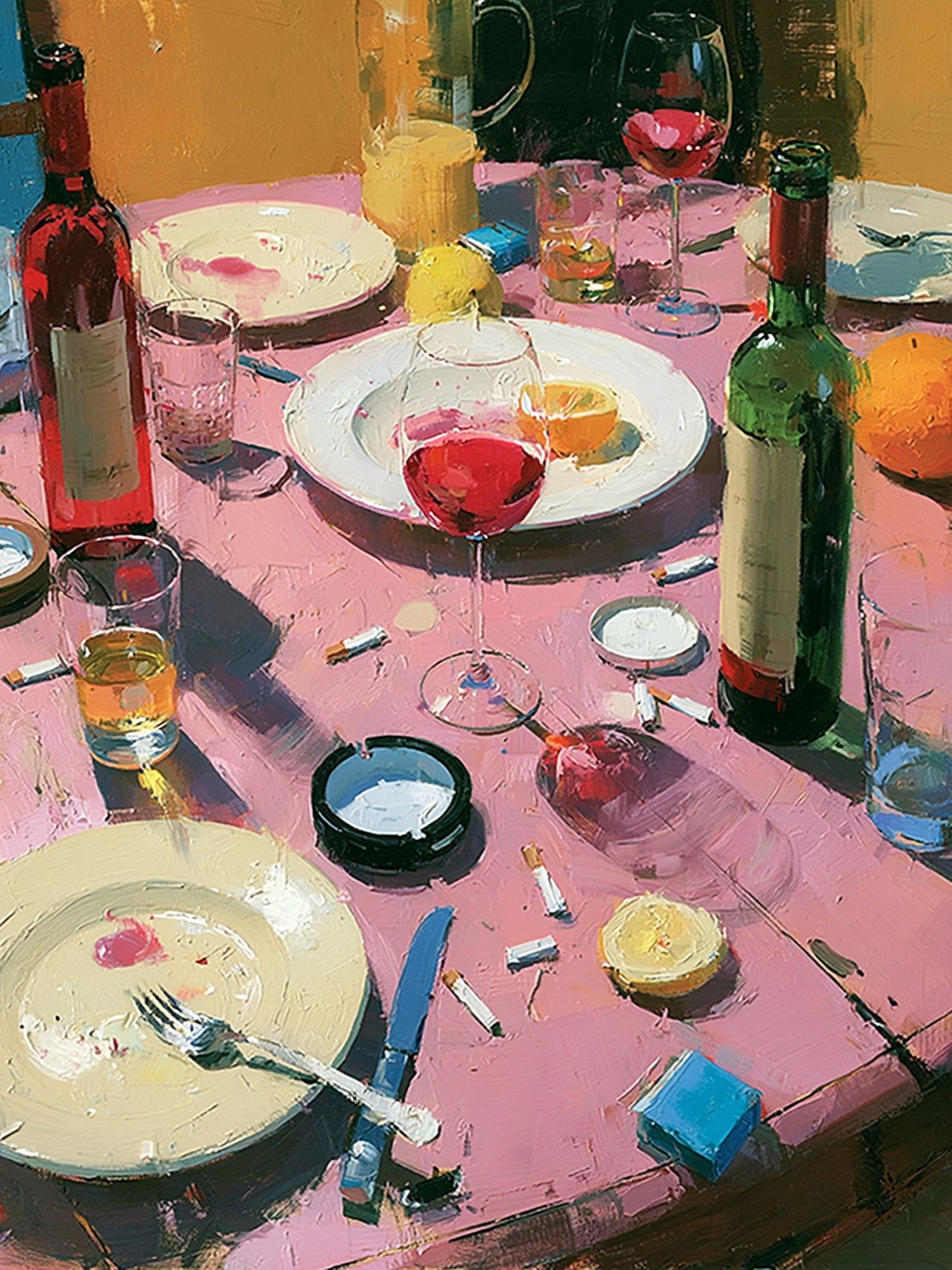
The easiest way to make the arrangement feel curated is to vary the imagery while repeating the finish. For example, pair a portrait with a document-style print, a still life, and one landscape. That mix prevents the wall from looking too matched. From our vintage art prints, antique ephemera and figurative works combine especially well with classic still lifes from the Fine Art selection.

A symmetrical layout suits formal rooms such as dining areas and traditional living rooms. An asymmetrical arrangement feels better in hallways, reading nooks, and bedrooms. Start by placing the largest piece slightly off centre, then build outward with smaller frames. If two prints have strong dark areas, avoid hanging them side by side — separate them to keep the composition visually even.
You can also bring in one contrasting note from Mid Century Modern prints if the colours align — but keep the shapes understated. Too much geometric contrast can break the antique mood.
Shop Tips for Choosing the Right Size
Before buying, measure both the wall and the furniture below it. If the print is going above a console that is 120 cm wide, aim for artwork between 72 and 90 cm wide in total. That could mean one 50x70 cm frame with a generous mat, or two 30x40 cm pieces hung as a pair.
For narrow walls under 80 cm wide, choose 21x30 cm or 30x40 cm sizes to avoid crowding. For large blank walls, 50x70 cm is often the most versatile starting point because it has presence without demanding a huge room. If your ceiling is below 240 cm, avoid stacking too many frames vertically — the arrangement can make the room feel compressed.
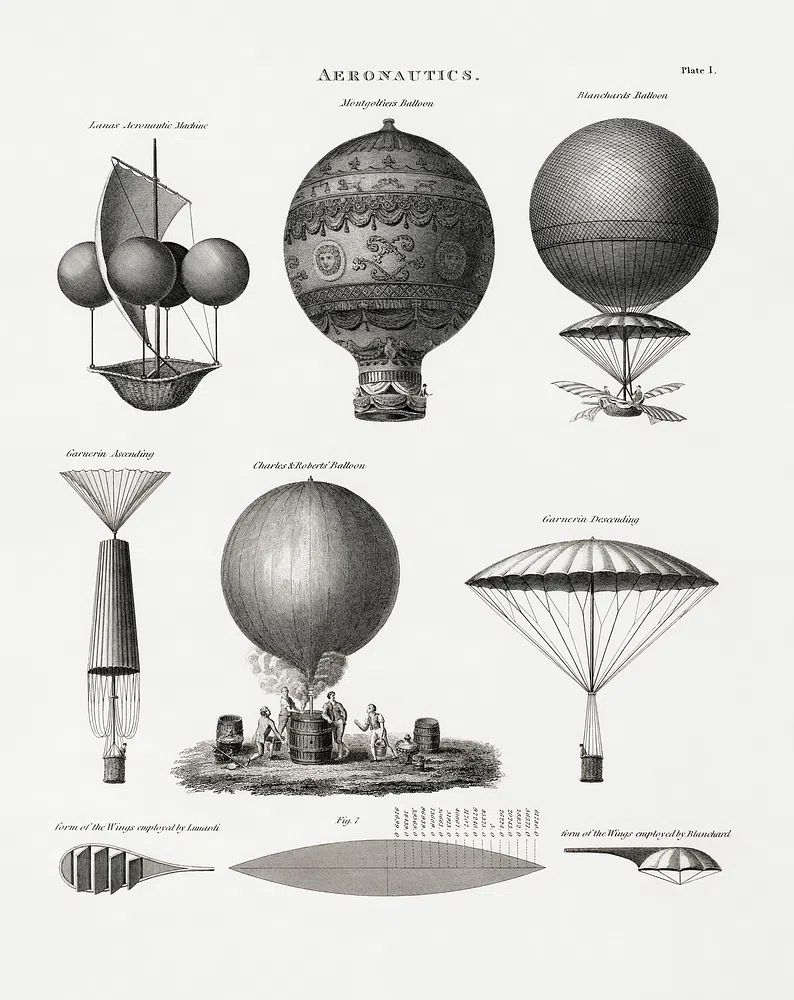
Think about viewing distance too. In a hallway where people pass within 1 metre, smaller details read well. In a living room where the artwork is seen from 2.5 to 4 metres away, larger formats are easier to appreciate. If you want a companion piece, try combining the main print with Aeronautics Vintage Print for a study-like feel, or with Window with Sheer Curtain for a softer, lighter pairing.
Final thoughts
The antique style iii poster print earns its place by doing something many decorative pieces cannot: it adds history without clutter. With the right frame, warm surrounding colours, and a measured layout, it can make a room feel more layered and more settled in a single move.
Treat it as a foundation piece rather than an afterthought. When you match its tone with natural materials, restrained colour, and thoughtful spacing, the result feels collected, calm, and lasting.
Frequently Asked Questions
What frame colour is safest if I change my decor often?
Dark walnut is the most flexible choice. It works with beige, olive, grey, black, and brass accents without looking too formal.
Should I use a mat for smaller sizes?
Yes — especially for 21x30 cm and 30x40 cm prints. A mat adds visual weight and helps a smaller piece feel more finished on the wall.
Can antique-style prints work in modern apartments?
They can, as long as the rest of the styling stays edited. Pair one or two antique-inspired pieces with simple furniture and natural textures rather than filling the room with ornate details.
What lighting shows vintage-style artwork best?
Warm bulbs around 2700K are ideal. They preserve the softness of aged tones better than cool white lighting, which can make the print look harsher.
What pairs well with antique-style art besides portraits?
Botanical studies, old letters, still lifes, and muted landscapes are the easiest companions. They keep the historical feel while giving the wall more variety.