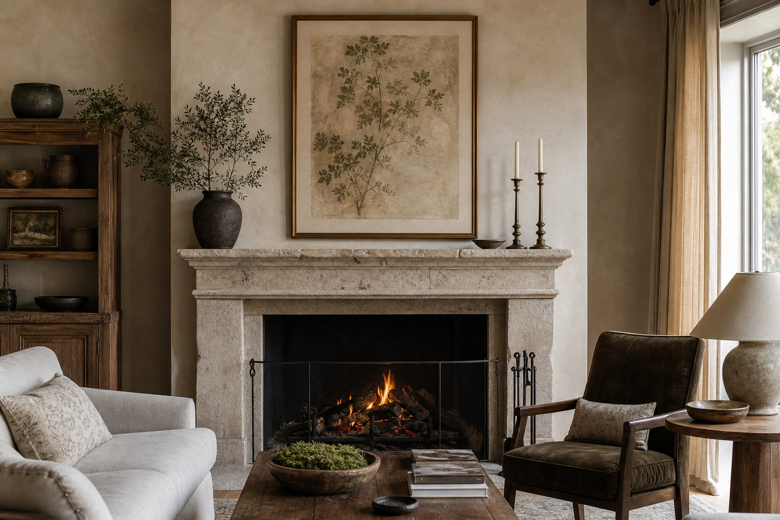
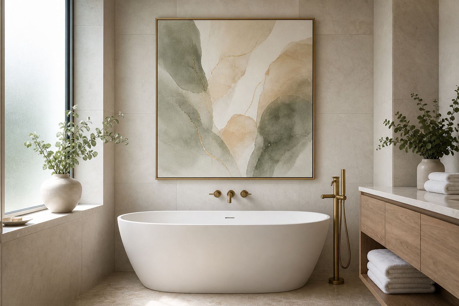
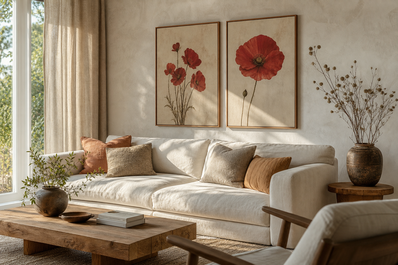
An antique style ii poster print works because it carries age without looking heavy. The palette is usually softened by sepia, parchment, faded charcoal, muted olive, or warm ivory tones, which makes it easier to live with than high-contrast contemporary art. In practical terms, that means it can calm a wall, add detail, and still leave room for furniture, textiles, and lighting to stand out.
The other reason an antique style ii poster print feels lasting is proportion. Antique-inspired pieces often include fine line work, balanced negative space, and classic subject matter such as documents, portraits, still lifes, maps, or scholarly studies. Those details echo what people already read as "established" in interiors — wood grain, linen, brass, leather, stone, and plaster — so the print feels connected rather than decorative for decoration's sake.
What Makes Antique Style II Feel So Timeless
Timelessness starts with visible texture and visual restraint. A good antique-inspired print does not rely on loud color. Instead, it draws the eye through paper-like grounds, aged patina, engraved marks, or painterly softness. If you already like pieces from our Vintage collection, you will notice this same steady, collected look across historical studies and old-world still lifes.
A second cue is subject matter that has survived trend cycles for decades: books, letters, anatomy, portraiture, and objects used in daily life. These themes feel familiar in both period homes and newer apartments because they reference craft and knowledge. A piece such as the Antique Bookshelf Still Life Poster, for example, naturally suits rooms with wood furniture, reading lamps, and layered textiles.

Antique-style art also benefits from a softer edge profile in the room around it. Think rounded lamp shades, woven shades, aged oak, or brushed brass instead of glossy chrome and sharp acrylic. That contrast is not mandatory, but it helps the print feel settled instead of floating.
Where an Antique Style II Poster Print Works Best
Living rooms are usually the strongest placement because they offer enough viewing distance. For a sofa wall that is 180 to 240 cm wide, choose a print around 50x70 cm or 70x100 cm if it will hang alone. Keep the artwork width at roughly 60 to 75 percent of the furniture below. This ratio prevents the piece from looking too small and makes antique detail readable from across the room.

Hallways and studies are equally effective because antique-inspired work has a quiet, observant quality. In a narrow hallway, a vertical 40x50 cm or 50x70 cm print above a small console creates structure without crowding. In a study, antique themes pair especially well with desks, bookshelves, and task lamps. If you want to build a more scholarly look, combine your main print with pieces from our Fine Art prints, especially softer still lifes and classic interiors.
Bedrooms work best when the antique style ii poster print has gentle tones rather than heavy black blocks. Place it above a dresser, beside the bed, or over a narrow bench instead of directly dominating the headboard wall. For a calm result, repeat one color from the print in bedding or curtains — usually beige, moss, brown, faded blue, or cream.
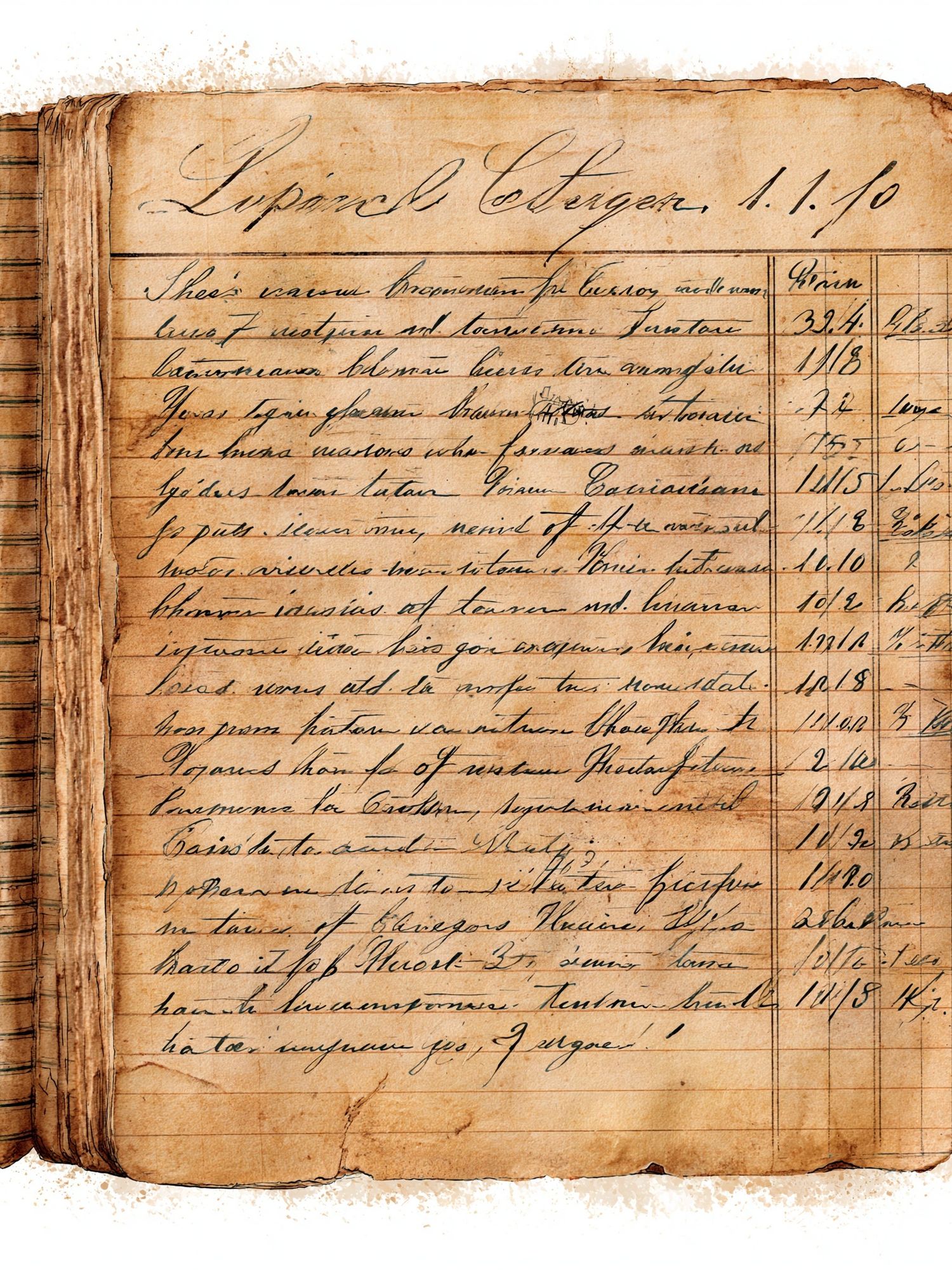
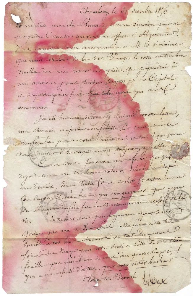
A piece with handwritten detail can be especially effective in transitional spots. The Antique Handwritten Ledger Vintage Print, for instance, suits entryways, stair landings, and reading corners where people pause and look more closely.
Choosing the Right Frame and Finish
For most antique-inspired prints, frame choice should support the art, not modernize it too aggressively. The safest options are matte black, dark walnut, medium oak, or antiqued gold. Black works best when the print contains strong line work. Walnut and oak bring warmth and are usually better in rooms with natural flooring, cane, linen, or brown leather. Antiqued gold adds depth, but choose a muted brushed finish rather than bright polished gold.
Glass finish matters more than most buyers expect. If the artwork hangs opposite a window, use acrylic or glass with anti-reflective treatment when possible. Antique prints often rely on subtle tonal shifts, and glare can flatten them. In darker rooms, standard clear glazing is fine, especially if you style the piece near a table lamp or wall sconce rather than under a strong ceiling spotlight.
A mount can also help. Add a white, cream, or light oatmeal mount of 4 to 8 cm around smaller prints to give them breathing room. This works particularly well when the print itself has dense visual detail. If you like the archival, collected look, browse our vintage wall art selection for pieces that already carry this layered effect through paper tone and composition.

How to Pair It with Modern Decor
The easiest way to blend antique-inspired art with modern furniture is to repeat shape, not era. If your room has a low contemporary sofa, keep the wall art simple and centered. If your coffee table is round, echo that softness with pleated shades, curved ceramics, or a rounded mirror nearby. This makes the antique style ii poster print feel intentional inside a cleaner room.
Color balance is the key. In modern interiors, keep the room palette to 3 main tones plus 1 accent. A reliable mix is warm white, walnut, charcoal, and olive. Another is sand, black, rust, and muted blue. Antique art often already contains two or three of those colors, so the wall piece becomes the bridge between old references and current furniture lines.
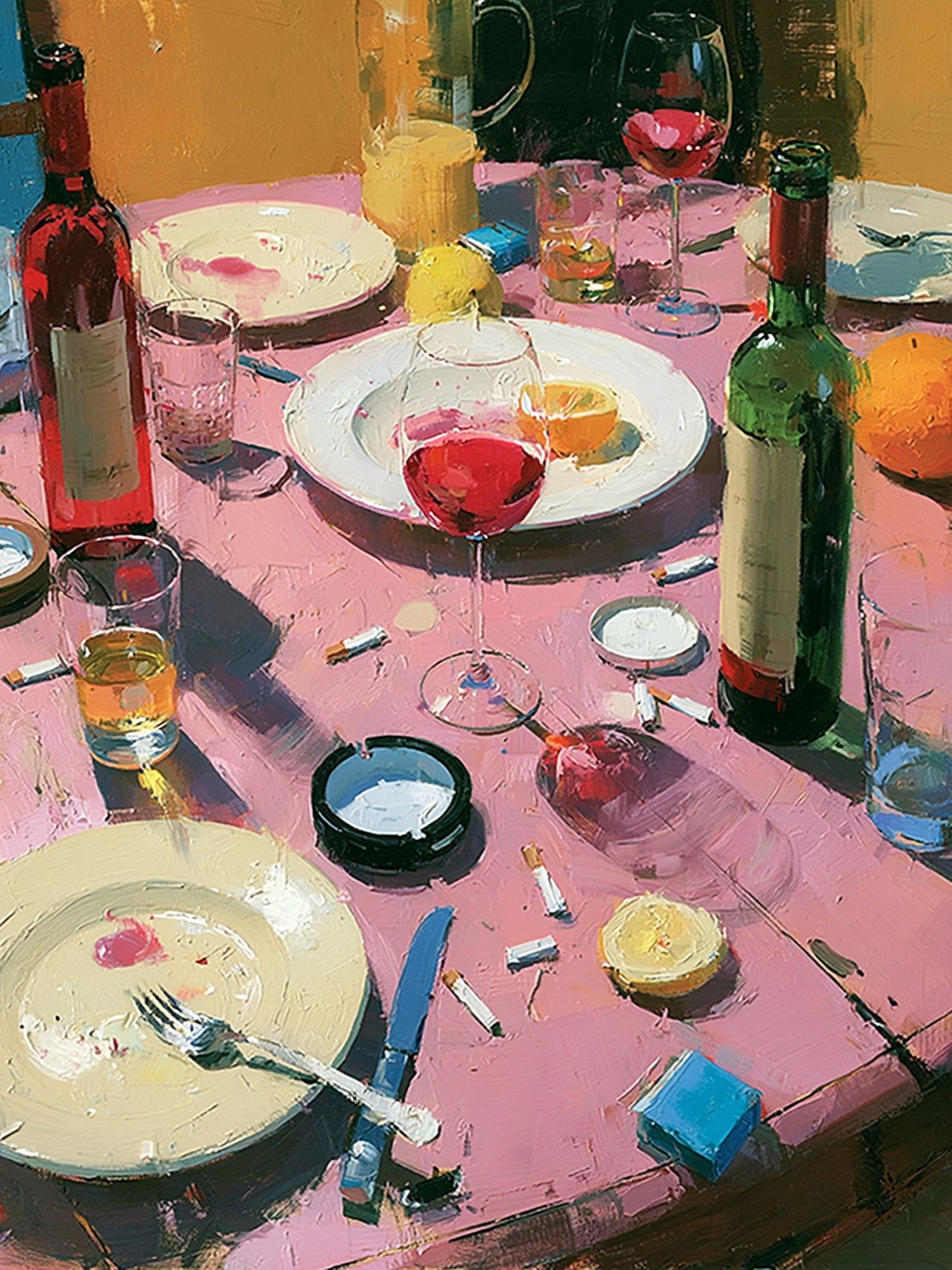
If the room feels too spare, pair your main print with one or two complementary works rather than filling the wall at once. Look for adjacent moods rather than identical themes. An old manuscript-style print can sit surprisingly well beside a quiet still life or a landscape with softened brushwork from our Charming Italian Village watercolor print or the broader Illustration collection if you want a slightly lighter touch.

For a more curated wall, use one statement antique piece alongside one cleaner geometric work. That contrast can sharpen the room. If you like this mixed approach, the Mid Century Modern collection offers a useful counterpoint — especially in homes with sleeker lighting and simpler silhouettes.
Sizing, Placement, and Gallery Wall Ideas
For single-print placement, hang the center of the frame around 145 cm from the floor. Above furniture, keep 15 to 25 cm between the top of the furniture and the bottom of the frame. These measurements hold the print in relation to the room instead of letting it drift upward.
If you are building a gallery wall, treat the antique style ii poster print as the anchor. Start with the largest piece — usually 50x70 cm or 70x100 cm — then add smaller works in 30x40 cm and 21x30 cm sizes around it. Keep spacing consistent at 5 to 8 cm between frames. Mixed antique subjects work best when they share one common rule: same frame color, same mount width, or one restrained palette.

In dining rooms and studies, a grid can look especially refined. Two rows of two frames in 40x50 cm sizes create clean order. In hallways, a vertical stack of two or three narrower pieces helps lengthen the wall. For a collected but not cluttered look, combine document-based art with one object study or still life.
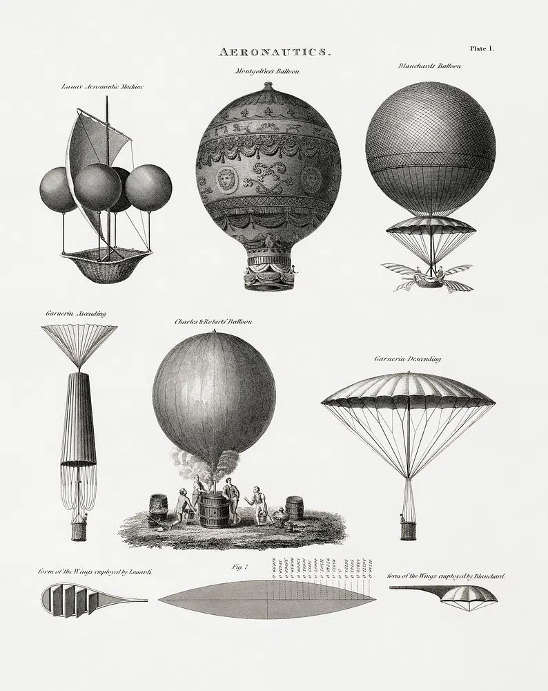
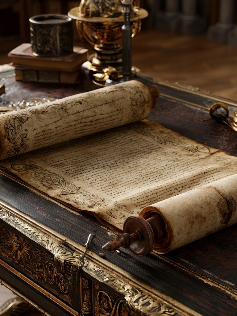
The Antique Scroll Still Life Poster is a strong anchor piece for this kind of arrangement because it carries volume and texture. If you want a companion with similar age and depth, the Aeronautics Vintage Print adds structure without repeating the exact same visual rhythm.
Final Styling Tips for a Cohesive Look
A cohesive room usually repeats the artwork's mood in at least two other places. With an antique style ii poster print, that might mean a walnut frame picked up in a side table, brass echoed in a lamp base, and parchment tones repeated in curtains or a rug. Keep those repeats subtle — two or three references are enough.
If you are shopping from scratch, start with one antique-inspired focal piece, then add supporting art only after the room has one strong material direction. Wood, linen, wool, aged metal, and matte ceramics all help. The result should feel edited, not themed.
Frequently Asked Questions
What frame width works best for an antique-inspired print?
A frame around 1.5 to 3 cm wide suits most sizes. Choose narrower frames for 30x40 cm prints and slightly wider profiles for 50x70 cm or 70x100 cm pieces.
Should I use a mount with darker antique prints?
Yes, especially if the artwork has dense detail or a deep background. A cream mount can brighten the presentation and separate the print from a dark frame.
Can antique-style wall art work in a small apartment?
It can, as long as scale stays tight. Choose one 40x50 cm statement piece or a pair of 30x40 cm frames rather than a crowded multi-piece wall.
What wall colors suit an antique style ii poster print best?
Warm white, mushroom, taupe, muted olive, and soft greige are the easiest matches. Stark blue-white walls can make antique tones look colder than intended.
How do I light antique-style art without damaging the look?
Use indirect warm lighting around 2700K to 3000K. A shaded table lamp or a picture light with soft spread will reveal texture better than a strong overhead spot.