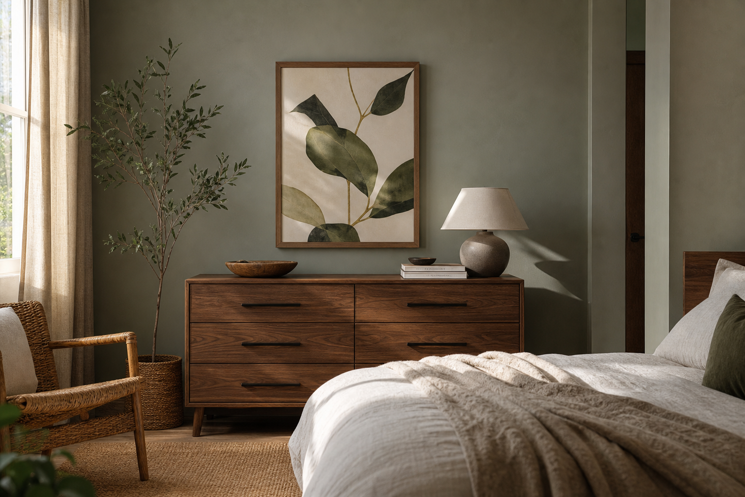
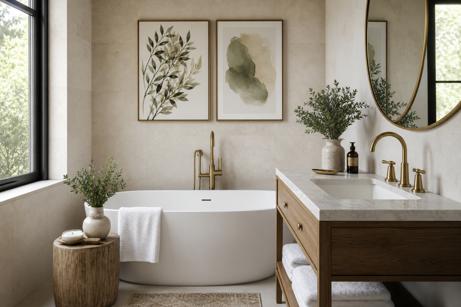
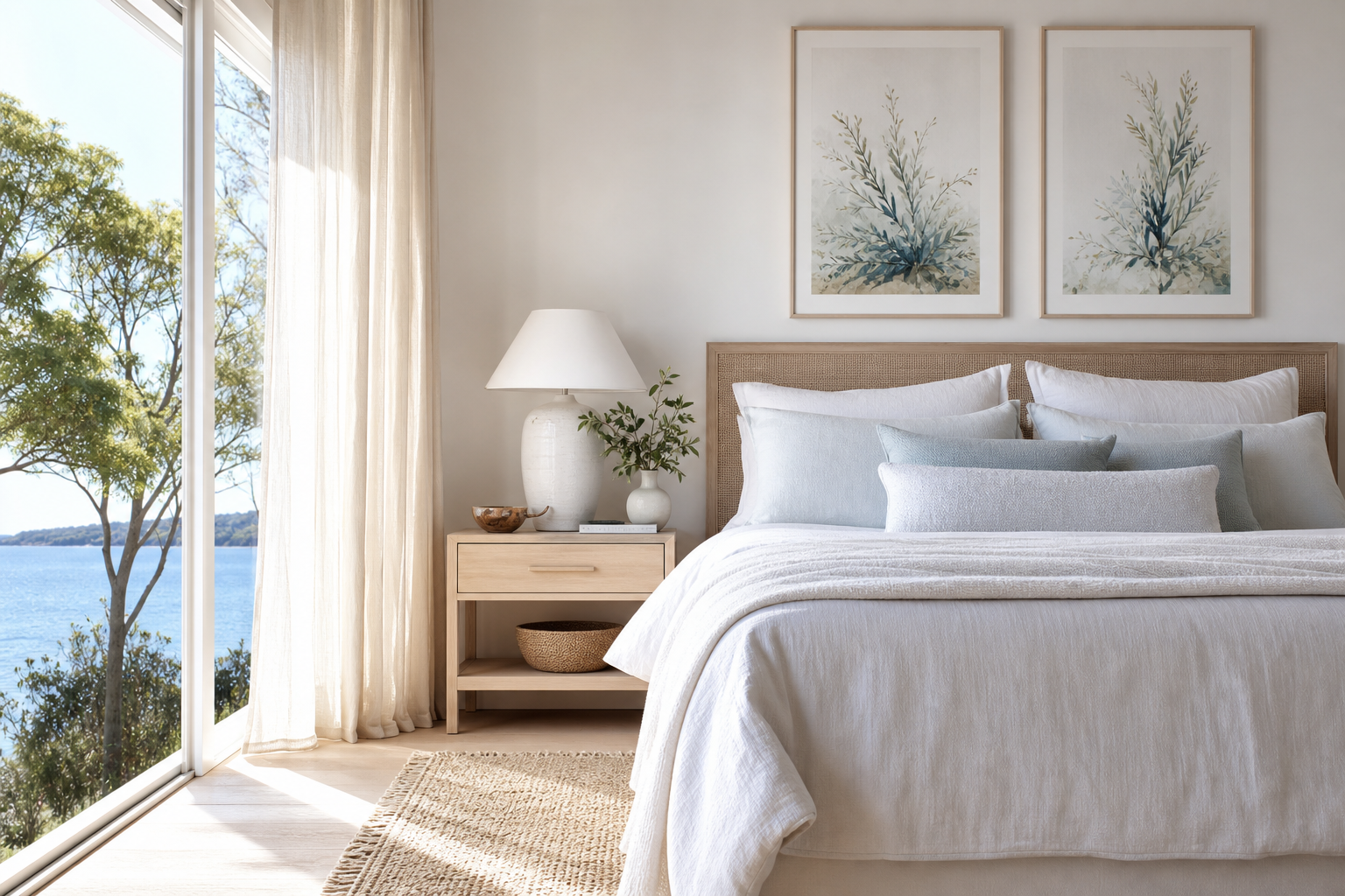
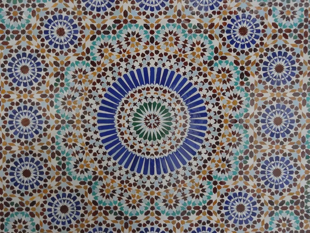
An ancient tiles i poster print brings two qualities that many modern rooms lack: ornament and memory. Historic tile motifs were designed to be seen every day — on floors, walls, courtyards, bathhouses, and stair risers — so they carry a decorative discipline that still feels relevant in contemporary interiors. Reframed as wall art, those geometric repeats, faded pigments, and hand-drawn edges add structure without making a room feel stiff.
Unlike trend-led graphics that peak fast, tile-based imagery has already proved its staying power over centuries. The appeal sits in repetition, symmetry, and weathered colour. A strong ancient tiles i poster print can echo the visual rhythm of stone, plaster, timber, or limewash, which is why it works especially well beside natural materials and layered rooms.
What Makes Ancient Tile Art Feel So Timeless
Historic tile art balances order and irregularity. Most patterns rely on grids, stars, florals, or interlocking forms, but the charm comes from slight imperfections — softened outlines, worn colour blocks, and uneven texture. That mix helps patterned wall art feel collected rather than mechanical.
Many interiors benefit from pattern that has depth instead of noise. A heritage tile print often contains 3 to 5 dominant tones rather than a full spectrum, which makes it easier to place than a busy abstract. If your room already includes oak, walnut, brass, terracotta, or off-white plaster, the pattern reads as an extension of the architecture rather than an isolated accent.
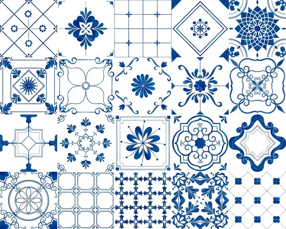
This is also why tile-inspired art sits naturally alongside pieces from our vintage collection and architecture prints. Both categories share the same sense of age, line, and material reference. If you want a wall that feels considered rather than overly matched, heritage patterns create a strong foundation.
Where an Ancient Tiles Poster Print Works Best
Living rooms are the easiest place to start because they usually have enough viewing distance for pattern to breathe. Over a 180 to 240 cm sofa, choose one large piece in 50x70 cm or 70x100 cm, or a pair of 50x70 cm frames with 7 to 10 cm between them. The repeated motif adds movement to broad wall space and stops neutral upholstery from looking flat.

Hallways are another strong match because patterned art creates rhythm in transitional spaces. A narrow corridor often needs something more structured than landscape art. One 40x50 cm frame above a console, or a row of three 30x40 cm works, can make a plain passage feel intentional. In homes with older mouldings or stone floors, tile imagery reinforces what is already there.
Kitchens and dining corners suit this style for practical visual reasons. Tile patterns naturally belong near surfaces, cabinetry, and ceramics. If your kitchen has white fronts, brushed brass hardware, or zellige-style backsplashes, a heritage pattern print can tie the room together without competing with functional elements. For adjacent styling, browse our bohemian art prints for pieces with earthy rhythm and decorative detail.
Bedrooms and studies need a quieter version. In these rooms, choose prints with more negative space, faded blue, muted clay, olive, or sand. If the bed is 160 cm wide, a 50x70 cm print centered above it is usually enough. In a compact home office, a 30x40 cm frame above the desk adds character without turning the wall visually heavy.
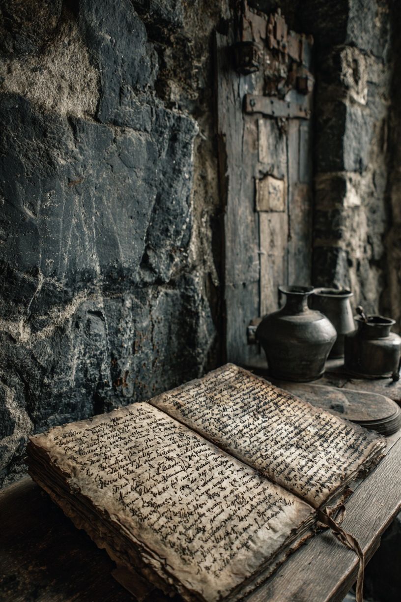
If you want the room to feel more storied, mix in one figurative or archival piece such as Ancient Chinese Portrait Vintage Print or a paper-based design like Ancient Manuscript — Vintage Print. These create a broader heritage narrative around the tile motif.
Choosing Colours, Scale, and Pattern Density
Start with the room's largest fixed surfaces. If your sofa, rug, or curtains are quiet — ivory, camel, stone, charcoal — you can afford a denser print with stronger contrast. If the room already has a patterned rug or veined stone, pick a design where the pattern is more open and the colour transitions are softer.
Blue and terracotta are the safest heritage pairing because they bridge cool and warm elements in one piece. Green-based tile prints work well with walnut, black metal, and cream upholstery. Monochrome or sand-toned versions are better if you want the effect of texture more than colour. A useful rule: if the print contains one tone already present in at least 20 to 30 percent of the room, it will feel integrated.
Scale matters as much as colour. A small, intricate motif in a 30x40 cm frame can get lost beyond 1.5 metres. For dense patterns, 50x70 cm gives the eye enough room to read the detail. If you're styling a compact wall, choose a design with larger tile blocks or more distressed texture so the motif is legible at a glance.

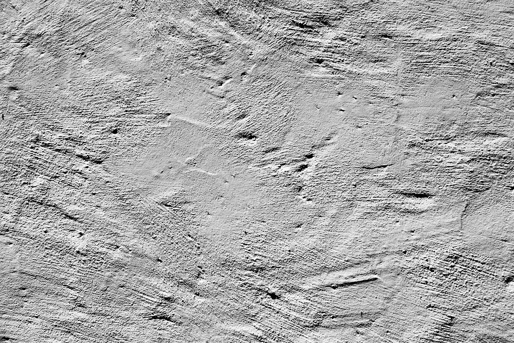
For a more restrained look, place a pattern-heavy print near quieter works from our minimalist collection. Pieces such as Textured Concrete Wall — Minimalist Print or Textured Fabric — Minimalist Print soften the intensity and let the tile design stand out without overwhelming the wall.
How to Style It With Other Wall Art
Tile-inspired art works best in a mixed composition when at least one other piece shares either its age, its colour family, or its geometry. That means you can pair it with typography, florals, architectural studies, or simple texture pieces — but not all at once. In a four-piece gallery wall, keep one dominant patterned work, one quiet texture, one figurative or scenic image, and one accent piece with a related tone.
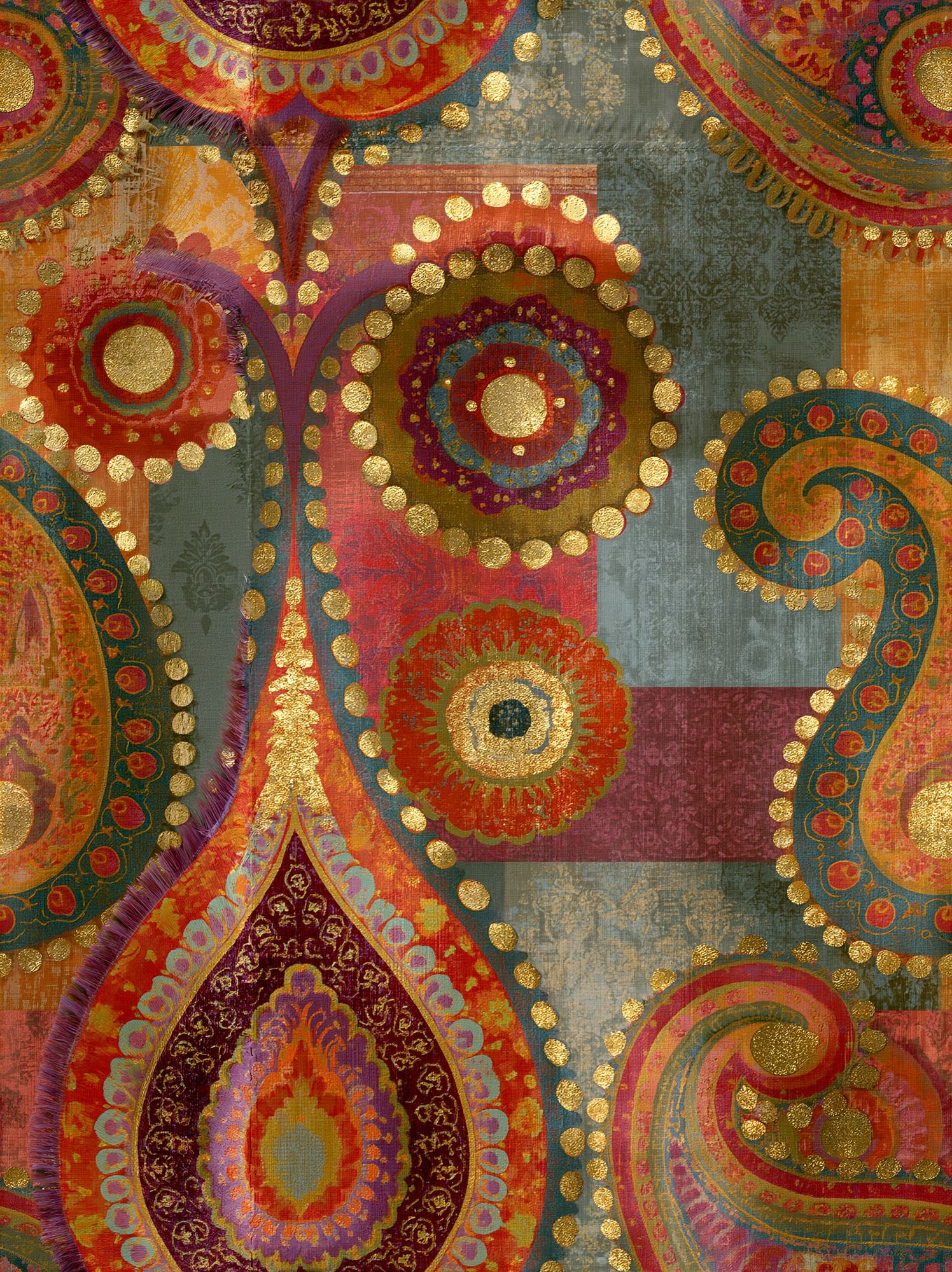

Botanical or ceramic-led art is especially effective because it offsets the strict geometry of tiles. If you like an eclectic Mediterranean look, combine pattern with vessel imagery, faded paper tones, and one artisanal stripe. If your room leans more classic, pair the tile print with items from our fine art selection or vintage wall art range to reinforce the sense of history.
Avoid matching every frame perfectly if the goal is a collected effect. A salon-style arrangement with 2 to 3 cm variation in frame width can work well, especially when the colour palette is controlled. If you prefer cleaner lines, use identical oak or black frames and let the artwork provide the variation.
Frames, Paper Finish, and Placement Tips
Frame choice changes the entire mood. Black frames sharpen pattern and make faded colours look more graphic. Oak frames warm up blue, green, and grey motifs. Brass-toned frames can work with tile imagery, but only when the room already includes warm metal elsewhere — on sconces, cabinet pulls, or table legs.

For paper finish, matte is usually the right call for heritage-inspired designs. It reduces glare, preserves the aged look of dusty blues and iron reds, and feels closer to the texture people associate with historical surfaces. Glossy finishes tend to make patterned artwork look too slick, especially under ceiling spots or direct window light.
Placement should be measured, not guessed. Hang the centre of a single frame at roughly 145 cm from the floor in hallways and living rooms. Above furniture, leave 15 to 25 cm between the top of the sofa, headboard, or console and the bottom of the frame. If you're hanging a pair, keep spacing consistent at around 5 to 7 cm for smaller frames and 8 to 10 cm for larger ones.
Shop the Look: Creating a Heritage-Inspired Wall
A polished heritage wall usually needs three layers: one anchor pattern, one softening neutral, and one companion piece with age or craft references. Start with your main tile-inspired artwork, then build around it with a textured print, a ceramic or botanical accent, or an archival image. That combination gives the wall both rhythm and pause.
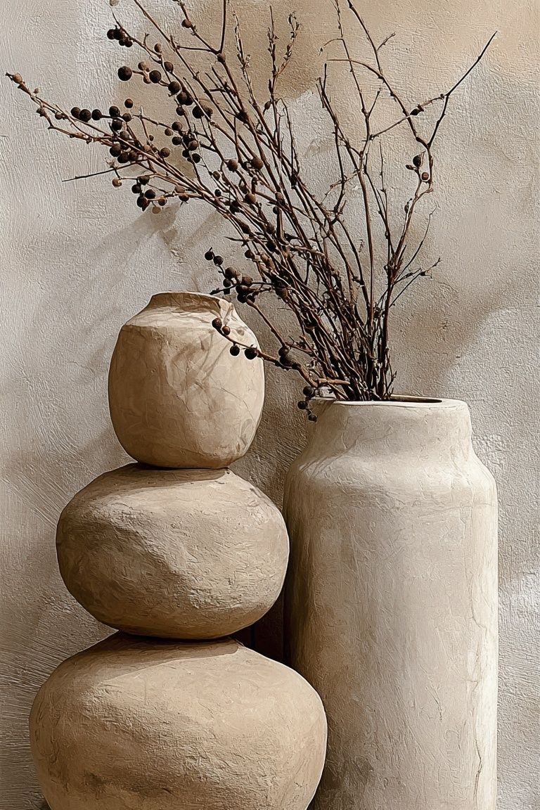
If you want a warmer, more decorative scheme, look at Ceramic Vases with Dried Branches — Bohemian Print beside tile-based work. If you want something sharper, pull in a structured neutral from Torn Paper Black and White Poster. The result feels designed, not themed.

Final thoughts
An ancient tiles i poster print works because it gives a room pattern with provenance. It brings geometry, faded colour, and a sense of architecture into spaces that might otherwise rely only on furniture and fabric for character.
Used well, an ancient tiles i poster print does not need a fully traditional room. It often looks strongest in contrast — against clean plaster walls, modern upholstery, and simple frames — where the history in the motif has room to speak.
Frequently Asked Questions
What frame colour works best with tile-inspired prints?
Oak is the most versatile for heritage tones, while black gives stronger contrast in modern rooms. Choose based on other wood or metal finishes already in the space.
Can I hang tile-pattern art in a small kitchen?
Yes — use a 30x40 cm or 40x50 cm size and keep it away from direct steam or splash zones. A single framed piece near a breakfast nook usually works better than a crowded arrangement.
Do heritage pattern prints pair well with plain walls?
They pair especially well with plain walls because the pattern becomes the focal point. White, warm beige, soft grey, and muted olive all support this style well.
Should I choose one large print or several smaller ones?
If the wall is wider than 140 cm, one 50x70 cm or 70x100 cm print creates a cleaner statement. For narrow walls or hallways, two or three smaller frames often feel more balanced.
What other decor helps this style look cohesive?
Ceramics, linen textiles, dark wood, aged brass, and natural stone all reinforce the look. Keep at least one of those materials visible near the artwork for a more connected result.