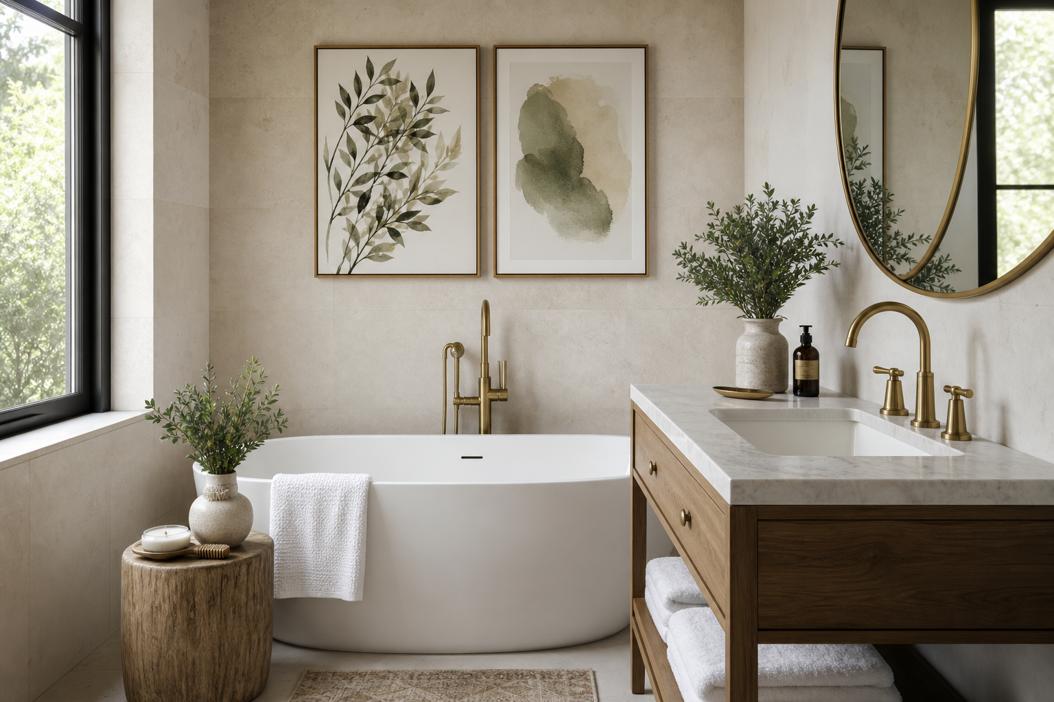
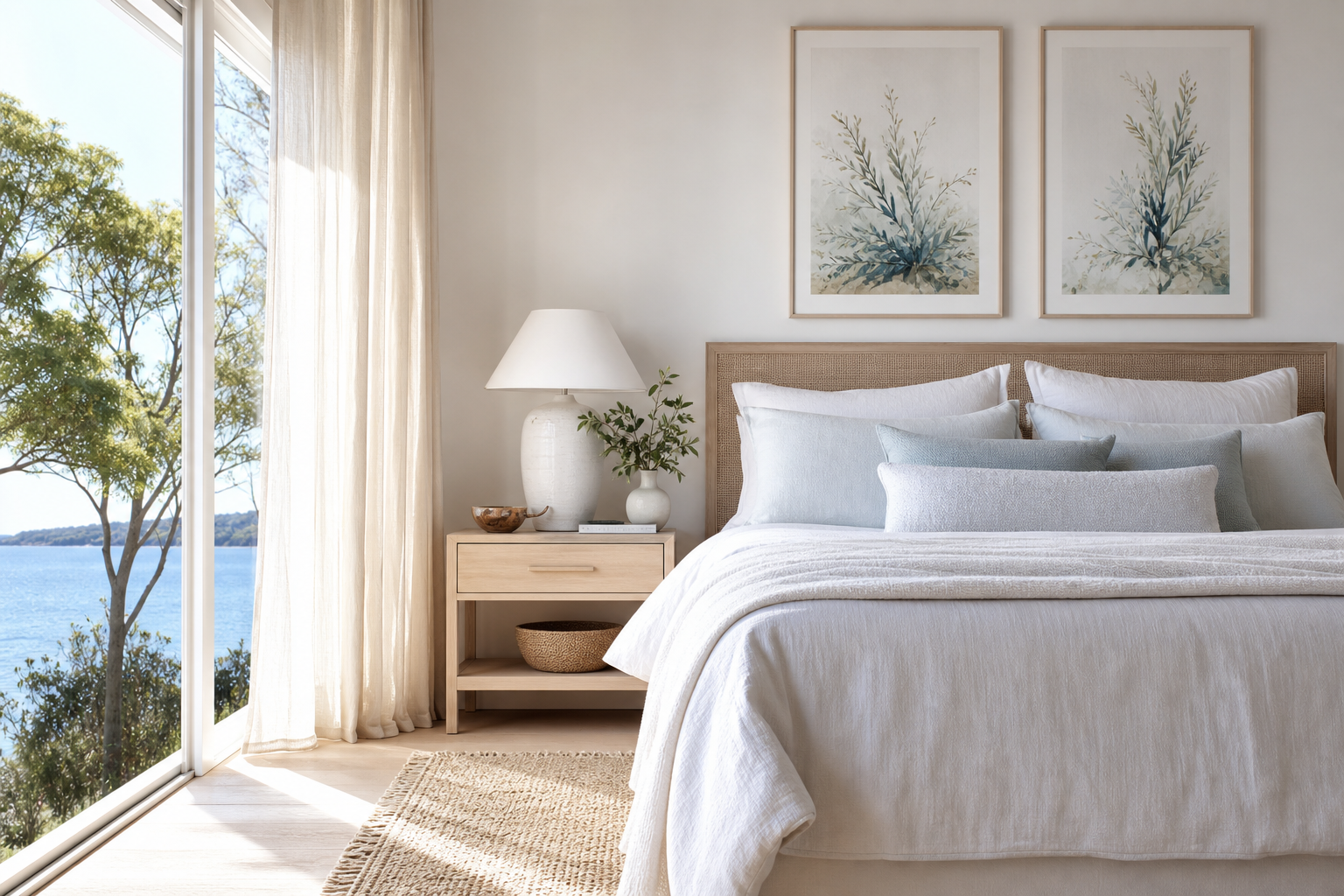
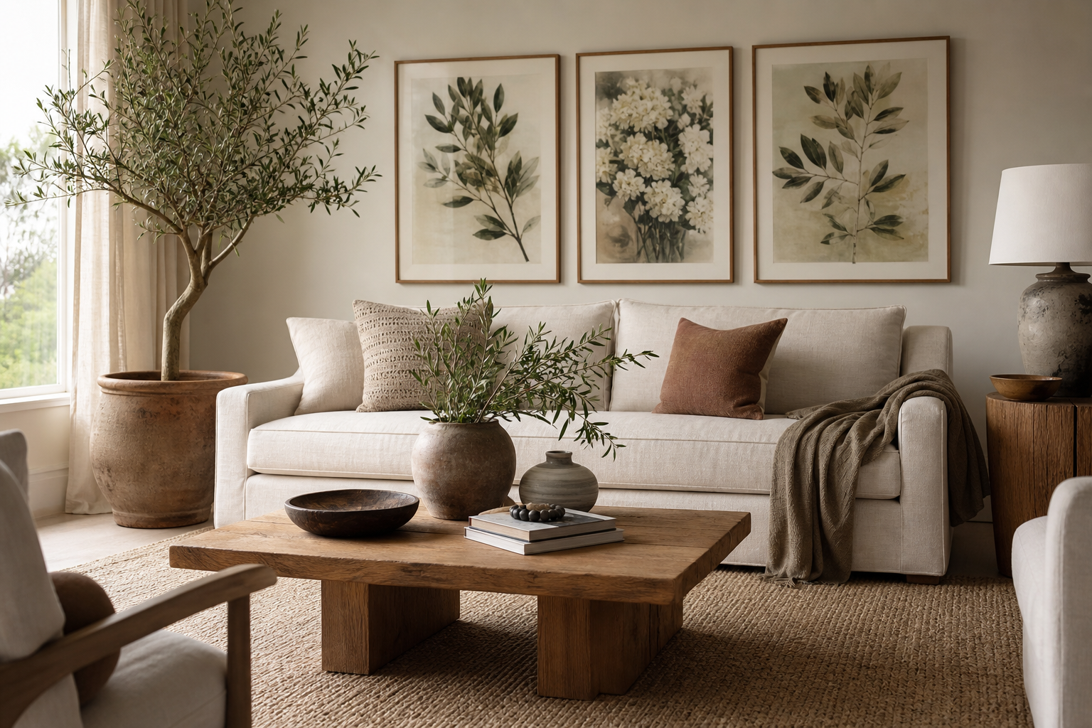
A 16 x 20 format sits in a useful middle range: large enough to read from across a room, small enough to fit walls that would overwhelm a 24 x 36 piece. In practical terms, 16 x 20 poster prints cover 320 square inches of visual space, which gives them enough presence for a focal point over a console, nightstand pair, desk, or narrow section of wall without forcing the rest of the room to scale up around them.
Why 16 x 20 Feels So Versatile
This size works especially well on small and medium walls because it leaves room for margins. On a wall that is 48 to 72 inches wide, a single 16 x 20 piece often looks balanced with 8 to 18 inches of breathing room on either side. That proportion is what makes the print feel intentional instead of squeezed in.
Vertical and horizontal orientations both perform well at 16 x 20. A vertical piece suits tighter spaces like the wall between a window and a dresser, while a horizontal composition can anchor a desk, bench, or sideboard. If you tend to rearrange furniture often, 16 x 20 poster prints are easier to move between rooms than oversized formats, which makes them a safer long-term buy.
If you like clean, restrained styling, this size pairs naturally with our minimalist collection and quieter tonal work from abstract art prints with soft texture. If you want more detail and narrative, pieces from the fine art collection hold up beautifully at this scale because they still reveal brushwork and atmosphere at close range.
Where to Hang It for the Best Impact
In the bedroom, one 16 x 20 piece works well above a nightstand, over a low dresser, or on a wall adjacent to the bed where a larger format would feel heavy. For a bed that is 60 inches wide, keep the art centered and hang the midpoint around 57 to 60 inches from the floor, adjusting slightly lower if the room has low ceilings or the furniture beneath is substantial.

In the living room, a single 16 x 20 print is enough when the furniture below is modest — think a reading chair, slim cabinet, or bar cart. Over a full sofa, this size usually works better as part of a pair or a small grouping. If the sofa is 84 inches wide, one 16 x 20 piece alone can look under-scaled unless the rest of the wall composition includes sconces, shelves, or mirrors.
Hallways and home offices are where this format earns its reputation. In a corridor 36 to 48 inches wide, a series of evenly spaced 16 x 20 frames creates rhythm without crowding the passage. In a workspace, a single piece above the desk brings focus without turning the wall into visual noise. Calm choices from Textured Concrete Wall or Elegant White Fabric suit rooms where concentration matters.

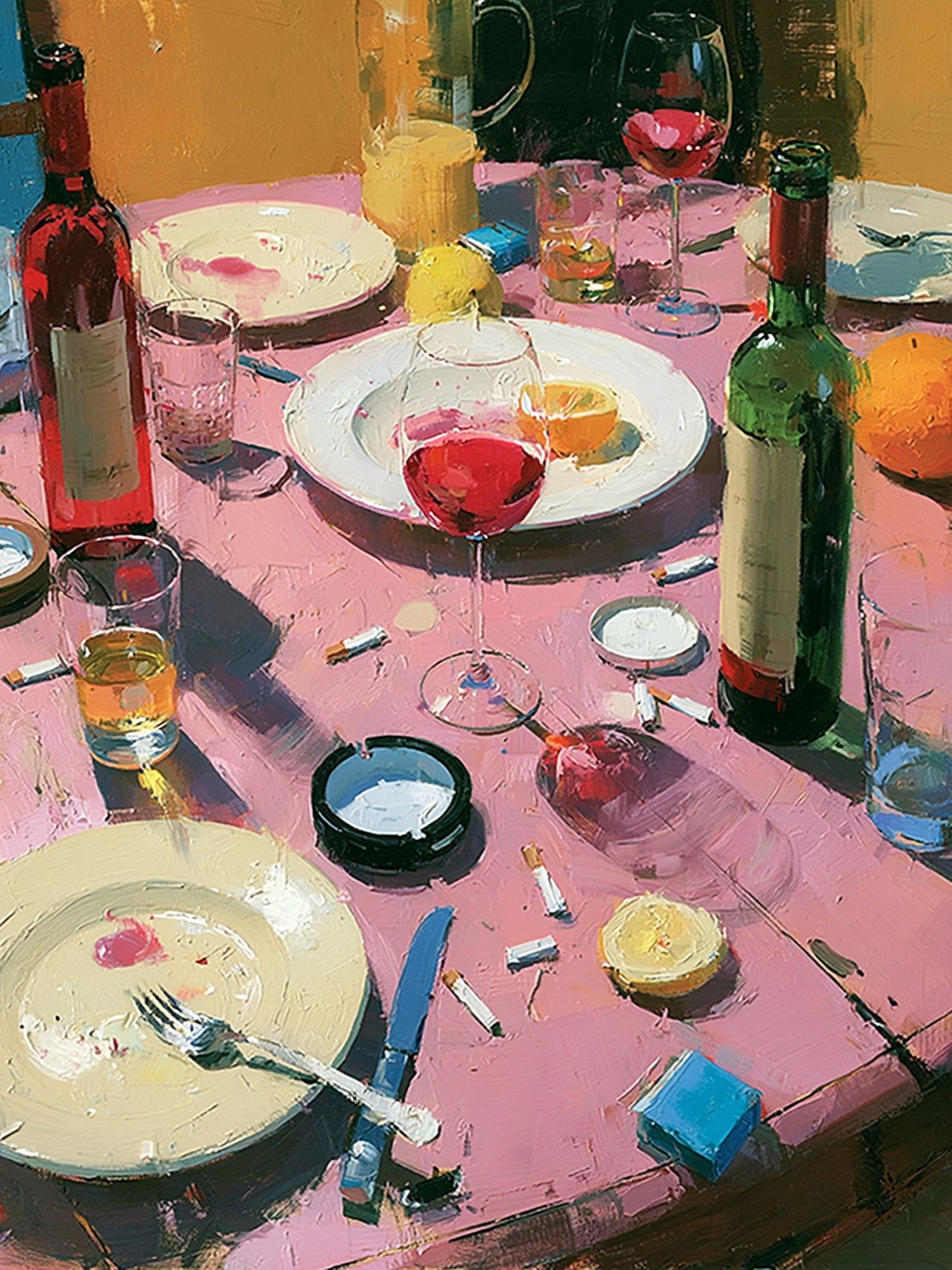
Kitchens also benefit from this size, especially over a breakfast nook, sideboard, or open wall near pantry shelving. A fruit still life, landscape, or gentle abstract often lands better than something too contrast-heavy. For a dining corner with wood and stone finishes, Wine Table Still Life is a strong fit because the subject reinforces the room's use without becoming too literal.
Framing Choices That Change the Look
Frame choice can shift the same artwork from casual to polished in minutes. A thin black frame — around 0.6 to 1 inch wide — gives 16 x 20 poster prints a sharper, modern edge. Oak or ash softens the look and works especially well with Scandinavian, warm minimal, and organic interiors. White frames are useful when you want the wall art to blend into pale walls rather than stand apart.
Matting changes the proportions more than most buyers expect. Add a 2-inch mat around a 16 x 20 print and the overall frame can move closer to 20 x 24, which makes the piece feel more gallery-like and gives delicate compositions more air. This is especially effective for line-led pieces and light-toned work such as White Flower Silhouette.

Glass and finish matter too. Matte glazing reduces glare in bright rooms with large windows, while standard acrylic or glass gives stronger contrast and can make darker art feel crisper. If the room already has reflective surfaces — mirrors, glossy tiles, polished stone — matte often feels more controlled.
For a classic look, fine art subjects respond well to a wider mat and a slimmer frame. Impressionist scenes, florals, and still lifes from our fine art prints gain elegance that way. For a more current look, abstract pieces usually prefer little or no mat and a leaner profile.
Styling Around the Print
The easiest way to make a single print feel settled is to echo one or two of its colors elsewhere in the room. If the art has cream, black, ochre, or dusty green, repeat that tone in a cushion, vase, throw, or lampshade. You do not need an exact match — staying within the same tonal family is enough.
A 16 x 20 piece also benefits from nearby objects with different shapes. If the frame is strict and rectangular, place it above a rounded lamp base, curved chair, trailing plant, or arched mirror. That contrast prevents the wall from feeling flat. On shelves, keep the print as the vertical anchor and let lower objects vary in height between 6 and 14 inches.



Layering also helps. A 16 x 20 frame leaning on a picture ledge can look more relaxed than a fully hung arrangement, especially when paired with stacked books and a small object in front. This approach works well with restrained pieces from Blush Watercolor Abstract or atmospheric scenes from Window with Sheer Curtain.
Design Ideas by Mood and Room
For relaxed rooms, choose muted palettes and low-contrast compositions. Pale florals, light textures, and soft landscapes support slower spaces like bedrooms, reading corners, and guest rooms. Pieces such as Vase with Flowers or Woman with a Parasol bring enough detail to hold attention without dominating the room.
For bolder interiors, use 16 x 20 poster prints with stronger color blocking or graphic shapes. This size is ideal if you want impact without committing to a wall-wide statement. A saturated abstract can carry a smaller wall beside shelving, or punctuate a neutral office with more energy.

If the room is minimal, stick to one strong visual idea per wall. A single tonal piece from Textured White Abstract or Textured Waves in a minimalist style will keep the space disciplined. If the room is cozy and layered, narrative pieces and painterly subjects can carry more personality without feeling busy.
How to Build a Larger Display Around One Size
The cleanest multi-piece arrangement is a grid. Two 16 x 20 prints side by side fill an area roughly 34 to 38 inches wide depending on frame thickness and spacing. A 2-by-2 grid can cover close to 36 x 44 inches unframed, or more once framed, which is enough for a substantial wall above a sofa, sideboard, or queen bed.
Spacing is what makes the layout feel professional. Keep gaps between 2 and 3 inches for a tight gallery effect. Use the same frame finish across all pieces, and align either the outer edges or the center line — mixing alignment methods is what usually makes gallery walls look accidental.

If you are mixing subjects, unify them through palette rather than theme. One abstract, one floral, one landscape, and one fabric-inspired composition can live together if they all share soft neutrals, charcoal, ochre, or dusty blue. This is where browsing across photography wall art, abstract collections, and fine art pieces can help you build a set with variety but consistent tone.
Shop Smart: Finishing Touches That Matter
Before buying, measure both the wall and the furniture beneath it. A good rule is to keep the art grouping at 60 to 75 percent of the furniture width below. For a 48-inch console, one framed 16 x 20 can work; for a 72-inch sofa, you will usually want two or more pieces or a mixed arrangement.
Orientation matters as much as subject. Vertical compositions visually raise ceilings and suit narrow wall sections. Horizontal images feel steadier over furniture. Also consider longevity: pieces tied to a broad palette and a clear mood tend to move between homes and rooms more easily than trend-specific designs.

Paper and print finish are worth paying for because this size is often viewed up close. Better paper shows richer blacks, cleaner neutrals, and more stable texture under daylight. That becomes obvious in subtle pieces, especially pale abstracts and fine art reproductions with delicate tonal shifts.
Final thoughts
16 x 20 poster prints work because they sit at the point where flexibility meets presence. They can stand alone on a modest wall, fit comfortably into a pair, or become the backbone of a grid without forcing the room into oversized proportions.
The best result comes from treating size, frame, placement, and surrounding objects as one composition. Get those four parts right, and even a simple 16 x 20 print can feel precise, finished, and fully at home in the room.
Frequently Asked Questions
Should I choose portrait or landscape for a 16 x 20 print?
Choose portrait for narrow wall sections, beside windows, or above slim furniture. Choose landscape for desks, benches, and wider consoles where you want a steadier horizontal line.
Can I hang a 16 x 20 print without a frame?
Yes, but it will read more casual and is more vulnerable to curling or edge wear. A frame gives cleaner structure and usually makes the size feel more substantial.
How much wall space should I leave around a 16 x 20 frame?
Aim for at least 6 to 8 inches from nearby furniture edges, corners, or shelves so the piece can breathe. On larger walls, 10 to 18 inches often looks better.
What frame color is the safest if I redecorate often?
Thin black, natural oak, and soft white are the most adaptable. Black adds contrast, oak adds warmth, and white keeps the look light against pale walls.
Do 16 x 20 prints work in renters' homes?
They do, especially because they are lighter and easier to hang with lower-damage hardware than oversized pieces. Use removable hooks or strips rated for the total framed weight, not just the print size.