Why Abstract Art Works in So Many Spaces
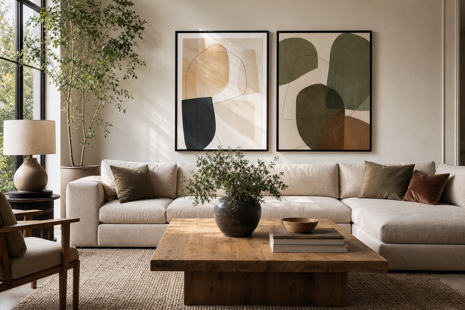
Abstract art succeeds where literal imagery can feel limiting. A landscape suggests a place, a portrait suggests a person, but abstract posters and prints create atmosphere first. That makes them especially useful in rooms that need mood rather than narrative — a calm bedroom, a sharper home office, or a living room that needs one confident focal point.
Another advantage is flexibility. Abstract pieces can sit comfortably beside minimalist art prints, richer bohemian wall art, or even more structured mid-century modern prints because the visual language is built from colour, line, texture, and rhythm. If you update a rug, repaint a wall, or change upholstery later, abstract work tends to adapt more easily than highly themed art.
If you want a piece that sets a room's tone without taking over, soft layered compositions usually work best. Textured Waves — Abstract Print is a good example of how movement and restraint can live together, especially in neutral spaces with oak, boucle, linen, or plaster finishes.

Choosing the Right Colours and Shapes
The easiest way to choose abstract posters and prints is to borrow 1 or 2 colours already present in the room. If your space has oatmeal upholstery, walnut wood, and black metal accents, art with cream, rust, charcoal, or muted terracotta will look intentional immediately. A good rule is 60-30-10: let 60% of the room stay dominant, 30% support it, and use the final 10% for contrast through art or accessories.
Soft palettes lower visual pressure. Blush, sand, ivory, faded ochre, and dusty teal make a room feel settled. In a bedroom or reading corner, pieces like Blush Watercolor Abstract Poster or work from our abstract collection can add colour without making the walls feel busy.
Bold palettes need a little more discipline. If you choose one artwork with saturated red, cobalt, or citrus yellow, repeat that colour only once or twice elsewhere — in a cushion, vase, or lamp base. More than that, and the room starts to compete with itself. Colorful Stained Glass Abstract Poster works best when the rest of the room stays pared back.
Shape matters as much as colour. Rounded forms feel calmer and more fluid, while sharp geometry brings speed and precision. Curves work well in bedrooms and lounge spaces; grids, stripes, and angular compositions suit desks, dining areas, and hallways where a bit more structure helps.



Finding the Best Size and Placement
Scale is where many rooms go wrong. Art that is too small looks hesitant, even when the piece itself is strong. Above a sofa, aim for a total artwork width that covers roughly 60% to 75% of the sofa's width. For a 200 cm sofa, that means your framed art should span about 120 to 150 cm. That can be one large print or a pair of medium pieces.
Above a bed, keep the composition slightly narrower than the headboard and hang it 15 to 25 cm above the top edge. In hallways, narrower vertical formats often work better than oversized horizontal ones because they maintain walking space visually. In smaller corners — above a console, beside a bookcase, or near a desk — a 30 x 40 cm or 40 x 50 cm print is often enough, especially with a mount that gives it breathing room.
Hanging height should feel architectural, not accidental. The centre of the artwork usually looks best at around 145 to 150 cm from the floor. If the art hangs above furniture, measure from the furniture rather than from the floor alone — keep the bottom of the frame around 15 to 20 cm above the top of the sofa, bed, or console.
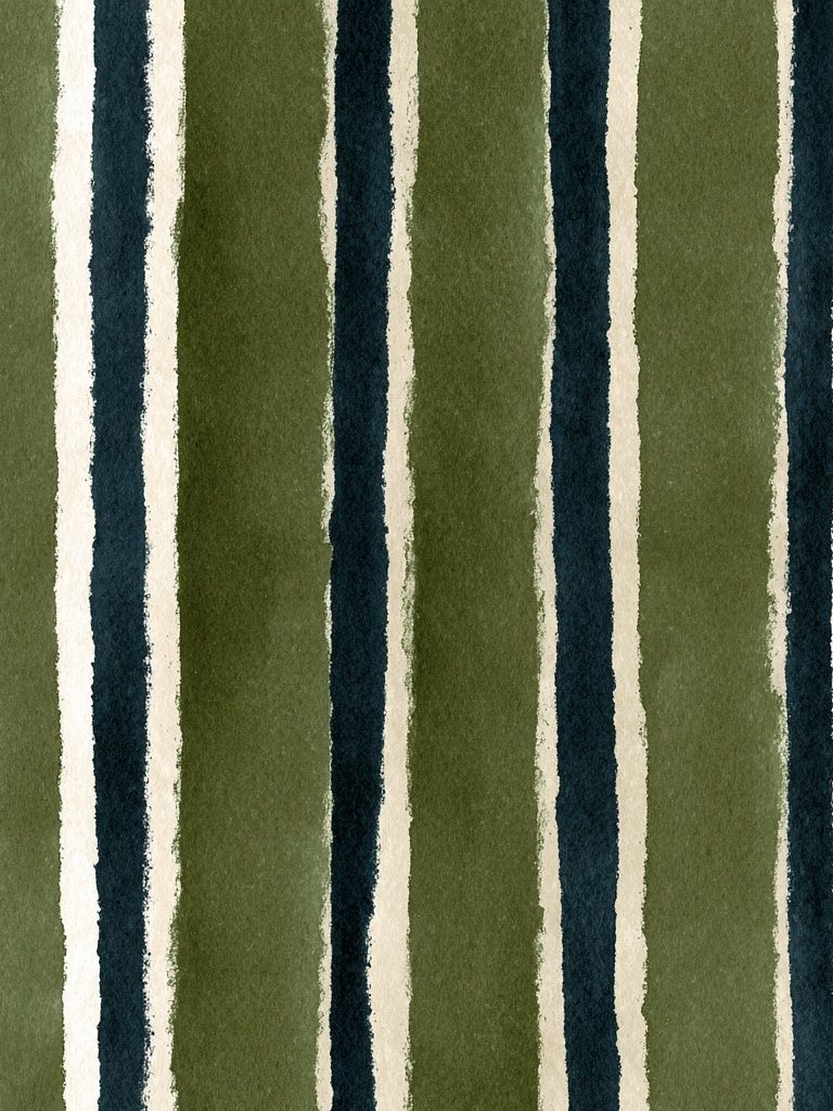
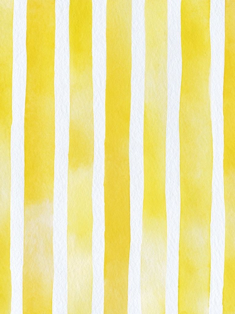
Large abstract posters and prints are especially effective when the composition itself is simple. Broad bands, tonal gradients, and repeating forms read clearly from across a room. Yellow Watercolor Stripes Poster is the kind of piece that can hold a wider wall without needing a complicated arrangement around it.
Framing Ideas That Change the Whole Look
Frames do more than finish a print — they decide whether the piece feels crisp, relaxed, decorative, or gallery-like. Black frames sharpen abstract work and increase contrast, which suits graphic designs and monochrome compositions. Oak and walnut frames warm up cooler palettes and tend to sit beautifully in Scandinavian, organic modern, or mid-century rooms.
A white mount can be useful when the artwork has dense colour or visible texture. It creates a pause between the image and the frame, making the piece feel more expensive and better proportioned. Mounts are especially effective for smaller sizes like 30 x 40 cm and 50 x 70 cm, where you want the overall framed piece to carry more presence on the wall.
For cleaner interiors, pair restrained abstract work with simple slim frames. Textured Waves — Minimalist Print or pieces from our fine art prints look stronger when the frame doesn't fight for attention. If your room already includes brass, travertine, velvet, or darker woods, a deeper frame profile can add the weight the space needs.

How to Build a Gallery Wall with Abstract Prints
A gallery wall works best when there is one unifying rule. That rule can be a shared palette, matching frames, repeated spacing, or a common subject style. With abstract art, colour cohesion is often easiest. Choose 4 to 7 pieces that repeat at least one tone — black, terracotta, dusty blue, sand, or forest green — and the arrangement will feel connected even if the compositions are varied.
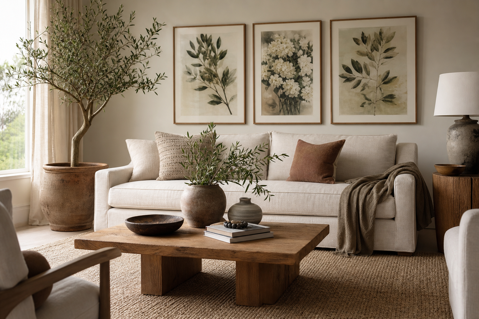
Abstract work mixes well with other genres when you keep one element consistent. You can combine an abstract print with a typographic piece, a botanical study, or a figurative fine art print as long as the scale and framing relate to one another. If you introduce typography, keep it to one piece only; more than that, and the wall can lose the calm ambiguity that makes abstract styling effective.
Layout matters. Start on the floor and build around the largest piece first. Keep gaps between frames consistent — usually 5 to 8 cm. Symmetrical grids feel cleaner and more formal, while salon-style arrangements feel more collected and relaxed. In smaller homes, a pair of stacked prints can be more effective than a full gallery wall because it gives you rhythm without visual clutter.
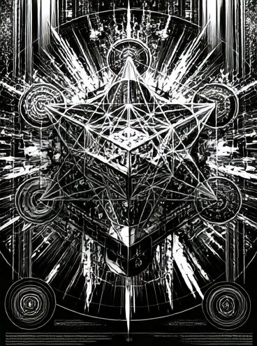
Graphic pieces are especially useful for anchoring a mixed arrangement. Sacred Geometry Black-White Poster can provide that sharper edge when surrounded by softer forms and painterly textures.

Room-by-Room Inspiration for a Finished Look
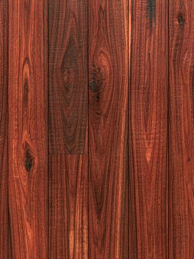
In the living room, abstract art should usually either anchor the sofa or define a secondary zone like a reading chair or sideboard. If the room already has strong furniture shapes, choose art with softer movement to balance them. If the furniture is very neutral, use bolder colour to stop the space feeling flat. Red Wood Grain Texture Poster or textured pieces from the abstract wall art range can add that needed energy.
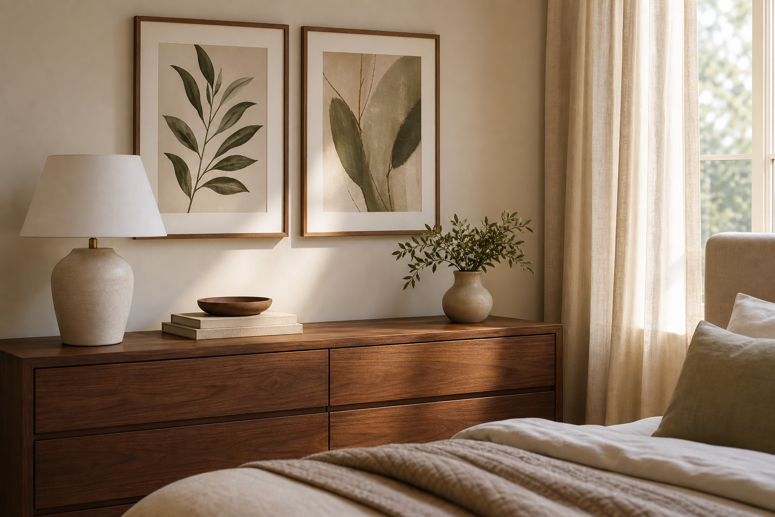
Bedrooms benefit from quieter compositions. Think layered neutrals, muted clay tones, off-whites, and rounded forms. A diptych above the bed often feels calmer than one very busy piece because the repetition creates symmetry. If your room has black bedside lamps or dark curtain poles, a slim black frame will tie everything together neatly.
Home offices can carry more contrast. This is where lines, geometry, and cleaner shapes help with focus. Black-and-white abstracts, teal curves, or structured stripes work well behind a desk, especially if the rest of the room is practical rather than decorative. Yin Yang Teal Abstract Poster has enough movement to keep the wall interesting without becoming distracting during work.
Entryways are the best place to be a little bolder. These are transition spaces, so stronger colour and more graphic forms can make an immediate impression. One vertical piece above a console or a tight pair of frames beside a mirror usually works better than a wide arrangement in a narrow hall.


Wrap-Up: Styling Abstract Art with Confidence
The best abstract posters and prints do one job clearly: they shape the mood of a room. Start with the room's palette, match the scale to the wall, and choose framing that supports the overall interior rather than pulling away from it. If the piece feels right from across the room and still rewards a closer look, you've chosen well.
When in doubt, keep the room simple and let the art carry the rhythm. Abstract posters and prints are at their strongest when they echo the colours, materials, and pace of the home around them.
Frequently Asked Questions
What frame colour works best for abstract prints?
Black suits high-contrast or graphic work, while oak or walnut softens the look and adds warmth. White frames work best in bright, clean interiors with pale walls.
Can I mix abstract art with patterned textiles?
Yes — keep one element consistent, usually colour. If the rug or cushions are patterned, choose art that repeats one of those tones but has simpler shapes.
Should abstract wall art be matted with a mount?
A mount is especially useful for smaller prints because it adds visual size and makes the piece feel more refined. It also helps dense or colourful compositions breathe.
What size print works well in an entryway?
For a narrow hall, 40 x 50 cm or 50 x 70 cm is usually enough for a single piece. If you have a wider console wall, two matching 50 x 70 cm frames often look more balanced.
Do abstract prints work on coloured walls?
They do, but contrast matters. On darker walls, choose lighter artwork or wider mounts so the piece stands out cleanly instead of disappearing into the paint colour.