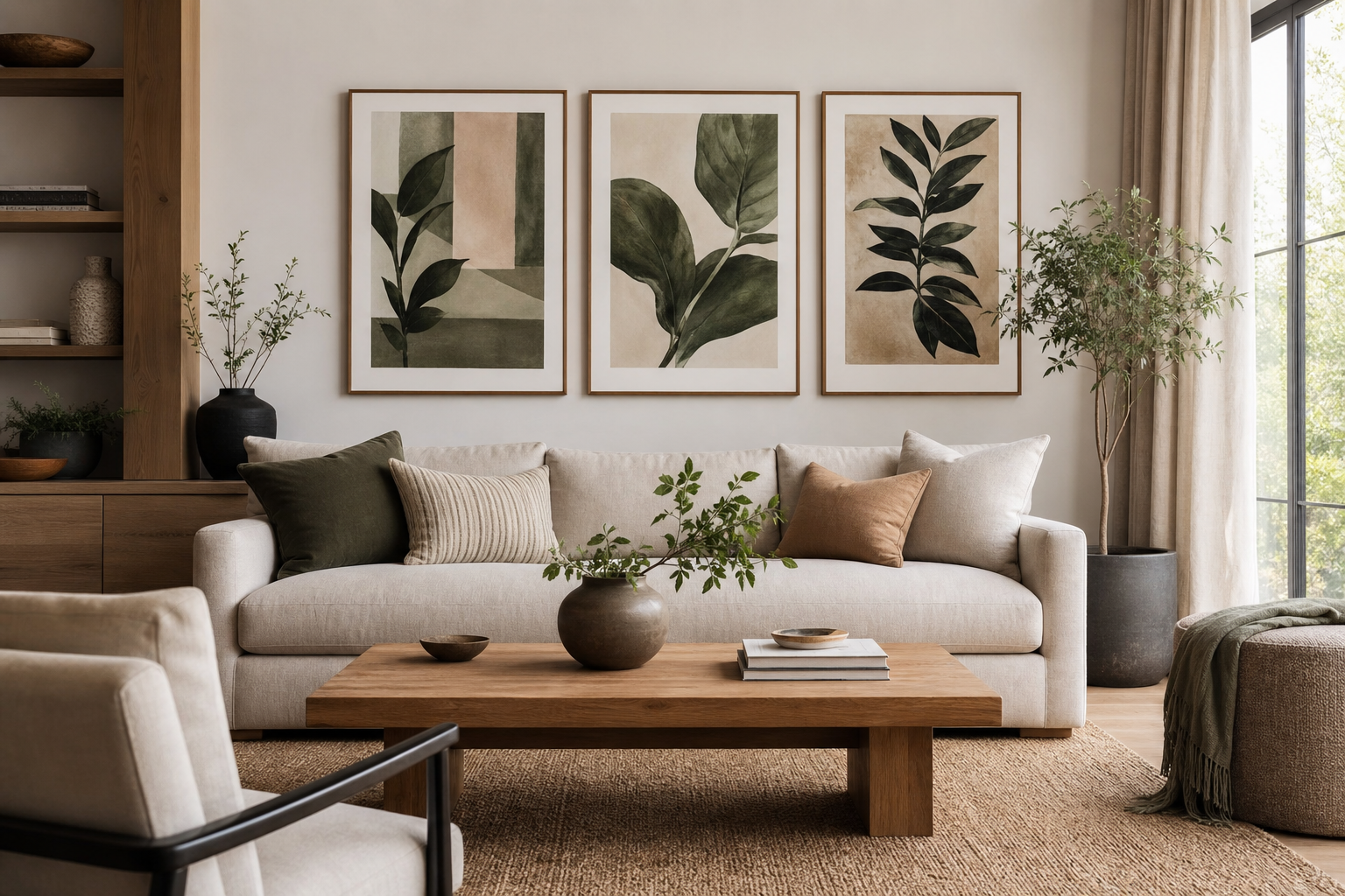
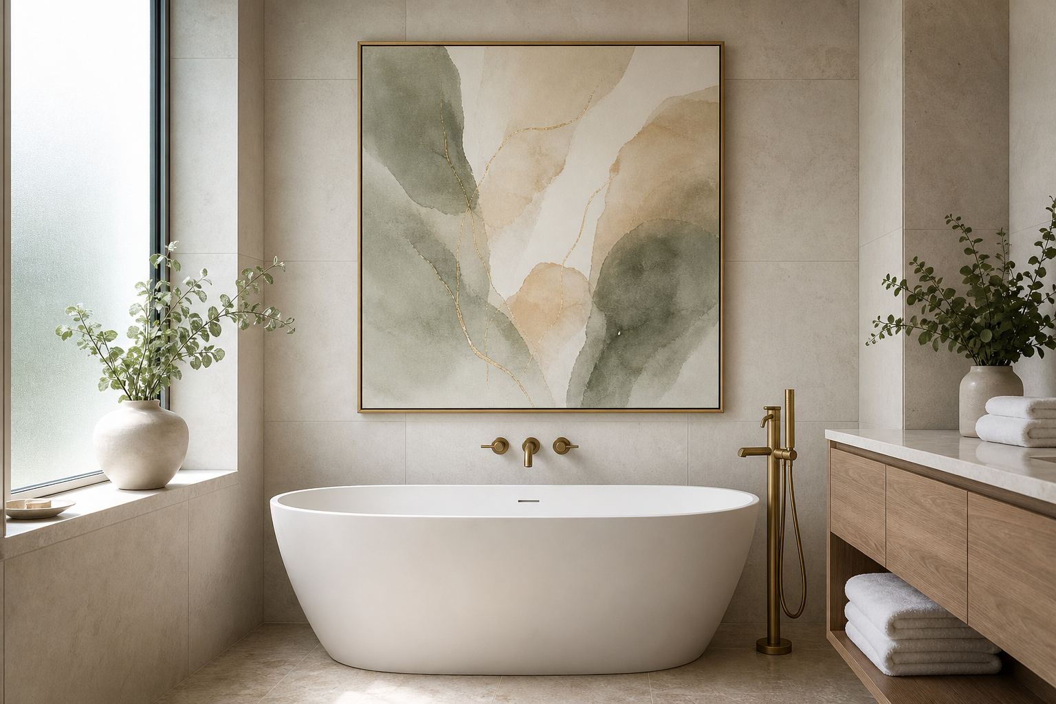
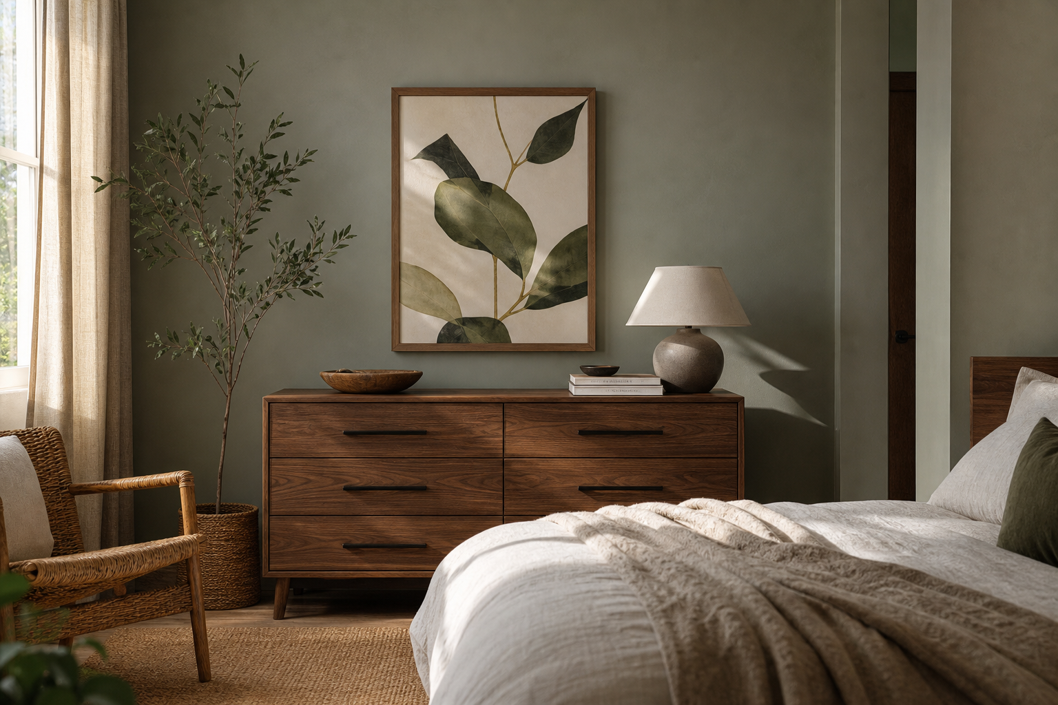
Choosing between 16x20 vs 20x30 is mostly about scale. A 16x20 print covers 320 square inches, while a 20x30 covers 600 square inches. That makes 20x30 nearly 88% larger in surface area, so the difference reads much bigger on the wall than the numbers first suggest.
What’s the real difference between 16x20 and 20x30?
A 16x20 format feels compact, tidy, and flexible. It suits narrow wall sections, layered arrangements, and rooms where you want art to support the space rather than dominate it. A 20x30 format has more authority. It creates a focal point faster, fills vertical or horizontal breathing room more effectively, and holds its own above larger furniture.
The proportions are different too. A 16x20 has a 4:5 ratio, while a 20x30 has a 2:3 ratio. That changes the visual read. The 4:5 shape feels slightly squarer and often more classic. The 2:3 shape feels more elongated and usually more cinematic in presence, especially with landscapes, figure studies, or bold abstract wall art.
If you prefer restrained styling, a smaller format often works best with minimalist art prints because negative space around the frame stays visible. If you want one piece to anchor the room, a larger format is often better for expressive fine art prints with brushwork, atmosphere, or richer tonal depth.
When 16x20 works best
A 16x20 works best on walls that are real but not expansive — beside a desk, over a nightstand, between windows, at the end of a hallway, or in a dining nook. On a wall under 60 inches wide, it usually feels more balanced than 20x30, especially if you are keeping the room light and uncluttered.

It is also the easier size for pairs and grids. Two 16x20 prints hung side by side with 2 to 3 inches between frames can span roughly 34 to 38 inches depending on frame width. That is ideal over a 48-inch console, a compact loveseat, or a work desk. If you enjoy clean repetition, a 16x20 is the more forgiving choice.
A subtle composition benefits from this scale. A piece like Elegant White Fabric has enough detail and softness to feel polished at 16x20 without overwhelming a quiet bedroom or reading corner.

Another strength of 16x20 is flexibility during styling changes. If you move furniture, shift a bed position, or restyle a home office, this size can relocate easily. It also pairs naturally with typography prints or simpler monochrome works when you want a layered gallery wall instead of one large statement.
When 20x30 makes more sense
A 20x30 size makes sense when the wall needs presence. Above a standard 72- to 84-inch sofa, a single 16x20 often looks undersized unless it is part of a wider arrangement. A 20x30 can work on its own, particularly if the frame has some visual weight and the artwork has clear contrast.
This size is especially useful in rooms with higher ceilings, larger furniture, or more open floor area. In those spaces, smaller art can feel disconnected from the room. A 20x30 solves that by giving the eye a proper focal point from 6 to 10 feet away.

For larger formats, color and texture matter more because they need to carry across the room. Starry Night is a good example of artwork that benefits from extra scale — the movement becomes easier to read, and the wall feels intentionally filled rather than sparsely decorated.

A 20x30 is also strong in entryways, dining areas, and home offices where you want a confident first impression. If your room already has enough furniture, rugs, and lighting to feel complete, one large print often looks calmer than several smaller frames competing for attention.
How frame choice changes the look
Frame choice can shift the effect of both sizes by more than people expect. A thin 0.5-inch black frame makes a 16x20 feel crisp and modern. A thicker 1.25-inch oak or walnut frame gives it more visual authority. Add a 2-inch mat, and the total framed size can jump to around 20x24 — enough to make a smaller print feel much more substantial.
For 20x30, matting can make the piece feel formal and gallery-like. Without a mat, the look is cleaner and more contemporary. This matters if you are comparing 16x20 vs 20x30 and worrying that 16x20 may feel too small. Sometimes the answer is not the larger print — it is a better frame package.
White or natural wood frames soften abstract and textured works. Black frames increase contrast and sharpen edges, which suits pieces like Sacred Geometry Black-White or high-contrast black-and-white minimalist prints.




Placement rules for a balanced wall
The simplest hanging rule is this: center the artwork about 57 to 60 inches from the floor. That is the usual gallery height, and it works in most rooms. Above furniture, leave 6 to 10 inches between the top of the sofa, headboard, or console and the bottom of the frame.
A good width rule is to make your wall art span around 60% to 75% of the furniture below it. Above a 60-inch console, that means an art arrangement between 36 and 45 inches wide. One 16x20 frame may look too narrow there, while one 20x30 or a pair of 16x20 frames will usually feel better proportioned.

Spacing matters. If you hang two 16x20s, keep 2 to 3 inches between them. If you place one 20x30 over a bed or sofa, center it carefully and avoid pushing it too high. Oversized gaps are the main reason art feels disconnected from furniture.
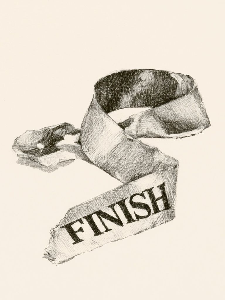
If you are styling a work area, a 16x20 often pairs well with graphic Finish Ribbon Typography Print or restrained abstract pieces because the scale stays supportive rather than distracting.
Style and mood: which size suits your space?
If your room is quiet, tonal, and edited, 16x20 usually supports that mood better. Bedrooms, small offices, and guest rooms often benefit from art that feels intentional but not dominant. A soft subject like Window with Sheer Curtain reads beautifully at medium scale because the room keeps its calm.
If your goal is bolder and more curated, 20x30 has the advantage. It makes one piece feel collected and deliberate, especially in living rooms with broader walls or stronger contrast. Large-scale color-driven abstract prints or painterly works can create a gallery effect without needing a full salon wall.

Think room by room. For a dorm, entry, or compact apartment, 16x20 is easier to place and easier to move. For a main living room, dining wall, or wide hallway, 20x30 tends to look more resolved. If you like symmetry, choose pairs of 16x20. If you like a single focal point, choose 20x30.
A balanced way to compare styles is to look at different subjects at similar visual weight. Fine art, soft neutrals, and minimal textures often feel elegant at 16x20, while stronger stripes, contrast, and brush movement often gain more from 20x30.
Final tips for choosing the right size
If you are stuck on 16x20 vs 20x30, tape both sizes on the wall before you buy. Use painter's tape and live with the outlines for 24 hours. Check them in daylight, lamplight, and from the doorway. This one step prevents most sizing mistakes.
Measure the furniture width, note the wall clearance around it, and decide whether you want art to blend in or lead the room. If the wall is narrow, if you plan a pair, or if your style is understated, start with 16x20. If the wall feels empty, the viewing distance is longer than 6 feet, or the room needs a focal point, move up to 20x30.
Go with the size that fits the room first, then let the artwork refine the mood. Strong scale always looks more expensive than a beautiful print in the wrong dimensions.
Frequently Asked Questions
Can I use a 16x20 print in a 20x30 frame?
Yes — with a mat. A custom or ready-made mat can center the smaller print neatly and give it a more finished, gallery-style look.
What frame color is safest if I change decor often?
Black, white, and light oak are the most flexible. Black adds contrast, white feels airy, and oak works especially well with soft neutrals and natural materials.
Is 20x30 too big for a bedroom?
Not if the wall and furniture can support it. Above a queen bed or a long dresser, 20x30 often looks balanced when hung 6 to 8 inches above the furniture.
Do textured or detailed artworks need a bigger size?
Usually yes if you want the detail to read from across the room. Fine brushwork, layered texture, and subtle tonal shifts become easier to appreciate at 20x30.