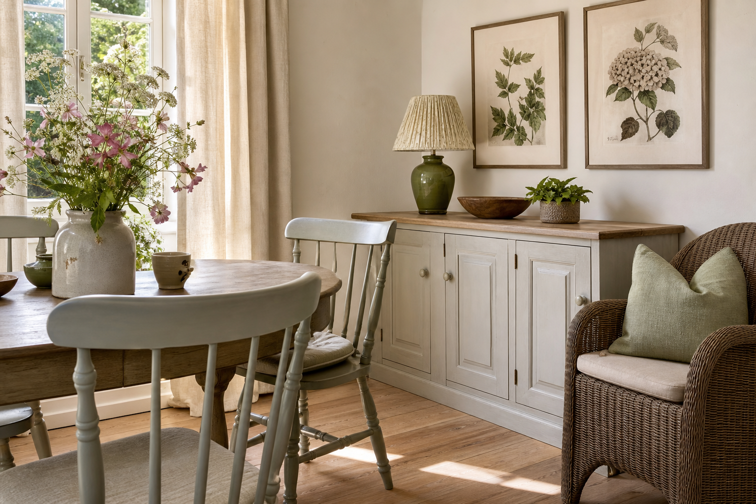
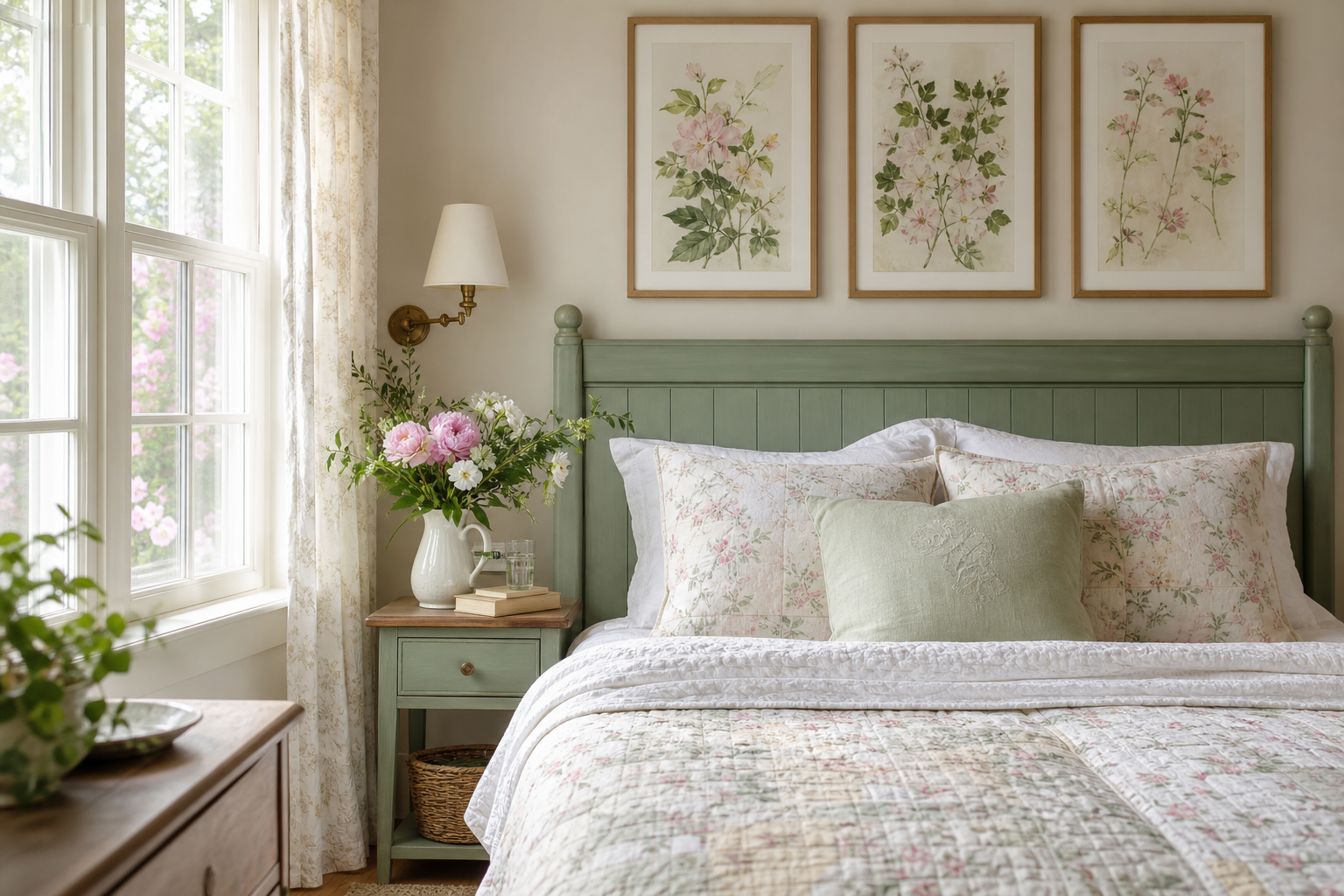
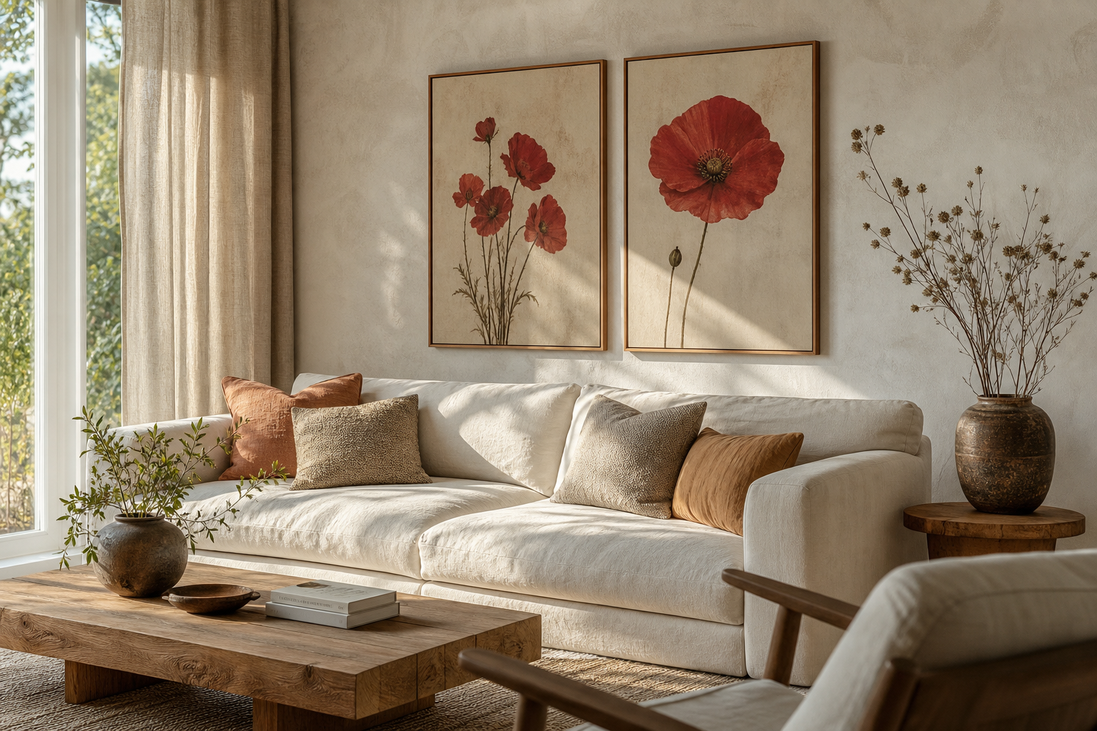
A well-chosen country cottage poster print adds warmth faster than almost any other wall detail. It brings in the softness of old gardens, stone paths, weathered shutters, and quiet rural views — all the visual cues that make a room feel settled rather than staged. In practical terms, this style works best when the art looks slightly romantic, lightly faded, and connected to nature or home life.
What Gives Country Cottage Art Its Charm?
Country cottage art usually relies on a muted palette and familiar subjects. Think soft greens, dusty blues, cream, faded rose, butter yellow, and warm brown — not high-contrast black and white. Scenes with cottages, village lanes, birds, meadows, garden florals, or window views feel especially natural because they echo the textures already found in cottage interiors: painted wood, linen, wicker, and worn timber.
A second key detail is gentleness in the image itself. Watercolor edges, painterly brushwork, and vintage-inspired fading help a piece feel lived-in. That is why works from our vintage collection and fine art prints often fit this look better than sharp graphic designs. A country cottage poster print should soften a room, not interrupt it.
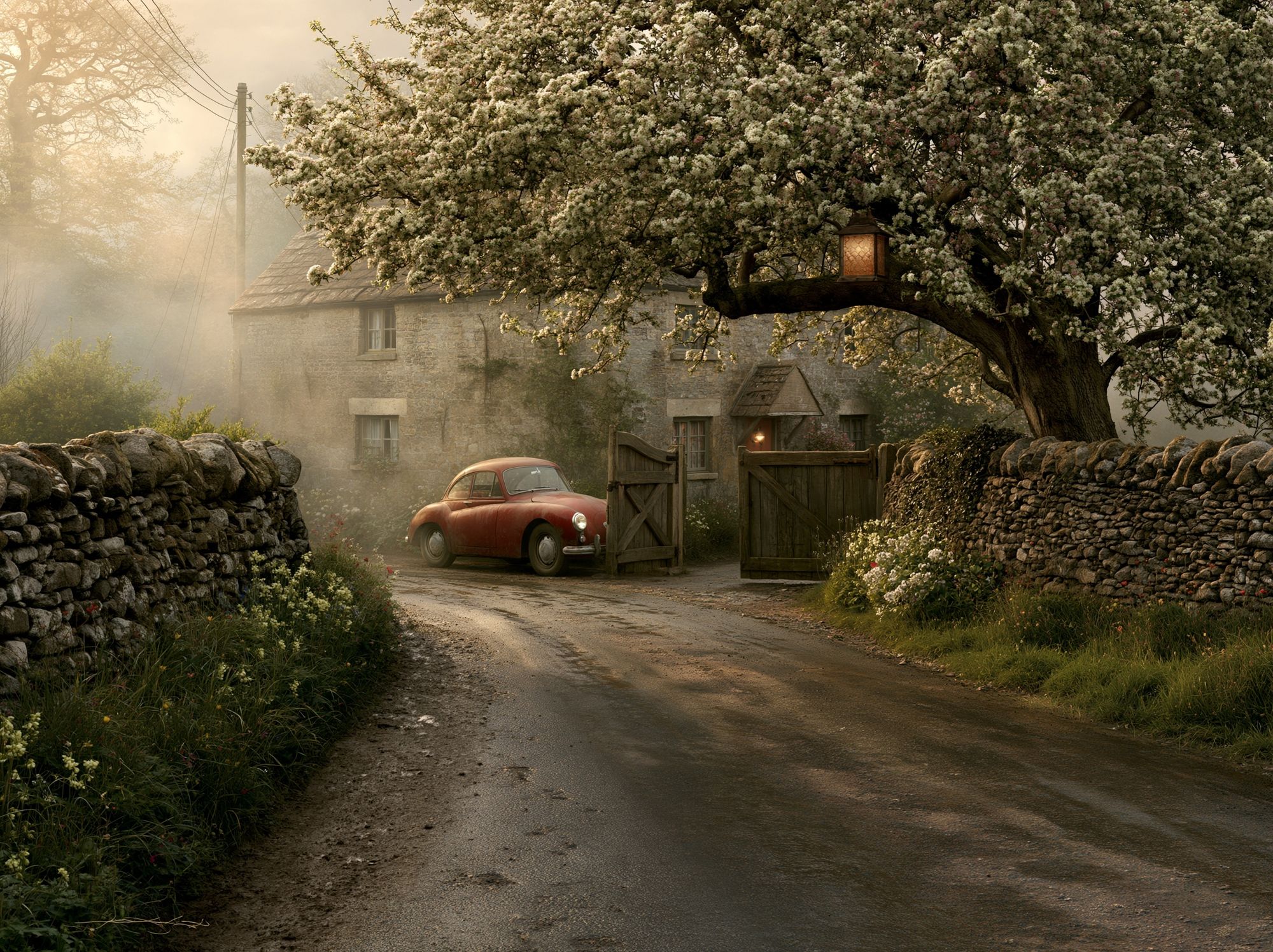
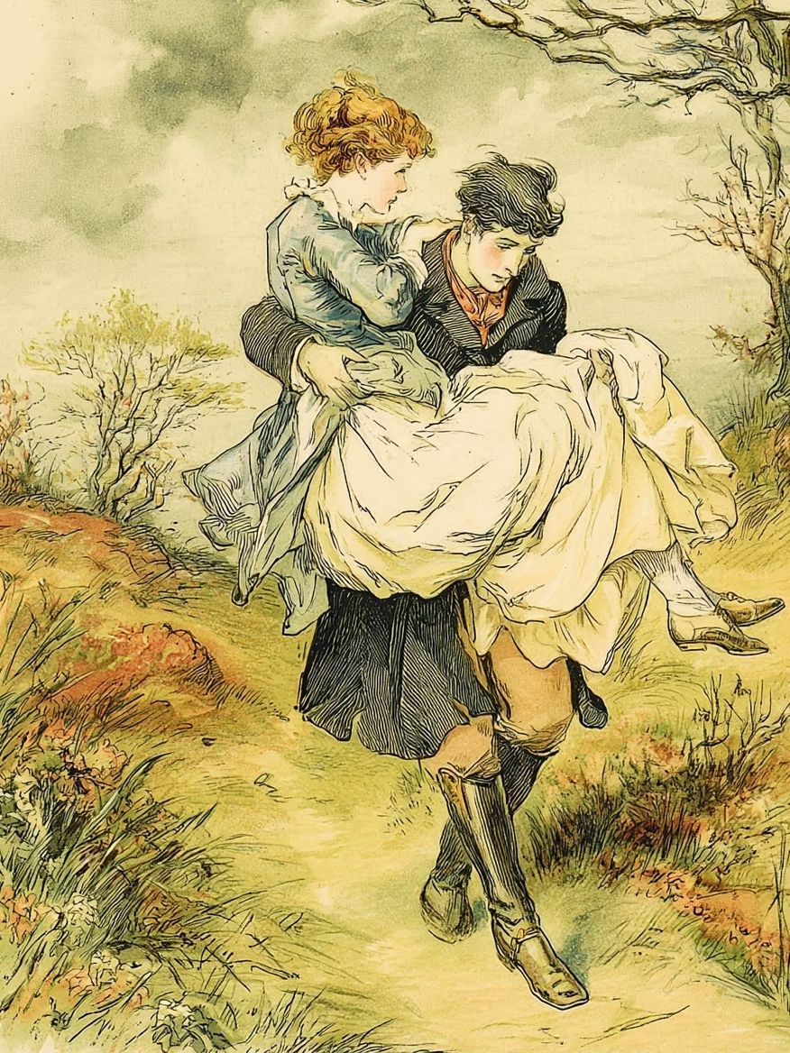
If you want the art to carry that nostalgic mood immediately, choose imagery with architecture or rural storytelling. Countryside Cottage Drive is a strong example — it has the sense of place that makes one framed piece feel decorative and atmospheric at the same time.
Choosing the Right Poster Print for the Room
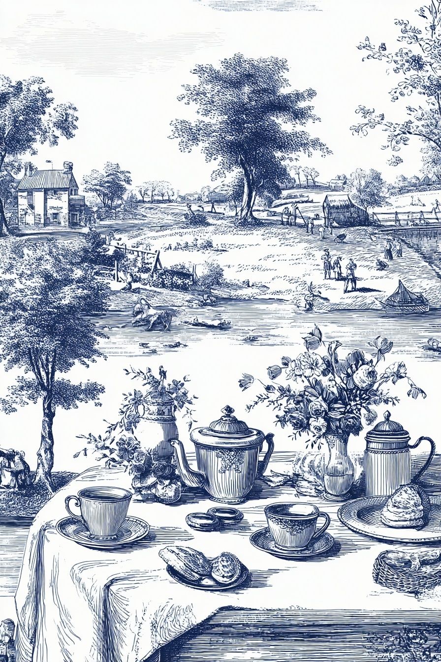
Different rooms benefit from different subjects and sizes. In a kitchen or breakfast nook, smaller prints in 30x40 cm or 40x50 cm work well because they can sit comfortably above a shelf, dresser, or narrow wall section. Look for intimate subjects — teacups, country lanes, flower studies, or village details. In that setting, Tea Time in the Countryside feels especially apt because it reflects the domestic, welcoming rhythm of the room.
Bedrooms tend to suit quieter imagery. A restful scene above the bed should not feel too busy from a distance of 2 to 3 metres. Soft landscapes, windows, and misty trees work well in 50x70 cm or 61x91 cm formats. Pieces such as Window with Sheer Curtain or selections from our nature art collection create calm without flattening the room.
Hallways and entryways can handle a slightly more narrative print because people view them while moving. Cottage roads, village facades, and architectural details give those transition spaces more character. If the wall is narrow, use one vertical frame about 40x50 cm; if it is wider than 120 cm, try a pair of 50x70 cm prints spaced 7 to 10 cm apart.

For living rooms, use scale more confidently. A single country cottage poster print above a sofa usually looks balanced when the frame width covers around 60 to 75 percent of the sofa's width. For a 200 cm sofa, that means one large piece around 100 to 140 cm wide including frame, or a pair of coordinated 50x70 cm prints.


Best Colours to Pair with Cottage Interiors
Country cottage styling works because the wall art echoes the room's existing tones rather than competing with them. Cream walls, sage cabinetry, pale blue textiles, and honey-toned wood all support artwork with a low-saturation palette. If your room already has two dominant colours — for example cream and green — choose a print that introduces one accent shade only, such as muted yellow or faded terracotta.
For rooms with painted wood furniture, aim for colour repetition in at least three places. A sage note in the artwork can be repeated in a cushion and a ceramic vase. A dusty blue sky can connect with ticking-stripe fabric and a painted side table. This keeps the country cottage poster print integrated, especially in layered spaces where there are many small decorative objects.
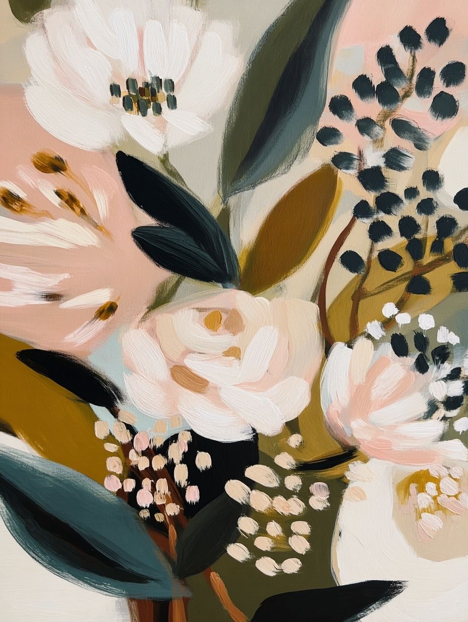
Avoid over-correcting with too much beige. Cottage interiors need warmth, but they also need contrast. A room that is 80 percent cream and tan benefits from prints with visible greens, sky blues, or floral blush tones. Our bohemian floral prints can be useful here in moderation, especially when a room needs softness from botanical forms rather than another neutral object.
Framing Ideas That Keep It Soft and Simple
The best frame for cottage art is usually understated. Natural oak, washed wood, matte off-white, and thin antique-gold finishes all work because they support the image instead of turning it formal. For most country scenes, a frame width of 1.5 to 2.5 cm looks balanced. Heavier mouldings can overwhelm softer prints unless the room has substantial furniture and higher ceilings.
Mounts matter too. A white or warm-ivory mount around 4 to 6 cm wide gives a vintage-inspired print breathing room and helps smaller artwork feel more substantial. This is especially useful if you are hanging a 30x40 cm print on a wall that otherwise risks looking empty. In relaxed interiors, avoid glossy black frames — they create too much visual weight and tend to look sharper than the rest of the room.

If you like a slightly collected look, mix finishes carefully. Use one dominant frame tone for about 70 percent of the wall arrangement, then introduce one secondary finish — perhaps antique brass or distressed cream — in the remaining pieces. That ratio keeps the display cohesive instead of cluttered.
Where to Hang a Country Cottage Poster Print
Placement should feel natural, not ceremonial. A country cottage poster print often looks better slightly lower than modern gallery conventions suggest because cottage rooms usually contain more furniture, lamps, and layered objects. As a rule, hang the centre of the piece around 145 cm from the floor, then adjust lower if it sits above a console, mantel, or headboard.
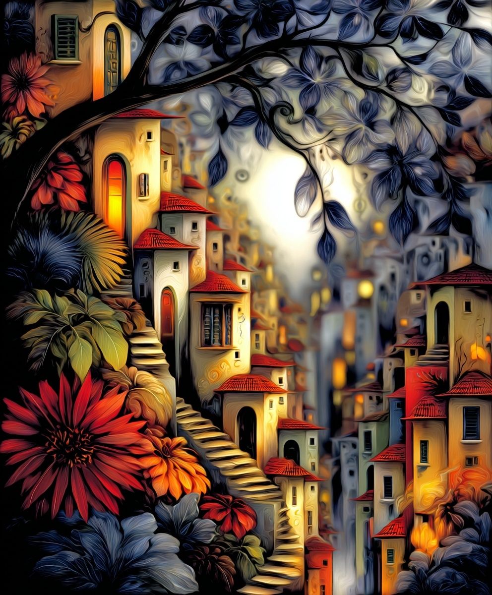
Above a mantel, leave 10 to 20 cm of space between the mantel surface and the frame. Above a bed, keep 15 to 25 cm. On shelves, lean the frame behind a small ceramic vase or candlestick to avoid a rigid look. This works especially well with intimate scenes such as Whimsical Village or Walking in the Misty Forest.
For narrow spots — between windows, beside a dresser, or at the end of a hallway — use vertical formats with architectural or tree-based compositions. For wider walls, one central piece plus two smaller companions often feels more relaxed than a strict grid.
How to Build a Cozy Cottage Wall Around It
The easiest way to make cottage art look intentional is to surround it with materials that already belong to the style. Mirrors with aged frames, small shelves, transferware ceramics, woven baskets, pressed flowers, and linen-covered lampshades all reinforce the same visual language. The goal is not to fill every gap — it is to create variation in texture around the wall art.
A good formula for a small gallery wall is 1 larger piece, 2 medium pieces, 1 mirror, and 1 object shelf. Keep spacing between frames at 6 to 8 cm so the arrangement reads as one composition. If the room is compact, stop at 5 to 7 total elements; beyond that, a cottage wall can quickly turn messy rather than charming.

To keep everything feeling personal, mix imagery types rather than repeating the same cottage facade three times. One house scene, one landscape, one bird or floral subject, and one interior view create more depth. You can browse across our illustration prints, vintage countryside art, and watercolor landscape prints to build that balance.
Final Styling Tips for a Relaxed Finish
Start with one piece you genuinely want to look at every day, then build around it slowly. A country cottage poster print feels most convincing when the room does not look bought in a single afternoon. Add one framed print first, test it with the textiles and wood tones already in the space, then introduce a second or third piece only if the wall still needs weight.
Keep the finish slightly imperfect. Linen textures, aged timber, brushed metal, and hand-thrown ceramics all help a country cottage poster print settle into the room naturally. If the colours are soft, the framing is simple, and the placement respects the furniture below, the result will feel timeless rather than themed.
Frequently Asked Questions
What frame size should I choose if my print is 50x70 cm?
A mount adds visual presence without changing the art itself — a 4 to 6 cm mount is a good fit. That usually brings the overall framed size close to 60x80 cm.
Can I mix cottage prints with more botanical artwork?
Yes, as long as the colours stay soft and natural. Keep at least one repeated tone — such as sage, cream, or dusty pink — across both pieces.
Do these prints work in a bathroom or utility room?
They can, but use a properly sealed frame and avoid hanging art where steam or splashes are constant. A wall opposite the bath or above towel hooks is usually safer than directly over a sink.
Should I use glass or acrylic in a busy family home?
Acrylic is lighter and more shatter-resistant, so it is often the practical choice for hallways, stairs, and children's rooms. Glass gives a slightly crisper finish but is heavier.