What Makes Country Cottage I Feel So Inviting
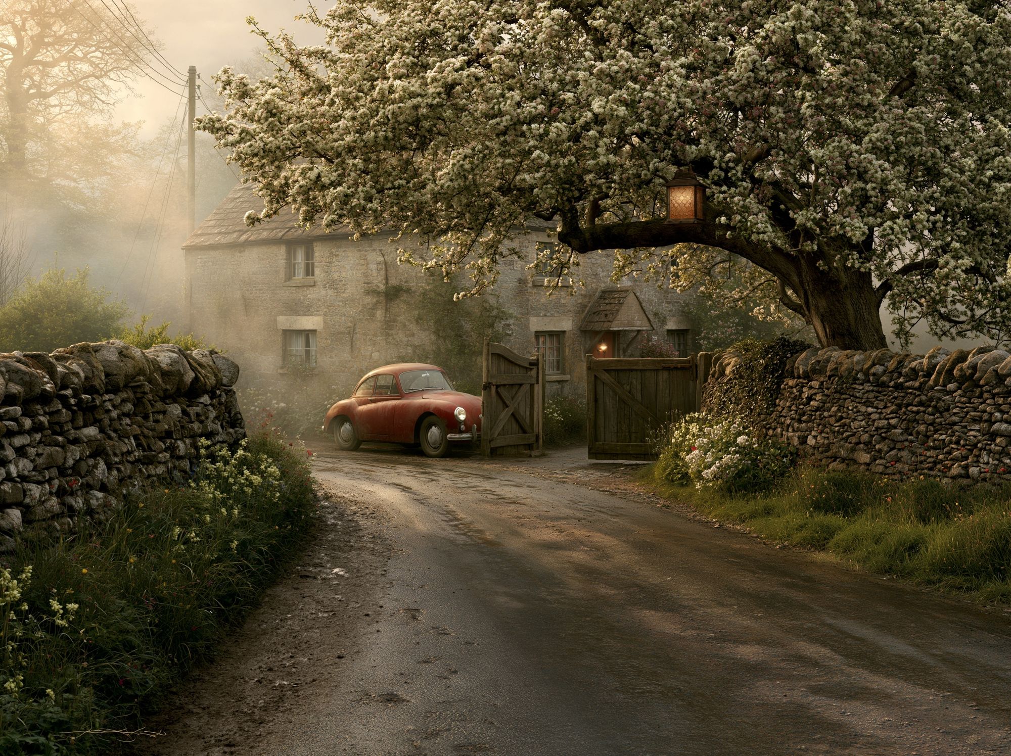
A country cottage i poster print works because it brings together three qualities that make interiors feel lived-in rather than styled for a photo: softness, familiarity, and gentle detail. Cottage imagery tends to rely on weathered architecture, garden planting, winding paths, and a calm horizon line. That combination lowers visual tension on the wall, which is why this style suits rooms meant for slowing down — kitchens, bedrooms, and sitting areas especially.
The most successful cottage-inspired art is rarely loud. Instead, it uses softened greens, chalky creams, faded sky blues, and earthy browns in a ratio that feels balanced — often around 60% light neutrals, 30% muted colour, and 10% darker definition. If you already like our vintage collection, painterly fine art prints, or countryside landscape wall art, this look sits neatly between all three.
A rural subject also brings structure to a room without feeling formal. A cottage, garden gate, or riverbank gives the eye a clear focal point, but the hand-painted or timeworn look keeps it warm. That is why a country cottage i poster print can soften newer interiors with flat paintwork, sharp cabinetry, or clean-lined furniture.
Where a Country Cottage Print Works Best
In kitchens, cottage wall art works best where the room already has practical texture — shaker cabinets, tongue-and-groove panelling, open shelving, or a scrubbed wood table. Hang one medium print, such as 40 x 50 cm, above a breakfast bench or on the wall beside a dresser. The goal is to add charm without competing with busy everyday surfaces like tiles, jars, and cookware.
Hallways are another strong fit because they benefit from art that feels welcoming from the first step inside. A cottage scene gives a narrow wall more depth, especially when hung above a slim console at roughly 145 cm from floor to centre. If you want a slightly more architectural interpretation of the look, Victorian Mansion Illustration introduces heritage character in a similar spirit.
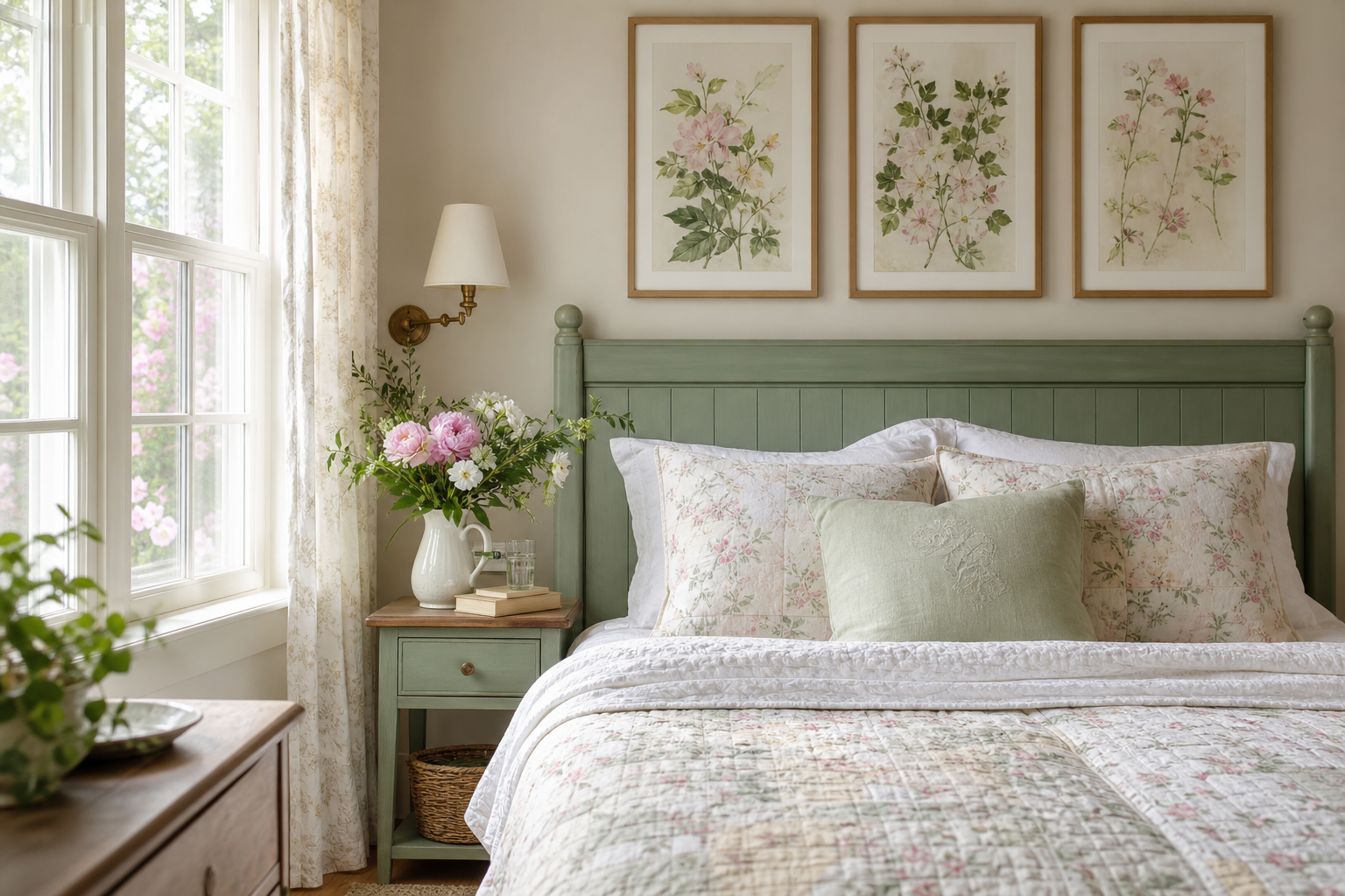
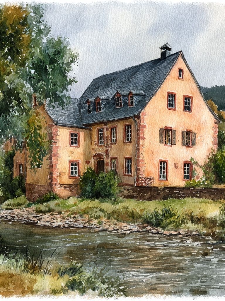
Bedrooms suit softer, more restful countryside scenes. Over a double bed, choose either one larger piece at 50 x 70 cm or a pair of smaller prints spaced 6 to 8 cm apart. The image should echo the room's calmest materials — washed cotton, quilted bedding, painted bedside tables. For a gentler, more painterly option, Charming Cottage by the River has the kind of quiet movement that sits well above a headboard.

Reading nooks and landings can take smaller art very well. A 30 x 40 cm print leaned on a narrow shelf or hung above a vintage chair is often enough. In these smaller moments, detail matters more than scale, so pieces like Watercolor Cottage Garden Print feel especially at home.
How to Style It with Colours and Materials
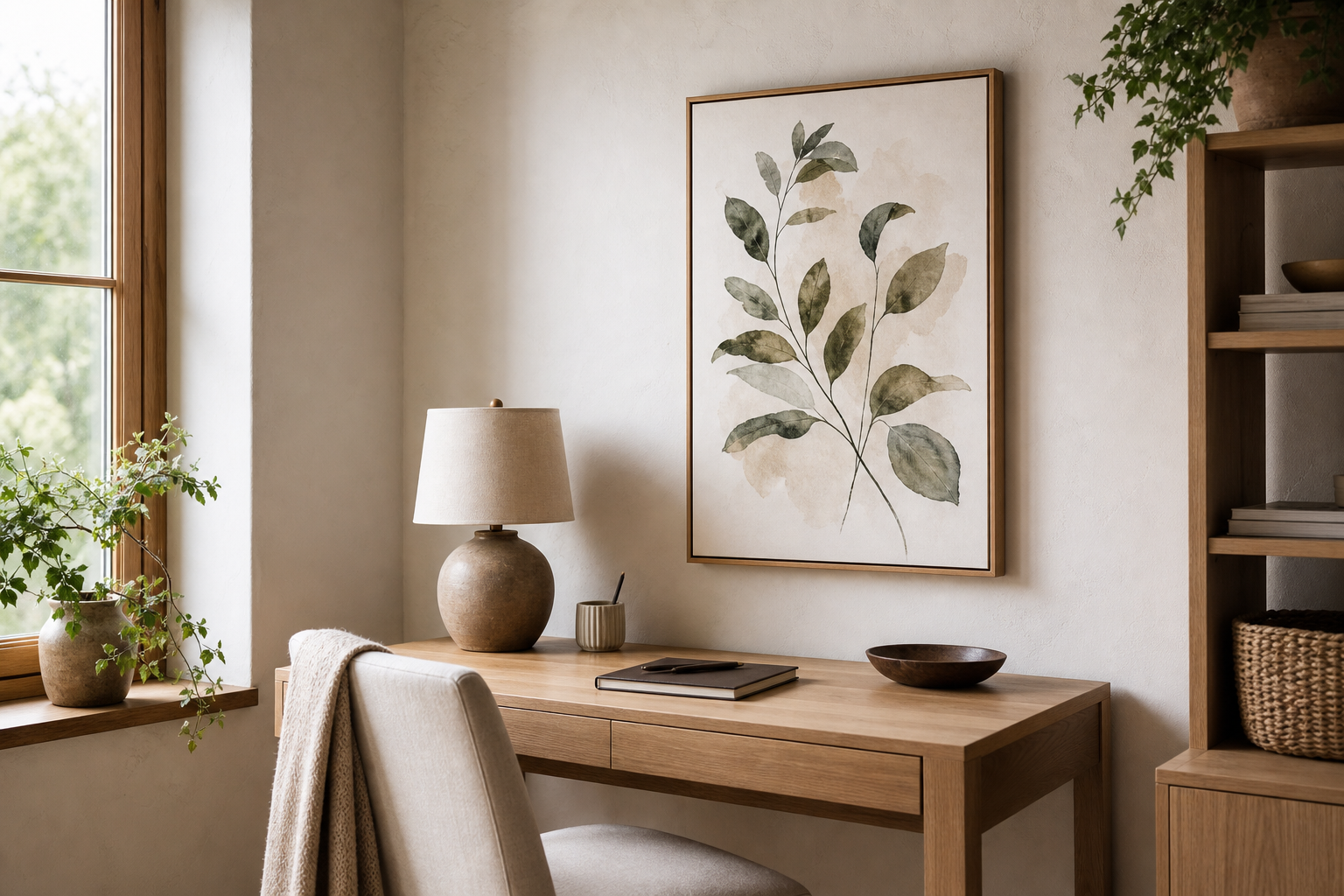
Country cottage styling depends less on buying "rustic" furniture and more on balancing finish and tone. Start with natural wood — oak, pine, ash, or painted timber with a visible grain. Then add one or two softened textiles such as flax linen, brushed cotton, or wool. A cottage print will look far more convincing against these materials than against glossy lacquer, mirrored furniture, or ultra-cool grey surfaces.
For colour, think heritage shades rather than stark contrast. Sage, buttercream, faded terracotta, dusty blue, and warm white all support the look. If your wall is painted, soft off-white or pale mushroom gives the artwork enough definition without a harsh border. A useful rule is to repeat one colour from the artwork at least twice elsewhere in the room — for example, a green seen in leaves can return in a lampshade and a seat cushion.

Pattern should be used carefully. A striped seat pad, small floral curtain, or checked throw can work beautifully, but keep the scale varied. If the art is detailed, choose broader and quieter fabric patterns. If the art is more open and airy, a tighter floral or ticking stripe can add the extra layer that stops the room feeling sparse. Prints from our bohemian art collection with floral detail can also pair well when the palette stays muted rather than bold.
Choosing the Right Size and Placement
Scale is where many cottage interiors either settle beautifully or start to feel cluttered. For a single wall piece above a console, dresser, or armchair, 40 x 50 cm and 50 x 70 cm are the most flexible sizes. Over a sofa around 180 to 220 cm wide, the artwork or grouped arrangement should cover roughly 55% to 70% of the furniture width — enough to anchor the area without stretching wall to wall.
If the print stands alone, leave at least 15 to 20 cm between the frame and the top of a piece of furniture beneath it. If you are hanging at eye level in a passage or kitchen, aim for the centre of the image to sit between 145 and 150 cm from the floor. In bedrooms, that can drop slightly lower when placed above a bed so the arrangement feels connected to the furniture.
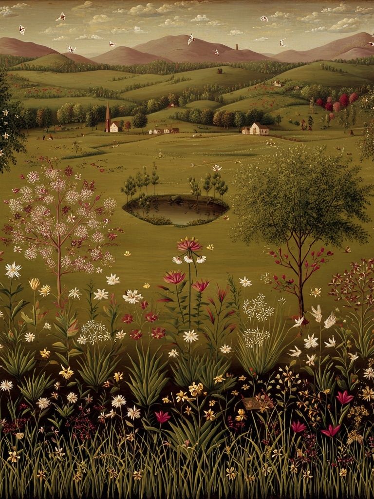
A single cottage print works best when the surrounding wall is already interesting — panelling, hooks, a lamp, or a console beneath it. If the wall is large and plain, pair the main piece with two or three related works instead. Landscape subjects such as Serene Countryside Landscape Poster or village scenes from Whimsical Village help build that expanded story without losing the rural mood.
Framing Ideas That Suit the Cottage Look
The best frames for cottage-style art are simple, tactile, and slightly understated. Natural oak is the easiest choice because it adds warmth without darkening the artwork. White-painted wood suits brighter country interiors, especially if the room already has white trim, cabinetry, or beadboard. A frame width of 1.5 to 2.5 cm usually feels right for prints around 30 x 40 cm to 50 x 70 cm.
If your room has more age and character — antique brass handles, darker floorboards, older furniture — try a frame with a gently aged finish. Nothing too ornate is needed. A narrow vintage-inspired profile can pull out the nostalgic side of the image while keeping it useful for everyday interiors, not just period homes.

Minimalist black frames are still possible, but they need support from the room. They work best when you want to stop a sweet or pastoral subject from becoming overly decorative. In a cottage-modern room with cleaner lines, a thin black frame can add just enough contrast to sharpen the whole composition.
How to Build a Cosy Gallery Wall Around It
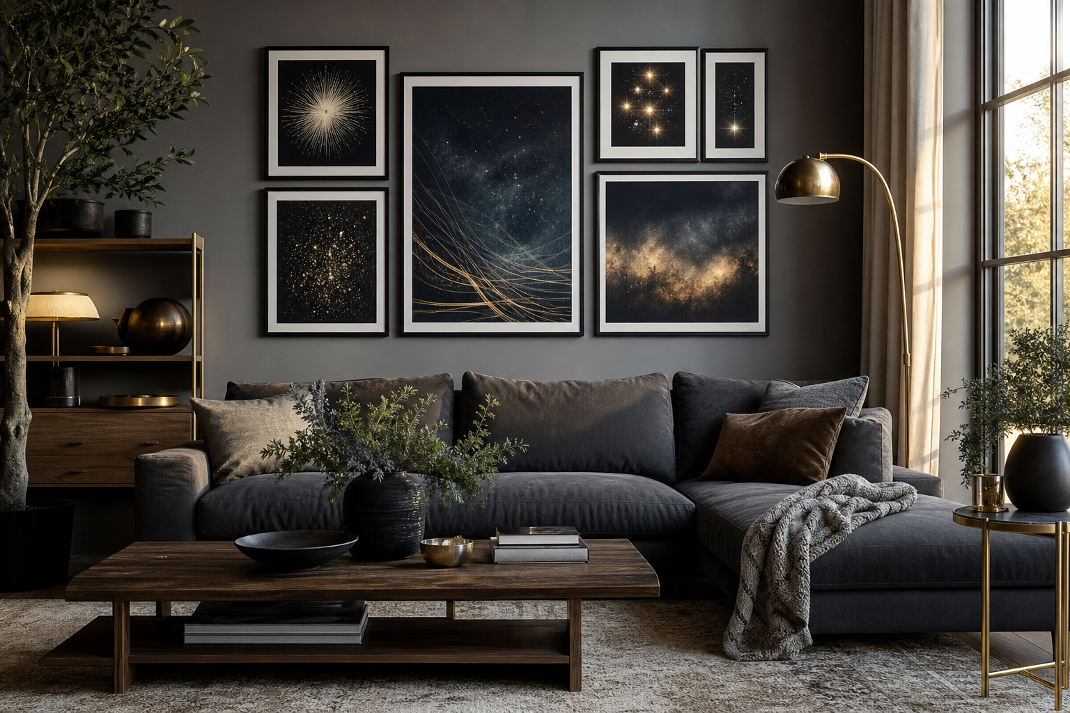
A cottage gallery wall should feel collected, not symmetrical to the millimetre. Start with the hero piece in the centre or slightly off-centre, then build outward with 3 to 5 supporting works. Keep gaps between frames at 5 to 7 cm. That spacing is close enough to feel unified but open enough for each piece to breathe.
The easiest supporting subjects are gardens, village views, floral studies, and gentle landscapes. Mix one architectural image, one botanical or floral image, and two softer landscape scenes for a balanced set. This stops the wall becoming repetitive while staying clearly within the same story.

Texture around the frames matters as much as the art itself. Add a pleated lampshade, stacked hardbacks, a ceramic jug, or a small branch clipped from the garden. These details make the wall feel integrated into the room rather than pinned on afterward.

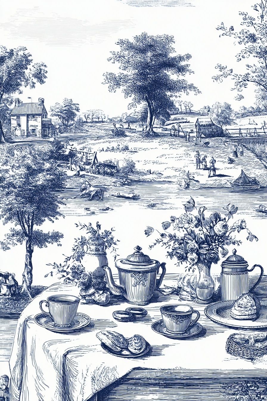
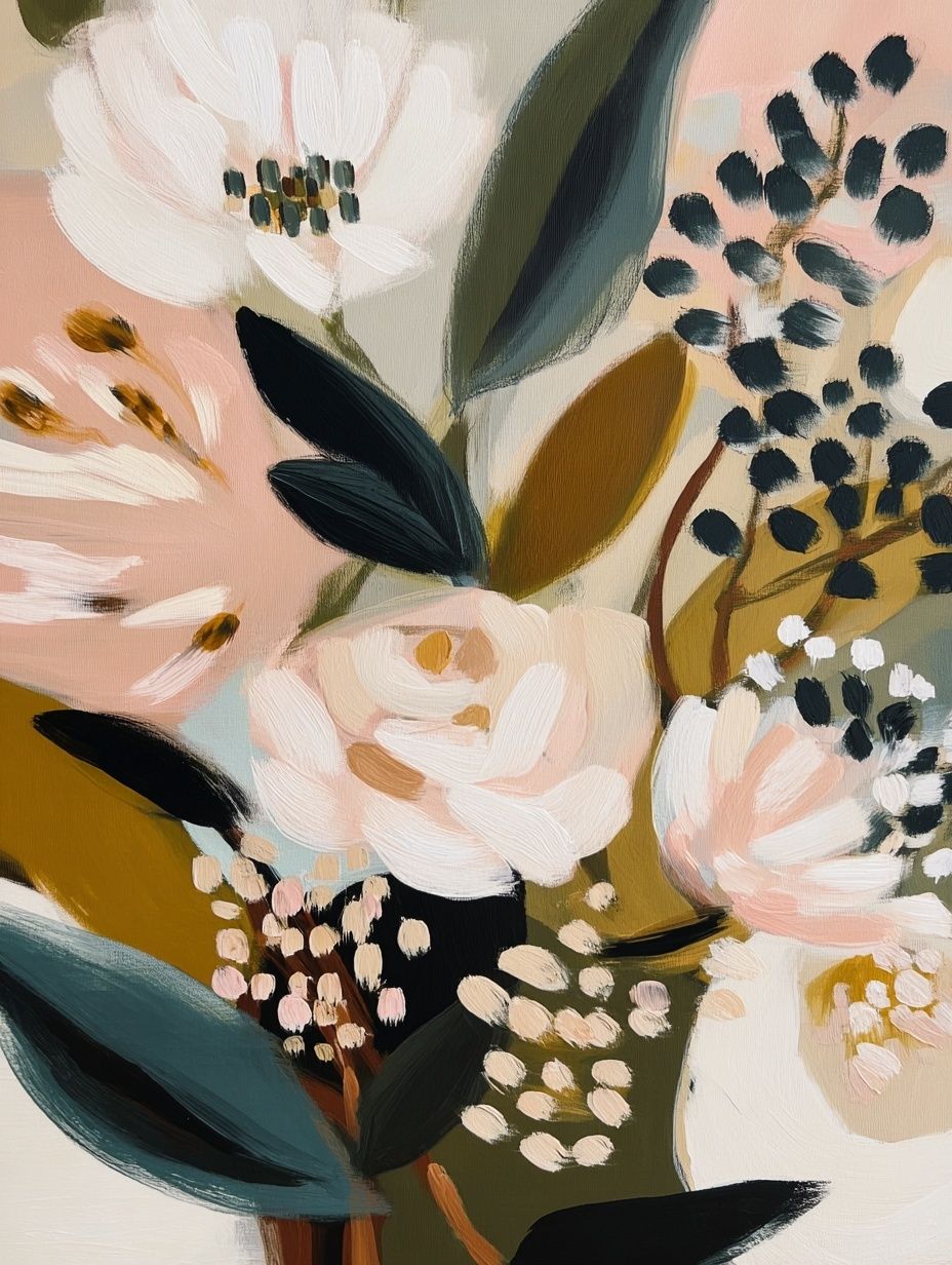
If you want a more layered arrangement, combine your main cottage piece with Tea Time in the Countryside, Floral Bouquet — Bohemian Print, or Windmill and Tulip Field. Each adds a different note — domestic charm, floral softness, or wider landscape depth — without pulling the scheme away from its cottage base.
Final Styling Tips for a Polished Country Feel
A polished cottage interior is usually edited more carefully than people expect. Keep the palette to three or four main tones, repeat wood finishes across the room, and avoid filling every wall. One well-placed country cottage i poster print with a good frame and proper breathing space will often do more than a crowded arrangement of smaller pieces.
When shopping, match the artwork to the room's existing age and mood. If the furniture is painted and light, choose softer watercolour scenes. If the room has darker woods or vintage details, lean into more nostalgic or antique-feeling pieces from Countryside Cottage Drive or the wider illustration wall art collection. The result should feel calm, useful, and easy to live with every day.
Frequently Asked Questions
What frame colour works best if my walls are cream?
Light oak and soft white are the safest choices. Oak adds warmth, while white keeps the look airy if the room already has painted trim.
Can I hang cottage-style art in a modern apartment?
Yes — use one or two pieces only, keep frames simple, and pair them with clean furniture lines. The contrast often makes the room feel warmer and less stark.
Should I use glass or acrylic for a kitchen print?
Acrylic is lighter and practical in busy areas, especially if the print hangs near a dining table or family walkway. Keep it away from direct heat and heavy steam.
What other decor pairs well with a country cottage print?
Ceramic pitchers, pleated lampshades, woven baskets, linen runners, and small antique brass accents all work well. Choose two or three, not all of them at once.