Why Butterfly on Pink Flower Art Feels So Captivating
A butterfly on pink flower print works because it combines two naturally delicate subjects in one composition. Butterflies bring movement and lightness, while pink flowers add softness and romance. On a wall, that pairing reads as gentle rather than busy, especially when the artwork uses negative space, pale backgrounds, or painterly detail.
This motif also sits in a useful middle ground between botanical and animal art. It feels more lyrical than a strict floral study, and less literal than a wildlife print. That makes it easy to place alongside our botanical collection, animal art prints with a softer mood, and even airy pieces from the nature wall art range without making a room feel themed.
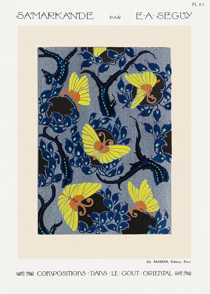
If you want a version with decorative historical character, Art Nouveau butterfly imagery has the same flowing, romantic line quality that makes pink floral art so appealing.
A soft subject matters most in rooms where you want visual calm. Strong contrast art can sharpen a space, but a butterfly and blossom composition usually lowers the visual noise level. That is why it suits areas designed for rest, getting ready, reading, or slow mornings.
The Colours That Make It Work
Pink is not one colour in interiors. A dusty rose print feels grounded and grown-up, a powder pink print feels airy, and a stronger peony pink can become a clear focal point. If your walls are white, warm ivory, greige, or pale taupe, pink floral art will usually look warmer and more dimensional than it does against cool grey paint.
The best support colours are quiet ones. Think oatmeal, sand, cream, pale sage, soft brown, and muted green. These tones let a butterfly on pink flower image stay romantic without turning sugary. Black can work too — but only in thin frame lines, lamp details, or one or two small accents. Keep dark contrast under 15% of the room palette if you want the artwork to stay soft.

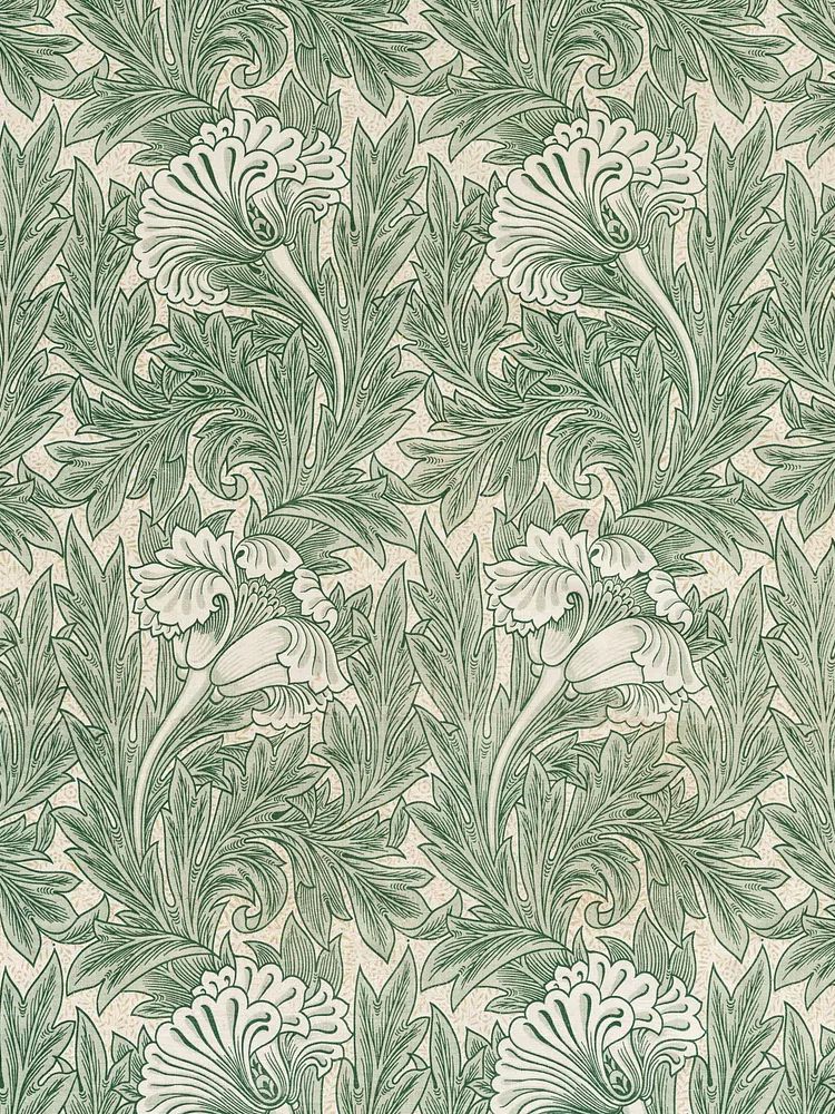
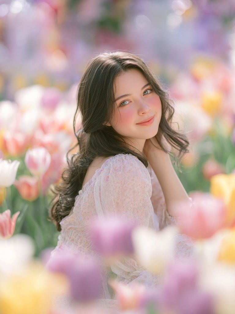
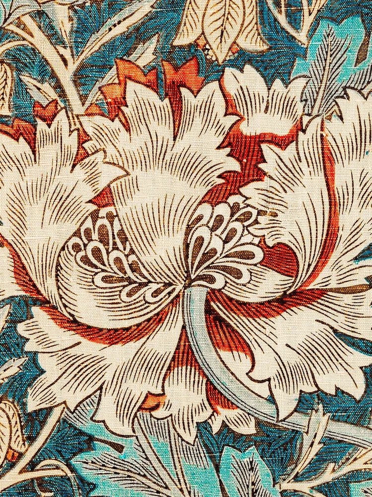
If the artwork includes green stems or leaves, it becomes easier to connect with other nature-led pieces. That is where prints such as Honeysuckle by William Morris, the Green Tulip vintage print, or the Woman in Tulip Field photograph can help build a palette around blush, green, and cream rather than pink alone.

Colour intensity should guide size choice. A pale, low-contrast print can be larger — 50x70 cm or 70x100 cm — because it does not dominate the room. A brighter pink piece often looks better at 30x40 cm or 40x50 cm, especially in compact spaces where too much saturated pink can close the room in.
Best Rooms for a Soft Floral Motif
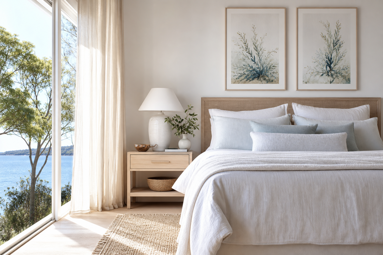
Bedrooms are the most natural fit. Above a 140 to 180 cm bed, choose one central piece around 50x70 cm, or a pair of smaller companion prints around 30x40 cm each. The subject supports the room’s purpose, and the gentle imagery reads well from both close up and across the room.

Nurseries also benefit from this motif because it feels tender without relying on cartoon styling. Stick to muted pink, ivory, and sage rather than bubblegum tones. In a nursery, 30x40 cm is often enough over a dresser or reading chair, with the frame hung at adult eye level — roughly 145 cm from floor to centre — so it still looks right as the room evolves.
Dressing areas and vanity corners suit floral-butterfly art for a different reason: reflection and ritual. A mirror, a small upholstered stool, and one romantic print can make even a narrow 80 cm wall feel finished. If you like figurative softness in that zone, Woman with a Parasol or Woman in Yellow Flowers pair well with butterfly imagery because they share lightness and an outdoor floral mood.
Living rooms need a more measured approach. A butterfly on blossom print works best there when the rest of the room is restrained — plain upholstery, low-contrast textiles, and no more than one or two other floral patterns. In busier rooms, detailed nature art can disappear.
How to Style It on the Wall
As a solo piece, this motif looks strongest when the print has enough breathing room. Leave at least 15 to 25 cm between the frame and nearby furniture edges. Above a console, the artwork should cover roughly 50% to 75% of the furniture width. So for a 120 cm console, aim for a framed width between 60 and 90 cm.
Frame choice changes the feel fast. Light oak keeps the look natural and Scandinavian. White frames make pale backgrounds feel crisp. Thin brushed gold adds romance — but use it sparingly, especially if the pinks are already rich. Wide black frames tend to overpower delicate subjects unless the artwork itself has strong line work.
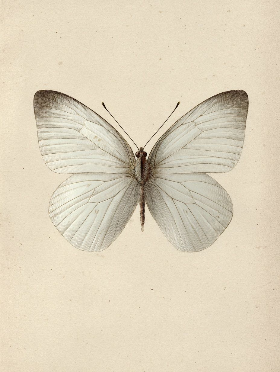
For a gallery wall, treat the butterfly print as the emotional anchor rather than the biggest piece by default. Place it slightly off-centre and build around it with floral studies, light landscape art, or one bird illustration. Pieces like Swallows in Flight bring motion without repeating the same subject too literally, while the vintage chrysanthemum flower print adds structure through petals and pattern.

Keep spacing tight and even — usually 5 to 8 cm between frames. In a romantic arrangement, symmetry is not essential, but alignment is. Use one clean bottom line or one shared vertical edge so the wall looks considered rather than scattered.
Pairing It with Other Prints and Decor
The easiest mistake is making the room feel overly sweet. To avoid that, pair soft floral-butterfly art with materials that have some weight: oak, walnut, linen, boucle, matte ceramic, plaster, and aged brass. These textures stop pink from feeling decorative-only.
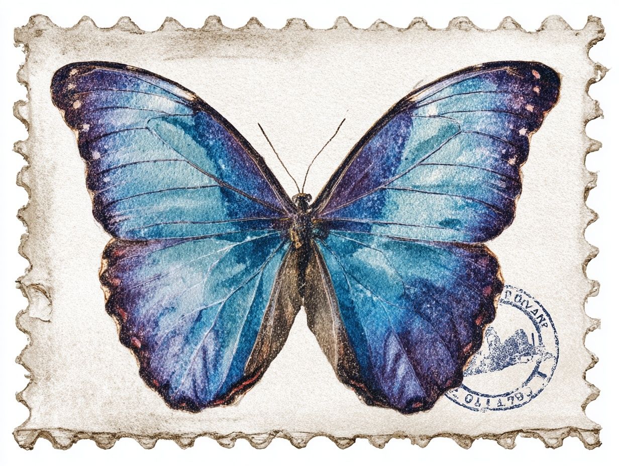
A good companion print should echo one quality, not all of them. If your main piece already has pink and butterflies, choose a second print for its greenery, line work, or atmosphere. William Morris's Honeysuckle, the Blue Butterfly vintage print, or a serene landscape watercolor all support the theme from different angles.
Textiles should stay one step quieter than the wall art. If the print is detailed, choose solid bedding, a low-pattern rug, or a stripe no wider than 1 to 2 cm. If the print is minimal and airy, you can add a floral cushion or scalloped lamp shade without overloading the room.
Fresh or dried flowers help, but keep them tonal. Pale pink ranunculus, blush peonies, white cosmos, or dried bunny tails will connect naturally. One arrangement is enough. Repeating pink flowers on every surface weakens the impact of the art.
Wrap-Up: Choosing the Right Butterfly on Pink Flower Print
Choose your butterfly on pink flower print by asking three practical questions: how soft is the room already, how large is the wall, and do you want the piece to read botanical, romantic, or vintage. A pale print with open background suits larger walls and calm bedrooms. A more detailed vintage version suits smaller framed moments, layered shelves, or intimate corners.
Pay attention to scale, frame finish, and surrounding colour before you buy. If the room already has warm woods and cream textiles, a pink floral butterfly piece will usually slip in easily. If the space is cooler or more graphic, add one bridging element — sage, ivory, or muted floral detail — so the artwork feels integrated rather than isolated.
Frequently Asked Questions
What frame colour works best for butterfly and pink flower art?
Light oak is the safest choice for a soft natural look. White suits airy rooms, while thin gold works best when used in just one or two accents nearby.
Can this type of print work in a room that is not pink?
Yes. It sits well in cream, sage, taupe, and warm white rooms because the floral tones act as an accent rather than the full palette.
What paper finish looks best for delicate floral-butterfly imagery?
A matte finish usually looks better than gloss because it reduces glare and keeps soft colours looking velvety. It also makes vintage and painterly detail appear more refined.
How high should I hang a butterfly floral print above furniture?
Leave 15 to 25 cm between the bottom of the frame and the top of the furniture. That gap keeps the print visually connected to the piece below it.
What art pairs well with a butterfly on pink flower print without feeling repetitive?
Choose one supporting theme only — botanical foliage, soft landscapes, or light bird illustrations. That keeps the wall layered rather than overly matched.