Why Black and White Wings Work So Well
Black and white wings carry two strong design qualities at once: contrast and movement. The palette is reduced to its essentials, so every feather edge, shadow, and curve reads clearly from across the room. That makes black and white wings especially effective in spaces that need one focal point rather than many competing accents.
Wing imagery also has a natural rhythm that softens strict architecture. In a room full of straight lines — square sofas, flat-front cabinetry, narrow shelves — curved feather shapes add relief without introducing extra color. If you already like minimalist wall art or abstract monochrome prints, wing-inspired pieces sit comfortably in that visual language because they feel sculptural rather than decorative.
A practical advantage is flexibility. Black and white wings work with warm white paint, cool gray plaster, oak flooring, black metal lighting, and even darker charcoal walls. Unlike colorful statement art, they do not force you into one accent color story. That is why this look works equally well in calm Scandinavian rooms and more dramatic boutique-hotel interiors.
Choosing the Right Style of Wing Print
The style of the artwork matters more than the subject alone. Photographic wing art tends to feel precise and atmospheric, with strong detail in the feather texture. Illustrated wings often feel lighter, cleaner, and slightly more graphic — better for pared-back interiors where you want definition without visual heaviness.
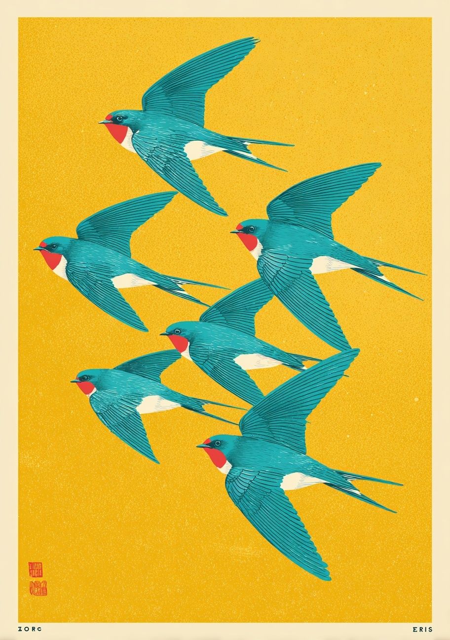
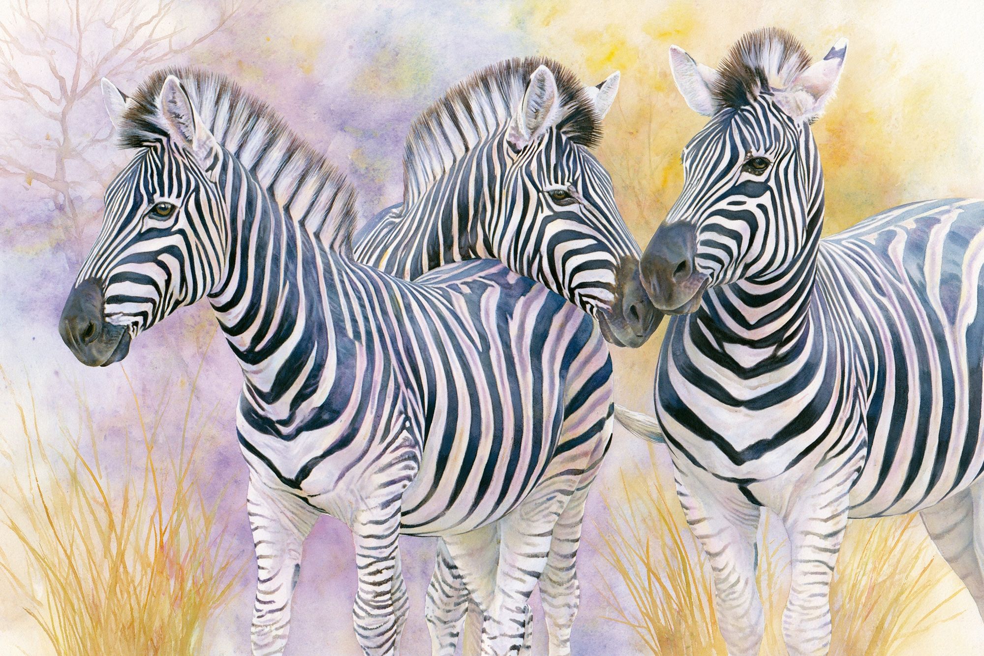
If your room already has visible texture — bouclé, linen, ribbed wood, limewash paint — choose a sharper, cleaner composition so the wall art does not get lost. If the room is very smooth and architectural, a more layered or textured piece can add depth. This is also where neighboring art styles help. A piece like Swallows in Flight shows how wing-related imagery can create lift and motion without feeling dense or dark.
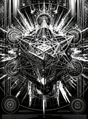
Vintage-inspired wing art usually suits classic black frames, off-white mounts, and quieter rooms. High-contrast graphic wings, by contrast, can handle frameless acrylic, slim metal frames, or oversized formats. If you want the same monochrome tension but in a more symbolic direction, Sacred Geometry Black-White gives a similarly striking presence through line and contrast rather than feather detail.
For softer interpretations, look at prints that rely on silhouette, texture, or negative space. White Flower Silhouette and Torn Paper Black and White are useful references for how a black-and-white composition can stay airy. That balance matters if you want black and white wings to feel elegant rather than heavy.
Best Rooms for Black and White Wings

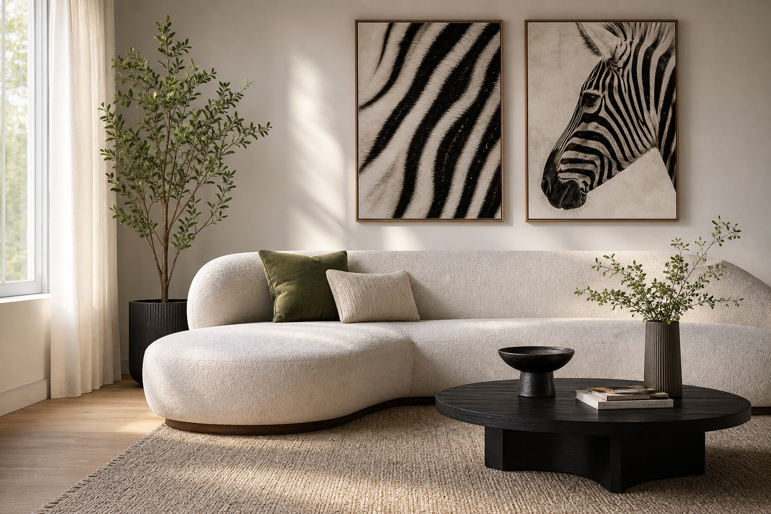
Living rooms are the easiest place to use black and white wings at scale. A large piece above a 200 to 240 cm sofa can visually anchor the whole seating zone. For most sofas, artwork around 60 to 75 percent of the sofa width works best — roughly 120 to 180 cm wide in total. The wing motif adds drama, but the monochrome palette keeps the room cohesive.
Bedrooms are often even better. A headboard wall already asks for symmetry, softness, and a sense of calm. Black and white wings fit because they bring movement without bright color stimulation. If you want a lighter bedroom mood, pair the artwork with pale bedding, warm timber, and soft cream curtains. If you prefer a darker scheme, repeat black in two or three places only — for example in the frame, bedside lamps, and one bench leg or mirror edge.
Hallways benefit from the verticality of wing imagery. Narrow walls, especially those between 80 and 120 cm wide, often suit a tall single print in 50x70 cm or 70x100 cm. In a transitional space, the motif feels intentional and directional — ideal where you want the eye to travel forward.
Creative workspaces are another strong match. A studio desk, home office, or reading corner often has practical furniture and little softness. A monochrome wing print introduces imagination without becoming distracting. Pair it with other clean-lined pieces from our fine art collection or nature-inspired wall art if you want the room to feel curated rather than themed.
How to Size and Place the Artwork
A single statement print is usually the cleanest option. Hang the center of the artwork at about 145 cm from the floor in standard rooms, adjusting slightly lower if it sits above a sofa or bed. Leave 15 to 25 cm between the furniture top and the bottom of the frame so the art reads as connected to the furnishing, not floating above it.
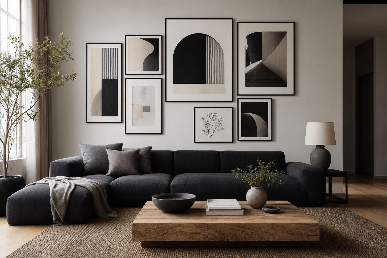
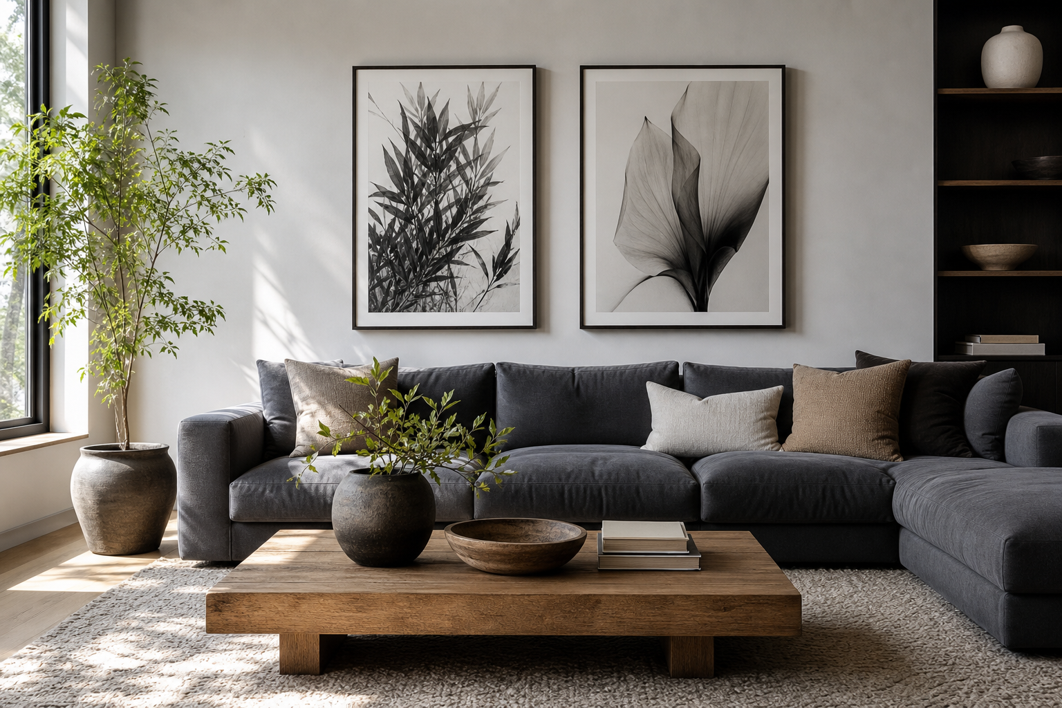
A pair works best when the wings are mirrored or when you want a more architectural arrangement. Above a queen bed, two 50x70 cm prints with 5 to 7 cm spacing create a measured, balanced look. Above a larger sideboard, two 70x100 cm pieces can make sense if the wall is at least 180 cm wide and the room has enough breathing space around them.

If you are not using literal wing art, choose supporting pieces that repeat the same visual logic: symmetry, feather-like texture, or strong black-and-white contrast. A print such as Textured Concrete Wall can work beside wing imagery because it adds atmosphere without competing for attention.


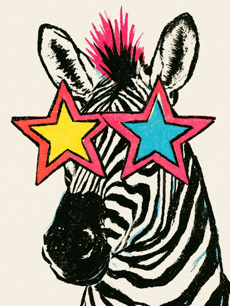
One common mistake is going too small. A 30x40 cm print above a full-size sofa usually looks incidental. If your wall is the main visual plane in the room, start at 70x100 cm for a single piece or build a grouped arrangement that spans at least 120 cm total width.
Framing, Finishes, and Palette Pairings
Black frames create the most dramatic interpretation of black and white wings. They sharpen the edges and make white walls look cleaner by contrast. Thin frames — around 1 to 2 cm face width — suit modern interiors, while chunkier gallery-style frames feel more architectural and better in larger rooms.
Oak or ash frames soften the mood. They are particularly useful if the room already has warm timber flooring or beige upholstery. This keeps monochrome art from feeling cold. White frames are the least assertive option and work best when the print itself has enough internal contrast to hold the wall.
Matte finishes almost always beat glossy ones for this look. Matte glass or acrylic reduces reflections, which matters in rooms with windows opposite the artwork. If the piece contains fine feather detail, a white mount around 4 to 6 cm can make it feel more expensive and give the image room to breathe.
For palette pairings, keep the ratio disciplined. A reliable formula is 70 percent light base, 20 percent mid-tone texture, 10 percent black accents. That might mean white or pale greige walls, gray textiles, and then only a few black lines in frames, lighting, and hardware. If you need softer transition pieces around the wings, Elegant White Fabric and Textured White Abstract show how white-on-white texture can support dramatic focal art without flattening the room.
Styling Ideas for a Modern Monochrome Look

To make black and white wings feel intentional, repeat their visual contrast elsewhere in the room in small doses. Use one black floor lamp, one black vase, and one dark textile edge rather than ten scattered accents. Repetition in threes tends to look composed, while repetition in sevens or more often starts to feel forced in compact rooms.
Texture is what prevents monochrome rooms from looking flat. Mix washed linen, wool, plaster, smoked glass, ribbed wood, and brushed metal. In practical terms, if your wall art is sharp and graphic, your rug and curtains should do some of the softening. If the wing artwork is detailed and airy, furniture can stay more structured.
A layered arrangement also works well if the main piece is dramatic. Add one quieter supporting print nearby rather than a busy gallery wall. Torn Paper Black and White is a good example of a companion piece that keeps the palette consistent while reducing visual intensity.

Lighting changes the effect more than most people expect. Aim for side lighting or a ceiling spotlight angled around 30 degrees to reveal texture without glare. Warm bulbs around 2700K to 3000K keep black-and-white schemes from feeling sterile, especially in bedrooms and living rooms.
Wrap-Up: Making the Look Feel Intentional
Black and white wings succeed when the room around them is edited with the same discipline as the artwork itself. Choose one scale, one framing finish, and a limited accent palette, then let texture do the rest. The result is dramatic, but still calm enough to live with every day.
If you are building the scheme from scratch, start with the art first, then pull in supporting pieces from our minimalist collection, black-and-white abstract prints, or illustrative monochrome wall art. That approach keeps black and white wings as the hero while the rest of the room stays coherent.
Frequently Asked Questions
What frame color is safest if I change my decor often?
Matte black is the most flexible choice because it works with white, gray, wood, and darker wall colors. Natural oak is a close second if your home leans warm rather than cool.
Can black and white wings work on dark walls?
Yes — especially on charcoal, deep taupe, or muted olive walls. Use a white mount or lighter frame edge so the artwork stays distinct from the background.
Should I use glass or acrylic for larger wall art?
Acrylic is often better for sizes above 70x100 cm because it is lighter and easier to hang securely. Choose a matte version if the room gets strong daylight.
How far apart should paired prints be hung?
Keep 5 to 7 cm between smaller frames and 7 to 10 cm between larger ones. The gap should look deliberate but tight enough for the pair to read as one composition.
What textiles pair best with this look?
Linen, bouclé, wool, and velvet all work well because they add softness against the hard black-and-white contrast. Stick to solids or very subtle patterns so the wall art remains the focal point.