A botanical study i poster print works because it feels collected rather than trend-led. Botanical illustration has always sat in that rare middle ground between science and decoration: detailed enough to feel purposeful, soft enough to live easily in a home. That balance gives it longevity in spaces that need calm, structure, and a little visual history.
What Makes Botanical Study I Feel So Timeless
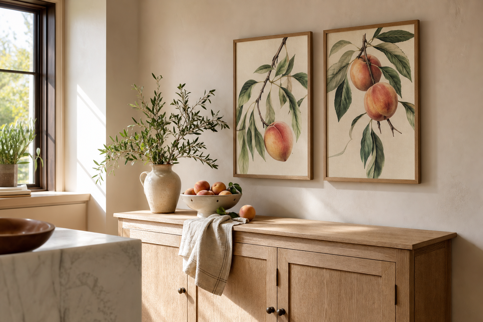
Traditional botanical studies were made to document plants with precision, which is why the composition often feels orderly and grounded. You usually get one central specimen, generous negative space, and muted natural colour — a format that still reads clean in modern rooms. If your interior leans contemporary, that restraint stops the artwork from feeling fussy. If your room is more classic, the heritage look helps it settle in immediately.
A botanical study i poster print also benefits from a palette that rarely dates: sage, moss, olive, cream, parchment, and soft brown. These are colours that already appear in timber furniture, linen upholstery, and stone-toned walls. That is why botanical art bridges styles so well, whether you pair it with minimalist art prints or a richer mix from our vintage collection.
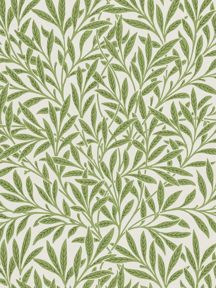
If you want a more decorative version of that timeless look, Arts and Crafts patterns are a strong companion. William Morris designs bring denser foliage and historical richness, which works especially well when you want the wall to feel layered rather than sparse.
The key is contrast in detail. A single specimen-style botanical print can anchor a wall, while surrounding furniture stays simple — think one oak console, one ceramic lamp, one textured rug. In practical terms, artwork with this much natural line work does best when the rest of the vignette stays within 2 to 3 dominant materials.
Where a Botanical Print Works Best
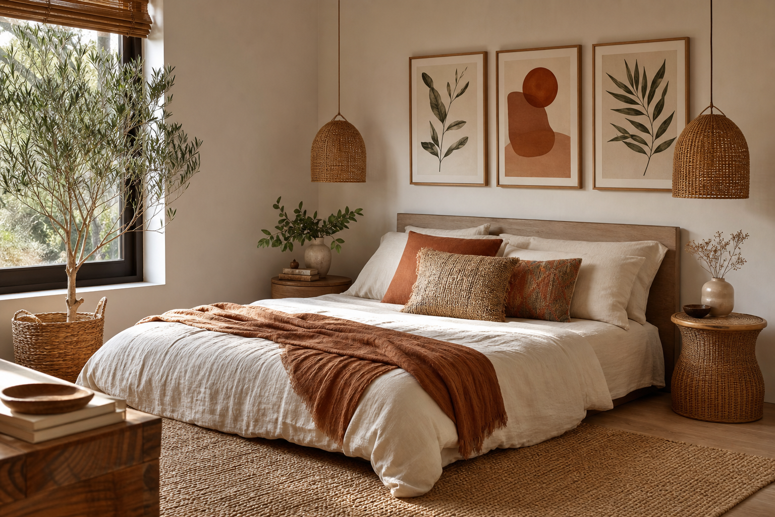
Bedrooms are the easiest place to start because botanical wall art supports a lower-contrast, slower visual rhythm. Above a queen bed, one large framed piece around 50x70 cm or 61x91 cm feels balanced. If your headboard is wide — roughly 140 to 160 cm — keep the artwork at about 60 to 75 percent of that width so it looks intentional rather than undersized.

In living rooms, the best placement is often above a sofa, sideboard, or reading chair rather than over a television. Botanical studies have fine detail, so they are more rewarding where people sit close enough to see the line work — around 1.5 to 2.5 metres away. A 70x100 cm piece above a 200 cm sofa gives enough presence without swallowing the wall.
Entryways benefit from botanical prints because they create a composed first impression without visual noise. A vertical piece works especially well over a narrow console table, especially if the hallway is under 120 cm wide. Pair it with a mirror only if the wall is at least 160 cm across; otherwise, let the print stand alone.
Home offices are another strong match, particularly if the room already includes wood shelving, a linen pinboard, or soft neutral paint. Botanical imagery keeps the wall active without becoming distracting during long desk hours. For that look, explore our botanical collection or mix in quieter landscapes from nature art prints.

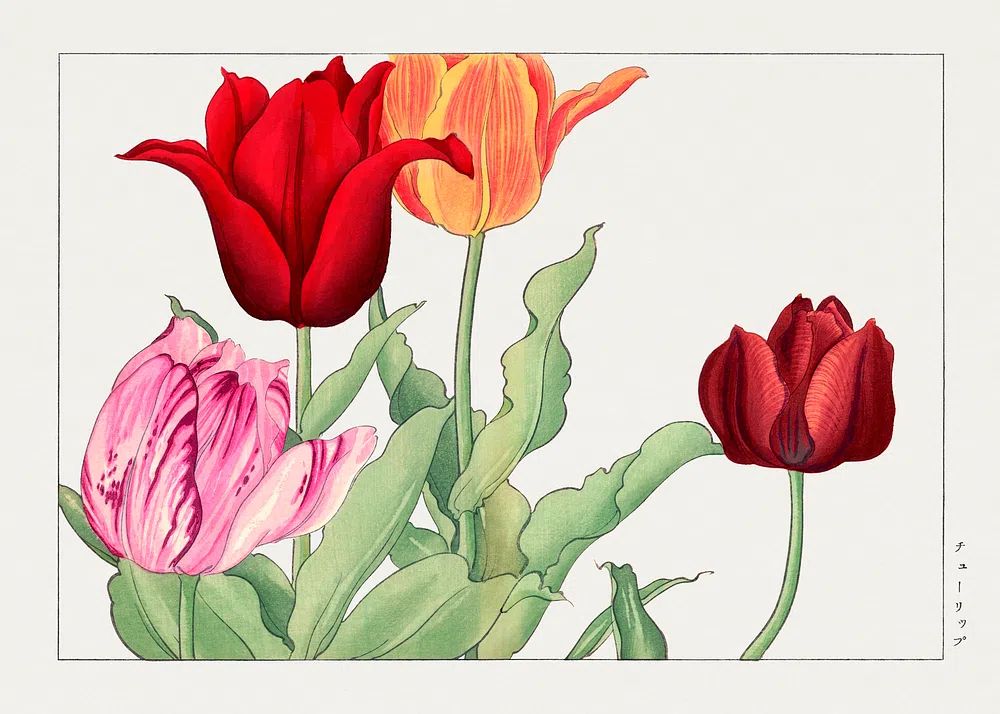
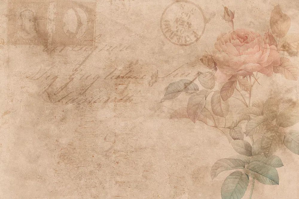

If you want a room to feel more layered, combine a specimen print with one or two related pieces rather than filling the whole wall. A considered trio has more impact than six loosely connected frames.
Choosing the Right Frame and Finish
Frame choice decides whether the print feels crisp, warm, formal, or relaxed. For most botanical art, oak frames are the safest option because they echo the natural subject matter and suit both Scandinavian and classic interiors. Black frames sharpen the edges and make pale backgrounds look cleaner — useful in more architectural rooms with white walls, metal lighting, or charcoal textiles.
White frames can work, but only if the wall colour is not too similar. If your paint is already warm white or ivory, a white frame can disappear unless the mount adds contrast. In that case, use an off-white mount with a 4 to 8 cm border to give the artwork definition.

For finish, matte glass is usually the smarter choice in bright rooms. It cuts glare from windows and ceiling spots, which matters if the art hangs opposite a south-facing window. Standard glass gives a slightly sharper image, but reflections can obscure delicate stems and labels. In rooms with uneven lighting, matte often wins on day-to-day usability.
A botanical study i poster print also looks stronger with breathing room around it. Mounting is not just decorative; it changes the perceived scale. A 30x40 cm print with a generous mount in a 40x50 cm frame can hold a wall far better than an unmounted frame of the same outer size. That is especially useful in hallways and offices where walls are visible at oblique angles.
For a more pattern-led companion piece, this Morris design brings depth without drifting away from the botanical story.
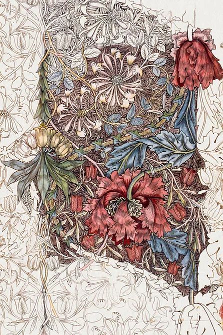
If you prefer a lighter, cleaner interpretation, pieces from White Flower Silhouette or Vase with Flowers can soften a gallery wall built around heritage botanicals.
How to Build a Calm Colour Palette Around It
Botanical art looks best when the room palette stays within a narrow band of natural colour. A simple formula is 60 percent warm neutral, 30 percent wood or green, and 10 percent darker contrast. In practice, that could mean cream walls, an oak dresser, sage cushions, and a single black lamp or bronze frame.
Green does not need to be literal or saturated. The most reliable shades are muted — eucalyptus, olive, lichen, and dusty moss. These tones support leaf detail without turning the room into a theme. If your print includes faded pinks, ochre, or terracotta, echo them only once or twice in smaller accents such as a cushion, book spine, or ceramic vessel.

Wood tone matters more than most people expect. Pale oak makes botanical prints feel fresher and more Scandinavian. Mid-tone walnut adds weight and suits vintage studies with cream paper backgrounds. If your room already has red-toned wood, keep surrounding textiles quiet so the artwork does not compete.
This is where category mixing can be useful. Pairing botanical detail with one landscape or bird illustration creates movement while keeping the palette nature-based. For example, Swallows in Flight works well beside a vertical plant study because it introduces air and spacing. If you want more painterly softness, Majestic Trees can round out the composition.
Sizing Ideas for Solo Display or Gallery Walls
For a solo display, use the wall width as your guide. Aim for the artwork, including frame, to cover roughly 55 to 75 percent of the furniture width below it. Over a 120 cm console, that usually means one piece around 50x70 cm. Over a 180 cm sofa, 70x100 cm or a pair of 50x70 cm frames often looks more resolved.
Gallery walls need a tighter system than most people think. Keep spacing between frames at 5 to 8 cm, and repeat at least one element across all pieces — frame colour, mount colour, or subject type. That repetition is what makes mixed artwork read as a set. A strong combination is one central botanical study, one floral pattern, one landscape, and one minimalist floral line piece.
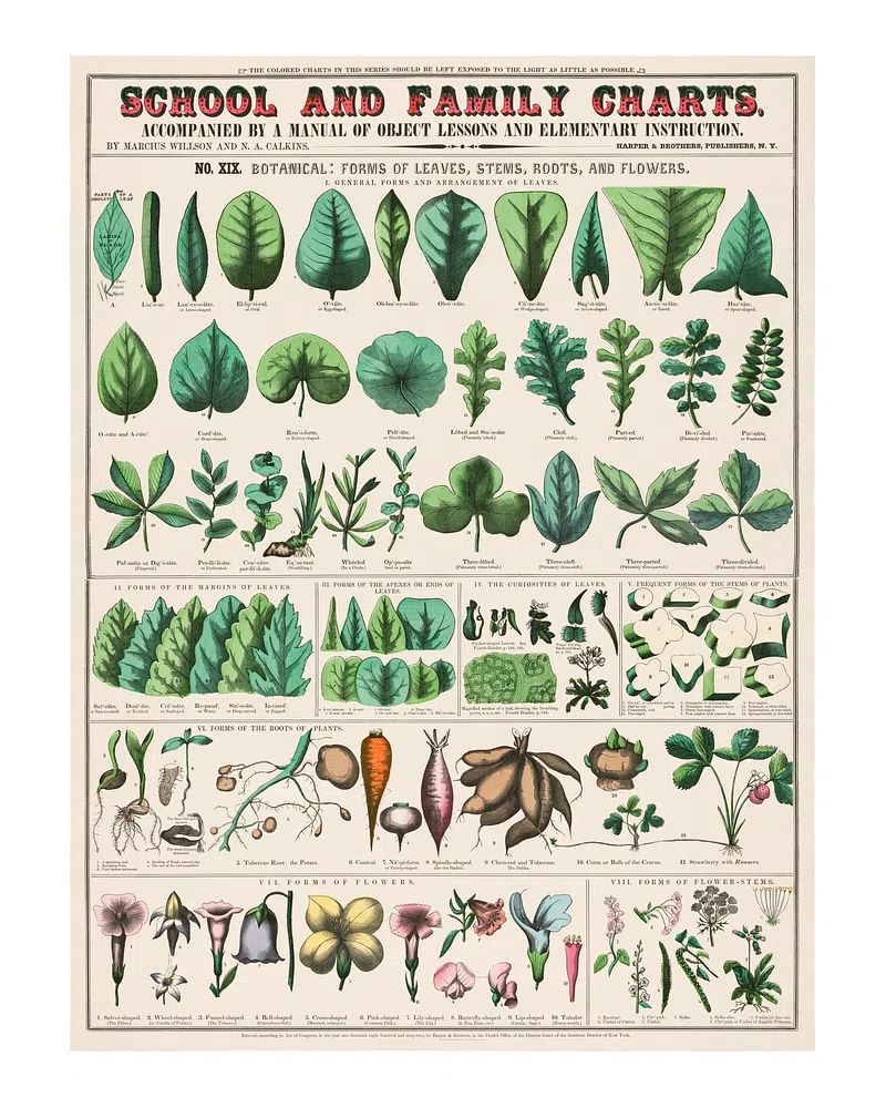
For narrow vertical spaces — between windows, beside wardrobes, near a desk — choose portrait orientation. For wide walls, either go large with one statement piece or create a structured row of 2 or 3 works. Avoid tiny frames scattered across a large wall; if each piece is under 30x40 cm, they need to be grouped tightly to avoid looking lost.
If you are building out a botanical-focused arrangement, start with one specimen print, then add from Vintage Rose Botanical or Wheat Bouquet depending on whether you want a softer floral note or a drier, textural one. For a more decorative finish, Marigold by William Morris brings denser rhythm and works particularly well in dining rooms or hallways.
Wrap-Up: Easy Styling Tips Before You Shop
A botanical study i poster print succeeds when the styling stays disciplined: natural frame, soft palette, enough wall space, and placement where the detail can actually be seen. Bedrooms, entryways, and home offices are especially reliable because they benefit from artwork that feels calm at first glance and interesting up close.
If you are choosing between options, decide in this order: room, size, frame colour, then companion pieces. That sequence prevents common mistakes like buying a beautiful print too small for the wall, or choosing extra artwork before the main piece is anchored. Start with one strong botanical, then build only if the wall needs it.
Frequently Asked Questions
What frame width works best for botanical prints?
A slim to medium frame — around 1.5 to 2.5 cm wide — suits most botanical pieces. Wider frames work best on larger prints above 70x100 cm.
Should I use a mat with a botanical print?
Yes, in most cases. A mat gives delicate illustrations more breathing room and helps smaller prints feel more substantial on the wall.
Can botanical wall art work in darker rooms?
Yes — choose artwork with lighter backgrounds and use an oak or brass-toned frame to lift it. Matte glass also helps reduce heavy reflections from lamps.
What is the best hanging height for a single framed print?
As a rule, place the centre of the artwork about 145 to 150 cm from the floor. Above furniture, leave 15 to 25 cm between the top of the piece and the furniture line.
What pairs well with a vintage botanical print if I do not want a full gallery wall?
One mirror, one sconce, or one smaller nature-themed artwork is usually enough. Keep the second element simpler than the botanical so the print stays dominant.