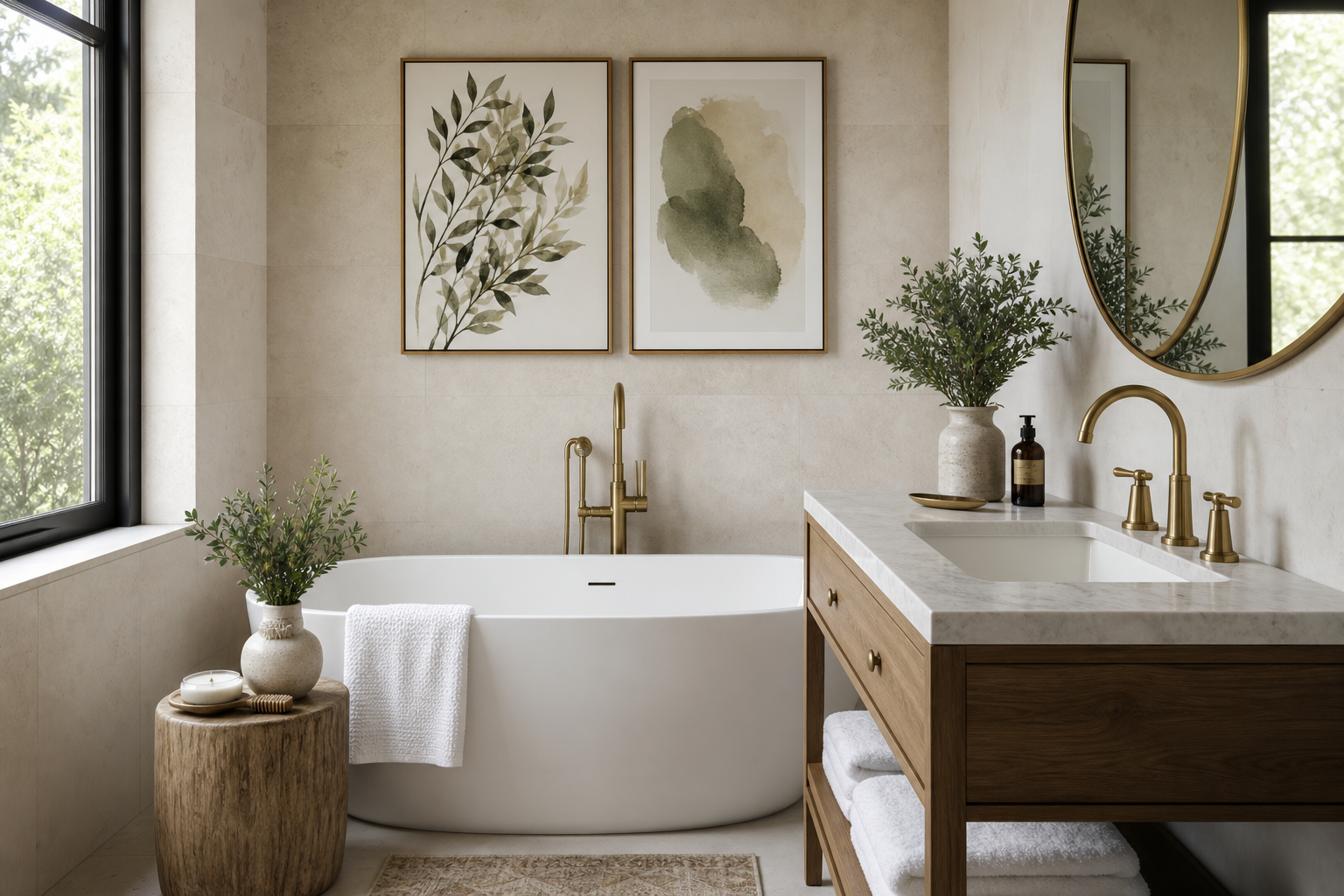
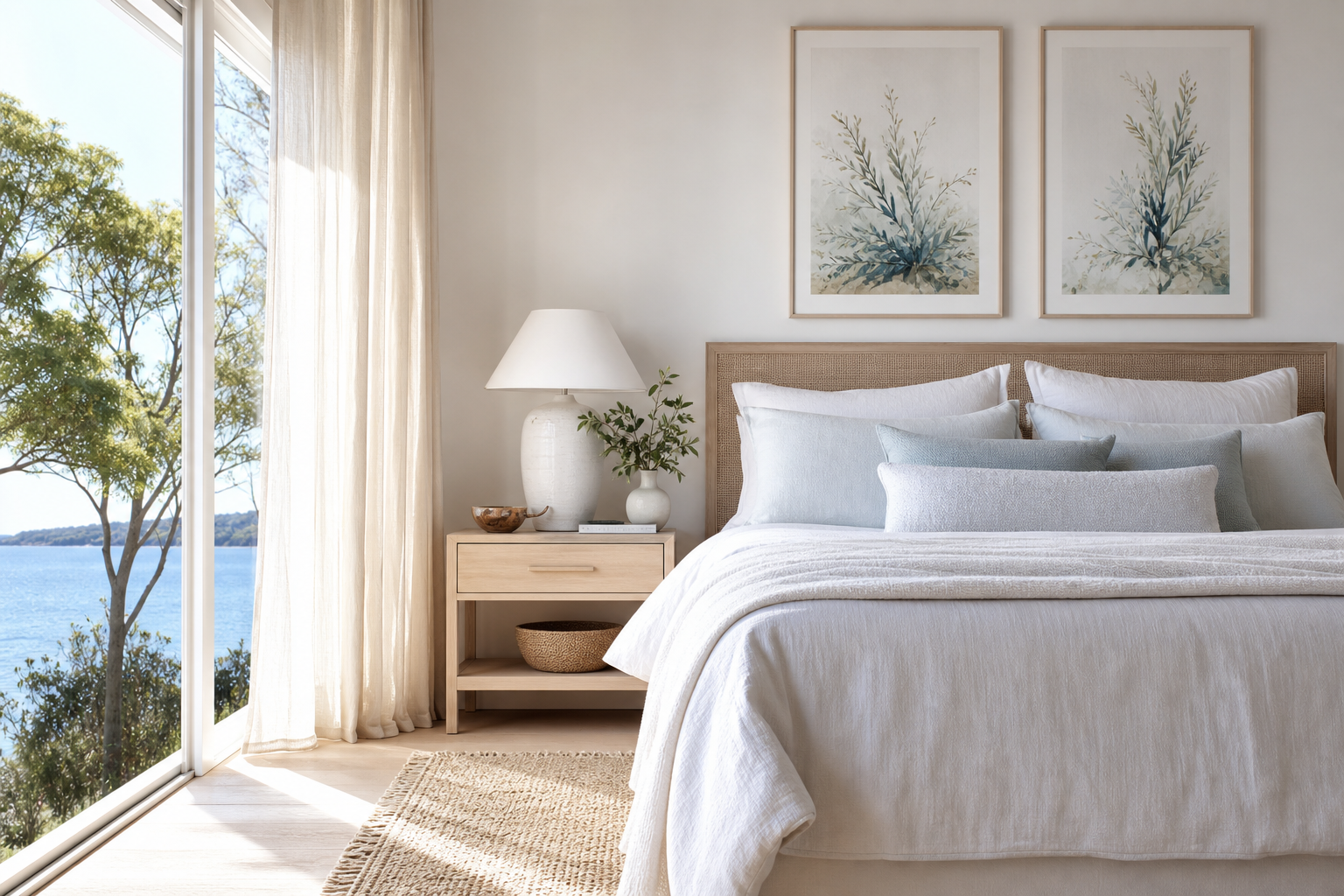
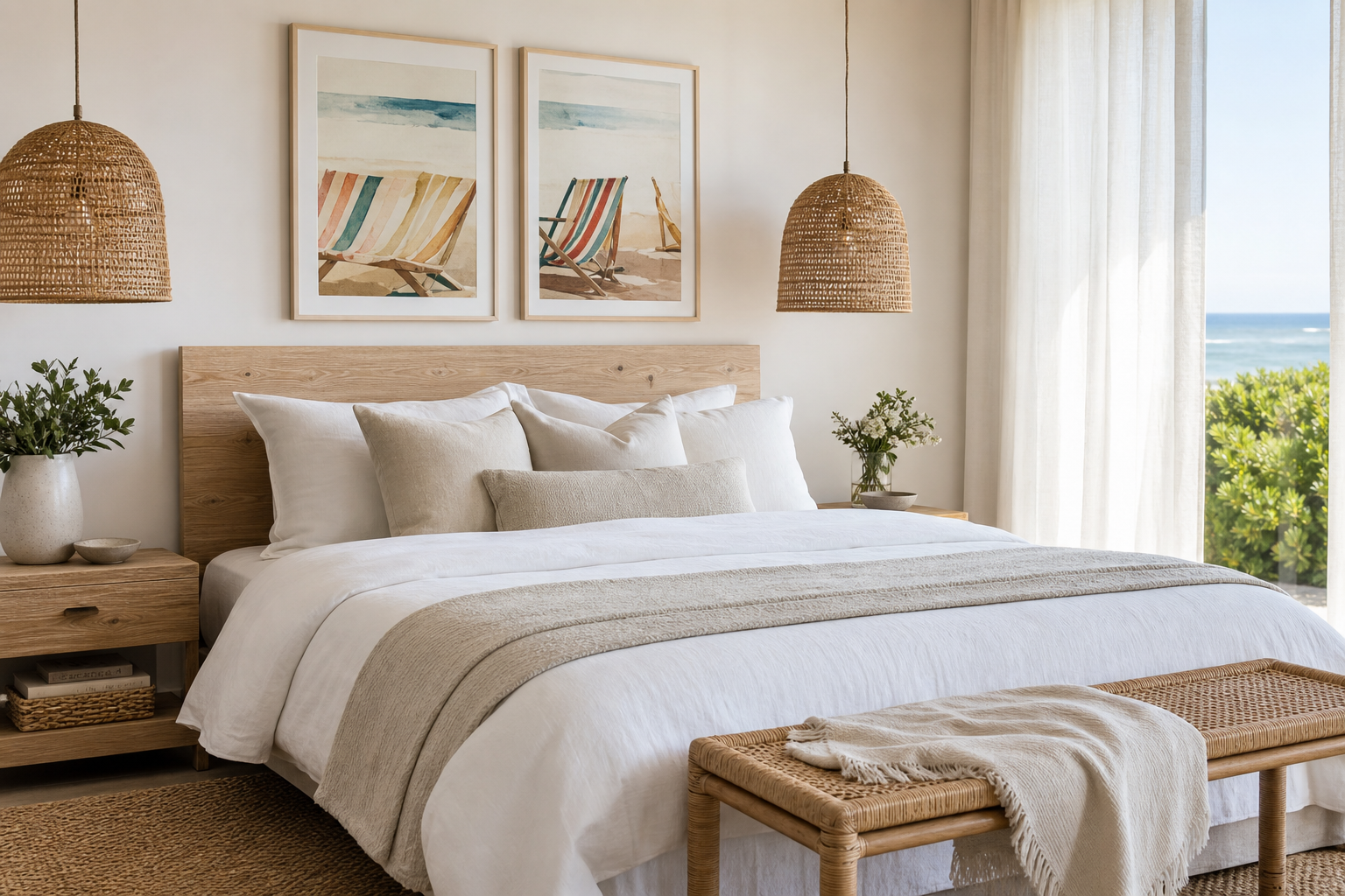
A bohemia river poster print works because it combines two ideas people consistently respond to at home: gentle movement and grounded colour. River imagery leads the eye horizontally, which makes a room feel wider and less visually tense, while earthy banks, misty water, and soft skies bring in the same natural cues that make our nature collection so easy to live with. In practical terms, this kind of artwork often feels calmer than high-contrast abstracts or urban scenes because the tonal shifts are gradual rather than sharp.
Why a Bohemia River Scene Feels So Restful
A river scene has built-in rhythm. Curved shorelines, reflections, and layered distance create movement without visual noise. That balance matters in rooms where you want the eye to settle — above a bed, opposite a sofa, or in a reading corner. A bohemia river poster print usually feels timeless for the same reason landscape paintings have endured for centuries: it references place, weather, and season without relying on trend-driven motifs.
When choosing the image itself, look for compositions with 3 clear zones — foreground, waterline, and sky or trees. That structure gives depth even in smaller sizes such as 30x40 cm. If you want the room to feel especially quiet, choose artwork with softened edges or watercolor detail rather than crisp architectural lines. The atmosphere in Serene Landscape — Watercolor Print is a good example of how muted transitions can hold attention without dominating the wall.
Choosing the Right Colour Palette
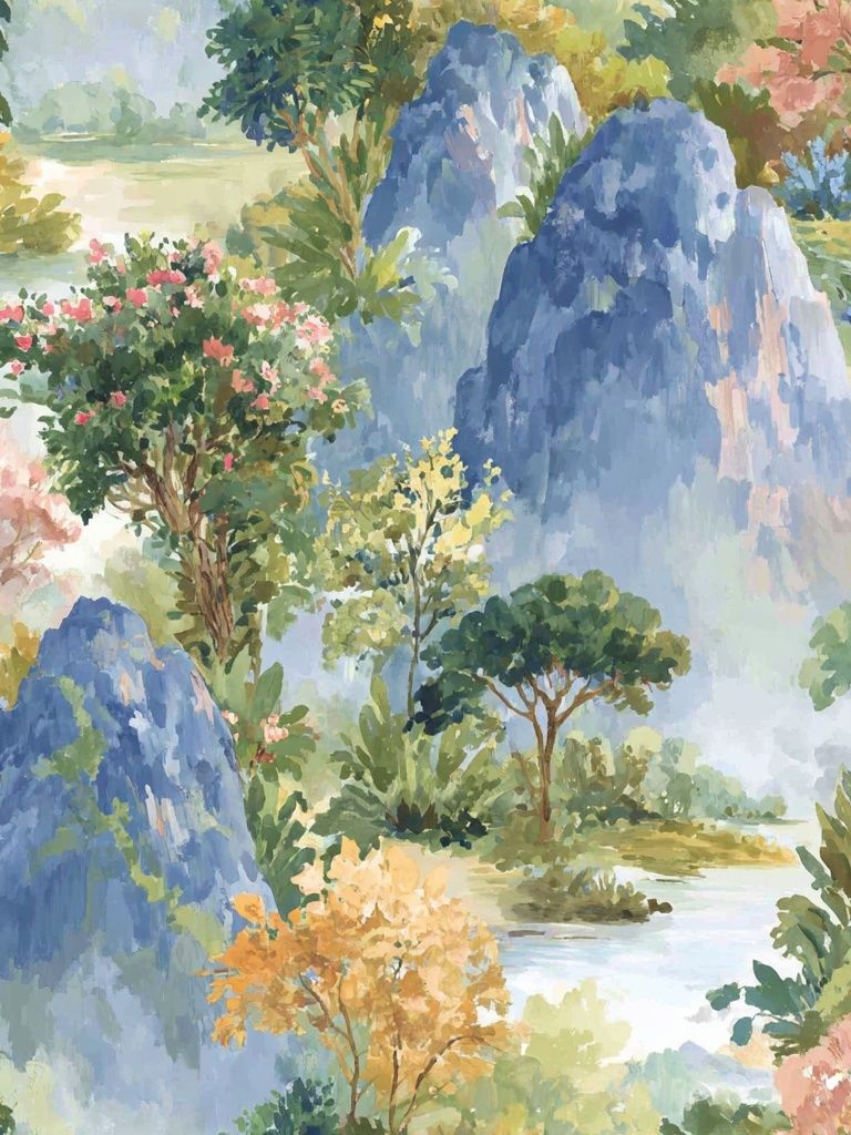
The easiest palette match starts with the undertones already in your room. If your space leans warm — sand upholstery, oat linen, walnut, terracotta — choose a river print with olive greens, taupe banks, or faded gold light. If the room already has cooler notes such as grey oak, slate textiles, or muted blue ceramics, pick a print where the water carries more blue-green or misty grey.
A good rule is to repeat 2 colours from the artwork elsewhere in the room. For example, if the print includes sage and warm beige, bring in one sage cushion and one beige throw rather than trying to copy every colour. That keeps the look intentional. Rooms styled with pieces from our bohemian wall art collection often work best when the palette stays within 4 to 5 dominant tones total.

Muted greens are particularly effective because they bridge plants, wood, and textiles. If your room already includes a lot of beige, a river scene can stop the palette from feeling flat by adding low-saturation green and blue. For a slightly more decorative look, pair it with subtle line-based pieces from our illustration prints so the walls stay airy rather than heavy.
Where to Hang It for the Best Impact
Placement changes the mood more than most people expect. Above a sofa, a horizontal river artwork helps stretch the seating area visually. Aim for the art to cover roughly 60% to 75% of the furniture width. Over a 180 cm sofa, that means a total artwork width between about 108 and 135 cm. In a bedroom, centring the piece 15 to 25 cm above the headboard keeps it connected to the furniture rather than floating too high.
Hallways are underrated for river scenes because they benefit from visual depth. A print with a receding shoreline makes a narrow passage feel less boxed in. Reading corners also suit this theme well — especially if the chair, lamp, and side table already have soft, tactile materials. If your home has a calm, collected style, a single river print often works better than a crowded arrangement in those smaller zones.
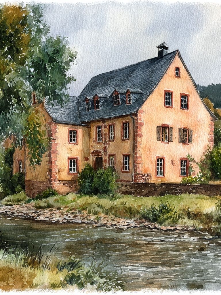
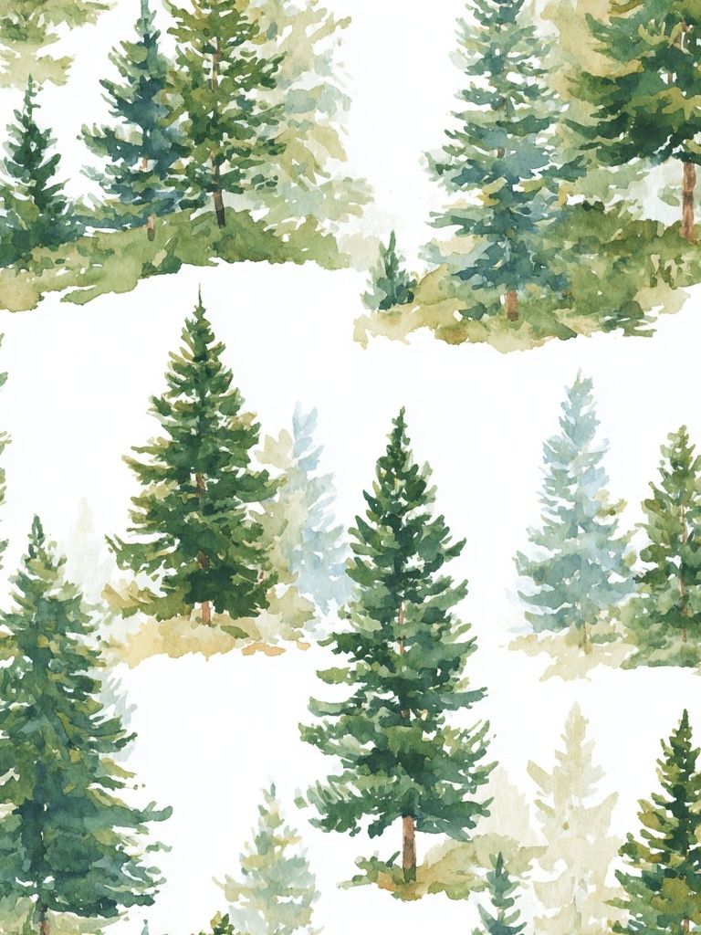
If you want a slightly more narrative take, Charming Cottage by the River — Watercolor Print fits beautifully in bedrooms, guest rooms, and quiet living spaces. For walls with a more outdoorsy or layered natural look, explore related landscapes through Mountain Landscape — Watercolor Print and Walking in the Misty Forest — Watercolor Print.

Framing and Finish Ideas
Frame choice determines whether the art reads rustic, refined, or modern. Oak frames pull out warm earth tones and work well with bohemian interiors that use rattan, linen, and ceramic surfaces. Black frames give more contrast and can sharpen a hazy watercolor, which helps in rooms that need stronger definition. White frames are useful when the wall colour is mid-tone or darker, because they create a clean edge without adding visual weight.
Border width matters too. For smaller prints such as 30x40 cm or 40x50 cm, a frame between 1.5 and 2 cm usually looks balanced. For larger statement sizes like 50x70 cm or 70x100 cm, a slightly wider profile — around 2 to 3 cm — can give the piece enough presence. If the artwork has delicate tonal variation, a mount can help. A white border of 4 to 7 cm gives the image space to breathe and adds a gallery feel.

For finish, matte usually suits a bohemia river poster print better than glossy. Matte reduces glare and keeps the scene soft, especially in bedrooms or rooms with large windows. Gloss can make colours appear slightly richer, but it also reflects lamps and daylight more strongly. If the wall gets direct sun for several hours, positioning the frame away from harsh reflection lines will matter more than the finish alone.
Pairing the Print with Other Art and Textures
The strongest combinations repeat theme, texture, or palette — not all three at once. A river scene pairs naturally with botanical motifs, birds, trees, and vintage travel pieces in softened colours. If you want a 4-piece wall, combine one main river image with two supporting nature prints and one lighter illustration to keep the arrangement from feeling too dense.
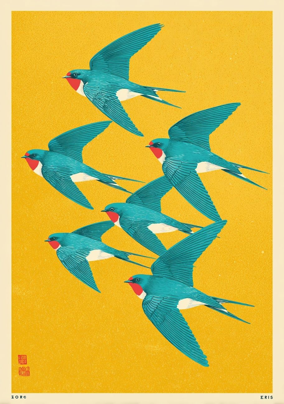
Notice how texture does just as much work as the artwork. Washed linen, unfinished wood, boucle, terracotta, and handmade ceramics all support the relaxed feel of a river image. If your room already has smooth finishes — lacquer, metal, glass — add one or two tactile elements near the art, such as a woven pendant or a raw wood console. That keeps the wall art connected to the rest of the room.
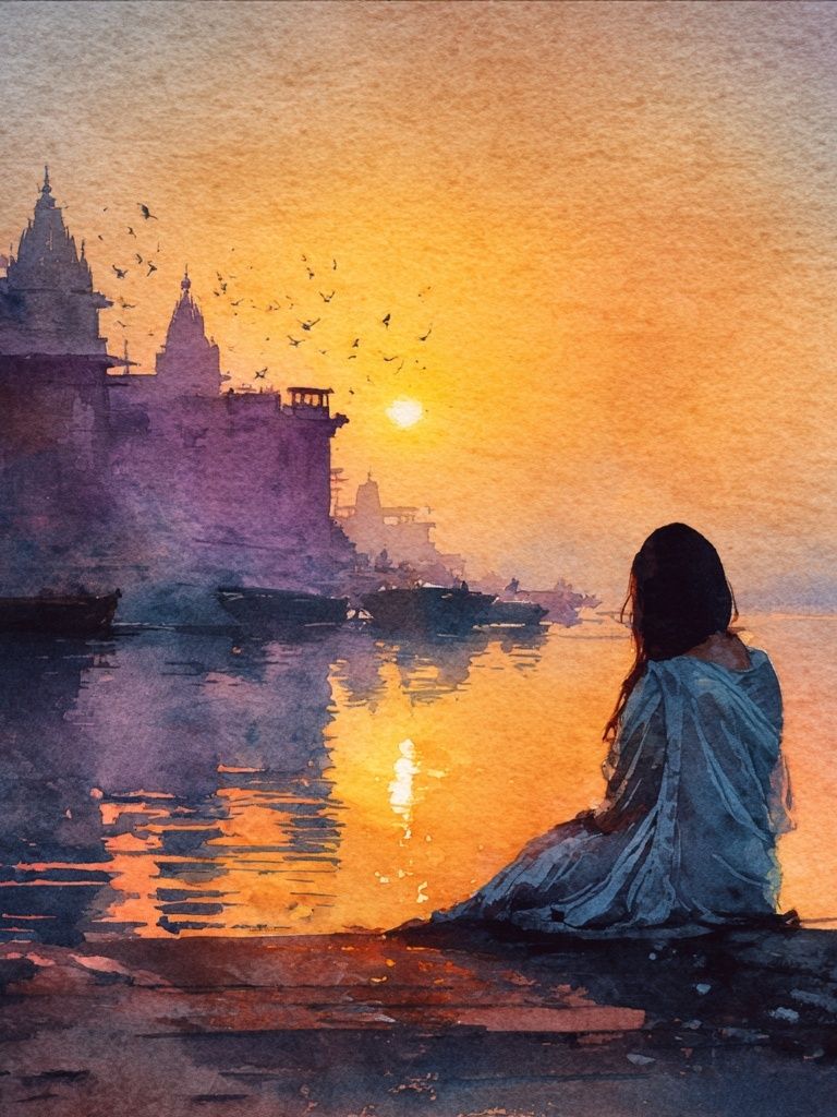
You can also mix a river print with heritage-inspired pieces from our vintage art collection or scenic travel imagery from our travel-inspired prints when the palette stays muted. A pairing like Sunset River Ghat Watercolor Print alongside more understated landscapes creates variation without breaking the calm mood.
How to Choose a Size That Fits the Space
Small spaces need restraint, not tiny art by default. For a narrow nook, 30x40 cm can work well if the wall width is under 70 cm and there is furniture directly below. For a bedside wall or slim hallway section, 40x50 cm gives more presence without crowding. Above a standard console table of 100 to 140 cm, 50x70 cm is often the safest single-print size.
For bigger statements, use proportion rather than guesswork. Over a bed that is 160 cm wide, a print around 70x100 cm can look balanced if the ceiling height is average to tall. Above a sofa, one larger piece is often more restful than three small frames because the river composition reads continuously. If you prefer a layered arrangement, keep 5 to 8 cm between frames so the grouping feels cohesive from a distance.

If you're deciding between two sizes, choose the larger one when the room has substantial furniture, high ceilings, or wide empty wall spans. A calm image loses impact when it is underscaled. The goal is not to fill every inch, but to make the landscape feel anchored.
Final Styling Tips for a Cohesive Look
A bohemia river poster print looks best when the room around it shares its pace. Keep nearby decor edited: 3 to 5 objects on a console, one or two textile patterns at most, and materials that improve with texture rather than shine. Repeating wood tones within one or two shades — for example oak frame, walnut side table, and cane chair — helps the whole wall feel deliberate.
If you are building around one key piece, start with the artwork, then pull out a colour, then add texture last. That order prevents overbuying and keeps the room from turning thematic. A calm river scene does not need much support — just thoughtful scale, a frame that suits the furniture, and a palette that stays close to nature.
Frequently Asked Questions
What frame colour is safest if I change my decor often?
Natural oak is the most flexible choice. It works with beige, green, white, terracotta, and muted grey interiors without looking too stark.
Can I hang a river print in a room with very little natural light?
Yes — choose artwork with lighter sky tones or soft reflections so the wall does not feel heavy. A white mount can also brighten the overall presentation.
Should I use one large print or two smaller ones above a bed?
One large print usually feels calmer and more cohesive. Two smaller pieces work if the headboard is wide and you want a more symmetrical, decorative layout.
What wall colour works best behind a bohemia river poster print?
Soft off-white, warm greige, clay beige, and muted sage all work well. Strong bright whites can look too sharp unless the print has crisp contrast.
How high should I hang the artwork if there is no furniture below it?
A reliable guide is to place the centre of the artwork around 145 to 150 cm from the floor. Adjust slightly lower in relaxed residential spaces with lower ceilings.