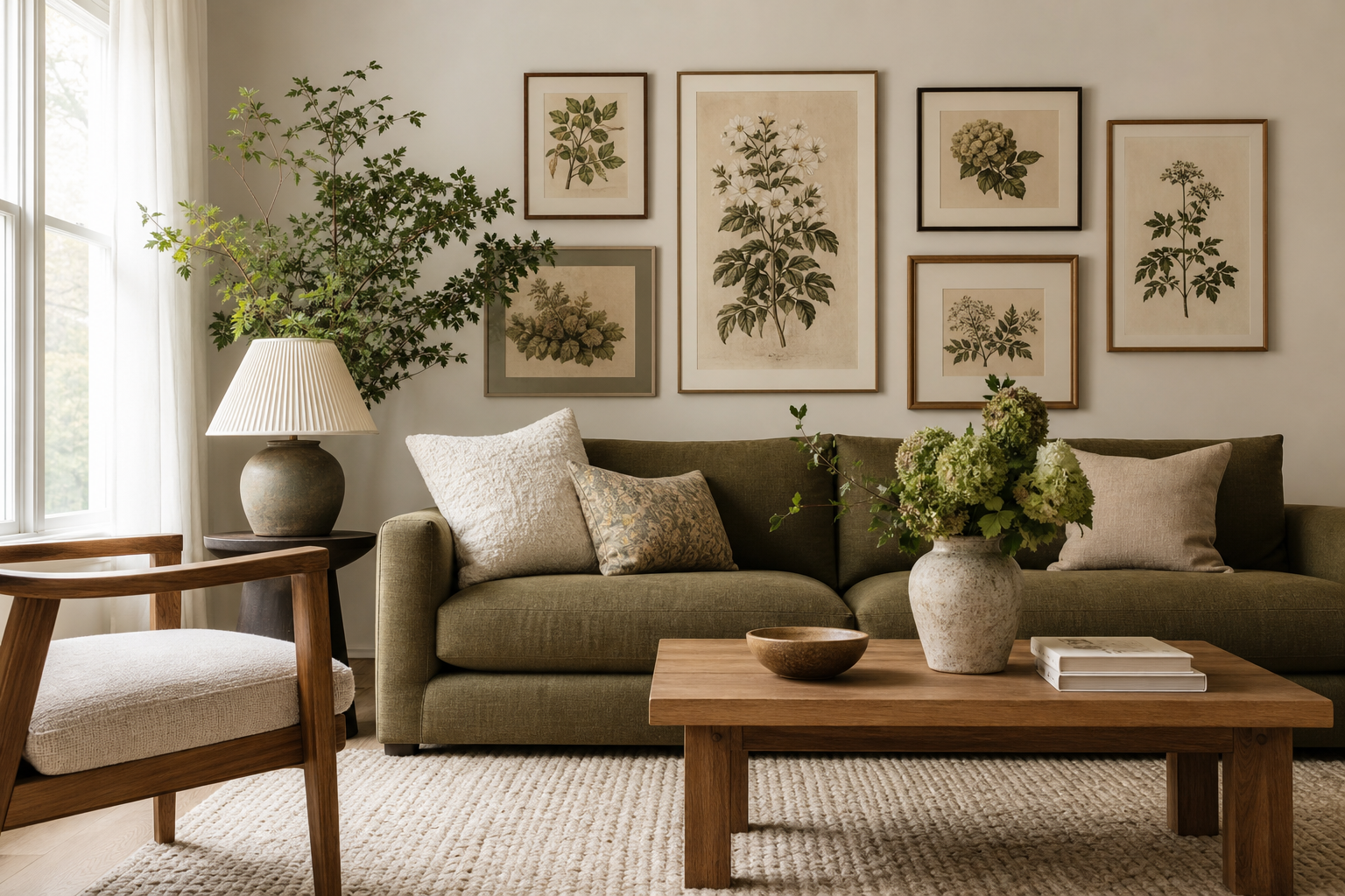
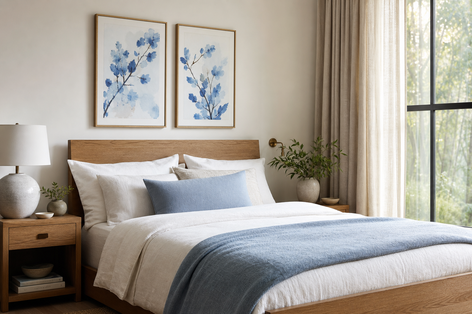
The appeal of the blue blossom ii poster print is straightforward: it adds floral detail without making a room feel busy. Blue is one of the easiest colours to live with long term because it reads as calm, clean, and slightly airy, while botanical imagery brings enough organic shape to soften straight-lined furniture. That balance makes this kind of piece especially useful in homes that sit between styles rather than following one strict look.
What Makes Blue Blossom II Feel So Timeless
A soft botanical print lasts because it is built on two stable design elements: natural form and restrained colour. Flowers and leaves have movement, but when they are rendered in pale or dusty blue, the result feels quieter than high-contrast floral art. The blue blossom ii poster print works well in rooms that already use white, sand, dove grey, muted sage, or light oak because those finishes keep the palette within a narrow tonal range — usually no more than three dominant colours.
If your space already leans classic, this print can sit comfortably near layered textiles and more decorative details. In a cleaner home, it can act as the main source of softness. That is why botanical art often crosses from our botanical collection into calmer minimalist wall art schemes — the subject is decorative, but the effect can still be pared back.
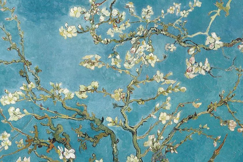
For anyone drawn to painterly blossom imagery, a piece like Almond Blossom — Fine Art Print shows how floral subjects stay relevant when the palette is airy and the composition stays open rather than dense.
Where to Hang It for the Best Impact
The best placement depends on whether you want the print to anchor furniture or soften an empty transition space. In a bedroom, hang it 15 to 25 cm above the headboard so it feels connected to the bed rather than floating. A 50x70 cm piece suits a double or queen bed well, while 70x100 cm gives stronger presence above wider headboards. In a living room, center it above a sofa with the artwork spanning roughly 50 to 70 percent of the sofa width for a balanced look.

Hallways and reading corners are often overlooked, but this is where a gentle botanical piece can do a lot of work. In a narrow hallway, one vertical print around 40x50 cm or 50x70 cm can break up a plain wall without crowding it. In a reading corner, place it above a low chair and side table to create a small visual zone — especially effective if the corner already has a lamp, a throw, and one natural material like cane or wood.
If you like a calmer nature-led look, it also pairs well with Serene Landscape — Watercolor Print or other pieces from our nature art prints range, particularly in spaces meant for rest rather than conversation.
How to Style Blue Blossom II with Your Decor
Treat the print as the room's soft colour reference point. Pull one or two tones from it into the rest of the space — for example, a dusty blue cushion, a grey-blue throw, or a ceramic vase with a washed glaze. Limiting repeated blue accents to 10 to 20 percent of the room keeps the look intentional instead of themed. The supporting colours that work best are warm neutrals: ivory, flax, mushroom, pale taupe, and light wood.
Texture matters more than pattern here. Pair floral wall art with matte linen, brushed cotton, boucle, oak, travertine, or ribbed ceramic. Those surfaces add depth while letting the artwork remain the focus. If you already have patterned upholstery or a rug with visible movement, keep nearby accessories plain so the wall art does not compete.

A simple way to sharpen the look is to introduce one contrasting shape. If the floral forms are loose and organic, add a clean-lined floor lamp, a round side table, or a rectangular mirror nearby. This gives the arrangement structure. Pieces from our abstract collection can also support the blue blossom ii poster print if you want a more editorial mix rather than an all-botanical wall.

Sizing, Framing, and Wall Composition Tips
For a single-statement look, choose the largest size your wall can comfortably hold. On a wall that is around 140 to 180 cm wide, a 50x70 cm print usually reads as elegant and understated. On larger walls — 200 cm and up — 70x100 cm delivers better visual weight. If the artwork is hung above furniture, leave 15 to 25 cm between the frame and the top edge of the piece below it.
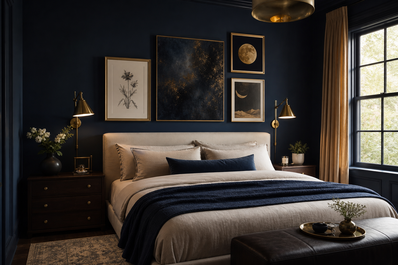
Frame finish changes the mood more than most people expect. Oak adds warmth and suits Scandinavian or soft modern rooms. White keeps the look fresh, especially against coloured walls. Black gives definition and works best when the room already includes at least two other black details — such as lamp bases, chair legs, or curtain rods — so it does not feel isolated.

If you want the artwork to stand alone, give it negative space. Leave at least 20 to 30 cm of clear wall around a 50x70 cm frame when possible. For a gallery wall, keep spacing tighter — around 5 to 8 cm between frames — so the group reads as one composition instead of separate pieces.
A quieter botanical partner such as White Flower Silhouette — Minimalist Print works particularly well if you want a two-piece arrangement with a clear hierarchy.

Building a Calm Botanical Gallery Wall
The easiest gallery wall formula is one hero floral, one minimalist botanical, one landscape, and one abstract or textural piece. This gives you variation in subject while keeping the mood cohesive. Use two colour bridges across the set — in this case, blue and warm neutral — and repeat them in every piece at least lightly.
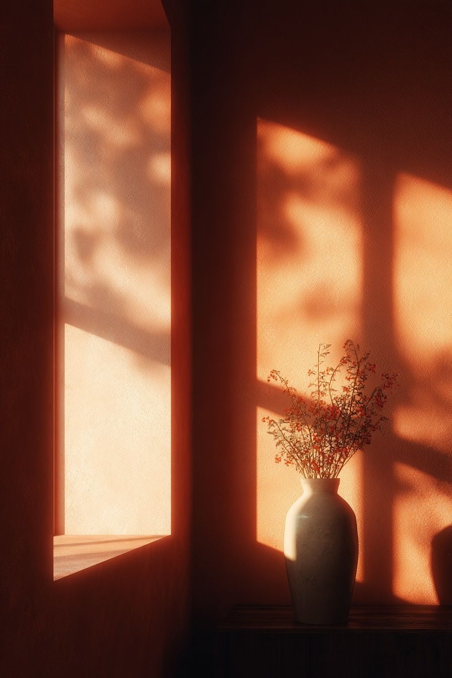
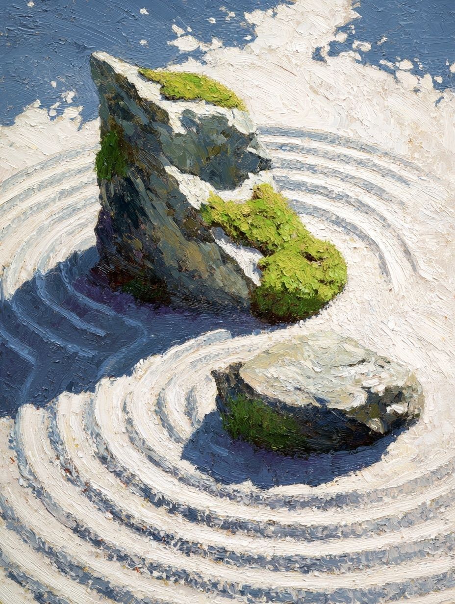
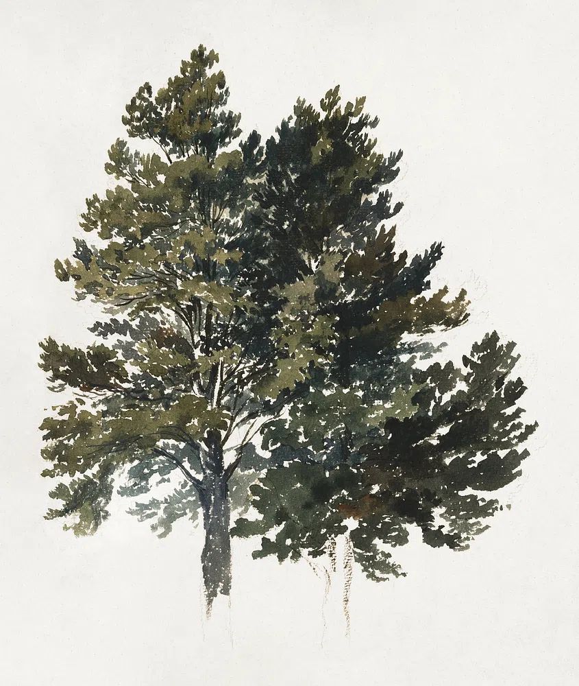

When arranging the wall, place the floral hero slightly off-center rather than dead middle if the set includes different orientations. That creates a more collected feel. Keep the overall gallery width to about two-thirds of the furniture below it. Above a 180 cm sofa, aim for a grouping roughly 110 to 125 cm wide.
You can also bring in heritage-inspired botanical detail through pieces in William Morris's vintage willow leaves or William Morris's (1834-1896) Blue if you want more pattern and historical richness. For a lighter, fresher variation, blend the blue blossom ii poster print with selections from botanical wall prints and one piece from fine art florals to avoid a wall that feels too uniform.

Wrapping Up: Easy Ways to Make It Shine
The blue blossom ii poster print looks best when the room around it stays edited. Repeat its blue tones once or twice, use natural textures, and choose a frame finish that already exists elsewhere in the room. If you are styling from scratch, start with the print, then add one textile, one ceramic accent, and one secondary artwork — that is enough to make the space feel considered.
If your room feels flat, go larger with the artwork before adding more decor. A single 70x100 cm piece often has more impact than several smaller accessories scattered around it. And if you want a layered result, keep the mix calm: one floral focal point, one tonal landscape, and one minimal supporting print will nearly always land well.
Frequently Asked Questions
What wall colour works best with blue botanical art?
Soft white, warm off-white, pale greige, and muted sage all work well. Mid-tone blue walls can also work, but choose a lighter frame so the art does not disappear.
Should I use glass or acrylic glazing for the frame?
Acrylic is lighter and easier to handle for larger sizes like 70x100 cm. Glass offers a slightly crisper surface but is heavier, which matters if you are hanging on plasterboard.
Can I hang botanical wall art in a dining area?
Yes — especially if the palette is soft rather than overly bright. Hang it at seated eye level if the wall is close to the table, usually a little lower than in a living room.
What frame width looks most modern for this kind of print?
A slim frame between 1 and 2 cm usually looks cleanest. Wider frames feel more classic and can suit traditional rooms, but they add visual weight quickly.