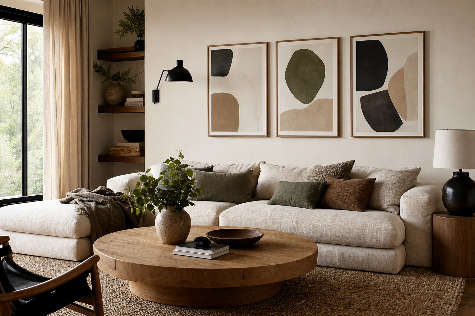
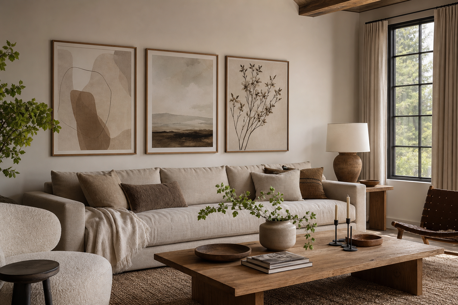
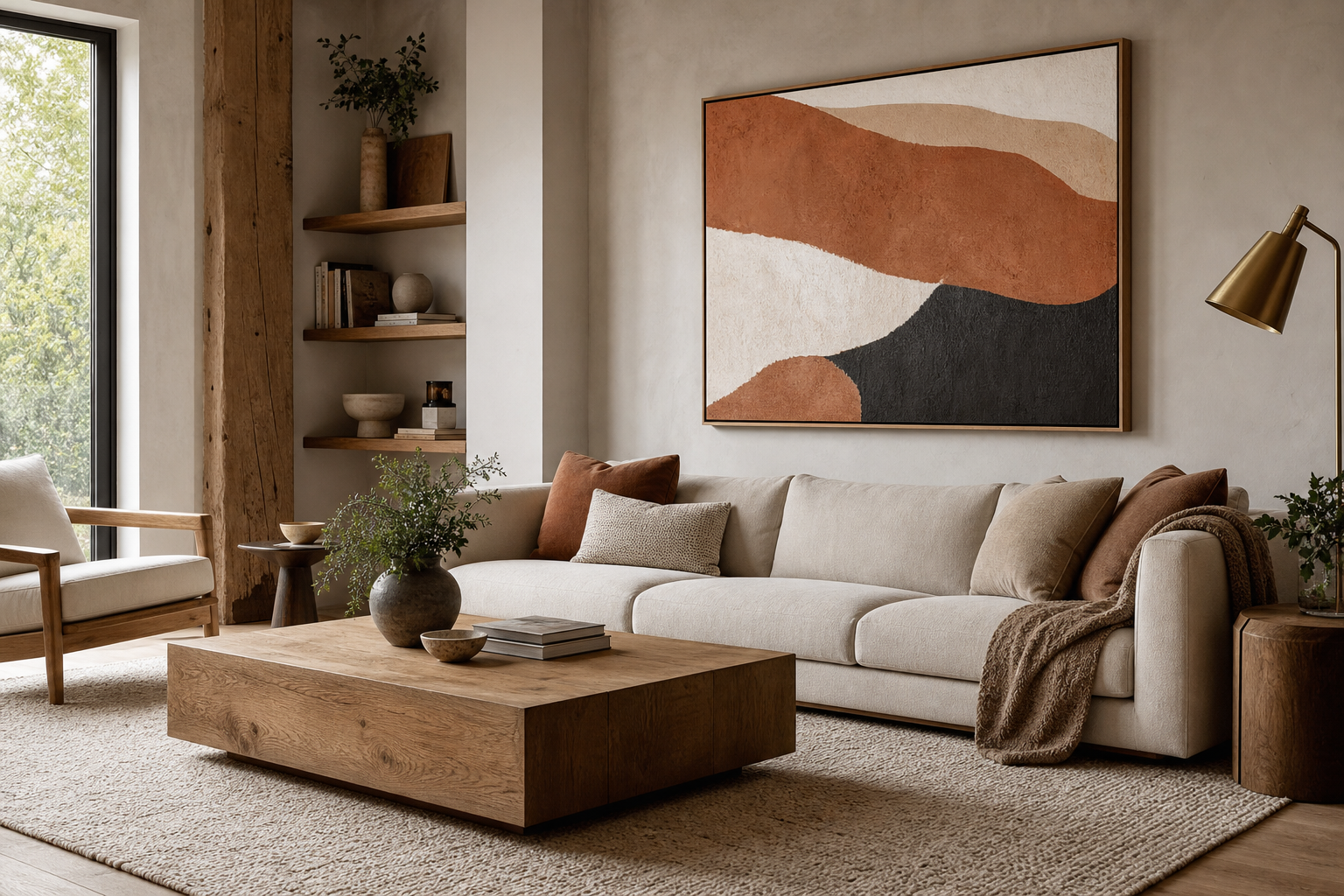
The best posters for living room styling do one job first: they make the room feel considered, not just decorated. A strong piece connects to the furniture scale, repeats at least one color already in the room, and adds a mood that the sofa, rug, and lighting are already hinting at. If your space is calm and tonal, look to our Minimalist collection or abstract art prints with soft color transitions instead of busy, high-contrast graphics.
What Makes a Living Room Poster Work
Scale is usually the difference between polished and awkward. Above a standard 84-inch sofa, the artwork grouping should span roughly 56 to 63 inches wide — about 65 to 75% of the sofa width. A single oversized print can work at 24x36 inches or 28x40 inches, while a pair often looks balanced in 20x28 inches each. Small frames under 12x16 inches tend to feel lost unless they are part of a tighter salon-style arrangement.
Mood matters just as much as size. Living rooms usually benefit from artwork you can live with every day: softer movement, layered neutrals, organic forms, or imagery with depth rather than novelty. That is why the best posters for living room setups often come from fine art prints with a timeless feel, photography wall art with atmospheric detail, or botanical pieces that add structure without noise.

"Window with Sheer Curtain" works because it brings lightness without demanding attention. In a room with oak, cream upholstery, or brushed brass, a piece like this adds visual air and helps a living room feel finished rather than overly styled.
Choose a Style That Matches Your Space

Abstract prints suit rooms that already have strong furniture silhouettes. If your sofa has clean lines and your coffee table is sculptural, abstract wall art adds interest without competing. For this look, abstract living room prints or Mid Century Modern wall art usually feel sharper than figurative pieces.
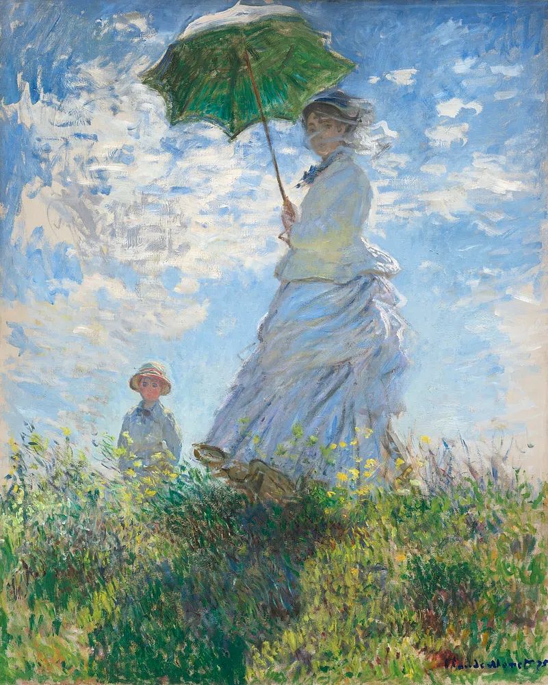
Vintage and fine art prints work well in rooms that need softness and history. They are especially good if your living room has antique wood, curved lamps, or traditional architectural details like molding. A print such as Woman with a Parasol brings movement and painterly color, while Starry Night adds drama in deeper blue-based interiors.



Botanical prints are useful when the room needs pattern, but only a light amount of it. They sit well with neutral upholstery, travertine, linen curtains, and indoor greenery. Typography is more niche in a living room — better as one accent piece than the entire wall, especially in shared family spaces where calm imagery tends to age better.
Get the Size and Placement Right
Hang artwork 6 to 8 inches above the back of a sofa or console. Any higher, and it starts to float away from the furniture. The center of the arrangement should land near 57 to 60 inches from the floor in most homes, but when art is anchored by furniture, the furniture becomes the real reference point.
If you are using one large piece, 24x36 inches is a reliable minimum over a small loveseat, while 28x40 inches or 30x40 inches feels more intentional above a full sofa. For two matching or coordinating works, keep 2 to 3 inches between frames. For gallery walls, 2 inches is usually enough spacing to create cohesion without making the whole arrangement look cramped.
Avoid filling the entire wall edge to edge. Leave at least 6 to 10 inches of breathing room on each side of a console or sofa. The best posters for living room arrangements nearly always look better when they are visually tied to a piece of furniture below them rather than centered on the full wall alone.
Build a Color Story That Feels Intentional

Start with the room, not the art. Pick two existing colors from your living room — usually one dominant neutral and one accent — then choose prints that repeat them. A simple ratio works well: about 70% shared room tones, 20% secondary shades, and 10% contrast. In practice, that could mean beige, olive, and a small hit of black.
For neutral rooms, art is often the smartest place to introduce warmth. Terracotta, ochre, moss green, dusty blue, and tobacco brown add depth without making the wall loud. If your room already has a lot of texture, a quieter palette will look richer than a rainbow of competing tones. Bohemian art prints and our Botanical collection are especially effective in these layered, earthy interiors.
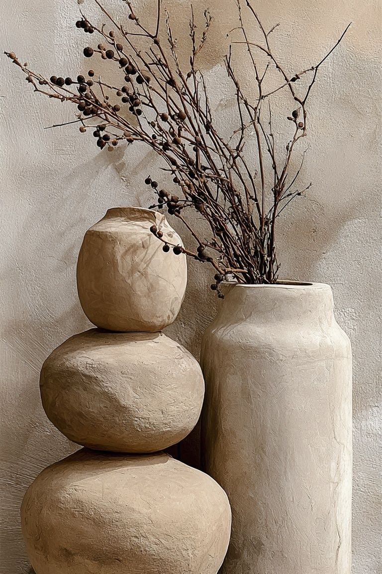
This piece is useful when the room needs warmth but not extra visual clutter. The dried branches, clay tones, and restrained composition echo natural materials already common in living rooms — oak, boucle, jute, and linen.
Frame It for a More Polished Finish
A frame changes how expensive the art feels. Thin black frames suit modern and minimalist spaces; oak or walnut frames soften the look and connect art to wood furniture; white frames are best when you want the image to recede into a pale wall. If you are mixing styles, keep one element consistent — frame color, mat width, or artwork palette.
Matting gives the print more presence. A 2-inch mat around an 18x24-inch print can make it feel more gallery-like, especially with fine art or photography. For graphic mid-century or abstract pieces, no mat can feel cleaner and more contemporary. If you mix matted and unmatted works, use that contrast deliberately rather than accidentally.

Create a Gallery Wall Without the Clutter
A good gallery wall needs a clear structure before it needs variety. Start with one anchor piece, then build around it using either matching frame sizes or a limited palette. The easiest formula is 4 to 6 frames in two sizes — for example, two 20x28-inch pieces and four 12x16-inch pieces. Lay everything on the floor first, and keep gaps consistent at 2 to 3 inches.
The calmest gallery walls usually repeat one of three things: subject, color, or frame finish. If every piece is different in all three areas, the wall feels scattered. Pairing Charming Italian Village with quieter nature or interior studies will feel far more cohesive than mixing it with loud quote art and heavy contrast photography.
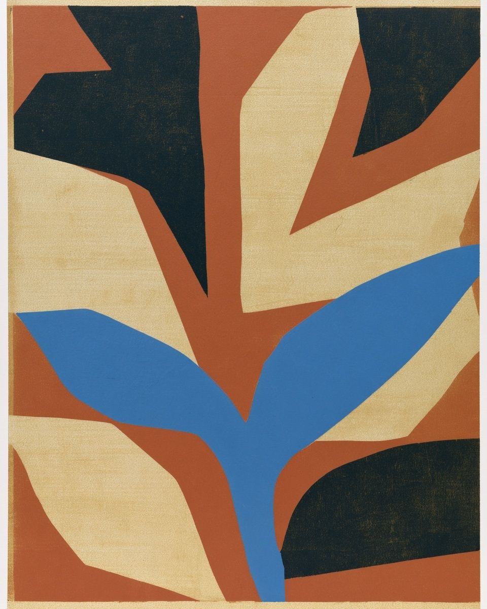
Mid-century shapes are especially useful in a gallery wall because they create rhythm. This print works well as the "graphic note" among softer images, especially if the room already has curved lamps, low-profile seating, or walnut furniture.
If you want a symmetrical arrangement above a sofa, try a triptych layout: three equal frames, each 20x28 inches, spaced 2 inches apart. If you prefer a looser arrangement above a console, use an asymmetrical cluster but align at least one top or bottom edge. That single alignment keeps the composition intentional.
Final Tips for Choosing Posters You’ll Love Long-Term
Buy for the room you have, not the image in isolation. Before ordering, measure the wall, mark the arrangement with painter's tape, and check it from 6 to 8 feet away. Look for prints with enough detail to stay interesting over time, but not so much contrast that they dominate every conversation area in the room. In most homes, pieces that sit between statement and subtle are the ones that last.
A good final check is material and finish. Matte surfaces tend to reduce glare in living rooms with large windows, while cleaner, simpler compositions age better than overly trend-driven graphics. If you are choosing between two options, the best posters for living room use are usually the ones that still make sense if you swap the rug, change cushion colors, or move to a new home.
Putting it together
A curated living room wall comes down to four decisions: right scale, a style that matches the furniture, a restrained color story, and framing that finishes the piece properly. Get those four right, and even one print can make the room feel complete.
If you want an easy starting point, begin with one timeless piece, then build slowly around it. Rooms feel more personal when the wall evolves with intention rather than being filled all at once.
Frequently Asked Questions
What frame size should I choose for an 18x24-inch print in a living room?
An 18x24-inch print works well in a 20x26-inch or 22x28-inch frame with a mat, or in a simple 18x24-inch frame without one. Use a mat if you want a more formal, gallery-style finish.
Should all the frames in a living room match?
No — but they should relate. Keep one element consistent, such as all black frames, all oak tones, or the same mat color, so the wall still reads as one composition.
What art works best in a dark living room?
Choose prints with mid-tone contrast and lighter backgrounds to lift the space. Soft botanical, Impressionist, or minimalist pieces usually brighten the room better than very dark photography.
Can I mix photography and painted art in one gallery wall?
Yes, if the palette is controlled. Keep the tones similar and let one medium dominate — for example, three painted pieces and one photographic image.
How do I reduce glare on framed wall art near windows?
Use matte paper and avoid hanging glass-framed work directly opposite strong sunlight. Position the art on an adjacent wall if possible, or choose acrylic glazing with anti-reflective properties.