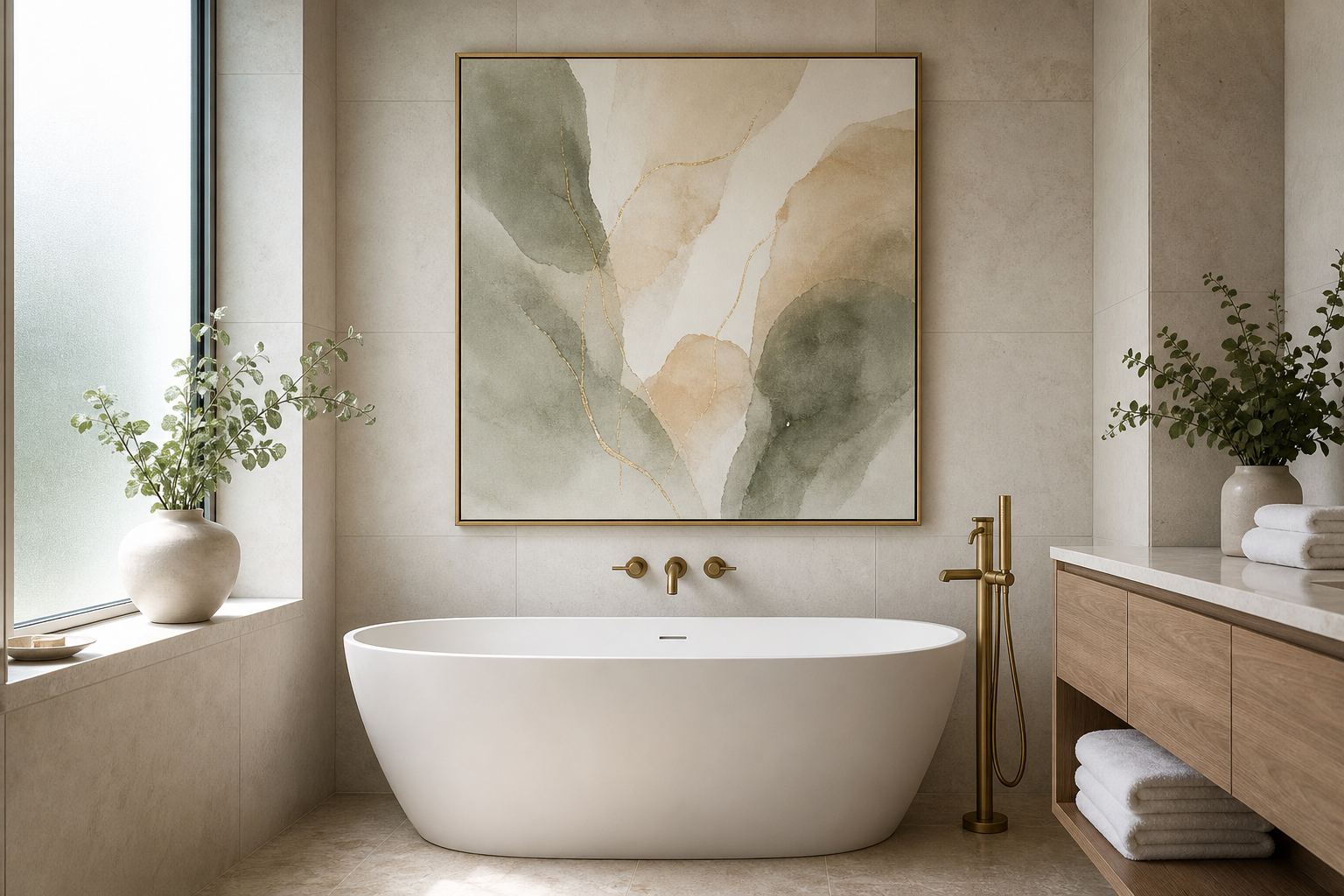
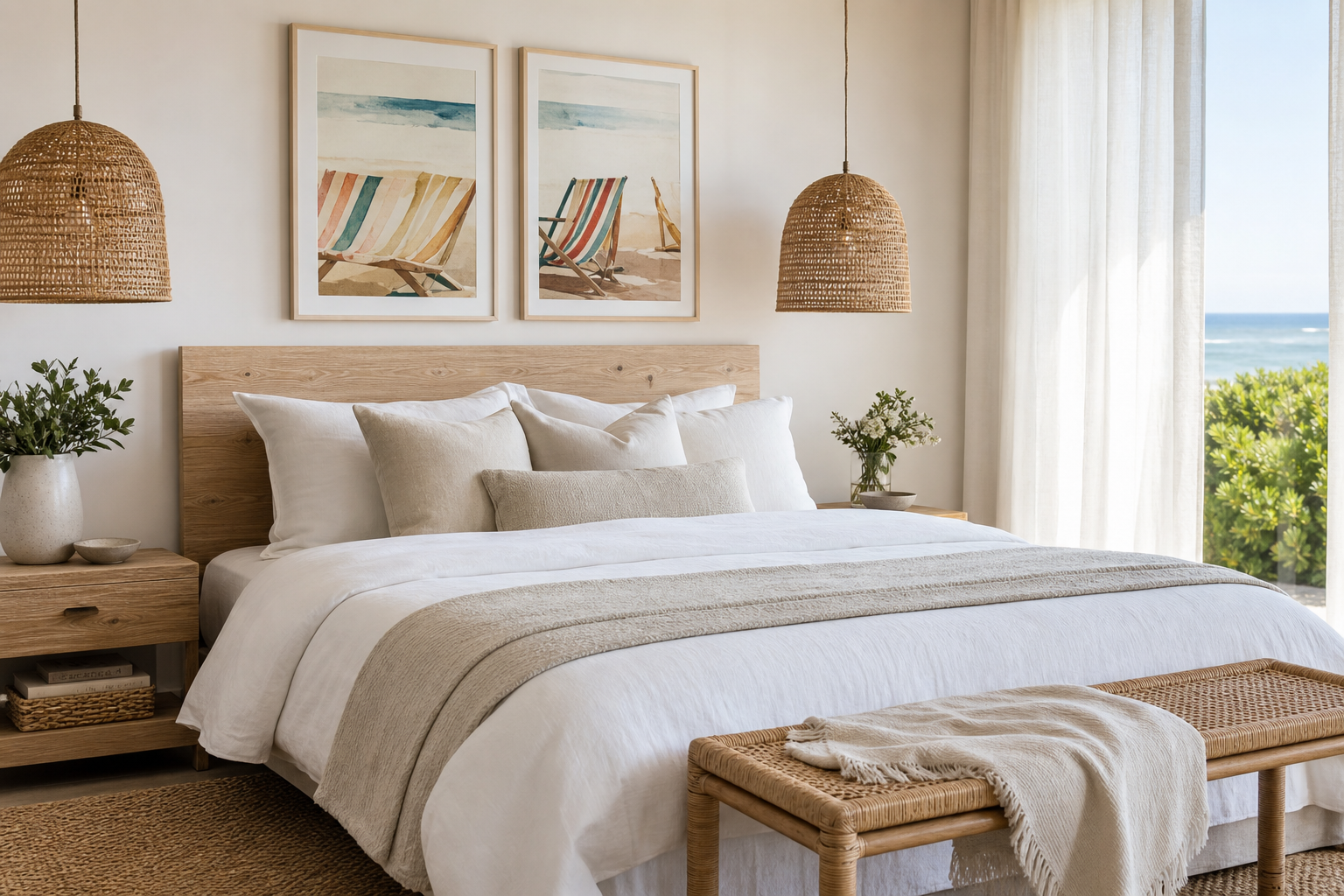
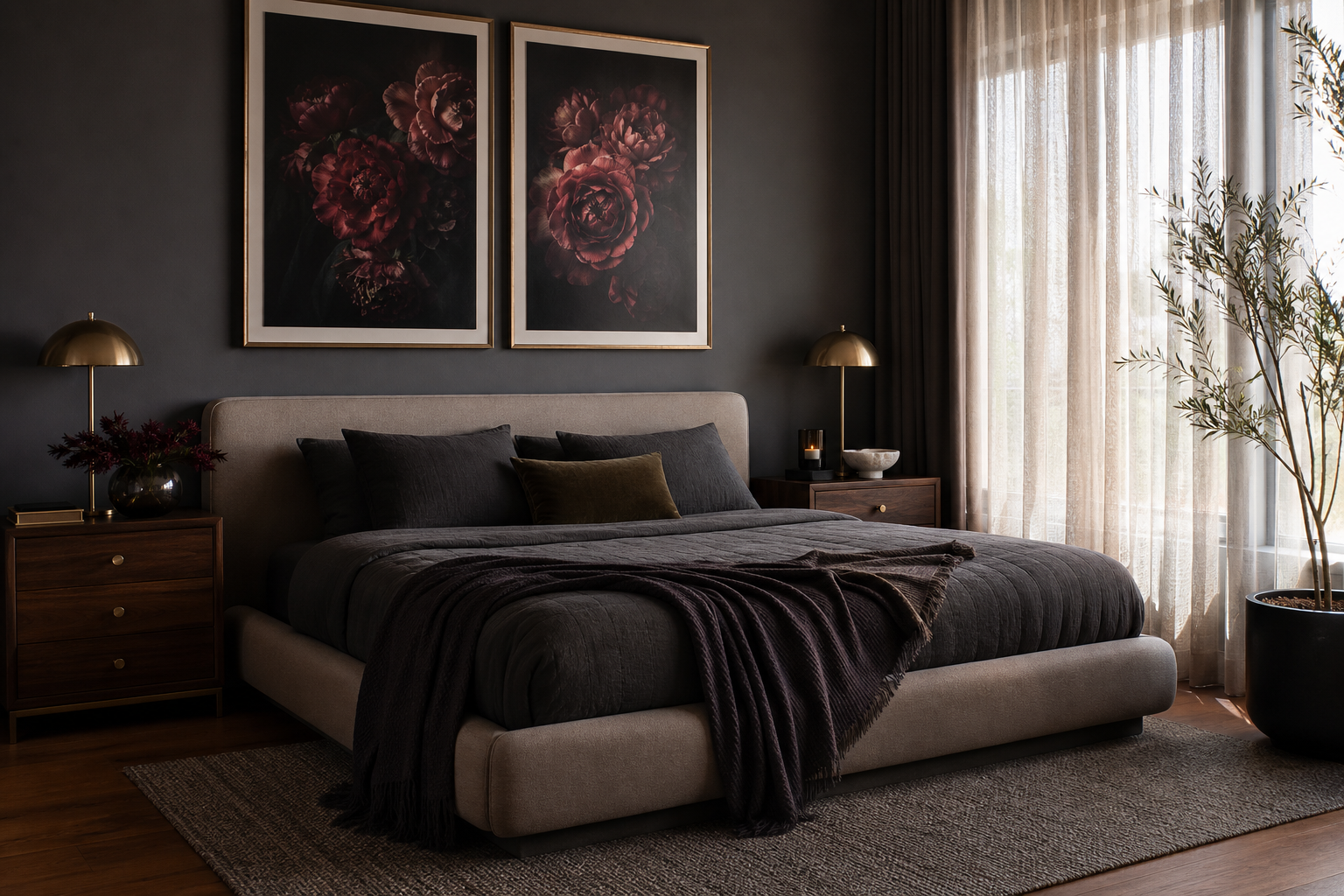
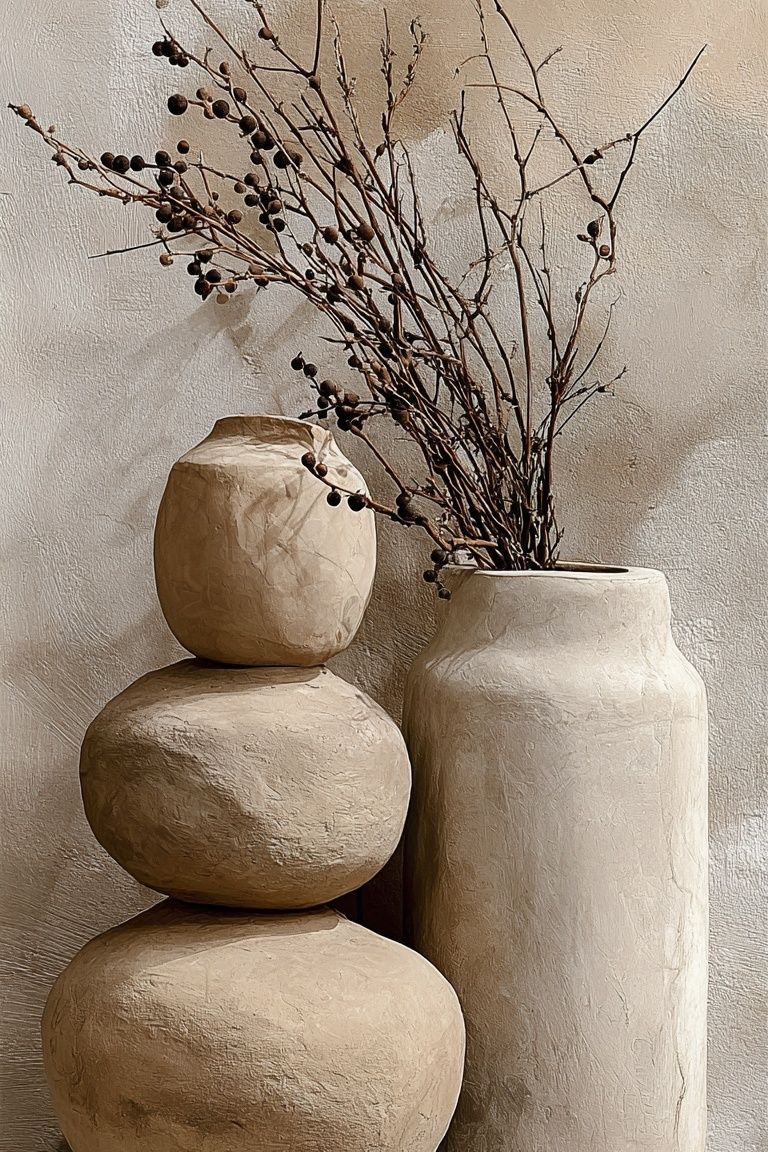
A beige on beige poster print does something louder wall art often cannot — it changes the mood of a room without taking over. Instead of adding contrast through bold color, it builds depth through texture, shadow, and closely related tones. That makes it especially effective in homes where the goal is calm, not spectacle.
The best version of this look is never blank. It relies on small shifts — sand against cream, oatmeal against stone, matte surfaces against soft linework. If you already gravitate toward our Minimalist collection, subtle Abstract wall art, or quiet Fine Art prints, this is the tonal thread that ties them together.
Why Beige-on-Beige Still Feels Fresh
Beige works now because interiors have moved away from sharp black-and-white contrast and toward layered neutrals with visible materiality. A room in 2026 feels finished when it combines 3 to 5 related tones rather than just one flat "neutral". Think ivory walls, flax curtains, oak wood, clay ceramics, and one beige on beige poster print that bridges them all.
A tonal print also softens architecture. In rooms with hard lines — square sofas, plain drywall, large wardrobes, straight desks — a warm neutral artwork introduces visual relief without disrupting the palette. That matters in smaller spaces, where one high-contrast artwork can make the wall feel busier than it is.

Another reason the look feels current is that it photographs well but lives even better. Soft neutrals react to daylight throughout the day — cool at 9 a.m., warmer by 5 p.m. That constant shift keeps a pared-back room from feeling static. A piece such as Late afternoon light beige wall, for example, echoes that same changing warmth in a very understated way.
What Makes a Beige on Beige Poster Print Work
A strong beige print needs one of four things: texture, movement, line, or composition. Without at least one of these, the artwork can disappear into the wall. Texture might look like plaster, fabric, paper grain, or soft brushwork. Movement can come from curved forms, layered shadows, or washed edges. Linework gives structure. Composition keeps the eye moving across the piece.
This is why material-inspired prints often outperform flat digital blocks of beige. A print such as Textured Fabric — Minimalist Print, White Cream Texture Poster, or Textured White Abstract Poster, uses surface detail to create contrast at close range. From 2 meters away, the effect is calm. Up close, it feels layered and intentional.
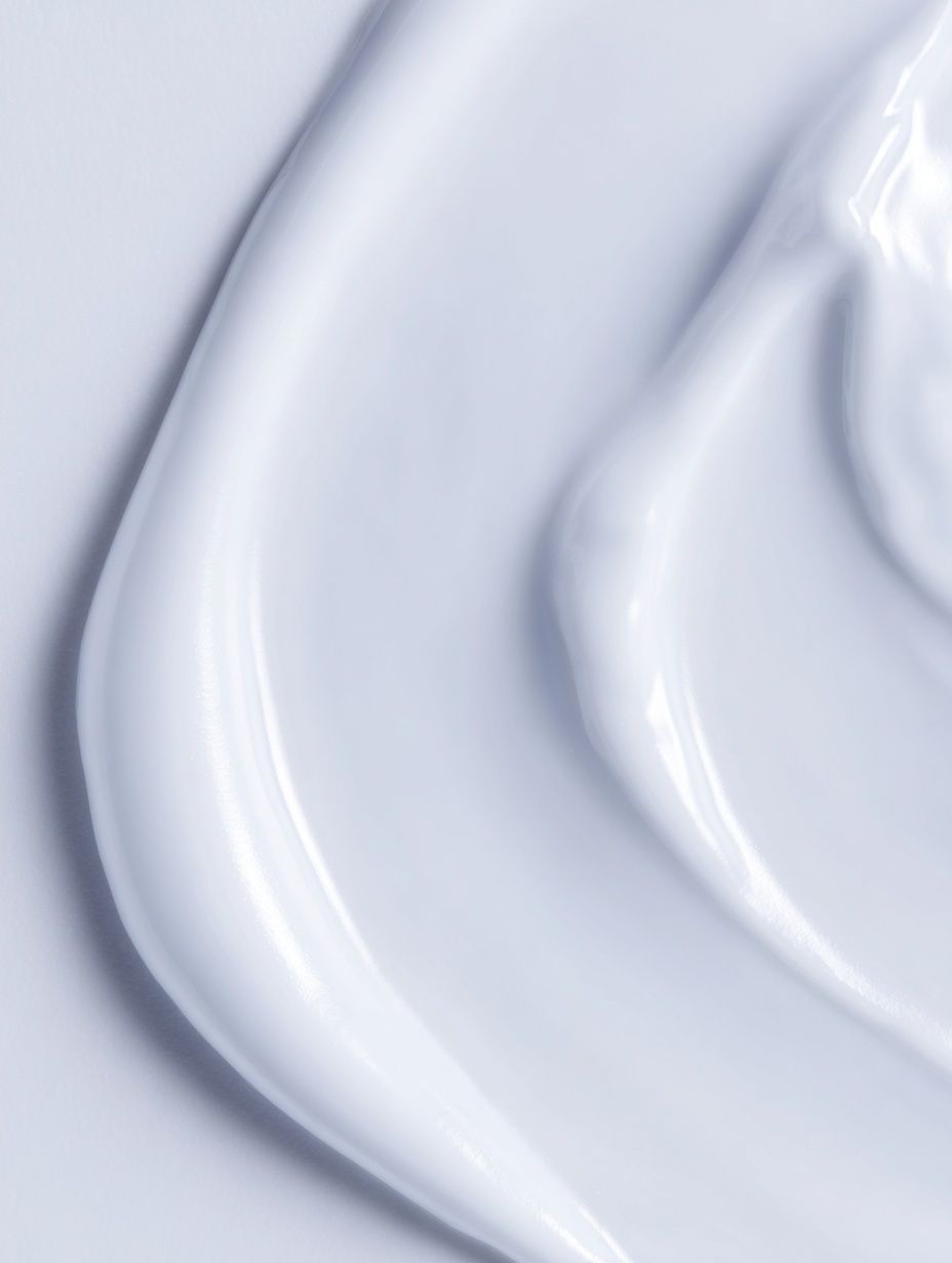
The most versatile beige on beige poster print usually has a tonal range of about 10% to 25% between its lightest and darkest areas. That is enough to register clearly on an off-white or greige wall, but still soft enough to preserve the quiet mood. If your walls are darker — mushroom, putty, or warm taupe — choose a piece with more cream and pale sand so it does not sink into the background.
Best Rooms for a Tonal Poster
Bedrooms are the easiest place to use this style because the palette already leans soft. Above a 140 cm, 160 cm, or 180 cm bed, a single horizontal print around 70 x 100 cm gives enough presence without creating visual pressure. Beige art also works well with upholstered headboards, washed linen bedding, and simple bedside lamps.

Living rooms benefit from tonal art when the furniture is already strong in shape. If you have a deep sectional, a chunky travertine table, or a sculptural floor lamp, the wall should support rather than compete. In that case, a single print from our minimalist art prints or warm Bohemian wall art can anchor the seating area.
Hallways and relaxed workspaces are also ideal. Narrow transitional spaces often need visual softness more than color. Over a console table, a vertical 50 x 70 cm print adds rhythm without crowding the wall. In a home office, beige art reduces visual noise behind a desk or shelving unit, which is especially helpful if the room doubles as a video-call background.
How to Style It with Furniture, Walls and Light
Match your beige art to the room's undertone first. If the space contains pink-beige upholstery, light walnut, and brass, choose a warmer print with blush or sand notes. If the room leans gray-beige with concrete, black metal, and cooler oak, choose cream, chalk, or stone-based neutrals instead. Mixing warm beige art with cool greige walls can work — but only if another element, like curtains or a rug, connects the two.
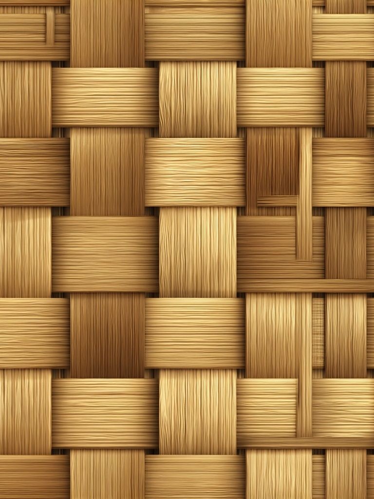
Natural materials make beige artwork look richer. Oak, ash, travertine, boucle, jute, limewash, and unglazed ceramic all add the tactile quality that tonal prints need around them. A piece like Woven Bamboo Texture Poster works particularly well in rooms that already include cane, rattan, or relaxed woven finishes.


Lighting matters more than people expect. A beige on beige poster print will look flatter under cold overhead LEDs above 4000K. For living rooms and bedrooms, 2700K bulbs are a safer choice because they pull out the warmer undertones in both the wall and the print. If the artwork hangs opposite a window, use a frame with non-glare acrylic or place it slightly off-axis to reduce reflections.
Choosing the Right Size and Frame
Scale is the difference between "subtle" and "forgotten". Over a sofa 200 to 240 cm wide, aim for artwork that spans roughly 55% to 70% of the furniture width. That usually means one 70 x 100 cm print, one 100 x 140 cm piece, or a pair of 50 x 70 cm works. Above a console, 50 x 70 cm is often enough. On a narrow wall section between door frames, 30 x 40 cm can work if paired with a sconce or stack of objects below.
Frame choice should reinforce the calm. Light oak gives beige tones a natural, Scandinavian softness. Matte white keeps the look crisp on deeper walls. Thin brushed brass adds warmth, but only if the room already has metal accents. Heavy black frames tend to overpower tonal art unless the print itself has stronger linework.
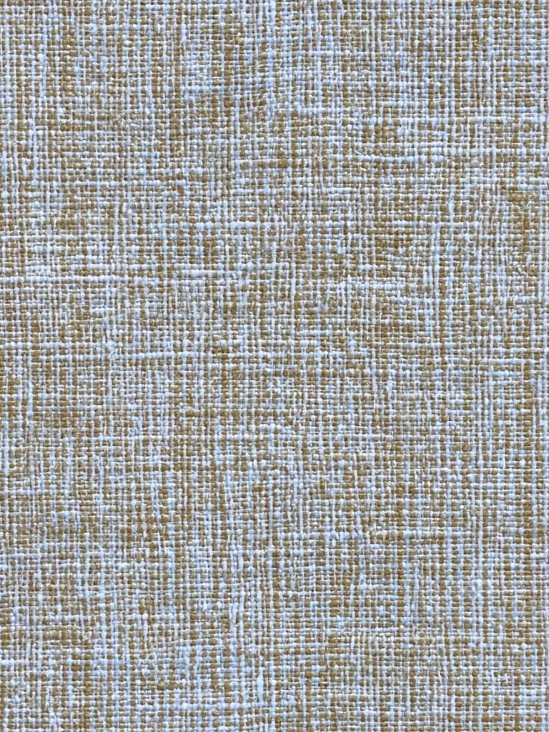
If you want the artwork to feel integrated rather than floating, repeat one tone from the print elsewhere in the room. A cream mat can echo curtains. A sand frame can pick up the rug. A textured piece like Elegant White Fabric — Minimalist Print or Textured Waves — Minimalist Print often benefits from this approach because it reads as part artwork, part material layer.
Building a Calm Gallery Wall Around It
A gallery wall built around beige tones works best when one piece leads and the others vary in structure, not color. Start with one larger beige on beige poster print as the anchor. Then add 2 to 4 supporting works with different visual languages — perhaps one botanical silhouette, one fabric texture, one soft abstract wave, and one quiet photographic piece.
Keep the palette within a narrow band: cream, flax, almond, taupe, clay, and soft brown. If every piece is exactly the same tone, the arrangement can blur. If one or two pieces are 15% darker, the whole wall gains shape. The easiest way to do this is to combine pieces across Minimalist, Abstract, and Fine Art wall art while keeping frames consistent.

Use 5 to 7 cm spacing between smaller frames and up to 8 to 10 cm around a larger center piece. Lay the arrangement on the floor first, then hang the midpoint of the group at roughly 145 cm from the floor. If you want a softer, less formal result, combine one abstract texture with a figurative or interior-inspired image such as Window with Sheer Curtain — Fine Art Print.
Shop the Look: Simple Ways to Finish the Space
The finishing layer around beige art should be quiet but not empty. Add one black accent at most — a lamp stem, small vase, or side table edge — to sharpen the room slightly. Then balance it with at least three warmer elements: linen curtains, oak or walnut wood, and a textured rug. This keeps the space grounded instead of washed out.
For styling surfaces, group objects in threes and vary heights by 10 to 20 cm. A low ceramic bowl, a medium stack of books, and a taller branch arrangement will echo the layered feel of the wall without pulling attention away from it. If the room feels too uniform, introduce a muted pattern through Mid Century Modern prints or a restrained striped piece from the Bohemian collection rather than adding stronger color.
Final thoughts
A beige on beige poster print is less about color and more about control. It lets you add presence to a wall through tone, texture, and proportion, which is why it suits calm interiors so well. Done properly, it does not disappear — it settles the room.
Choose a piece with visible surface interest, size it generously, and frame it in a finish that matches the materials already in your space. That is the formula that makes a beige on beige poster print feel deliberate rather than tentative.
Frequently Asked Questions
What wall color works best behind beige art?
Off-white, warm white, greige, putty, and pale taupe are the safest choices. If the wall is very close in tone to the print, use a mat or lighter frame to keep definition.
Should I use glass or acrylic for a beige framed print?
Acrylic is lighter and often better for larger sizes like 70 x 100 cm or 100 x 140 cm. Non-glare acrylic is especially useful in bright rooms with large windows.
Can beige artwork work in a room with gray furniture?
Yes — choose beige pieces with cooler notes like stone, mushroom, or chalk. Add one bridging material, such as oak or linen, so the palette feels connected.
How high should I hang one print above a bed or sofa?
Leave 15 to 25 cm between the furniture and the frame. That gap keeps the artwork visually attached to the piece below it instead of floating too high.
What frame width suits minimalist beige art?
For most prints, 1.5 to 2.5 cm frame width looks clean and current. Wider frames can work, but they tend to feel more traditional and heavier on a tonal wall.