What Makes Anime Girl Pastel So Appealing
The appeal of anime girl pastel art comes down to balance. It keeps the expressive faces, stylized detail, and emotional atmosphere that anime fans want, but swaps high-contrast intensity for a softer palette. Blush pink, powder blue, pale lilac, and creamy peach create a look that feels calmer on the wall, especially in bedrooms and desk areas where bold neon can feel too busy after a few hours.
Pastel anime artwork also feels current because it overlaps with wider interior trends. Soft color stories work naturally with minimalist wall art, light wood furniture, white bedding, and muted textiles. That makes anime girl pastel easier to integrate than darker fandom-focused decor, which often demands a full themed room to feel cohesive.
A strong pastel piece usually still has contrast — just in smaller doses. Think rosy shadows, cool silver hair, a black ribbon, or a deeper mauve outline. That 10 to 20 percent of darker detail stops the image from looking washed out and helps it read clearly from 2 to 3 meters away.

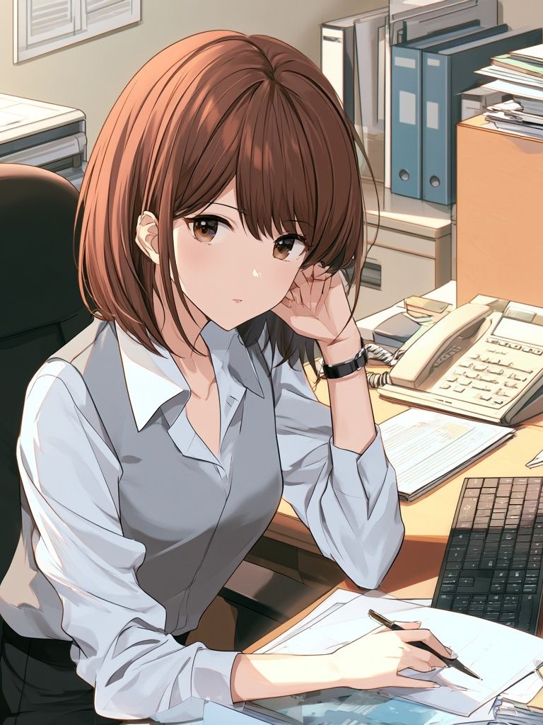
If you want the look to stay soft rather than sugary, choose imagery with clean composition and one clear figure. A single character portrait, like those in our Anime collection, often works better than crowded action scenes because the room gets breathing space around the art.
Choosing a Pastel Palette That Works
The easiest way to build around pastel anime art is to limit the room to two main pastels and one neutral. A reliable mix is blush + lilac + warm white. Another is mint + powder blue + light oak. If your room already has grey furniture, choose cooler pastel shades — blue, lavender, icy pink — so the colors feel intentional instead of mismatched.
For warmer bedrooms, peach and blush are the safest starting point. They pair well with cream walls, beige rugs, and brass lamps. For a more digital, slightly futuristic setup, try lilac and icy blue next to white desks and translucent accessories. In both cases, keep stronger accent colors under 15 percent of the room so the wall art remains the visual anchor.

If your art includes more than one pastel tone, repeat at least one of them elsewhere in the room. A lilac cushion that matches the shadows in the print or a mint desk mat that echoes a hair accessory is enough. This is where crossover pieces from our Illustration collection can help, especially when they carry the same airy color language without adding another strong subject.
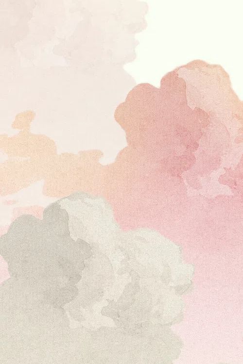
For a softer layered wall, pair character-led pieces with simple atmospheric prints. A cloud study or dreamy background image gives the eye a break and prevents every frame from competing for attention. That approach works especially well with Soft Pastel Clouds beside a more detailed anime portrait.
Best Rooms for Anime Girl Pastel Prints
Bedrooms are the most natural fit because pastel art supports a calmer mood. Above a 140 to 180 cm bed, one medium-to-large piece creates a focal point without overwhelming the headboard wall. If you prefer symmetry, use two vertical prints between 40x50 cm and 50x70 cm with a gap of 5 to 8 cm.
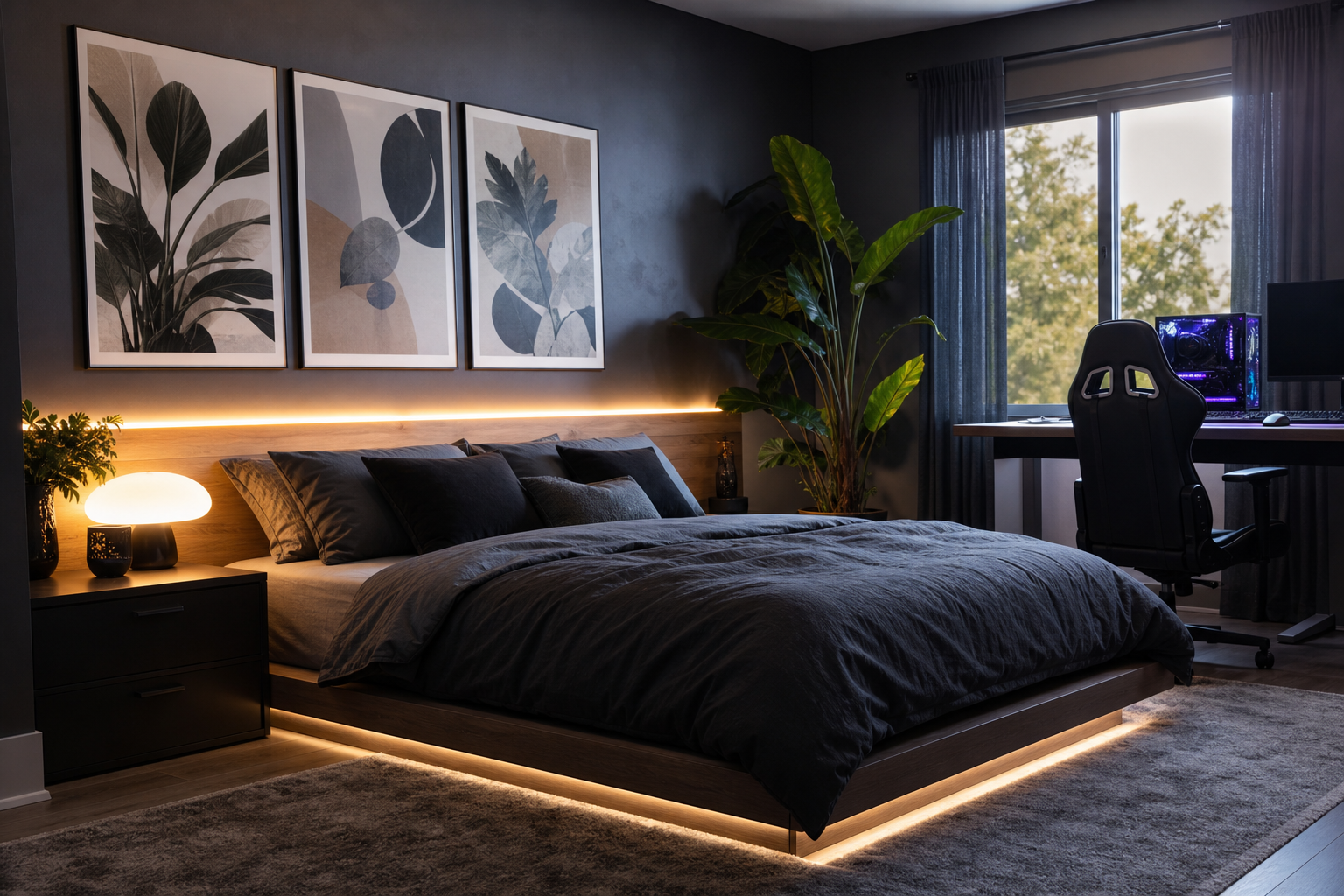
Desk setups and gaming corners are the second strong option. Here, pastel anime art softens the hard edges of monitors, keyboards, and LED strips. If your setup already includes RGB lighting, keep the wall art gentle — pink, pearl, lavender — so the room does not turn visually noisy at night.

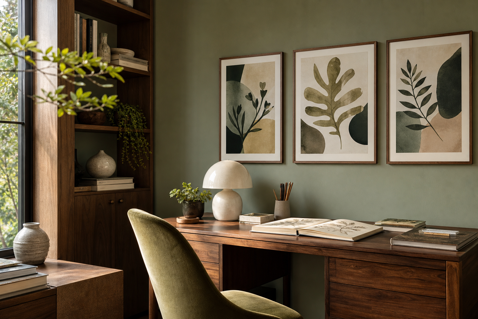
Creative studio corners also benefit from this style because it feels personal without being distracting. Near a sketch desk or reading chair, the artwork adds identity and softness. If you are mixing styles, pastel anime pieces sit comfortably beside fashion art prints or a delicate print from the Kids collection when the palette is aligned.
How to Size and Place the Artwork
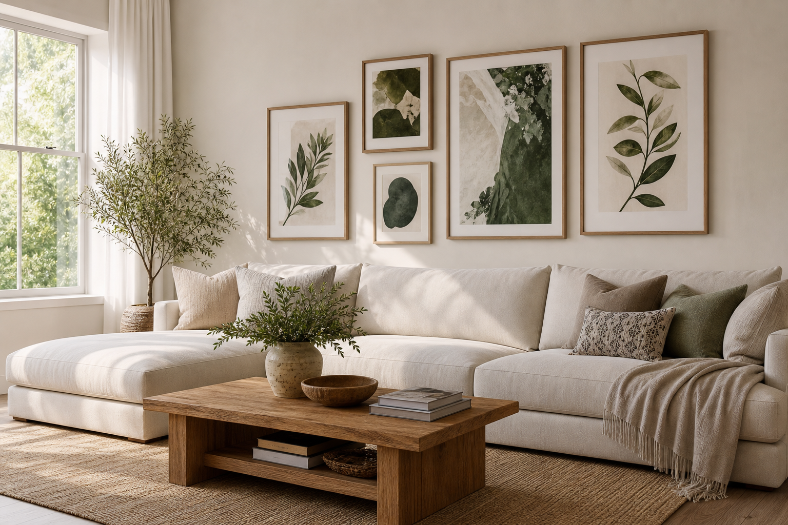
The cleanest rule is simple: your art grouping should span about 60 to 75 percent of the furniture width below it. Above a 160 cm bed, aim for a total arrangement width of roughly 96 to 120 cm. Above a 120 cm desk, stay around 72 to 90 cm wide.
Single prints work best when the illustration has one strong focal character. Go for 50x70 cm if you want presence without dominating a small room, or 70x100 cm if the wall is wide and the rest of the decor is restrained. Pairs are ideal when you want a more styled editorial feel — one character piece balanced by a softer complementary image.
For placement, keep the center of the arrangement around 145 cm from the floor in open wall areas. Above furniture, leave 15 to 25 cm of space between the top edge of the headboard, desk, or shelf and the bottom of the frame. That tighter spacing makes the art feel connected to the furniture rather than floating too high.

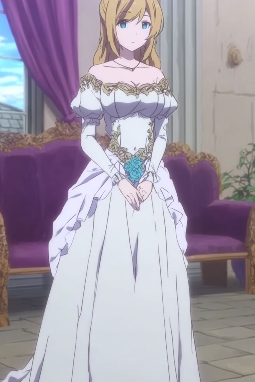
If you are building a small gallery wall, keep frame finishes consistent and vary subject intensity instead of color chaos. One detailed anime portrait, one atmospheric pastel illustration, one simpler profile image, and one light abstract-style piece often looks more refined than four equally busy works. For a moodier version of the style, a product like Dark Elegance — Anime Art Print can work — but only if the rest of the grouping stays light.
Framing and Finish Choices That Elevate the Look
White frames are the easiest match for pastel anime art because they keep edges crisp and fresh. Light oak adds warmth and works especially well with peach, blush, and cream-heavy prints. Black frames can work too, but only when the artwork already includes darker linework — otherwise the border may feel too heavy for the palette.
Matte finishes usually suit this look best. They reduce glare from windows, monitors, and overhead lighting, which matters in bedrooms and gaming rooms where screens are already reflecting light. Glossy surfaces can make pale colors look more saturated, but they also highlight fingerprints and reflections more quickly.

If you want a slightly more elevated presentation, choose framed pieces with a white margin around the image. A 3 to 5 cm border gives the artwork breathing room and makes even a playful anime subject feel more curated. This is especially helpful when pairing anime art with adjacent styles such as minimalist prints or soft portrait-led pieces like Fashion Model in Pink Suit.
Styling Around the Print Without Clutter
Pastel wall art works best when the rest of the room supports it quietly. Start with textiles: one duvet, one throw, and two to three cushions are usually enough for a bed wall. At a desk, a fabric mouse pad, one lamp, and one small shelf often create more polish than adding multiple figurines and bright accessories around the frame.
Lighting matters more than most people expect. Warm bulbs around 2700K to 3000K flatter blush, peach, and cream tones, while neutral bulbs around 3500K keep lilac and powder blue looking clearer. If your artwork hangs near LED strips, set them to a static soft white or pale pink rather than cycling colors, which can distort the print.

Use accessories with restraint. Transparent acrylic, pale ceramics, frosted glass, and light wood all support the look without competing. Busy pattern mixing — especially strong checkerboards, saturated neon, or heavy black-and-red gaming decor — can break the softness very quickly. If you want extra texture, borrow from bohemian wall decor through one woven basket or a subtle textile, not an entire boho palette shift.
Final Styling Tips for a Cohesive Pastel Setup
The most polished rooms treat pastel anime art as part of a broader color story, not as an isolated fandom piece. Keep one hero print, repeat one or two of its colors across the room, and give it enough empty wall to stand out. In smaller bedrooms, that often means one large piece or one balanced pair rather than a crowded collage.
When mixing styles, stay consistent with softness. Pastel anime portraits pair best with airy illustration, selective fashion imagery, and simple neutral framing. If every piece shares either the same palette or the same visual calm, the room feels intentional instead of themed.
Frequently Asked Questions
What frame size works best for a small bedroom wall?
For compact rooms, 40x50 cm and 50x70 cm are the safest sizes. They add presence without shrinking the wall visually.
Can pastel anime prints work with dark furniture?
Yes — add one bridge tone such as dusty pink, soft grey, or pale lavender in bedding or desk accessories. That softens the contrast between the artwork and the furniture.
Should I use one large print or several small ones above a desk?
One large print usually looks cleaner above desks under 140 cm wide. Multiple small frames work better when you have open side space and want a more collected look.
Do matte prints lose color intensity?
They can look slightly softer than glossy finishes, but that is often an advantage for pastel artwork. Matte also handles glare much better near windows and monitors.
What colors pair well with anime girl pastel art if I do not want an overly pink room?
Try powder blue, soft grey, ivory, and pale sage. These keep the setup gentle while making the palette feel more grown-up.