What "Aiming for the Moon" Means in Wall Art
"Aiming for the moon" works in interiors because it combines two strong ideas in one visual theme: ambition and wonder. On the wall, that usually translates into night skies, spacecraft, celestial geometry, distant horizons, or clean symbolic forms that suggest progress rather than clutter. The best aiming for the moon pieces feel uplifting, not childish — more forward-looking studio than novelty bedroom.
This theme also gives you flexibility. You can lean literal with pieces from our Space collection or take a quieter route through Minimalist art prints and Typography wall art. That range matters if you want the room to signal focus, imagination, or long-term goals without turning every surface into a themed set.
A good rule is to choose one dominant message. If the room is meant to feel driven and energised, sharp silhouettes and strong contrast work well. If the aim is calm aspiration, soft gradients, orbit-like curves, and restrained compositions create a better rhythm. In both cases, aiming for the moon is strongest when the art suggests momentum.
The Best Poster Styles for a Moon-Driven Mood
Minimalist space art is the easiest way to make the theme feel current. A single shuttle silhouette, a reduced planetary diagram, or a black-and-cream composition with lots of negative space gives the room a clear focal point without visual noise. If you already like pared-back interiors, mixing moon-inspired imagery with black-and-white minimalist textures keeps the look refined.
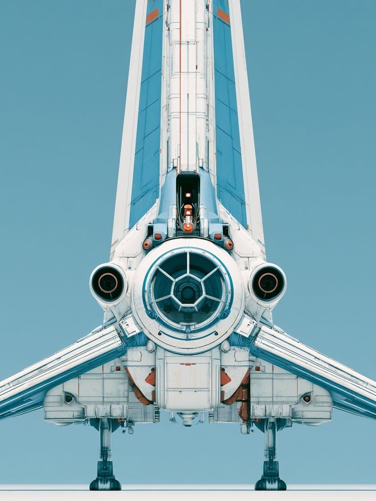
Vintage-inspired space prints bring more character. They work especially well in reading corners, home offices, and hallways where you want a sense of story. Slightly faded colour, archival-style illustration, and retro aerospace shapes feel intelligent and collected. A piece like Retro Space Shuttle introduces that exploratory tone while still feeling graphic enough for modern rooms.
Dreamier illustration styles are better for softer spaces. Bedrooms, guest rooms, and creative studios often benefit from art that feels imaginative rather than technical. Celestial sketches, zodiac references, and gentle cosmic line work add emotion to the aiming for the moon idea without relying on hard-edged sci-fi imagery.
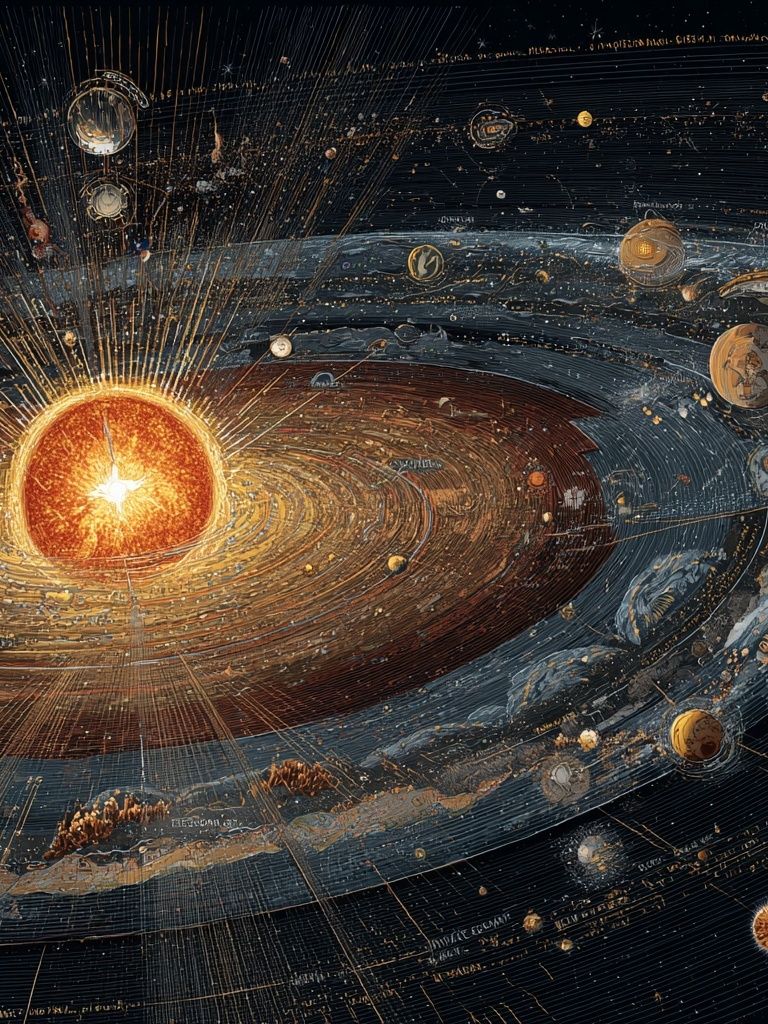
Typographic designs can also support the theme, but they need restraint. One quote-led print is enough in most spaces, especially if it sits beside an image-based piece. If you want words in the room, pair them with visual depth from the Illustration collection or with clean cosmic forms from our Solar System print so the wall does not read as flat.

Colours and Compositions That Feel Cosmic
The most effective colour palette for this look starts with midnight blue, charcoal, off-black, silver, and warm cream. That combination creates depth while staying easy to integrate with common interior finishes like oak, black metal, white plaster, and grey upholstery. If the room already has strong colour, keep the art mostly dark and neutral so the wall feels intentional rather than crowded.
Soft gradients can make aiming for the moon feel more atmospheric. Blue-to-black fades, smoke-like transitions, and pale lunar whites help larger walls feel expansive. You can borrow this mood from abstract work too — especially from Abstract wall art where texture and tonal movement can mimic cloud bands, dust, and distant light without spelling out the theme too directly.

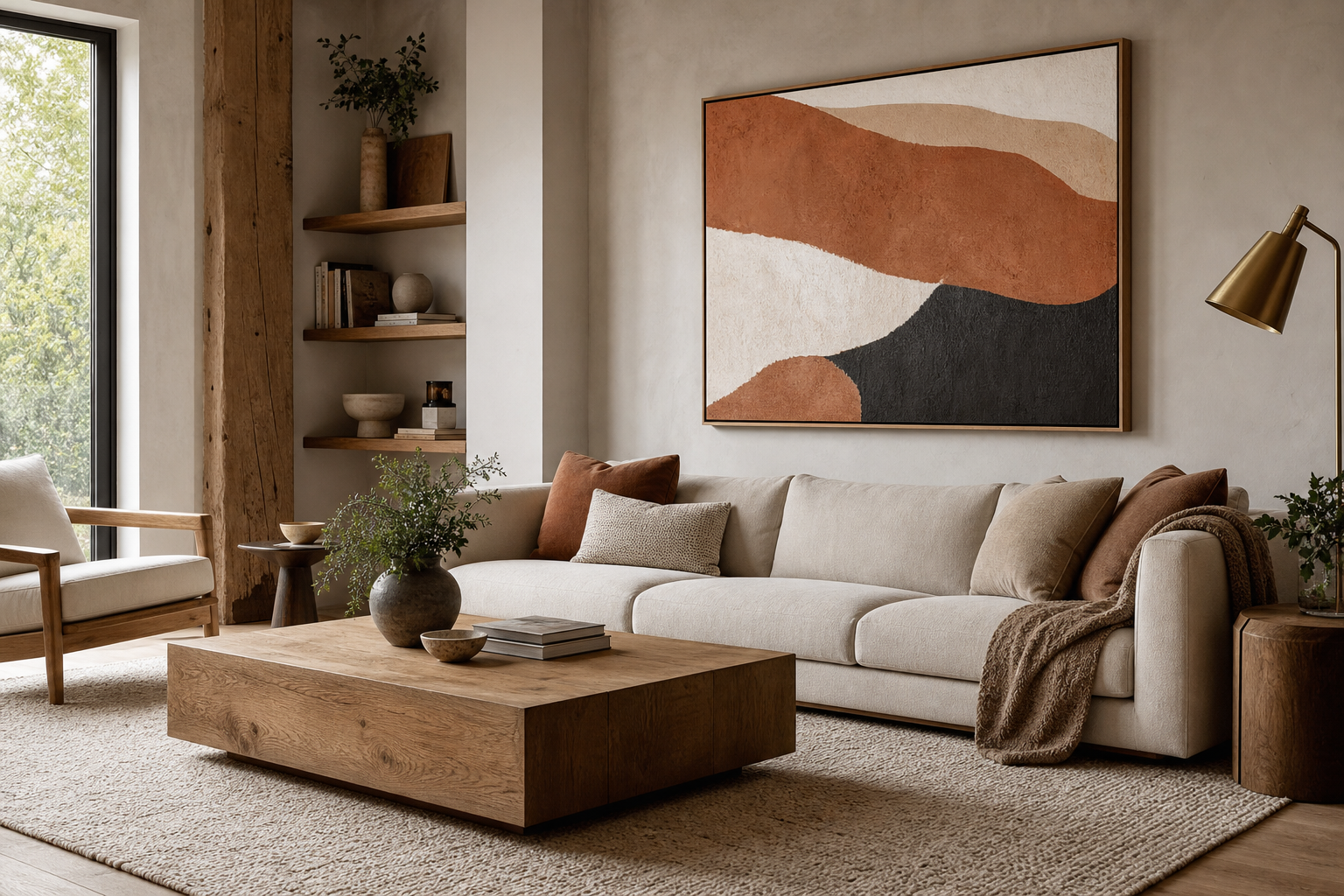
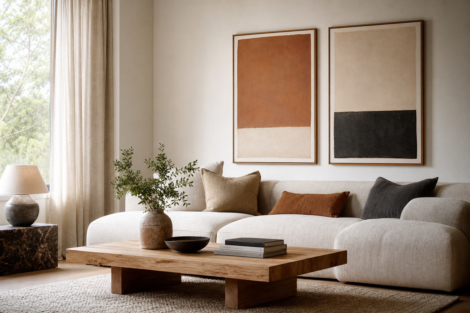
Composition matters as much as colour. One large vertical print around 50x70 cm creates a clear statement beside a desk or chest of drawers. Above a bed or sofa, a 70x100 cm piece or a pair of 50x70 cm frames usually gives better scale. Leave 15 to 25 cm between the top of furniture and the bottom of the frame so the artwork feels connected to the room, not stranded on the wall.
If you are building a small set, use a simple ratio: one hero print, two supporting prints. Keep the hero piece visually strongest — usually the darkest or most detailed. The supporting works should echo one element only, such as line work, silver-grey colour, or circular shapes. That is the easiest way to make moon-inspired art feel polished.
Where to Hang Moon-Inspired Posters
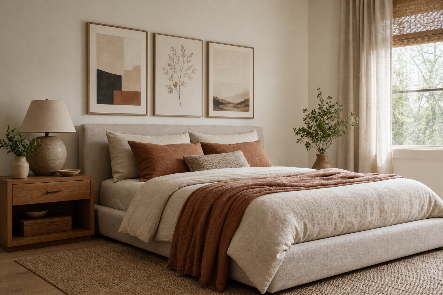
Bedrooms are the most natural setting because the theme already connects with night, rest, and reflection. Hang a single large piece centred over the bed, or build a horizontal trio if the headboard is at least 140 cm wide. In smaller bedrooms, one 40x50 cm frame above a nightstand can be enough to carry the mood without overfilling the walls.
Home offices are where the phrase really earns its meaning. Aiming for the moon wall art in a workspace should feel motivating, so choose cleaner, more directional pieces — orbit lines, shuttles, helmets, or structured diagrams. A desk wall benefits from a print hung at seated eye level, usually with the centre around 145 cm from the floor.

Hallways and transition spaces are underrated for this theme. Because people pass through them quickly, bold silhouettes and simple contrast work better than heavily detailed scenes. A narrow 30x40 cm or 40x50 cm print can turn a forgotten stretch of wall into a strong visual pause.
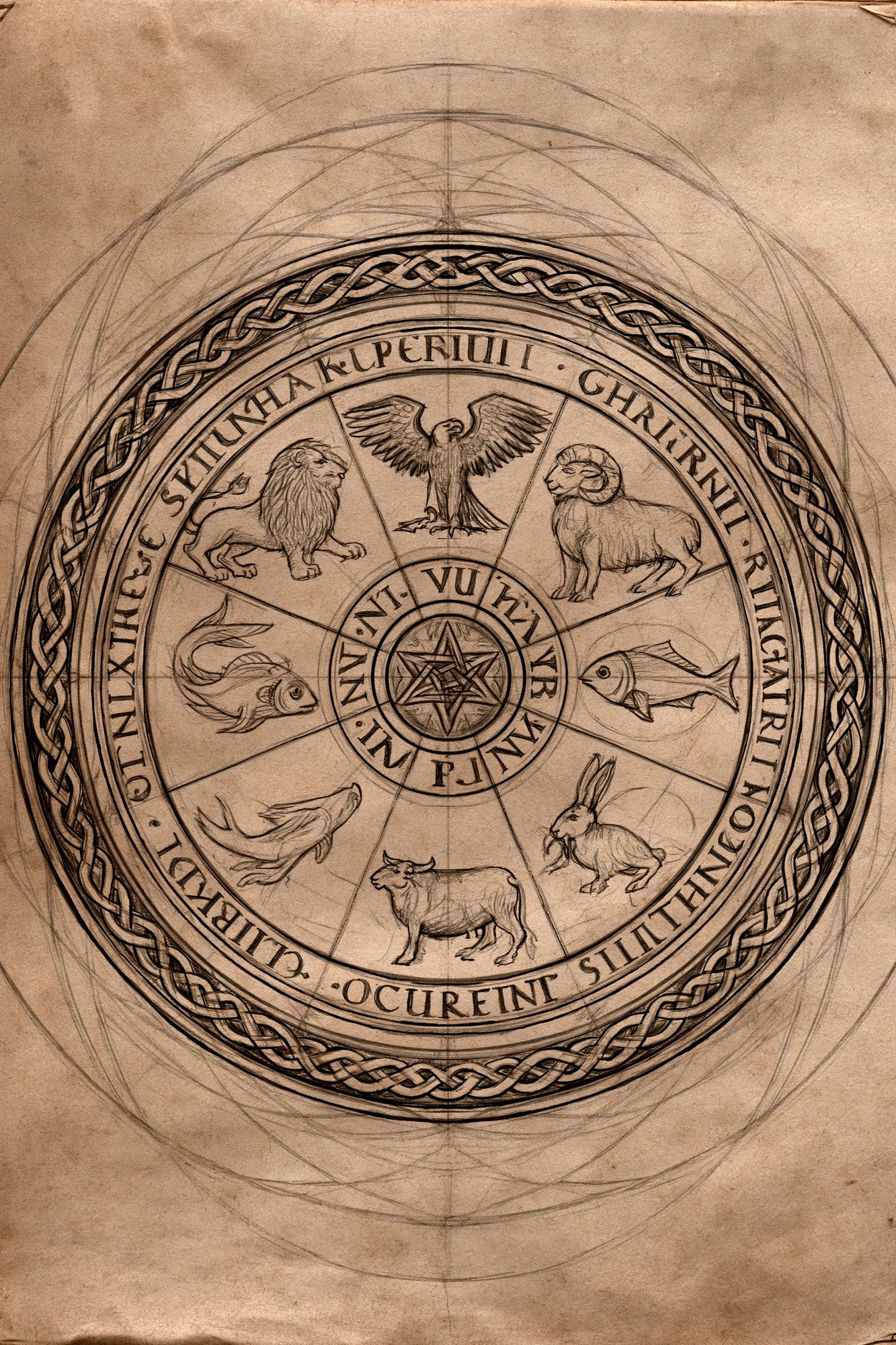
Creative corners — near a bookshelf, record setup, or sketch desk — are ideal for more expressive interpretations. A piece like Artist Illustration Falcon Heavy Demo adds energy, while celestial illustration from Zodiac Wheel Sketch softens the look if you want something more poetic.
Sizing, Framing, and Pairing with Other Prints
For most rooms, 50x70 cm is the most reliable starting size. It is large enough to make the aiming for the moon theme visible from across the room, but not so large that it limits pairing options. If your ceiling is under 240 cm, use this size for the main print before jumping to oversized formats.
Frame finish changes the tone fast. Matte black feels crisp and architectural. Brushed silver reinforces the cosmic angle and works especially well with blue-grey palettes. Natural oak warms up dark celestial imagery and is usually the best choice if the room has beige, cream, or walnut furniture. White frames are useful when you want the wall art to feel lighter and more Scandinavian.
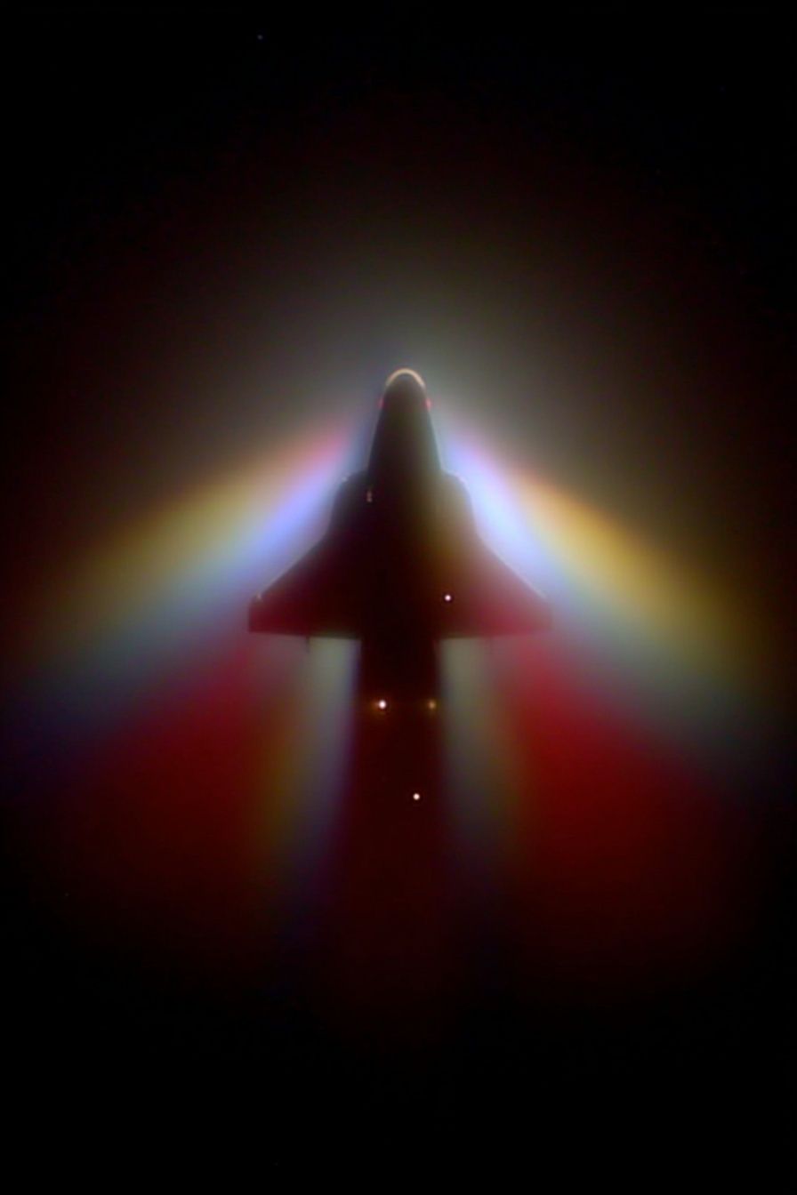
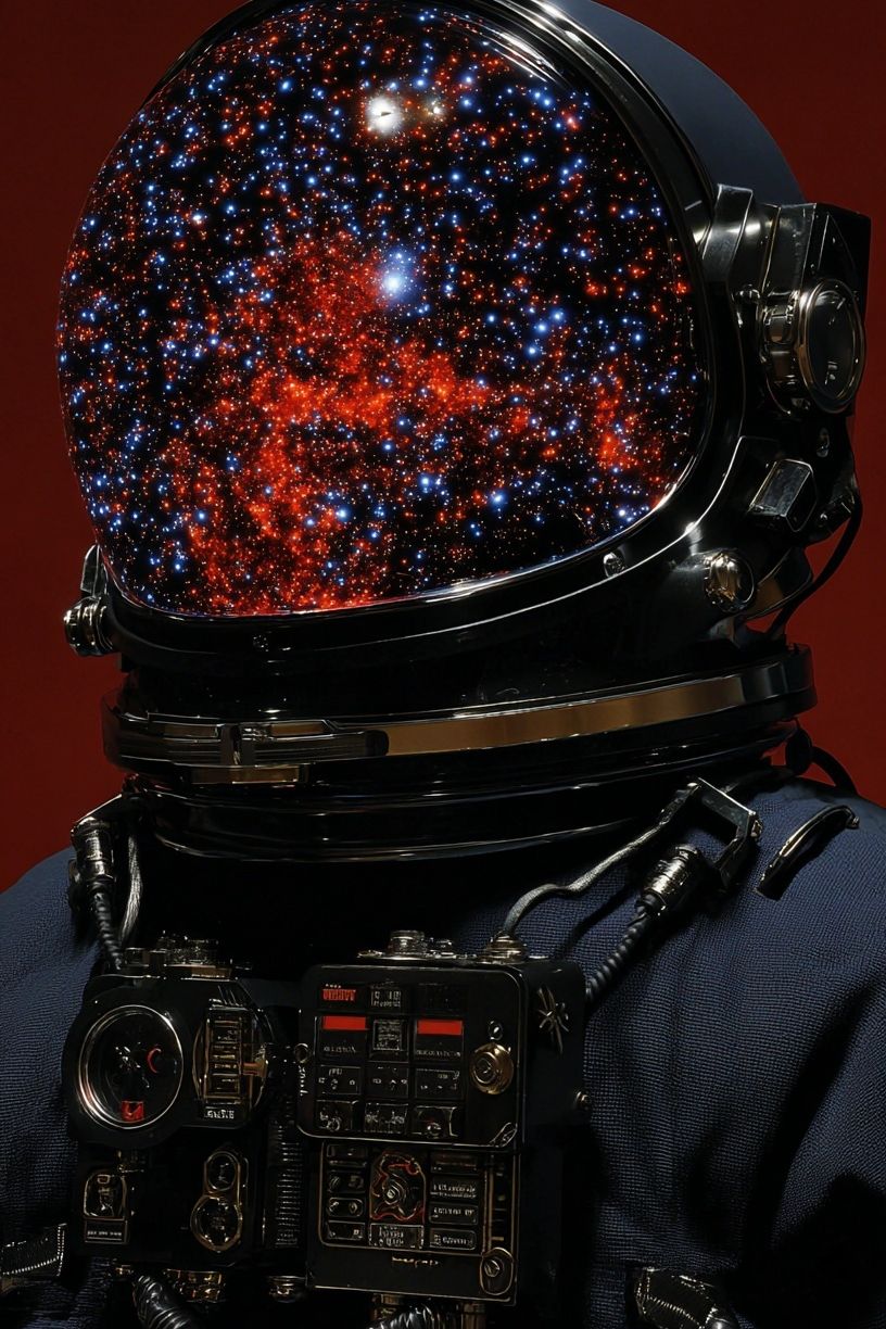
To build a gallery wall, start with one moon-led piece, then add two or three complementary works from nearby categories rather than forcing every frame to show space. Pair a spacecraft silhouette with textured white abstract art or a celestial sketch with Astronaut Helmet with Cosmic Reflection for contrast in both scale and detail. Keep spacing between frames at 5 to 8 cm for a tight modern arrangement.
A balanced four-frame layout often works best above a sofa: two 50x70 cm prints on the bottom row and two 30x40 cm prints above. That gives you structure without making the wall too formal. If all four pieces are equally dark, add one lighter abstract or line-based work so the arrangement breathes.

How to Style the Look Without Going Too Literal
The cleanest version of this theme uses references, not repetition. One or two celestial artworks, a dark textile, and a metal accent are usually enough. If you add moon lamps, star bedding, chrome decor, and multiple rocket images all at once, the room quickly loses sophistication. The better approach is 70% neutral base, 20% cosmic palette, 10% thematic detail.
Texture helps the room feel grounded. Linen curtains, wool throws, smoked glass, brushed metal, and dark-stained wood stop the art from feeling flat. This is especially useful if your prints have high contrast or digitally crisp lines. A textured companion print from the Textured Waves abstract print family can soften the overall scheme.
You can also make the theme more mature by mixing categories. A moon-inspired focal piece beside a restrained graphic from our Ground Rules typography print or a subtle neutral work from the Minimalist collection creates a layered wall that feels styled rather than obvious. That mix is often what turns aiming for the moon from a concept into a room with staying power.

Wrap-Up: Choosing a Poster That Feels Aspirational
The best aiming for the moon wall art does two jobs at once: it sharpens the room visually and reinforces the mood you want to live with. Choose one piece that carries the ambition clearly, then support it with calm colour, measured spacing, and materials that suit the rest of the interior.
If you want the look to last, buy for tone before theme. A print that feels focused, expansive, or quietly optimistic will age better than one that relies only on novelty. That is what makes aiming for the moon such a useful direction — it can be bold, elegant, or understated, as long as the composition keeps reaching upward.
Frequently Asked Questions
What frame width works best for space-inspired prints?
A slim frame between 1 and 2 cm suits most moon-inspired artwork. Go slightly thicker for large 70x100 cm prints so the piece feels anchored on the wall.
Should I use a mat border with dark cosmic art?
Yes, a white or off-white mat can help dark prints feel more premium and easier to read. A 3 to 5 cm mat is usually enough for 40x50 cm and 50x70 cm sizes.
Which wall colour pairs best with aiming for the moon artwork?
Soft white, light greige, charcoal, and muted blue-grey work best. If the wall is already dark, choose art with some cream or silver tones so it does not disappear.
Can I mix moon-inspired prints with non-space artwork?
Yes — abstract textures, minimalist line work, and restrained typography pair well. Keep one shared element, such as colour, frame finish, or circular forms, across the set.
How high should I hang a single print in a hallway?
Aim for the centre of the artwork at roughly 145 to 150 cm from the floor. In narrow hallways, that usually keeps the print comfortably at eye level without feeling too low.