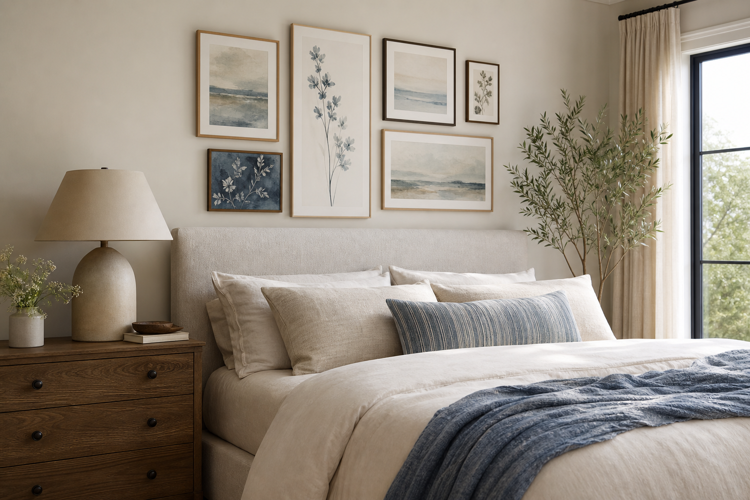
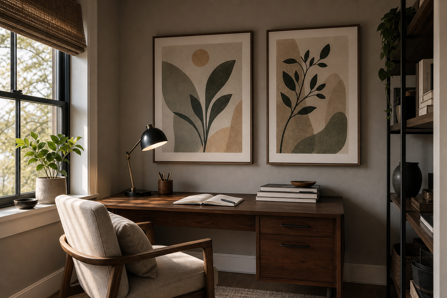
A walled city brings structure, age, and atmosphere to a room in a way softer landscape themes rarely do. Towers, gates, battlements, and narrow streets create instant visual depth, which is why this subject works so well in homes that need a stronger focal point than abstract art can offer.
The appeal of "a walled city" is its mix of order and mystery. You get clear geometry from ramparts and stone lines, but also layered detail from weathered surfaces, old routes, and clustered buildings. That balance makes the theme especially useful in interiors that already have solid materials such as oak, linen, iron, or matte plaster.
What Makes a Walled City So Compelling
A fortress-inspired wall theme feels grounded because it is built on real visual weight. Thick walls, repeated arches, and elevated viewpoints naturally pull the eye upward and across a composition. In practical styling terms, that means one well-chosen print can hold a 120 to 180 cm stretch of wall above a sideboard or desk without looking thin.
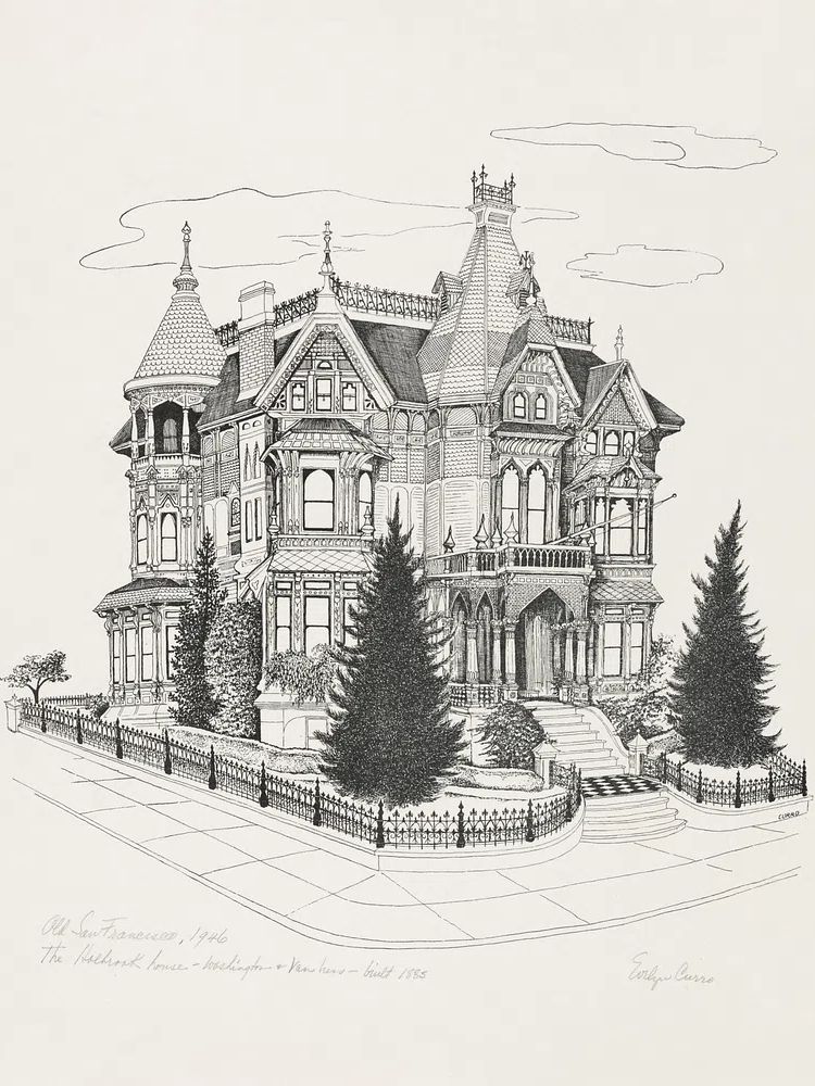
Historic urban scenes also bring narrative without becoming busy. A single image of gates or hillside fortifications suggests travel, trade, defense, and daily life all at once. If you already like architectural subjects, our architecture collection is a strong starting point, while the maps and travel prints category adds a more geographic, exploratory angle.
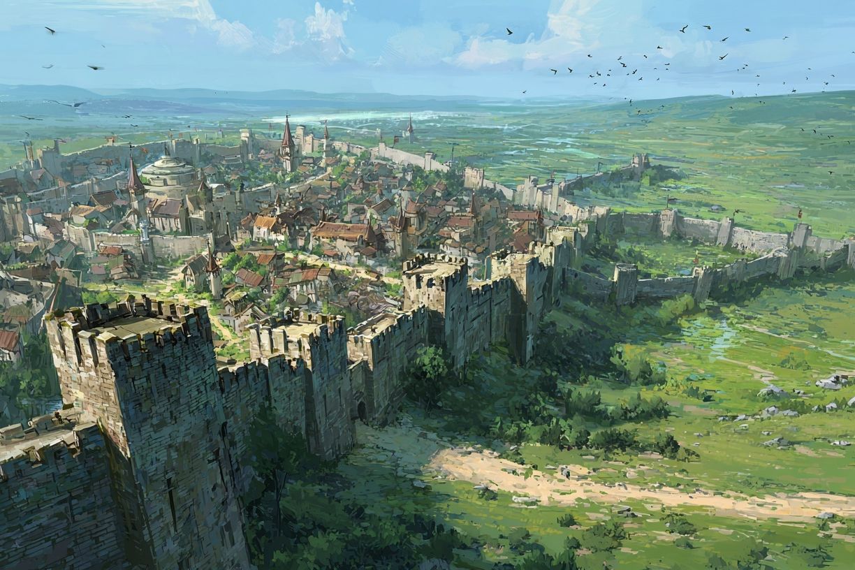
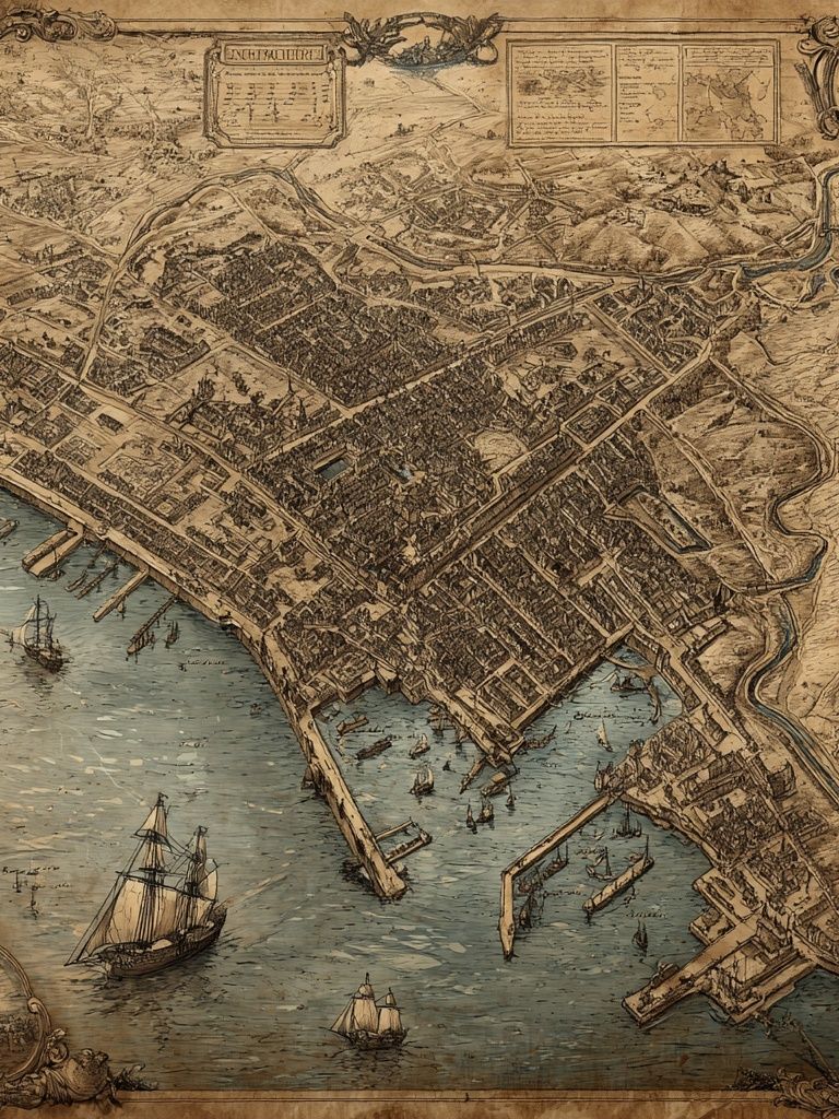
If you want the room to feel storied rather than theatrical, choose imagery with visible distance and layered elevation. Art that shows outer walls, inner buildings, and sky creates three reading planes instead of one flat scene. That is exactly why a piece like Medieval Walled City Landscape Print has more presence in a study or hallway than a simpler skyline silhouette.
Choosing the Right Poster Mood
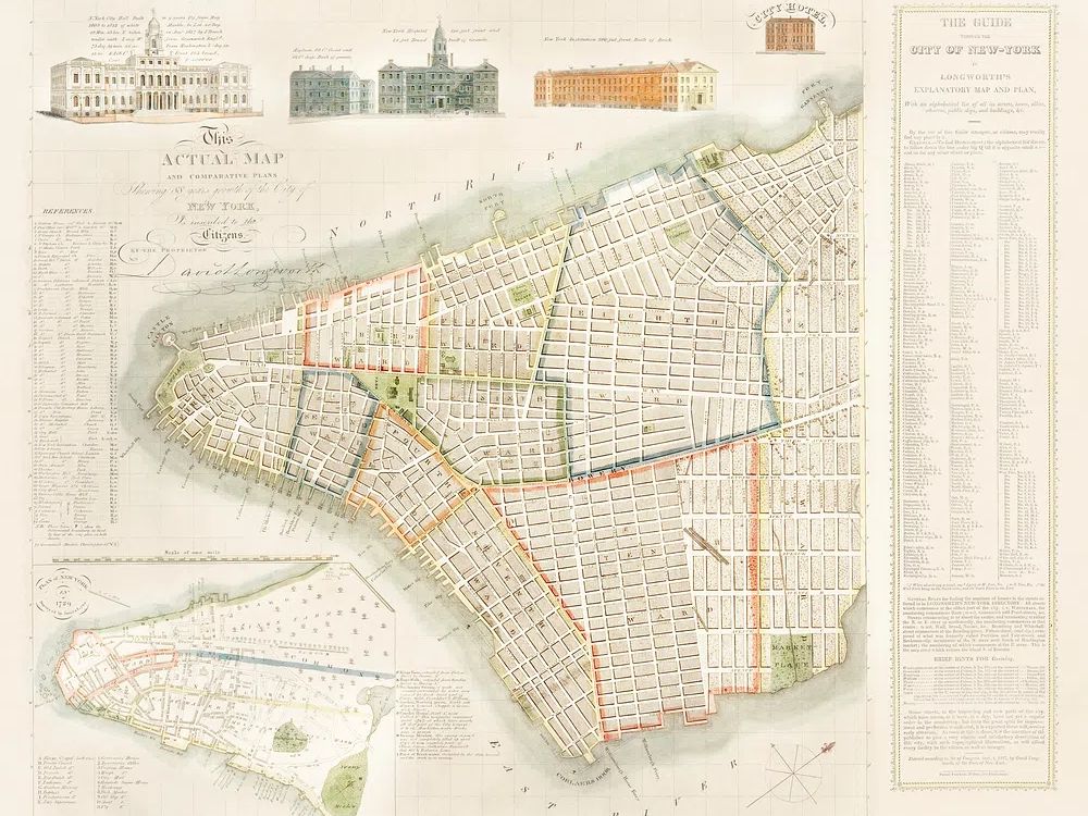
There are three strong directions for this theme: painterly historic views, travel scenes with stone architecture, and map-led compositions. Painterly pieces feel richest in traditional or transitional interiors because they soften the hard edges of fortress forms. Travel imagery works better in brighter homes where you want the architecture to feel collected rather than heavy. Map-style art is the cleanest option for smaller rooms.
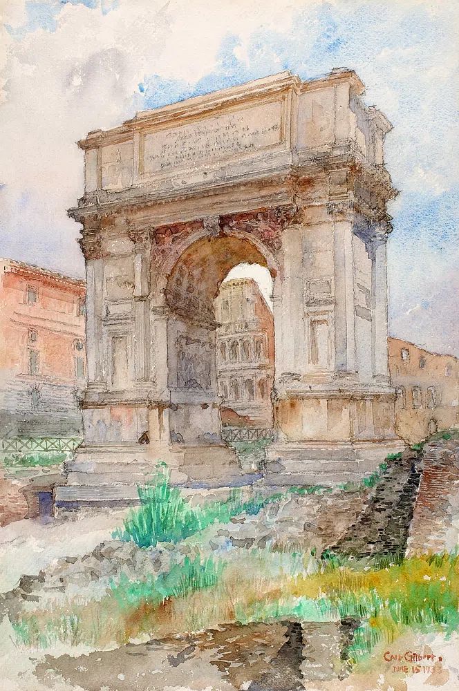
If you want a direct interpretation of a walled settlement, lean into fine art with visible masonry, clustered rooftops, and uneven terrain. If you want a looser reference, prints with arches, cliffside buildings, or old city layouts still support the theme without making the room feel costume-like. This is where Roman Arch Watercolor Travel Print and Vintage City Map Poster can work as supporting pieces around a stronger central image.

A useful rule is 60/30/10. Let 60% of the display be the main historic city scene, 30% supporting architectural or map imagery, and 10% negative space from mounts and wall around the frames. That ratio keeps "a walled city" feeling composed instead of theme-park literal.

Working with Colour and Texture
The strongest palette for this look starts with stone-based neutrals: chalk, sand, taupe, smoke, and umber. Add one darker anchor such as deep navy, iron black, or olive-brown. A simple 70/20/10 room split works well — 70% light neutrals on walls and larger furniture, 20% medium wood or leather, 10% dark accents in frames, lamps, or textiles.
Texture matters as much as colour. Fortress imagery looks more convincing next to tactile surfaces: limewash paint, brushed wood, woven wool, hammered metal, and natural linen. Smooth, glossy finishes tend to flatten the mood. If your room already has cleaner lines, you can still introduce texture through art choice — pieces with aged-paper tones from our vintage print collection are especially effective.
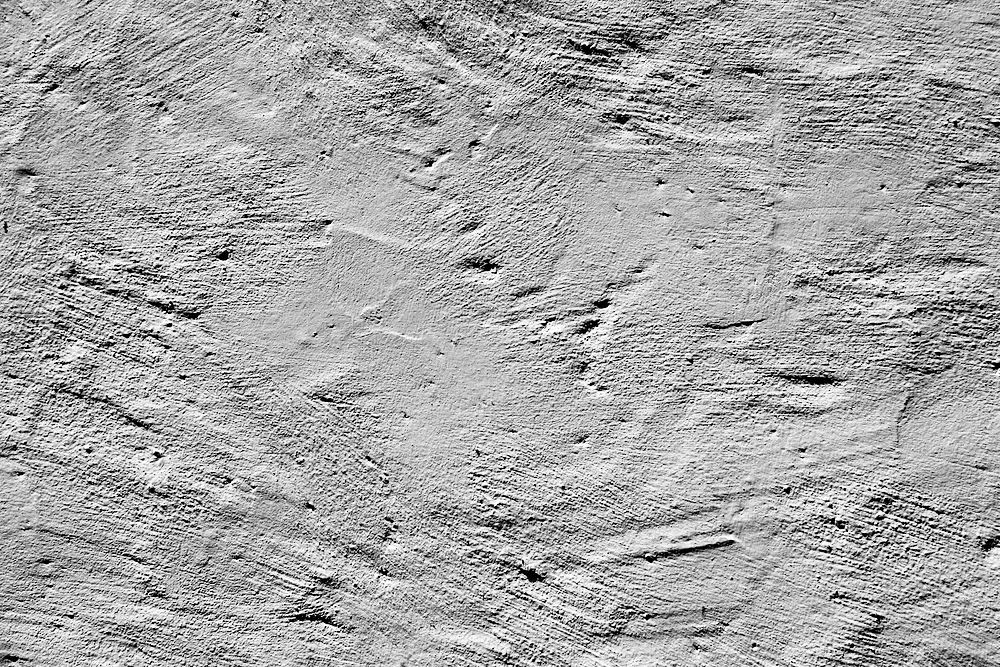
A more restrained way to support the theme is pairing historic imagery with one textural minimalist piece. Textured Concrete Wall — Minimalist Print echoes masonry without repeating the same visual story. That pairing is useful if the room needs calm more than drama, especially in modern apartments with white walls and limited architectural detail.
Where a Walled City Print Fits Best
Living rooms suit this theme when the furniture has enough visual weight to match it. Think sofas with full arms, substantial coffee tables, and curtains that reach the floor. A framed city-wall landscape in 50 x 70 cm or 70 x 100 cm works best above a console, while a pair of 40 x 50 cm supporting prints can flank a shelf or reading corner.
Hallways are often even better. Narrow transitional spaces benefit from directional artwork, and fortress scenes naturally lead the eye forward. A vintage city plan or travel print from the Maps Travel collection can sit beside a stronger main work without overcrowding the wall.

Studies and home offices may be the best fit of all. The subject has discipline, line, and historical depth, which gives a workspace more character than generic city photography. If you prefer a more travel-led interpretation, Santorini Cliffside Village Travel Print adds elevation, stone architecture, and layered buildings in a lighter palette.
Sizing, Framing, and Gallery Wall Ideas
For one statement piece, use the two-thirds rule: your artwork should span roughly 60 to 75% of the furniture width below it. Above a 150 cm sideboard, aim for art around 90 to 110 cm wide. That could be one 70 x 100 cm frame in portrait orientation or two 50 x 70 cm pieces hung with a 5 to 7 cm gap.
Frame choice changes the mood quickly. Black wood frames sharpen the defensive lines and feel more editorial. Walnut or dark oak softens the formality and connects better with vintage furniture. If the art includes softer washes or map detailing, a 4 to 6 cm off-white mount gives the image room to breathe.

For a gallery wall, build around one anchor piece and keep the supporting works quieter. A strong formula is one 50 x 70 cm central artwork, one 30 x 40 cm map, one 30 x 40 cm architectural study, and one 21 x 30 cm texture-led print. If you want a softer companion to the fortress theme, Charming Italian Village — Watercolor Print adds old-world density without repeating battlements and towers too literally.
A Few Styling Tips Before You Buy
First, decide whether you want the room to read as historic, architectural, or travel-focused. Historic means deeper tones, darker frames, and richer materials. Architectural means cleaner lines and fewer accessories. Travel-focused means mixing city views with cartographic pieces and lighter woods.
Second, watch the detail level. In a small room, one intricate print is enough. If you add three highly detailed pieces on one wall, the eye has nowhere to rest. In that case, combine a main artwork with one simpler companion from our minimalist collection or one toned map from Vintage Map of Great Britain and Ireland Poster.
Third, check undertones before you commit. Warm stone scenes fight with cool grey walls more often than people expect. If your wall paint leans blue-grey, use black framing and one bridging accent — navy, charcoal, or antique brass — to connect the palette.
Final thoughts
Styling "a walled city" well comes down to balance: one strong historic image, a controlled palette, and materials that echo stone, age, and structure. Done right, the look feels collected and architectural rather than themed.
Start with one piece that carries the story, then support it with maps, texture, or quieter architectural references. That approach gives a walled city enough drama to define the room, but enough restraint to live with for years.
Frequently Asked Questions
What frame color works best for fortress-inspired wall art?
Black, walnut, and dark oak are the safest choices. Black gives sharper contrast, while walnut and oak make historic scenes feel warmer and more lived-in.
Can I use this theme in a small apartment?
Yes — choose one medium-size print, such as 40 x 50 cm, instead of a busy gallery wall. Pair it with simple furnishings and leave at least 15 to 20 cm of open wall around the frame.
What materials pair best with a walled city print?
Linen, wool, leather, plaster, stone, and aged brass all work well. Avoid too many glossy surfaces, which can make the look feel less grounded.
Should I mix maps with architectural prints?
Yes, but keep one piece dominant. A good ratio is one large city or fortress scene with one or two smaller map-based works.