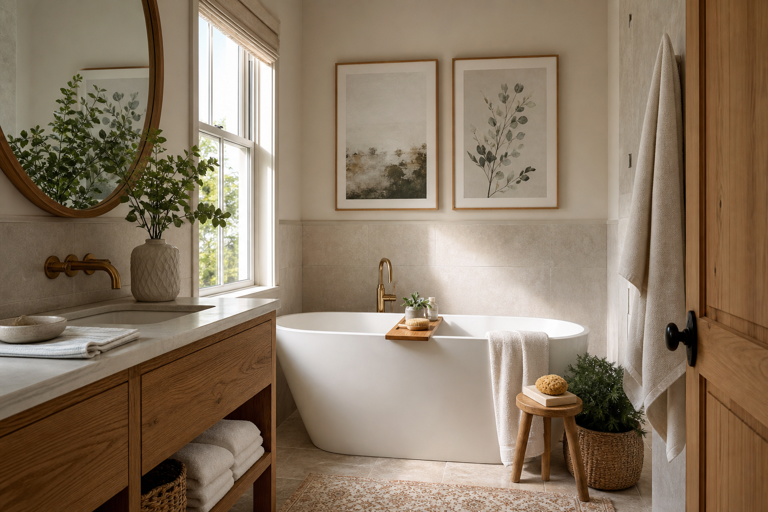
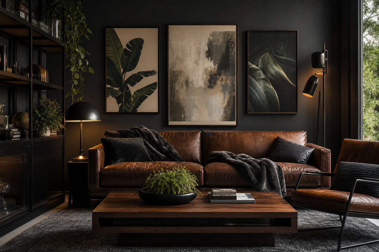
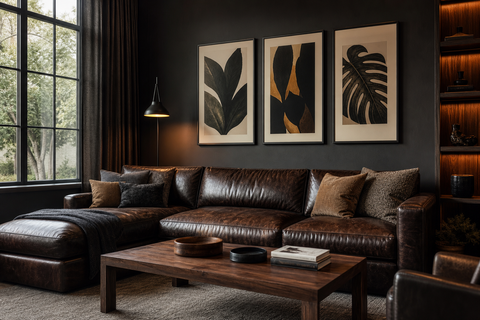
Vintage posters work because they add history, contrast, and personality in one move. A clean-lined room can feel flat when every surface is new, but one or two aged-looking prints introduce visual depth fast. That balance is what makes vintage posters feel current rather than nostalgic — especially when they sit alongside simple furniture, restrained colour palettes, and contemporary materials like black metal, oak, glass, or boucle.
A second reason they stay relevant is flexibility. Vintage posters can lean elegant, playful, academic, or graphic depending on subject matter. A botanical study reads differently from a retro fashion portrait, and both read differently again from bold typography. That range makes it easy to pull from our Vintage collection and mix it with Mid Century Modern art prints or even Typography wall art without the room feeling themed.
Why Vintage Posters Still Feel Fresh
The strongest vintage styling usually relies on contrast. If your room has modern silhouettes — think a sofa with straight arms, a round pedestal coffee table, or a slim desk — aged imagery provides tension in a good way. The eye reads the room as layered rather than matched. Aim for one dominant era and one supporting era: for example, 70% modern furniture and 30% vintage-inspired art is a safer ratio than splitting everything 50/50.
Subject matter matters too. Scientific illustrations, heritage portraits, old travel scenes, and archival-style graphics all carry different energy. In contemporary rooms, images with clear composition tend to look sharper than highly cluttered designs. A single portrait, one strong object, or a disciplined colour field will generally feel more polished at 50 x 70 cm than a busy collage of tiny details.
Choosing the Right Poster Style for Your Space
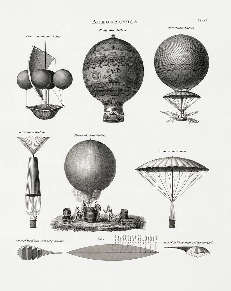
Travel and transport imagery works well in living rooms and hallways because it brings movement and a sense of place. If you like a room that feels collected but not overly decorative, aviation or architecture prints give you structure and line. Aeronautics Vintage Print is a good example of a piece that feels archival while still reading cleanly in a modern interior.
Portrait-based vintage art is better when you want warmth and softness. Bedrooms, dressing areas, and reading corners suit feminine silhouettes, muted palettes, and classic fashion references. If your furniture is minimal — white bedding, a pale oak nightstand, a single ceramic lamp — a figurative print can stop the room from feeling sterile. For this look, explore Fashion wall art alongside select pieces from the vintage print collection.
Typography and advertising-style works are stronger in kitchens, home bars, or offices, where a more graphic tone feels appropriate. They usually pair best with fewer surrounding accessories because text-based designs already carry visual weight. One framed piece above a bar cart or desk is often enough at 30 x 40 cm or 40 x 50 cm.

Colour, Texture, and Framing Rules
The easiest way to modernise vintage posters is through framing. Thin black frames create the sharpest contrast and suit graphic or monochrome pieces. Natural oak frames soften portraits and botanical subjects. Brass-toned frames can work, but only if you repeat that metal elsewhere — for example in a lamp base, mirror edge, or cabinet handle — so the finish feels intentional.
Paper tone should guide your palette. If a print has warm cream, tobacco, faded red, or olive notes, echo one or two of those colours elsewhere in the room through textiles or accessories. You do not need an exact match. Repeating a poster's accent colour at about 10% to 15% of the room is usually enough — a rust cushion, olive glass vase, or ochre throw can tie the whole wall together.
Texture is just as important as colour. Vintage-style art looks better against materials with some tactility: limewash paint, oak veneer, wool, linen, and matte ceramics all help. Ultra-glossy furniture can make aged prints feel disconnected unless the artwork itself is very graphic. For richer, moodier schemes, Fine Art prints can sit beautifully beside vintage pieces because both categories share painterly depth and subtle wear.

Where to Hang Vintage Posters in the Home
In the living room, place the centre of the arrangement around 145 cm from the floor, or 15 to 25 cm above the back of a sofa. That gap keeps the art visually tied to the furniture. One large vintage print at 70 x 100 cm can anchor a room more effectively than three small frames if the wall is wide and the furniture is low.
Bedrooms benefit from quieter imagery and softer tones. Hang one horizontal piece above the bed, or two vertical pieces stacked beside a wardrobe or dressing mirror. In tighter rooms, a 40 x 50 cm or 50 x 70 cm format prevents the wall from feeling heavy. Hallways suit narrower arrangements — think two or three 30 x 40 cm frames lined up with 5 to 7 cm spacing.
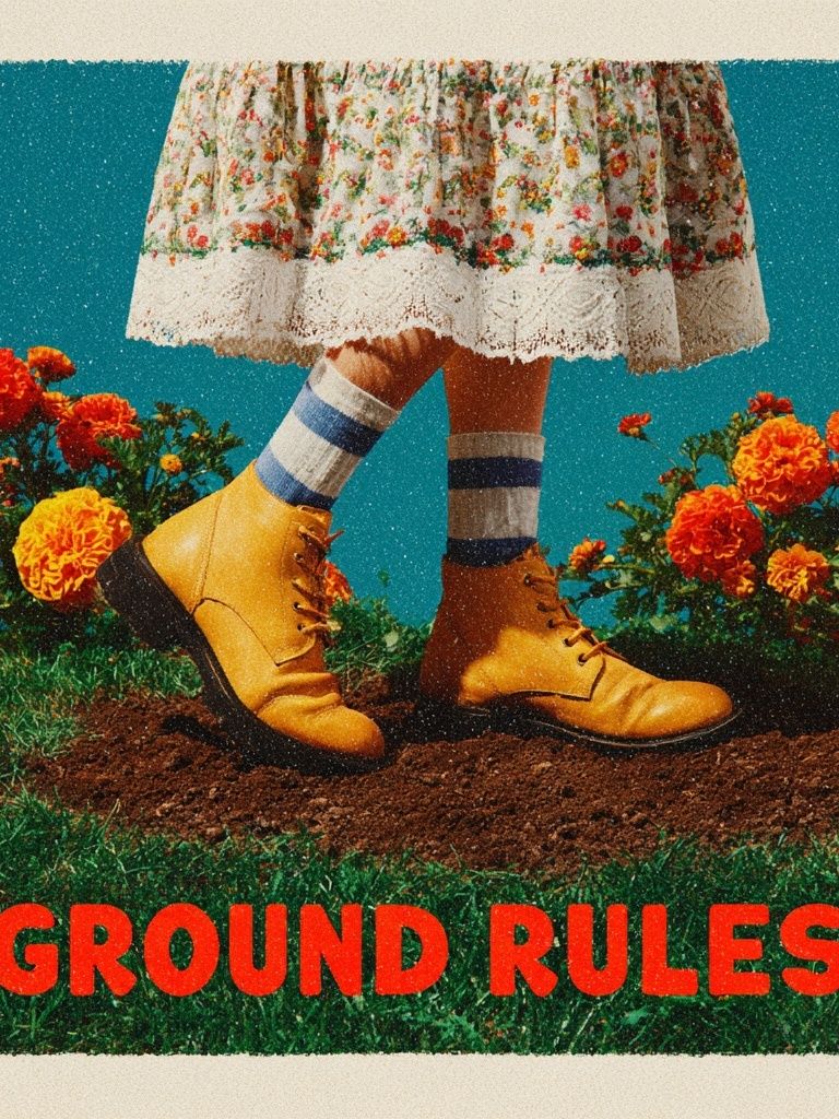
Kitchens and home offices can carry more playful or functional subjects. A retro food, drink, or quote print near open shelving feels relaxed and sharp. If your workspace includes walnut, chrome, or leather details, a slightly graphic piece like Ground Rules — Retro Typography Print can bring rhythm without adding clutter.

How to Build a Gallery Wall with Vintage Pieces
A gallery wall works best when one element stays consistent. That could be the frame colour, the subject family, or the overall palette. If everything varies at once — black frame, oak frame, portrait, map, still life, quote, saturated colour, sepia tone — the result gets messy fast. Choose one anchor piece first, ideally the largest, then build around it with supporting works 20% to 40% smaller.
Spacing should stay tight enough to read as one composition. In most homes, 5 to 8 cm between frames is the sweet spot. Start on the floor before hanging anything. Lay out the pieces, keep the visual weight balanced left to right, and avoid putting all the darkest works on one side. A mixed arrangement often looks more refined when the entire grouping fits within an invisible rectangle.
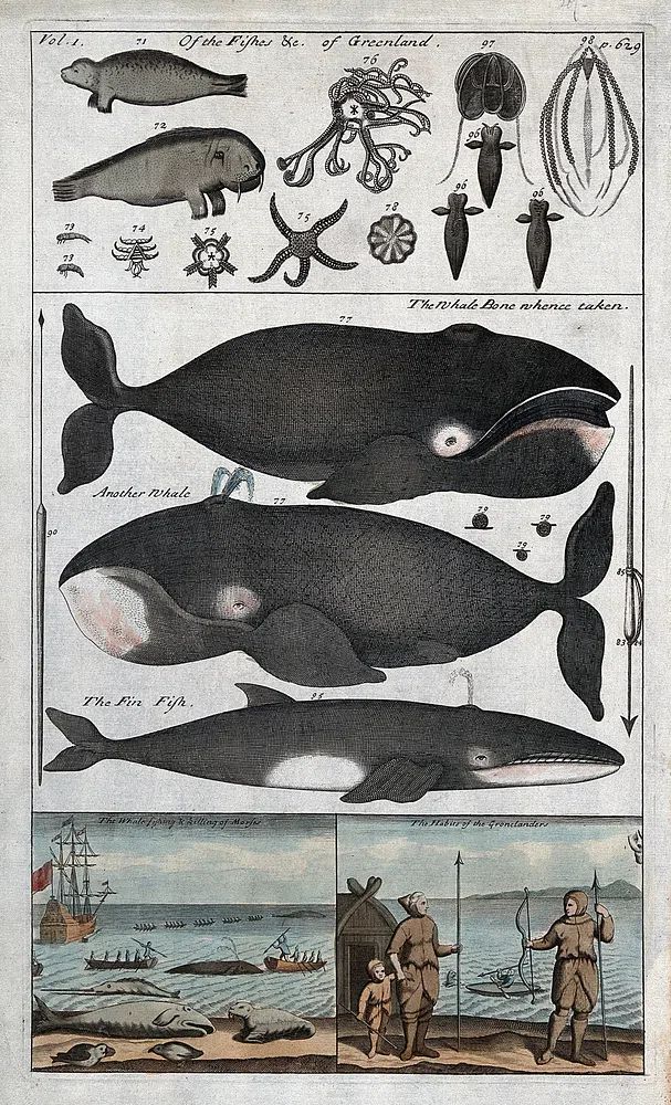

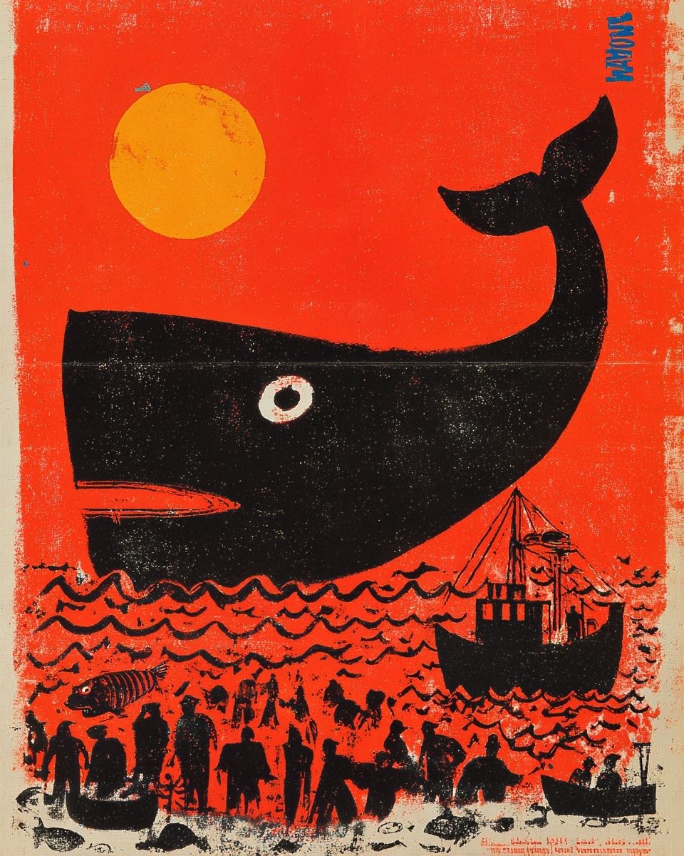
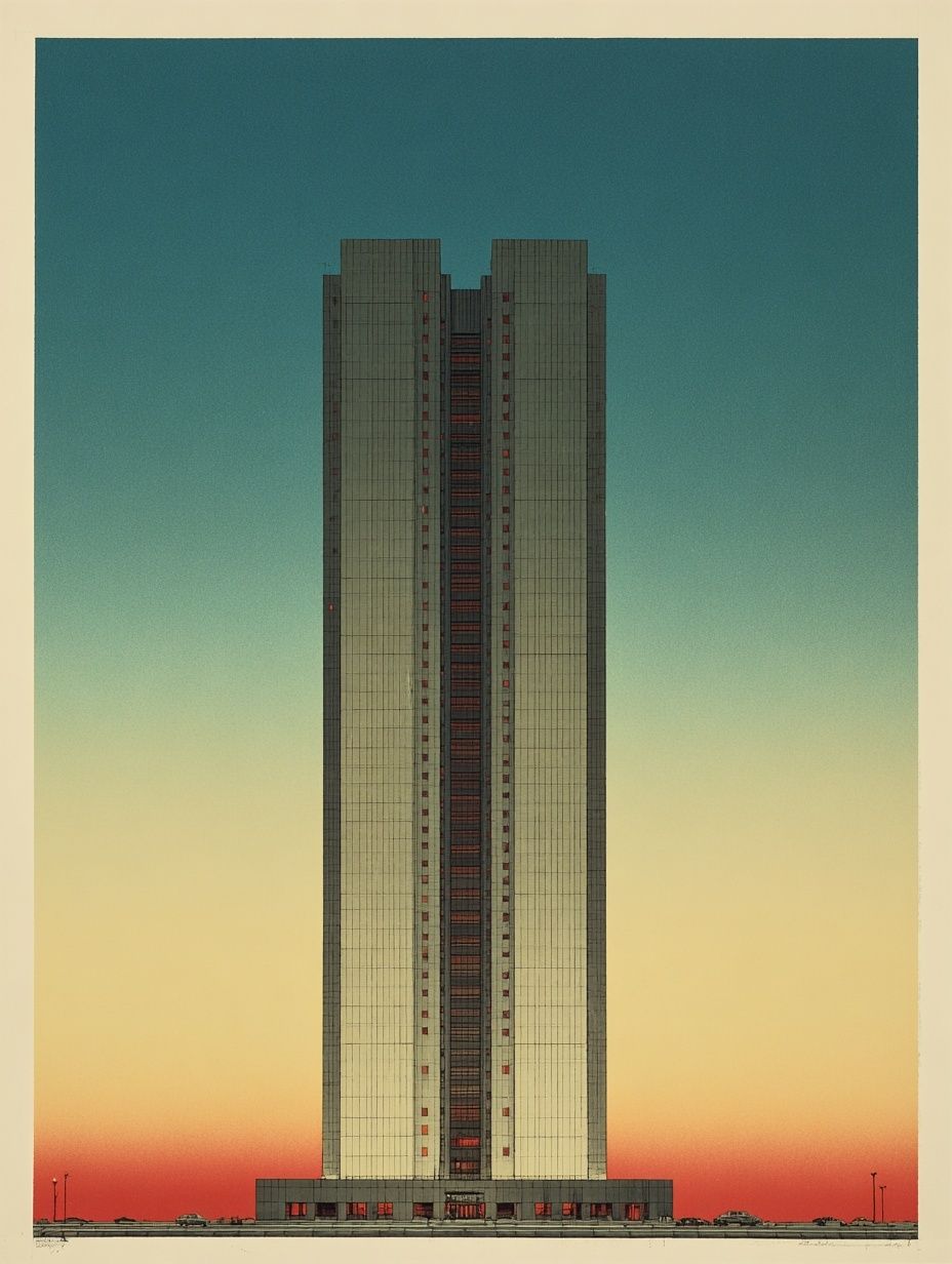
If you want a gallery wall to feel sophisticated rather than eclectic, mix no more than three subject types. For example: one scientific print, one portrait, one typography piece, and then repeat those tones. Pieces like Whale Anatomy and Hunting — Vintage Print bring an academic edge, while Modern Skyscraper — Vintage Print keeps the grouping clean and urban.
Sizing, Printing, and Buying Tips
Scale first, detail second. For walls above a sofa, sideboard, or bed, your art arrangement should fill roughly 60% to 75% of the furniture width. If your sofa is 200 cm wide, aim for a total arrangement width of about 120 to 150 cm. That proportion looks intentional and avoids the common mistake of hanging art that is too small for the wall.
Choose fewer, larger pieces if your room already has pattern through rugs, curtains, or upholstery. Save denser gallery walls for simpler rooms. In narrow spaces, vertical formats add height; in low-ceilinged rooms, wide horizontal pieces can make the wall feel calmer and broader.
Printing quality changes the result more than most buyers expect. Fine detail, soft tonal transitions, and a matte finish all help vintage posters look premium rather than flat. Glass choice matters too. If the wall faces a window, reduce glare with positioning — place the frame on an adjacent wall where possible instead of directly opposite strong daylight.
For buying, think in sets even if you purchase one piece at a time. Ask whether the print could pair with a portrait, a typography work, or a mid-century shape later. That approach helps you build a coherent wall over time. Browsing both our vintage wall art and Mid Century Modern collection is often the quickest route to a look that feels edited rather than overly period-specific.

Final Styling Notes for a Timeless Finish
The most convincing vintage posters are the ones that relate to the room instead of dominating it. Pick a subject that suits the space, repeat one or two colours elsewhere, and use framing to sharpen the final look. If the room is already warm and layered, go cleaner with the art. If the room is minimal, choose pieces with more age, patina, or character.
A timeless result usually comes down to restraint: one strong oversized print, or a tightly edited set of four to six frames, will outlast a busy wall of random finds. Start with quality, keep the palette disciplined, and let the contrast between old imagery and modern furniture do the work.
Frequently Asked Questions
What frame colour works best with vintage posters?
Black is the safest for a crisp modern contrast, while oak works best for softer or more organic rooms. If you use brass, repeat it in at least one other detail nearby.
Can I mix vintage posters with contemporary abstract art?
Yes — keep one common thread, such as colour palette, frame style, or scale. That shared element prevents the wall from feeling disconnected.
What size should I choose for a hallway or narrow wall?
30 x 40 cm and 40 x 50 cm are usually the easiest fits for tight passages. Leave at least 10 to 15 cm from door frames or corners so the art can breathe.
Do vintage-style prints work in kitchens?
They do, especially typography, food, drink, or advertising-inspired pieces. Keep them away from direct steam or splashes, and use a frame with a proper backing.
How many pieces should a vintage gallery wall include?
Four to six frames is a strong starting point for most homes. That number gives enough variation to feel collected without turning the wall into visual noise.