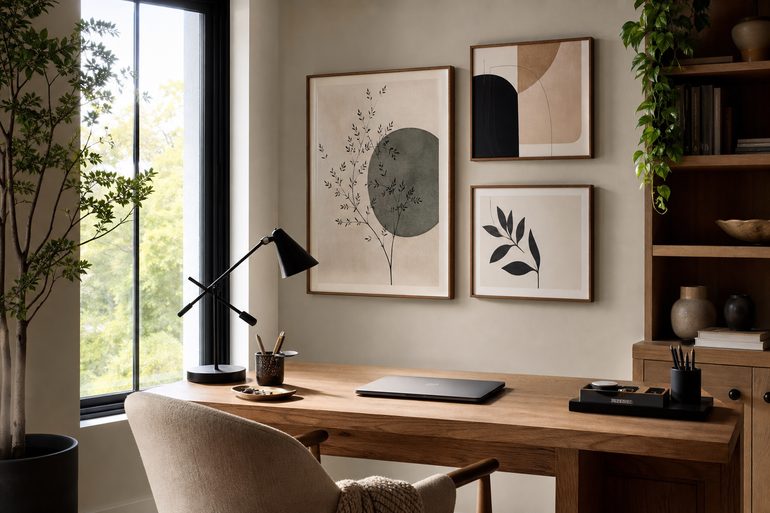
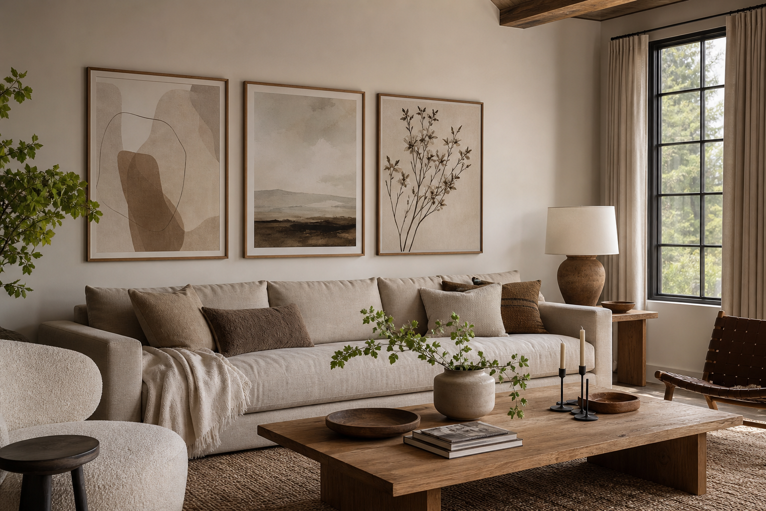
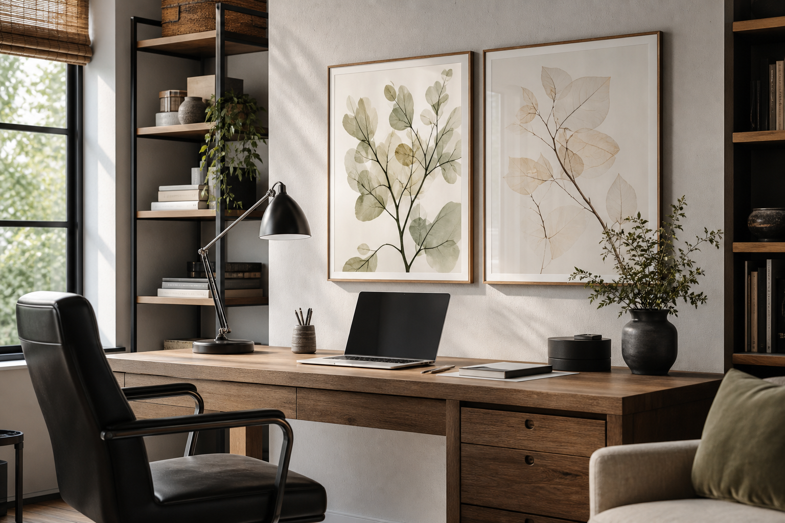
Typography art prints do something few decorative pieces manage on their own: they add message, structure, and contrast at the same time. A good text-based print can sharpen a plain wall, echo the mood of a room, and make the space feel considered rather than simply filled. That is why typography art prints work especially well in rooms that already have strong furniture shapes but need a focal point with more personality.
Unlike figurative art, typography is direct. You notice it from across the room because the eye reads letters faster than it decodes imagery. On a blank wall, that clarity helps anchor a scheme quickly—especially in spaces with simple furniture, limited color, or a lot of negative space. If you are building around clean silhouettes, our Typography collection and Minimalist art prints are an easy starting point.
Why Typography Works So Well on the Wall
Text-based art is versatile because it can carry tone without demanding a specific style. A black-on-ivory statement in a slim frame feels restrained; a distorted word treatment in acid green reads edgy and urban. That range means typography can sit comfortably next to abstract wall art for softer layering or alongside fine art prints when you want contrast between classic imagery and crisp graphic form.
Short phrases tend to work best because they read in 2 to 4 seconds. That matters in a hallway, above a console, or over a bed where people see the piece at a glance. One to five words usually have more visual strength than a long quote, especially in sizes like 30x40 cm or 50x70 cm where letterforms need breathing room.
Choosing the Right Words, Quotes, or Phrases
Pick text that matches the function of the room first, then your style. Bedrooms suit calming, reflective wording. Kitchens can handle humor. Home offices benefit from concise, motivating language that feels smart rather than shouty. A phrase you want to live with for years should be specific enough to mean something, but broad enough not to date the room after one season.
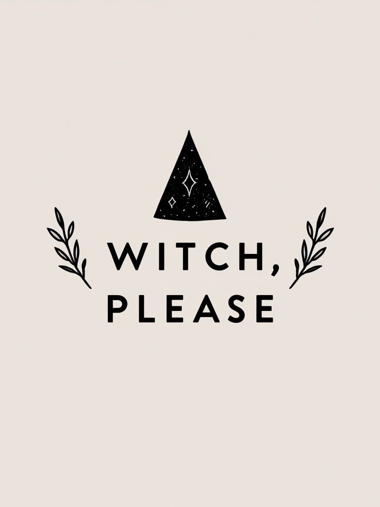
A useful rule: if the wording feels right on a mug but not on a wall, skip it. Wall art needs more staying power. Single words such as "still", "begin", or initials work well in quiet interiors, while bolder sayings belong in social spaces where they can act as conversation pieces. For more playful rooms, a piece like the Witch, Please Typography Poster shows how humor can feel graphic and styled rather than novelty-driven.
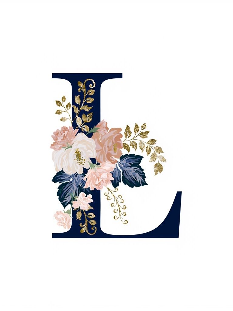
Personalization also matters. Initial-based designs, especially when styled with restrained color, work in bedrooms, entryways, and giftable spaces because they feel custom without being literal. If you want something softer than a bold slogan, the Floral Letter L Typography Poster is a good example of typography leaning decorative rather than graphic.
Matching Typography Art Prints to Your Style
Minimalist rooms benefit from typography with disciplined spacing, limited color, and generous margins. Look for high contrast—black, cream, soft gray, muted sand—and avoid cluttered layouts. In these interiors, a single large print, often 50x70 cm or 70x100 cm, has more impact than a busy cluster. If your room already uses simple oak, boucle, stone, and matte metal, clean typography art prints can finish the scheme with very little effort.

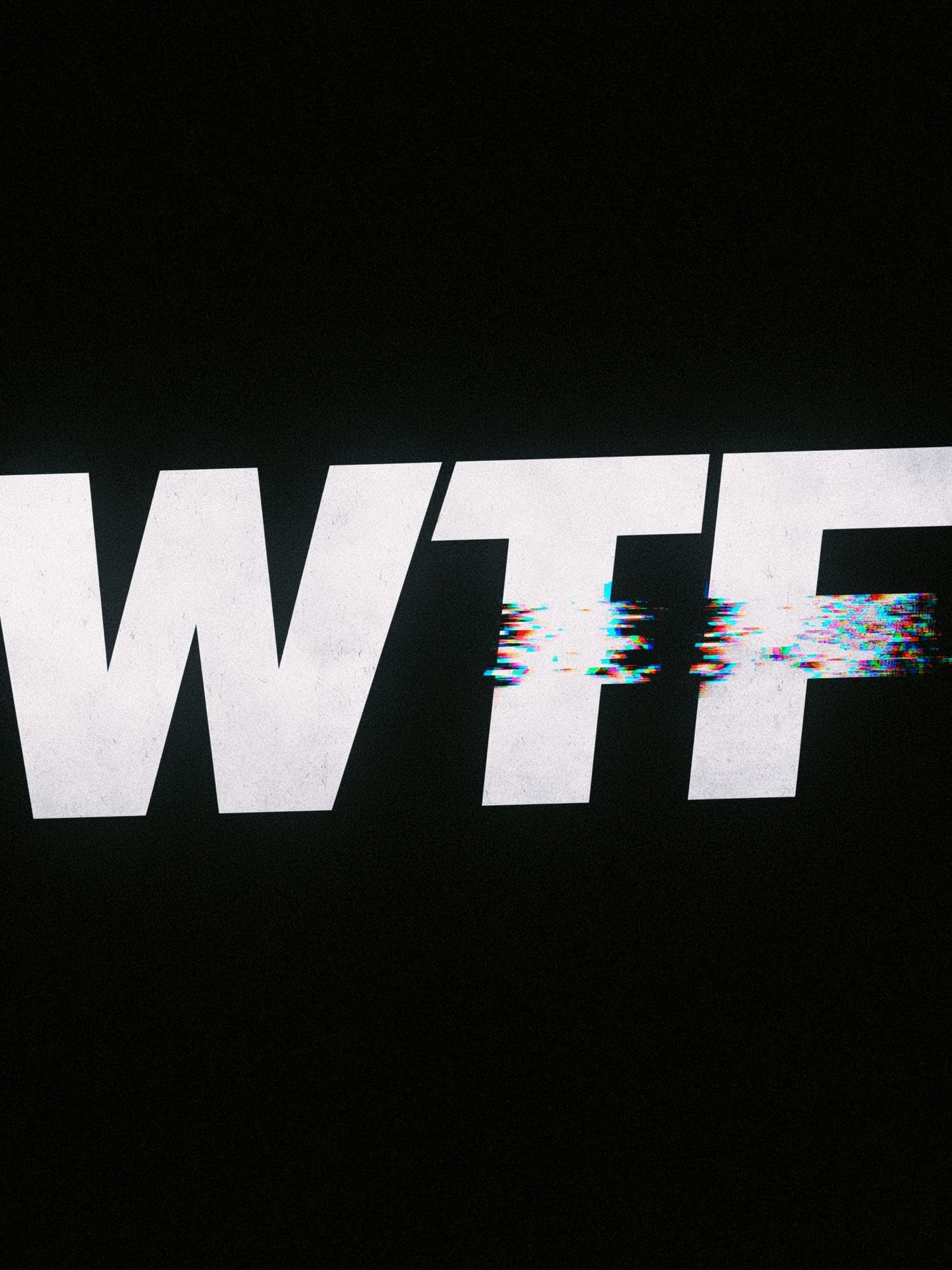
Modern and eclectic interiors can take more visual tension—cropped letterforms, layered text, glitch effects, or unconventional color. These rooms often benefit from a statement piece that introduces movement. The WTF Glitch Typography Poster works best in a home office, media room, or youthful living space with black accents, chrome, or concrete textures.
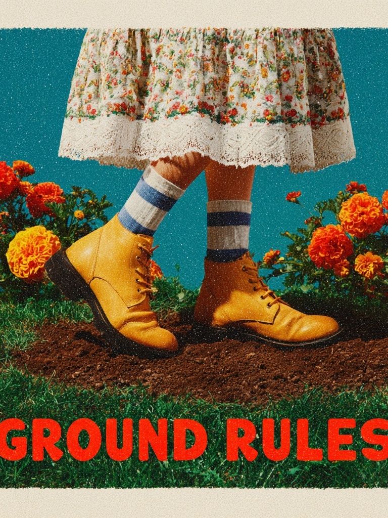
Vintage-inspired spaces need typography with warmth. That can mean retro fonts, faded tones, cream backgrounds, or layouts that feel borrowed from old packaging and signage. The Ground Rules — Retro Typography Print is the right kind of bridge piece if you like character but still want a clear message. It pairs naturally with vintage wall art and selected pieces from our Mid-Century Modern collection.
Sizing, Spacing, and Placement That Feel Balanced
The easiest mistake with typography art prints is going too small. Because text needs to be legible and graphic, scale matters more here than with many image-based works. Above a sofa that is 180 to 220 cm wide, aim for artwork or a grouped arrangement that spans roughly 60 to 75 percent of the furniture width. That usually means one 70x100 cm piece, two 50x70 cm frames, or a salon-style arrangement with a total width around 120 to 160 cm.
Leave 15 to 25 cm between the top of the furniture and the bottom of the frame. For grouped pieces, keep gaps tight—typically 5 to 8 cm—so the set reads as one composition. Typography loses impact when frames drift too far apart because the eye stops reading them as a single visual statement.

Entryways, desks, and narrow wall sections are strong placements for vertical prints in 30x40 cm or 40x50 cm. Over a bed, symmetrical pairs often feel calmer than one loud slogan. In a hallway, repeat black or oak frames at the same height—about 145 cm from floor to frame center—for a gallery look that feels orderly.
Framing and Finishing Details That Elevate the Look
Frame choice changes the voice of the print. Black metal or slim black wood gives typography a sharper, more architectural edge. Natural oak softens it and helps text art feel more at home in Scandinavian, bohemian, or mid-century rooms. White frames can work in very light interiors, but they reduce contrast on pale walls unless the print itself is bold.
Matte paper usually suits typography better than glossy finishes because it reduces glare and keeps lettering readable from different angles. If the room gets strong daylight, this matters even more. A non-reflective surface will preserve black depth and fine line clarity better than glass with a high shine. For a more elevated look, add a mount around smaller pieces—especially 30x40 cm designs in 40x50 cm frames—to create margin and visual importance.

Room-by-Room Ideas for Using Typography Art Prints
In a bedroom, choose words that quiet the room rather than energize it. Neutral palettes, smaller contrasts, and softer fonts work best above a headboard or dresser. A decorative initial or a simple phrase can add personality without making the wall too busy.
In kitchens and dining areas, typography can be more relaxed and social. Humorous pieces do well near breakfast nooks, bar carts, or open shelving, especially when the color palette already includes warm woods, off-whites, and brass. That is where bolder conversational designs can feel natural rather than forced.
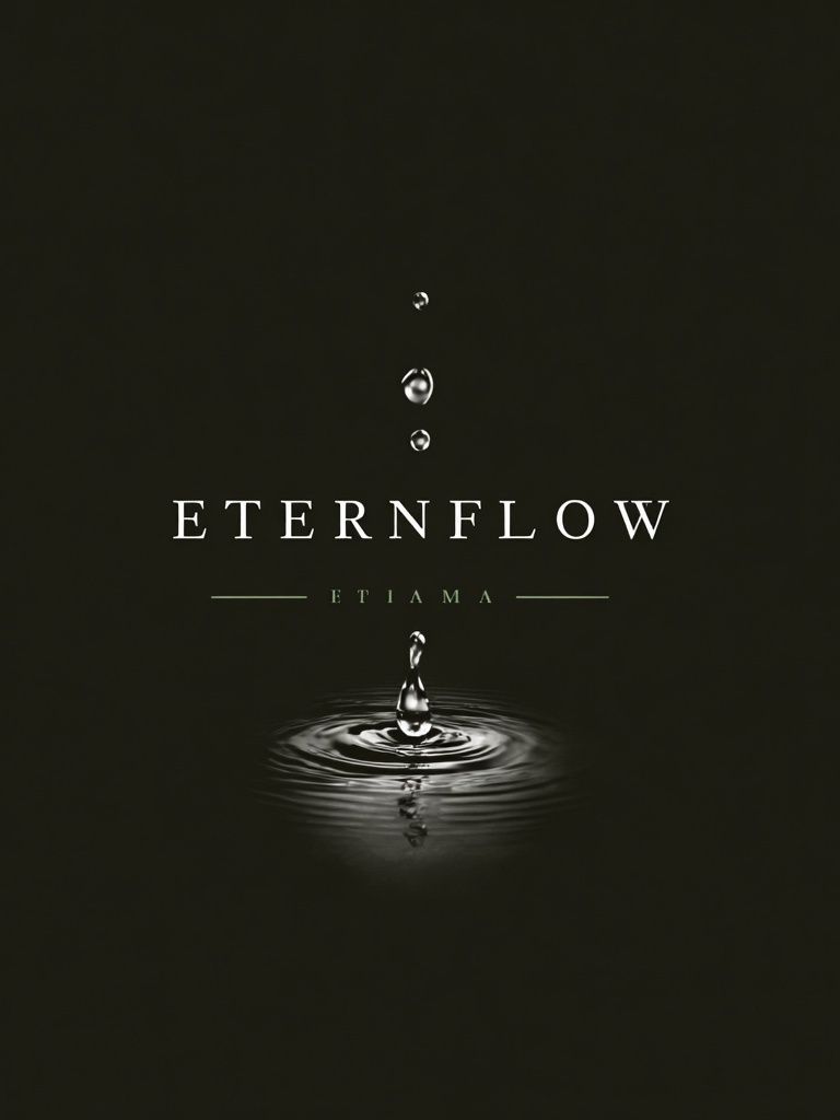
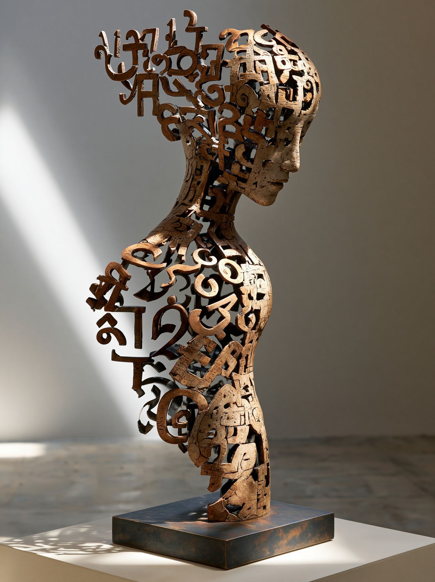
For home offices, pick typography art prints with structure. Strong alignment, restrained color, and intentional negative space help the room feel focused. If the room includes graphic furniture or industrial touches, the Typographic Sculpture Portrait Print offers a more art-led approach to text, while the Water Drop Minimalist Typography Poster suits cleaner, quieter desk setups.
Hallways benefit from repeat and rhythm. Try three to five pieces in matching frames, all tied by a black-and-white palette or a shared accent color. Living rooms can handle the biggest statement—especially if the rest of the space is neutral and needs a visual point of view.

A Few Smart Styling Tips Before You Buy
Check readability from the actual viewing distance. A print above a sofa may be seen from 2.5 to 3 meters away, so thin fonts and low-contrast color combinations can disappear faster than expected. If the text is the subject, it should still feel strong from across the room.
Limit your wall to one dominant voice. If your typography is witty or loud, keep surrounding art quieter. If your text print is subtle, pair it with supportive forms from our abstract collection or restrained graphic pieces from Mid-Century Modern art prints. Consistency in frame color often matters more than matching every artwork exactly.
Final thoughts
Typography art prints are most successful when they do two jobs at once: they say something worth seeing and they improve the structure of the room. Get the wording right, scale it properly, and frame it with intention, and even one piece can make a wall feel finished.
If you want a safe formula, start with one large text-based print in a size that suits the furniture below it, then build around it only if the room needs more. In most spaces, clarity beats quantity.
Frequently Asked Questions
What frame color works best for typography prints?
Black is the most versatile because it sharpens letterforms and suits modern rooms. Oak is better if you want a warmer, softer look.
Can typography prints work on colored walls?
Yes—just increase contrast. On darker walls, choose lighter backgrounds or bold white lettering so the text stays readable.
Should I use glass or acrylic for larger frames?
Acrylic is lighter and often safer for 70x100 cm and above. It is a practical choice for bedrooms, stairways, and rentals.
How high should I hang a single typography print in a hallway?
Keep the center of the frame around 145 cm from the floor in most homes. If you are hanging several pieces, align their centers to the same height for a cleaner result.
What pairs well with typography if I do not want a full quote wall?
Try one text print with one or two quieter companions—abstract shapes, vintage pieces, or minimalist forms. That mix keeps the wall layered without competing messages.