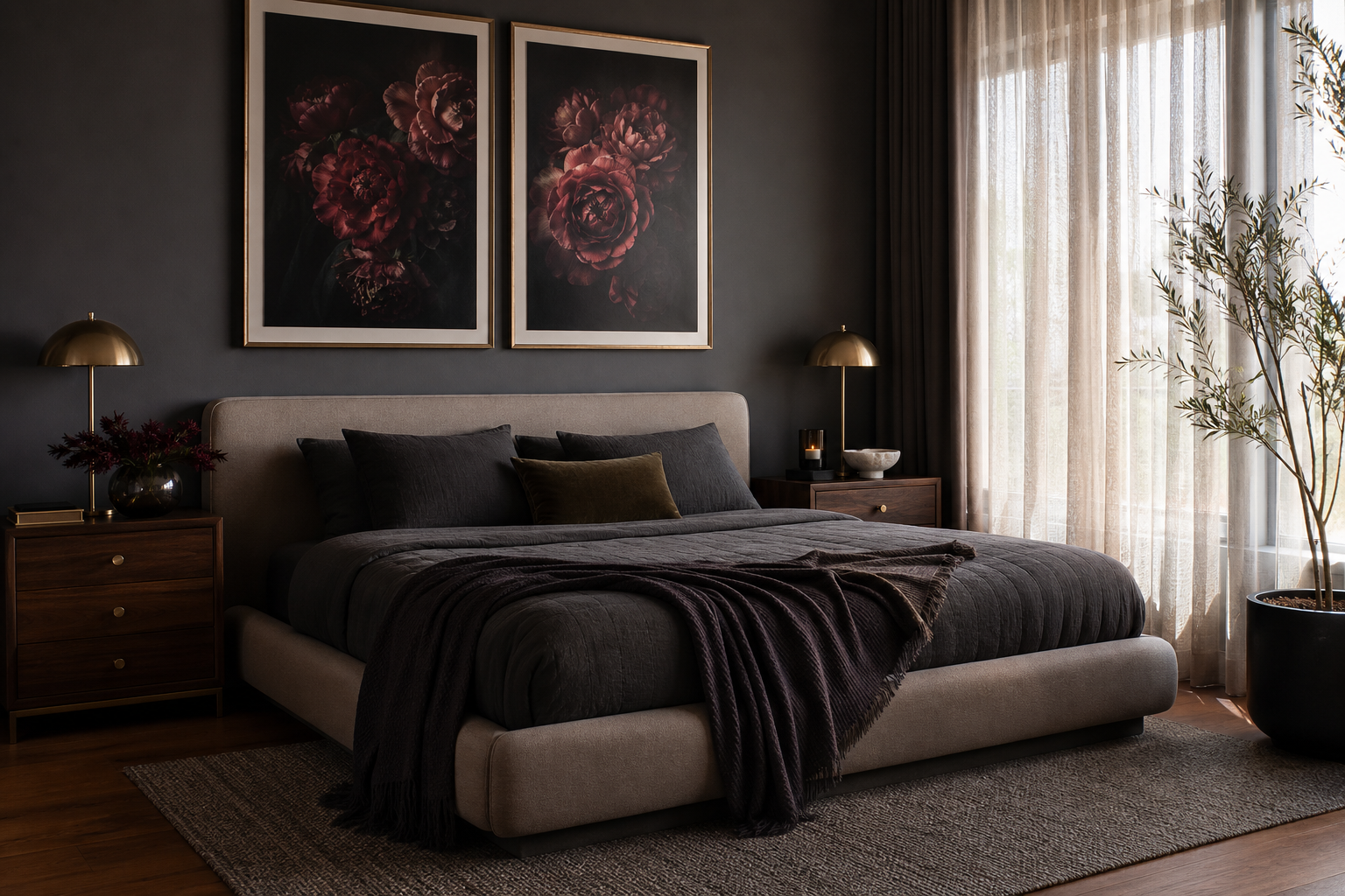
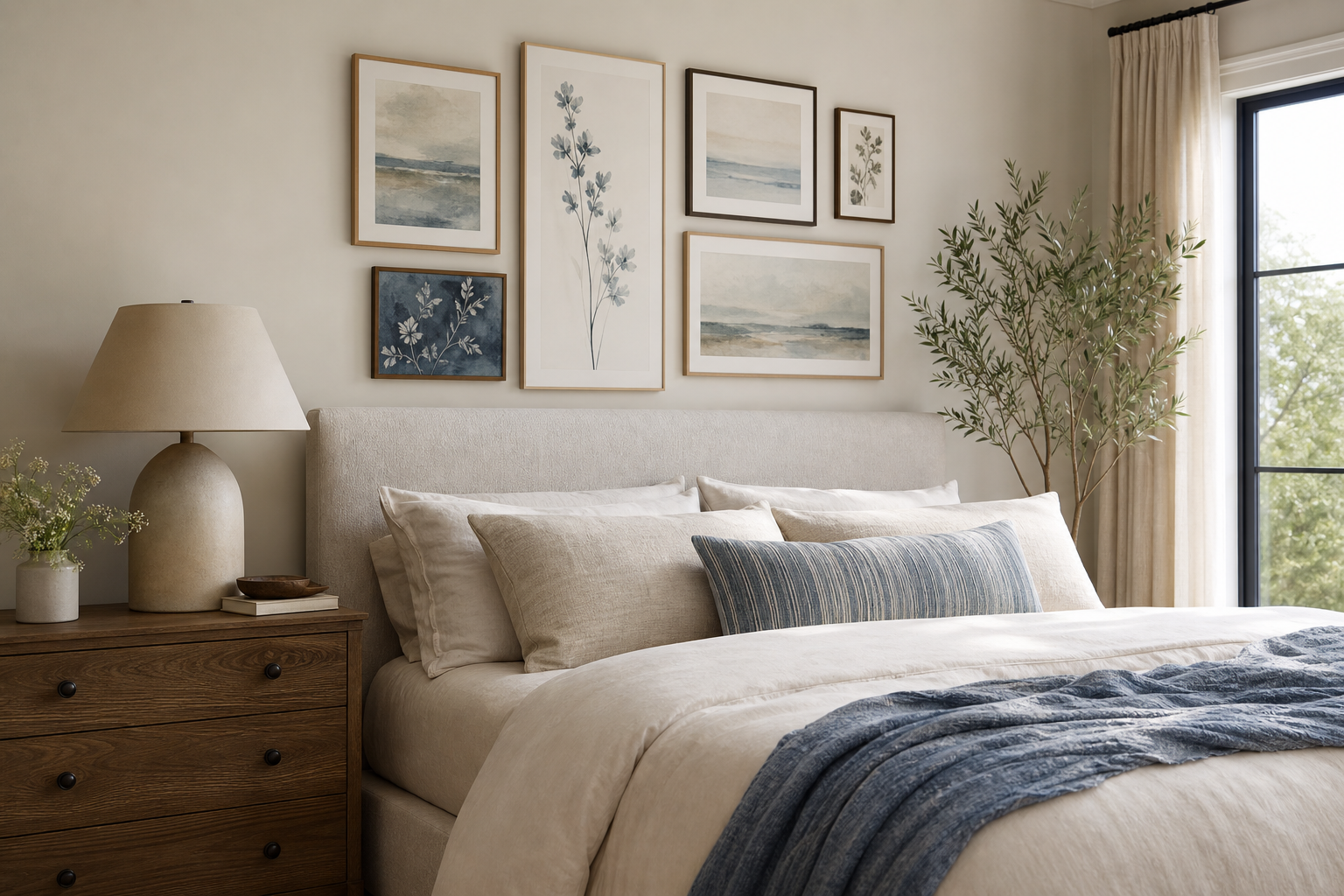
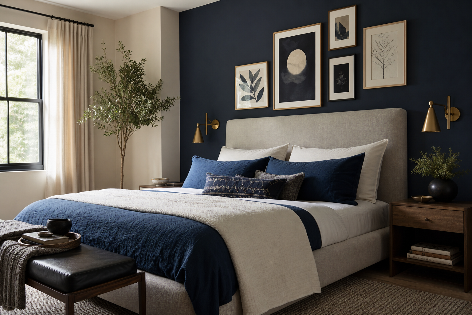
A letter a poster is one of the easiest ways to make a wall feel specific to the person who lives there. One initial can mark a name, a family surname, or simply a letterform you love for its shape. Because typography is graphic by nature, it reads clearly from a distance and settles neatly into rooms that already have pattern, colour, or layered decor.
Unlike trend-led novelty prints, a letter a poster stays flexible across different interiors. It can look crisp in a modern bedroom, soft in a nursery, and intentional in a hallway gallery wall. If you want a piece that feels personal without requiring a custom commission, our typography collection is the most direct place to start.
Why a Letter A Poster Works Anywhere
Monogram-style art has lasted for decades because it solves two design needs at once: identity and structure. A single letter carries meaning, but it also works visually as a bold shape. The letter A is especially useful because of its balanced triangular form, which gives a wall strong vertical presence without feeling heavy.
That structure makes it adaptable across room types. In a nursery, the initial can introduce the baby's name without covering the wall in text. In an adult bedroom, it feels cleaner than a quote print. In a home office, it adds personality while still looking composed. If you like pared-back styling, a letter print also sits naturally beside pieces from our minimalist art prints or softer forms from abstract wall art for layered spaces.
A good example is a thread-based design that feels decorative without losing clarity.
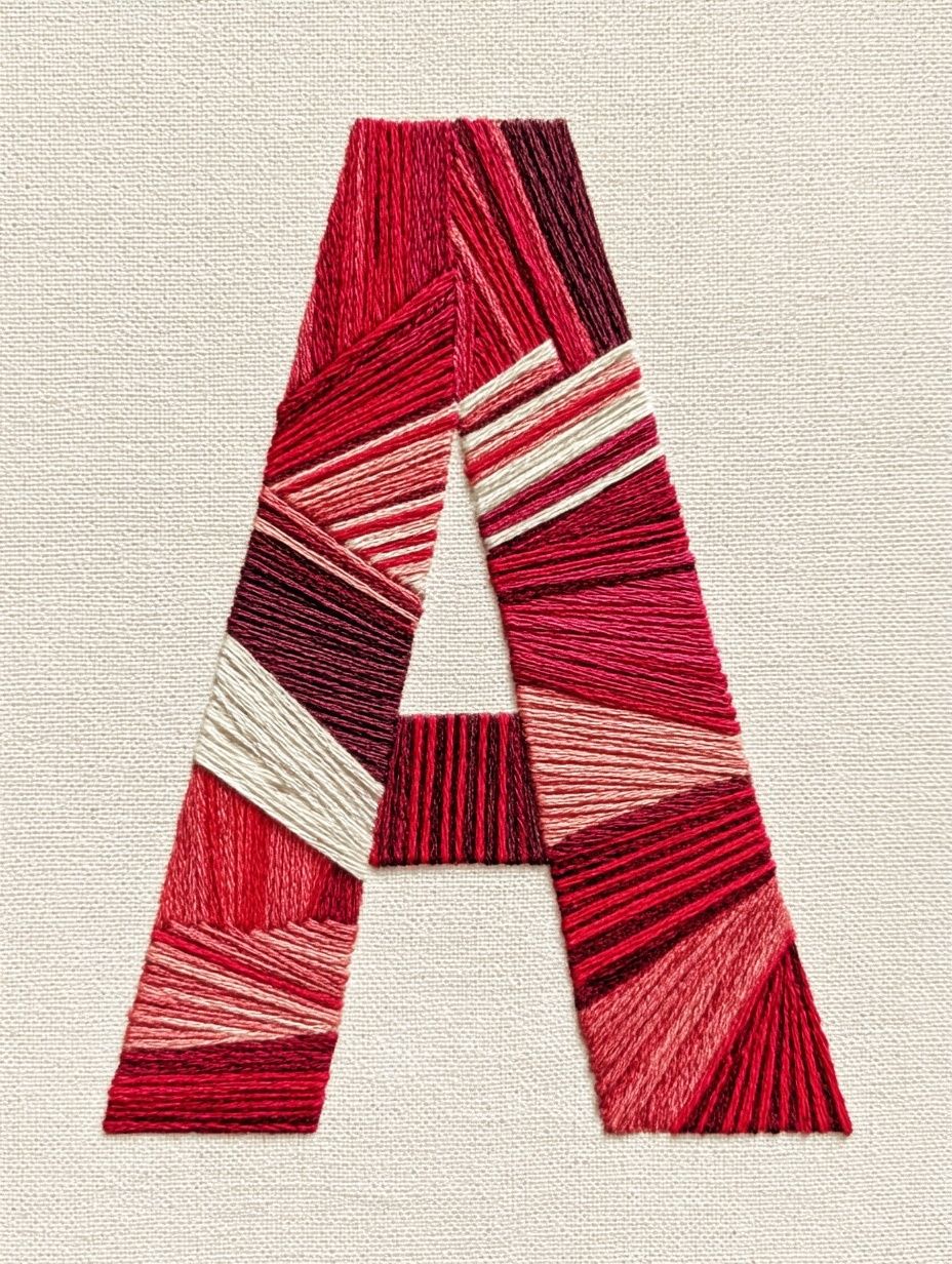
The fine linework in this piece gives the initial movement, which helps it feel more elevated than a plain block letter. It works especially well when you want the wall to feel personal but not juvenile.
Choosing the Right Style of Letter A
The mood of a letter print is shaped almost entirely by the letterform. Serif A designs tend to feel classic and editorial. They suit traditional bedrooms, reading corners, and spaces with darker woods, brass, or antique-inspired details. Sans serif versions feel cleaner and more contemporary, which makes them useful in Scandinavian or minimalist rooms where the palette stays within 3 to 5 tones.
Hand-drawn or floral interpretations make the initial softer. These are often the best fit for nurseries, children's bedrooms, or gift styling because they bring warmth and texture. If you are building around a sweeter, more relaxed wall, our kids wall art and selected pieces from illustrative prints for softer interiors can help you balance the initial with shapes that feel playful rather than strict.
Vintage-inspired letter art has a different effect. It introduces age, patina, and a sense of collected decor. That works best when the room already has woven textures, old books, painted wood, or off-white walls rather than stark white.
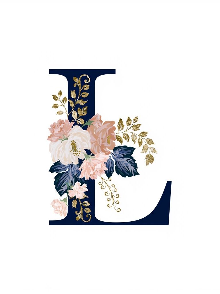
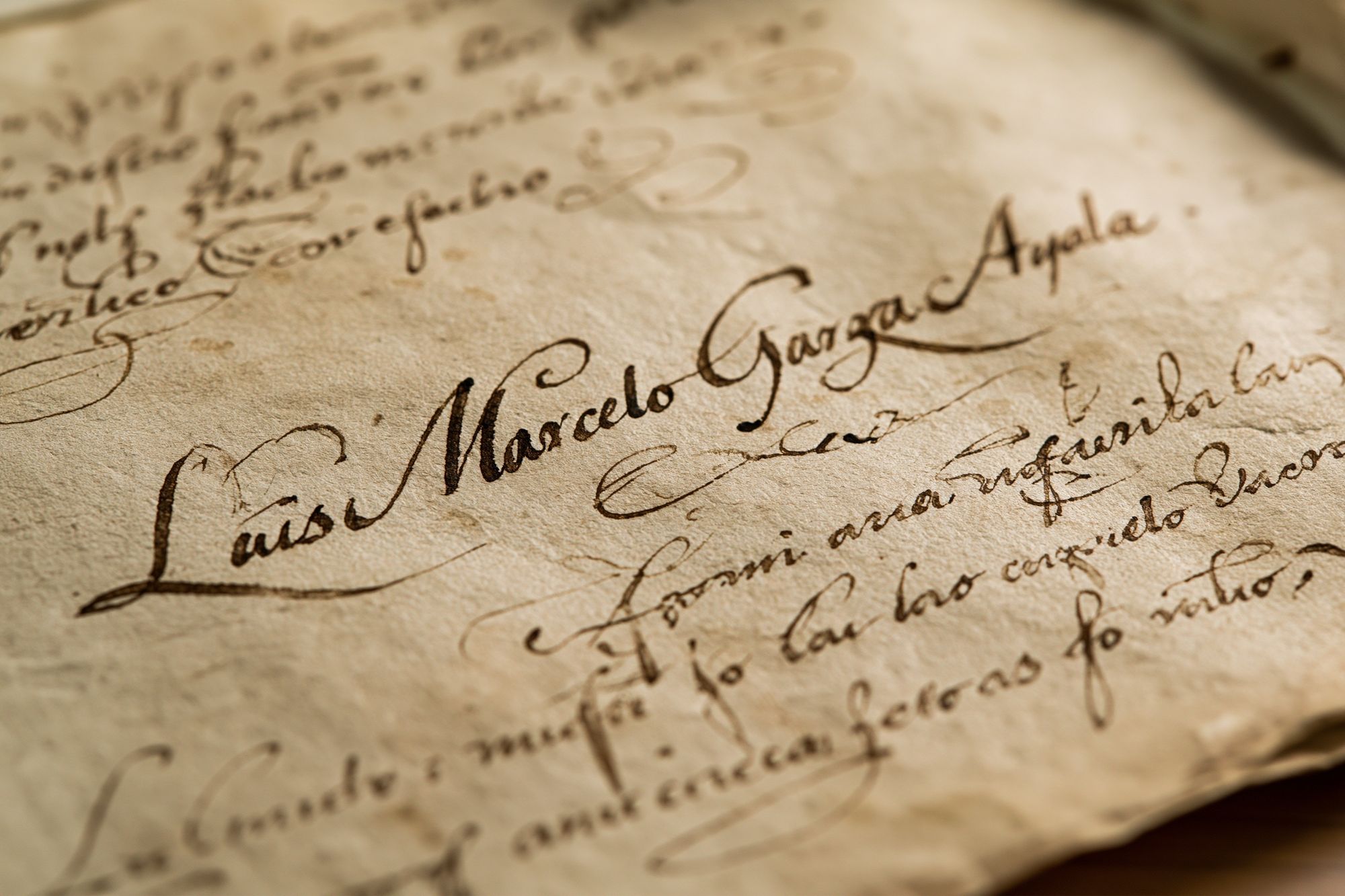

Even though this article focuses on the letter A, the surrounding style still matters more than strict matching. Pairing one statement initial with letter-adjacent artwork often creates a fuller, more natural composition than repeating initials across the wall.
Where to Hang It for the Best Effect

Placement changes how important the print feels. Over a crib, chest of drawers, or headboard, a letter A becomes a focal point. On a narrower wall — such as between a door frame and wardrobe — it works better as a vertical accent. In an entryway, a single initial can read as a household monogram, especially when centered above a console table 80 to 100 cm wide.
For bedrooms, hang the artwork so the centre sits around 145 cm from the floor, or 15 to 25 cm above the headboard. In nurseries, keep at least 20 cm of space between the top of furniture and the frame so the arrangement does not feel cramped. In a gallery wall, use the initial as the anchor piece, then add 2 to 5 supporting works around it with 5 to 8 cm spacing between frames.
If you want a cleaner layout, pair the initial with one or two quiet designs rather than many detailed ones. Pieces from White Flower Silhouette or Elegant White Fabric can soften the geometry of a letter print without competing with it.
How to Pair It with Colours and Decor
A letter a poster looks strongest when at least one colour in the print repeats somewhere else in the room. That repetition can be subtle: a rust line echoed in a cushion, an ivory background matched to curtains, or black linework tied to a lamp base or frame. Two repeated notes are usually enough to make the piece feel intentional.
For calm interiors, build around soft neutrals such as warm white, mushroom, flax, and pale taupe. A red-accented letter A works well here because it introduces contrast in a controlled way — especially if the room already has walnut, oak, or cognac leather. In more playful rooms, combine the initial with muted sage, dusty blue, or terracotta so the wall feels styled rather than primary-colour heavy.

Frames matter here more than many people expect. Black frames sharpen the typography and give the initial a modern edge. Oak frames lighten the mood and work better in nurseries or relaxed family spaces. Brass or aged gold frames suit vintage letter art best, especially if the room includes mirrors, sconces, or warm metallic hardware.
If your decor is already busy — striped bedding, patterned rugs, open shelving — choose a simpler letter design and let the surroundings do the rest. If the room is sparse, you can go for a more decorative interpretation with threadwork, florals, or aged paper textures.
Sizing, Framing, and Print Finishes
Size should follow wall width, not just taste. For a small vignette above a nightstand or changing table, 30x40 cm is usually enough. Over a desk, dresser, or narrow console, 50x70 cm has more authority without overwhelming the furniture. Above a queen bed or larger sofa, a single 70x100 cm piece can work, though many people prefer pairing a 50x70 cm initial with two smaller supporting prints.
When in doubt, aim for artwork that spans roughly 50% to 70% of the furniture width beneath it. That ratio keeps the setup balanced. A frame with a mount also helps a letter print feel more refined. A 40x50 cm frame with a 30x40 cm print, for example, gives the letter breathing room and makes even a simple design feel more gallery-like.
Matte finishes are usually the better choice for typography and initial art because they reduce glare and keep linework readable from different angles. Glossy surfaces can look sharper in bright colours, but they also reflect windows and lamps more strongly. In bedrooms, nurseries, and offices, matte tends to feel calmer and more premium.
Letter A Poster Ideas for Gifts and Milestones

A letter a poster makes sense as a gift because it feels personal without forcing the recipient into a very specific theme. For a new baby, it marks the child's name while still leaving room for the nursery style to evolve. For a birthday, it feels considered and decorative at the same time. For a housewarming, the initial can reference a shared surname or the first letter of a new family home.
This kind of print also has a long life. Baby-name decor often dates quickly, but an initial remains useful from infancy through school age, and it can later move into a study area or bedroom wall. If you want to create a fuller gift, pair the frame with a second complementary piece from the Red Thread Letter A print or a softer neutral artwork from White Cream Texture.
Vintage-style letter pieces can also make strong gifts for adults who prefer more collected interiors.

This direction works particularly well for readers, writers, or anyone with a home office, library corner, or traditional entryway.
Styling Tips to Finish the Wall
The cleanest way to style a letter print is to give it one supporting role and one contrasting role. Supporting means repeating its colour, frame finish, or texture elsewhere. Contrasting means setting it against a different visual language — such as placing a crisp letterform beside a soft textile-inspired print or a loose abstract shape. That contrast prevents the wall from feeling flat.
Try a three-piece formula if you want an easy starting point: one letter A print at 50x70 cm, one smaller abstract at 30x40 cm, and one organic piece with floral or fabric texture. Keep frame colours consistent and vary only the subject matter. If the wall is small, lean the lower piece on a shelf and hang only the main print above. That saves visual space while still giving the arrangement depth.
For a more playful room, especially in a child's space, use the initial as the "grown-up" anchor and surround it with looser imagery rather than more text-heavy typography. For a mature bedroom or hallway, keep the composition tighter and rely on negative space. In both cases, a letter a poster works best when it is treated as part of the room's overall rhythm — not as an isolated personalised add-on.
Final thoughts
A letter a poster succeeds because it is simple, legible, and tied to identity without being overly literal. The right style, size, and frame can make it feel classic in a nursery, polished in a bedroom, or distinctive in a gallery wall.
Start with the room's mood first, then choose the letterform that matches it. Once the print echoes your colours, proportions, and materials, the wall will look finished rather than decorated.
Frequently Asked Questions
What frame colour works best for a letter A print?
Black gives the sharpest contrast, oak feels softer and more relaxed, and brass suits vintage-inspired letter art. Match the frame to existing hardware or furniture tones for the most cohesive result.
Can I hang a letter print in a nursery safely?
Yes — place it well above the crib and secure the frame with proper wall fixings. Lightweight acrylic glazing is a practical option for children's rooms.
Should I choose a mounted frame for initial wall art?
A mount helps a single letter feel more refined and gives the composition breathing room. It is especially useful for 30x40 cm prints displayed in 40x50 cm frames.
What finishes are easiest to maintain in bright rooms?
Matte prints are usually easier because they show less glare and fewer fingerprints. If the wall gets strong direct sun, use UV-protective glazing to reduce fading over time.
What pairs well with a letter A poster on a gallery wall?
Abstract neutrals, soft botanical shapes, and quiet texture-based prints work best. Keep at least one repeated colour or matching frame finish across all pieces so the arrangement stays connected.