A fine art figure study print brings something rare to a room: movement without noise, softness without sentimentality, and a strong artistic reference without demanding a full traditional interior. Because figure studies are built on gesture, contour, and negative space, they fit just as well in pared-back modern rooms as they do in layered, classic homes. That flexibility is what makes a fine art figure study print such a lasting choice.
What Makes a Figure Study Feel Timeless
Figure studies age well because they are usually about observation rather than narrative. A single line tracing a shoulder, back, or seated pose feels relevant decade after decade, especially when the palette stays restrained — black, sepia, cream, stone, or warm grey. Unlike trend-led decorative art, a figure study tends to read as collected rather than seasonal.
The strongest examples rely on line quality. Loose gestural marks feel airy and modern; denser charcoal-style work adds weight and drama. In interiors, that matters. A delicate drawing can soften hard architectural lines, while a darker study can anchor a room with 2.4 to 2.7 metre ceilings and large blank walls. If you already lean toward our Minimalist collection, figure studies work especially well because both styles value space, restraint, and form.
A good visual comparison is artwork that focuses on the human silhouette rather than detail-heavy realism. Pieces from our Fine Art collection often sit comfortably with a figure-study look because they prioritise composition and mood over decoration.

"Woman in Yellow Flowers" is a useful reference point if you want a softer, more painterly interpretation of the human form. It suits rooms that need warmth and colour, but still keeps the focus on the figure rather than busy background detail.
Choosing the Right Room for the Print
Bedrooms are the easiest place to start. A figure study naturally supports a slower mood, so above a bed, dresser, or reading chair is often more effective than in a high-traffic entry. For a queen bed, aim for art around 80 to 100 cm wide if hanging solo above the headboard. That keeps the piece substantial enough to feel intentional, but not so wide that it competes with the furniture below.
Living rooms benefit from figure studies when the rest of the scheme is already tactile. Think linen upholstery, brushed oak, travertine, wool, leather, and matte ceramics. In that setting, a figure drawing above a sofa or on a side wall adds polish without making the room feel formal. If your living room already includes pieces from our Bohemian collection, choose a study with warm undertones so the transition between art and decor feels natural rather than stark.
Hallways and creative workspaces are also strong options. A narrow corridor can handle one vertical figure study at about 50 x 70 cm, while a desk wall often looks better with smaller formats — 30 x 40 cm or 40 x 50 cm — leaned on a shelf or paired with another understated piece. In studios or home offices, figure studies add artistic credibility without the visual distraction of loud colour blocks.
Sizing and Placement That Feel Intentional
The most common mistake is choosing a print that is too small. If the wall space above a console is 120 cm wide, your framed piece should usually cover 60 to 75 cm of that span. That means a 50 x 70 cm print with a mount, or a 70 x 100 cm print without one, often works better than a compact 30 x 40 cm frame.
Hang the centre of the artwork around 145 cm from the floor as a starting point. Above furniture, leave 15 to 25 cm between the top of the sofa, headboard, or console and the bottom of the frame. Those proportions create a connected composition rather than a floating object on the wall.
A figure study can stand alone, but pairings are effective when the second piece supports rather than repeats. One figurative work next to an abstract texture or tonal piece creates balance. If you want a cleaner arrangement, explore combinations with Elegant White Fabric or Torn Paper Black and White — both can echo the softness and restraint of a figure study without competing for attention.



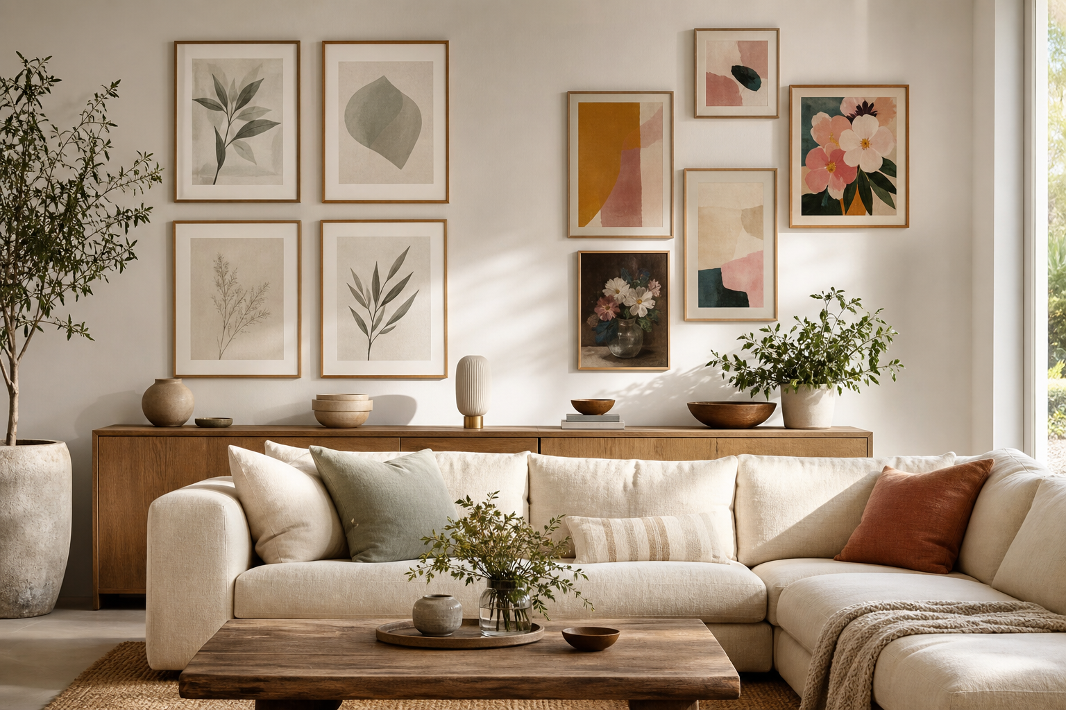
If you are building a small gallery wall, keep spacing tight: 5 to 8 cm between frames is enough. For a more gallery-like effect, align either the top edges or the vertical centres. Mixed alignment usually looks accidental unless you are working with a very large, salon-style arrangement.
Frames, Finishes, and Paper Choices
Frame choice changes the tone of a figure study more than most people expect. Black wood frames sharpen line work and make pale paper look crisp. Oak frames warm up charcoal or sepia pieces and suit Scandinavian, bohemian, and soft contemporary rooms. White frames can work, but they need enough contrast against the wall — on a white wall, they often disappear unless the mount is substantial.
Use a mount when you want breathing room. A 5 to 8 cm mount gives a modest print more presence and helps delicate line work feel elevated. For example, a 40 x 50 cm print in a mounted 50 x 70 cm frame often looks more expensive than a larger unmounted piece. If the artwork is painterly and already fills the page with tone, skip the mount and keep the presentation direct.

Glazing should be practical as well as aesthetic. Acrylic is lighter and safer for larger sizes, especially above beds or in homes with children. Glass gives a slightly sharper finish, but it reflects more. In bright rooms with large windows opposite the art, a matte or anti-reflective option is worth considering.
Paper finish matters most when the subject is subtle. A lightly textured matte paper tends to flatter figure studies because it supports tonal variation and feels closer to an artist's sheet than a glossy decorative print. If you like an art-school, studio-informed look, stay away from shine.
Pairing Figure Studies with Colour and Texture
The easiest colour palette starts with bone, sand, taupe, clay, charcoal, and muted olive. These shades support the body-focused softness of figure studies and let the artwork read as part of the room rather than a separate statement object. If you want contrast, bring in one darker note — espresso wood, black metal, or deep brown leather.
Texture does half the work. Plaster walls, slub linen, boucle, wool rugs, ribbed ceramics, and brushed timber all reinforce the quiet tactility of figurative art. If your room feels flat, the answer is often not more colour but more material contrast. A simple figure study above a walnut console with a ceramic lamp and stacked books can feel complete because the textures create depth around the art.
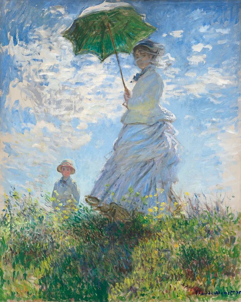
For slightly more expressive interiors, pair the print with selected pieces from our Fashion collection or painterly works from Woman with a Parasol. The key is to keep one common thread — a related palette, soft brushwork, or a shared focus on the human figure.

"Yoga Practice" works particularly well beside a fine art figure study print because it echoes the body as subject while staying visually quiet. That makes it a strong second piece in bedrooms, home studios, and calm living spaces.
Styling Ideas for a Gallery-Like Look
A ledge arrangement gives you flexibility if you are not ready to commit to one fixed layout. Place the largest figure study at the back, then overlap one or two smaller works in front. Keep the supporting pieces quieter than the main artwork — texture studies, minimal abstracts, or soft monochrome pieces are ideal. Two to three layers are enough; more starts to feel cluttered.
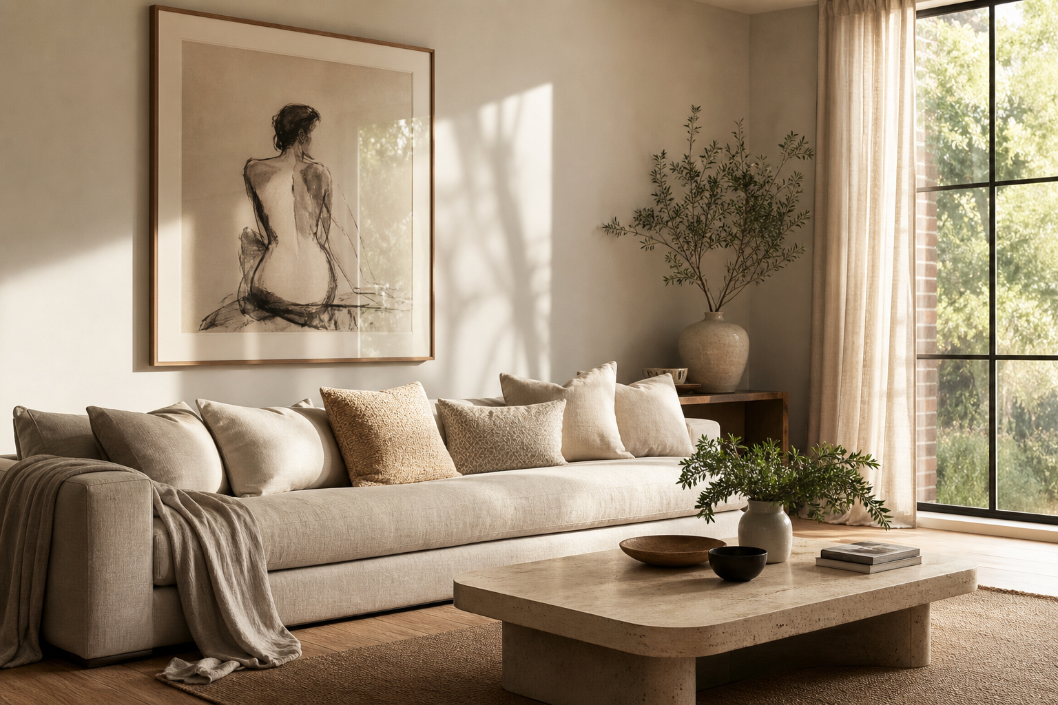
For a cleaner wall, use one oversized piece. A 70 x 100 cm or 100 x 140 cm figure study above a sofa, sideboard, or bed immediately creates a gallery effect, especially with wide margins and a thin frame. This approach works best when the room already has disciplined styling — fewer objects, stronger materials, and at least one open surface.
If you prefer a grouped arrangement, build around one figurative anchor and add no more than three companion works. Keep the tonal range narrow. A common formula is one figure-based piece, one abstract texture, one landscape or painterly work, and one minimal line composition. That balance stops the wall from feeling themed.
Shop Notes: How to Choose a Print You’ll Keep
Buy for staying power, not instant novelty. A print earns its place long-term when you still appreciate the composition after the first week of looking at it. With figure studies, that usually comes down to line, proportion, and emotional temperature — calm, grounded, expressive, or introspective. If the mood suits your home now, it is likely to keep working as furniture and accessories change.
Check the practical details before you commit: available sizes, border treatment, frame compatibility, and whether the colours are truly neutral or slightly warm. Warm blacks, ivory paper, and earthy undertones are generally easier to live with than icy greys. If you want a piece with more classical weight, Zeus — Fine Art Print can suit more architectural spaces, while softer figurative options are easier in bedrooms and relaxed living rooms.
A final test is distance. If a piece still reads beautifully from 2 to 3 metres away, it will hold the wall well. If it only works up close, use it in smaller zones like a hallway niche, vanity corner, or shelf styling setup.
Final thoughts
A fine art figure study print works best when the room gives it space to breathe. Focus on scale first, then choose a frame and palette that support the artwork rather than trying to make it carry the whole room on its own.
The result should feel composed, not decorated — one strong figurative piece, a few tactile materials, and enough negative space to let the line work do its job.
Frequently Asked Questions
What frame colour is safest for a figure study print?
Matte black is the most versatile choice because it defines line work clearly. Natural oak is a close second if your room already has warm wood tones.
Can I hang a figure study print in a bathroom?
Yes, but only if the room has good ventilation and the print is properly framed behind glazing. Avoid placing it where steam hits the frame directly.
Should the artwork match the wall colour exactly?
No — a slight contrast is better. If your walls are warm white, choose art with black, sepia, clay, or cream tones so the piece does not disappear.
Is it better to use a mount with smaller print sizes?
Usually yes. A mount can make a 30 x 40 cm or 40 x 50 cm print feel more substantial and gallery-like without increasing visual clutter.
What decor pieces pair well with figure studies on a shelf?
Use two or three tactile objects at most: a ceramic vase, a stack of books, and one small sculptural item. Keep heights varied and leave at least one-third of the shelf empty.