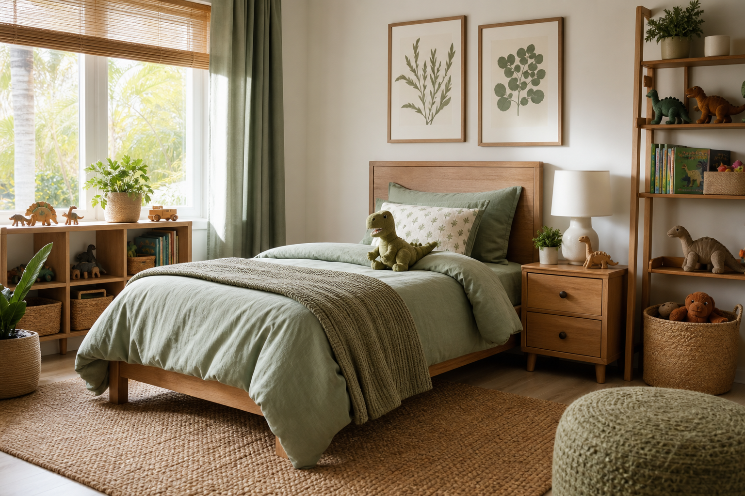
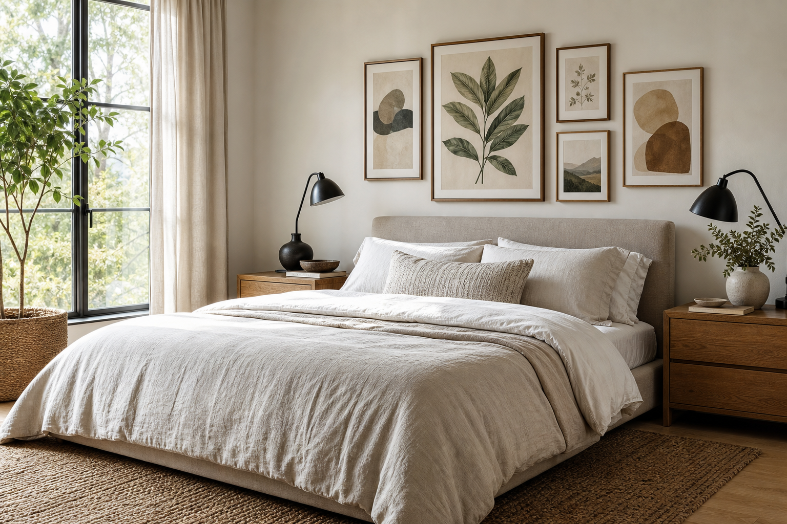
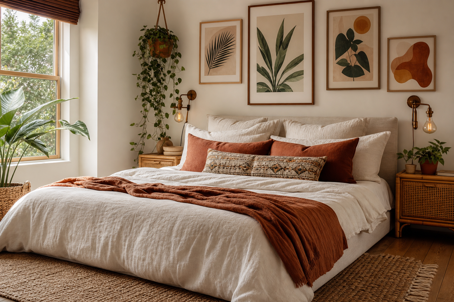
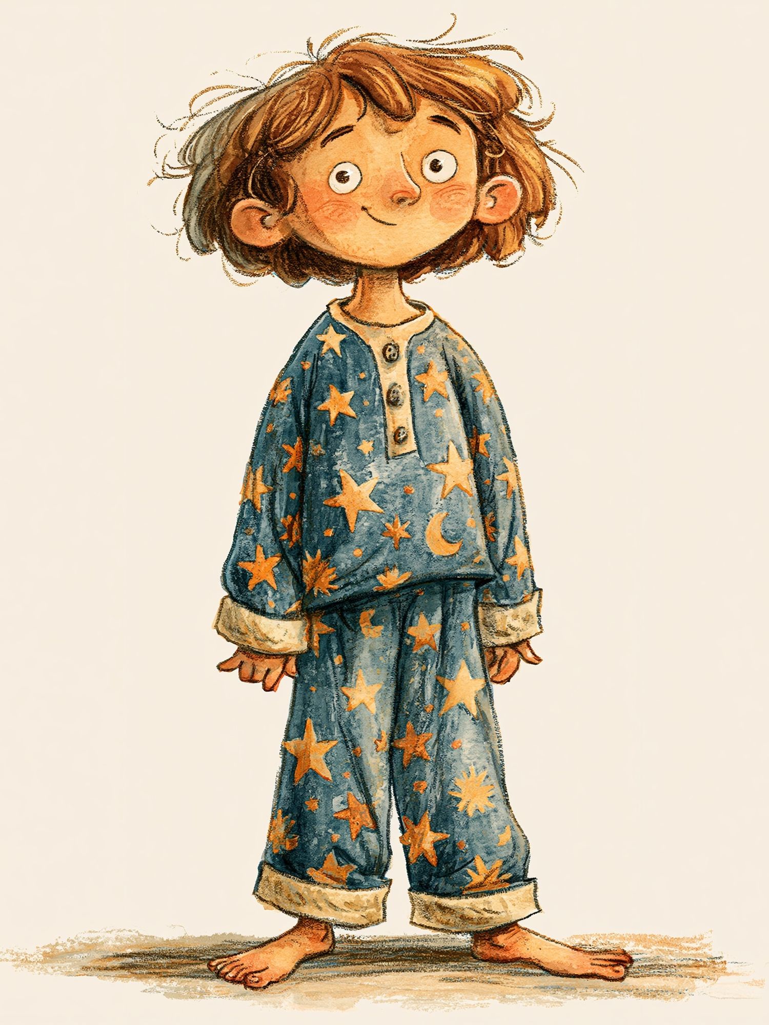
A cute korean doll drawing works because it mixes delicacy with personality. The best versions have rounded features, expressive eyes, soft blush tones, and clothing details that feel styled rather than generic. That balance gives the artwork a collectible quality — light enough for playful interiors, refined enough for a grown-up bedroom, dressing area, or studio wall.
Unlike louder character art, a cute korean doll drawing usually sits comfortably with modern decor because the shapes are clean and the palette is controlled. You get charm without visual noise. That is why it pairs well with our illustration collection and also with quieter pieces from minimalist art prints when you want the room to feel soft rather than busy.
What Makes a Cute Korean Doll Drawing So Appealing?
The appeal starts with proportion. Many doll-inspired illustrations use a larger head-to-body ratio — often close to 1:3 or 1:4 — which makes the figure feel gentle and stylized. Add neat hairstyles, ribbon details, pleated skirts, puff sleeves, or tiny shoes, and the image reads as thoughtful fashion as much as character design. That is why this style can cross over nicely with fashion-inspired wall art.
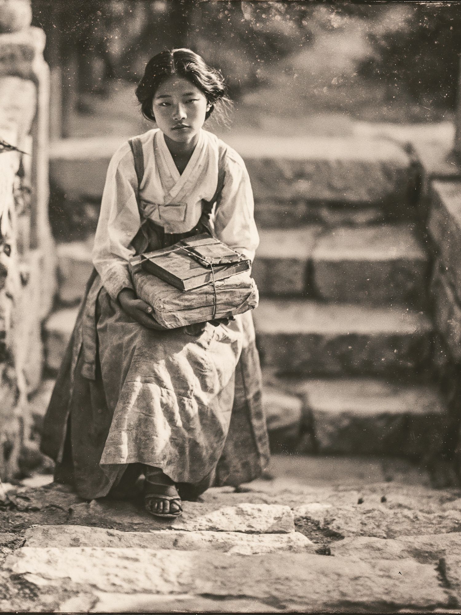
Another strength is emotional tone. These drawings tend to feel calm, sweet, and slightly nostalgic instead of childish. A single framed piece can soften a room with sharp furniture lines, black metal shelving, or plain white walls. If you want a reference point for Korean-inspired illustration with character detail, this Korean Hanbok Girl illustration shows how costume and color can carry the whole mood without overcrowding the composition.

Choosing the Right Palette and Mood
Pastels are the most natural fit. Blush pink, powder blue, butter yellow, and soft lilac all support the doll-like quality without making the wall look sugary. If your room already has warm neutrals — oat, ivory, sand, pale maple wood — use artwork with 60 to 70% muted tones and only a few stronger accents. That keeps the illustration as a focal point instead of letting it clash with textiles and furniture.
If you prefer a fresher look, use one accent color across the room. A coral hair ribbon in the artwork can connect with a desk lamp, vase, or cushion. A mint dress can echo a ceramic tray or bedside book stack. Repeating one hue two or three times is enough. More than that, and the room starts to feel themed instead of styled.

Neutrals also work well when you want the drawing to feel more editorial. Pair it with stone, beige, light gray, or chalky white, then add one darker note such as walnut, charcoal, or black. This is especially useful if you are mixing cute character art with simpler pieces like the Woman and Dog Sketch Print or textured designs from our minimalist collection.
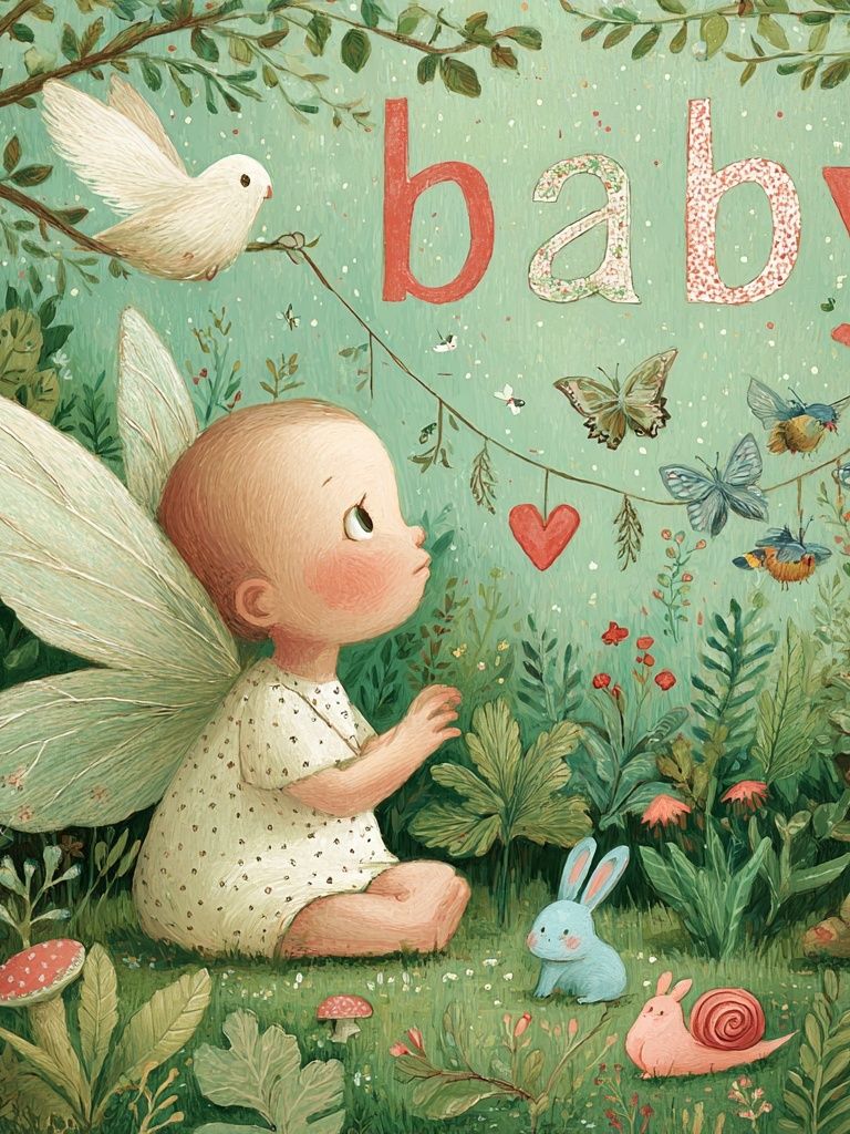
For a brighter wall, choose artwork that already carries color confidence. Pieces from our anime selection often have stronger candy tones and bolder outlines, which can help a cute doll-inspired arrangement feel more energetic in a dorm room or creative workspace.
Best Rooms to Display the Artwork
Bedrooms are the easiest match because the mood is already personal and relaxed. Hang one medium frame above a nightstand, or place two 30 x 40 cm prints offset above the headboard for a less formal look. If the bed is 140 to 160 cm wide, keep the artwork grouping around 80 to 110 cm total width so the wall still breathes.
A dressing area is another strong option. Doll-style illustration naturally complements mirrors, trays, jewelry stands, and soft textiles. One 40 x 50 cm framed print beside a full-length mirror can add enough character without competing with reflective surfaces. If your room is small, hang the piece 145 cm from floor to center — slightly below standard gallery height — so it connects visually with furniture rather than floating too high.

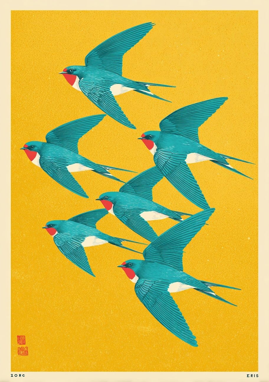
Creative corners benefit from these prints because they bring identity to a desk setup. Above a narrow desk, a single vertical print can fill the empty strip between a shelf and lamp without making the space feel cluttered. If you are building a fuller wall, combine a doll drawing with delicate companion works from our kids art collection or airy pieces like Swallows in Flight for movement.
Frame Styles That Suit the Illustration
White frames are the safest choice when the illustration has multiple small details. A slim white profile — around 1.5 to 2 cm — keeps the edges crisp and gives pastel tones a cleaner look. This works well in Scandinavian rooms, especially with white walls and pale oak furniture.
Warm wood frames add softness. Light oak, birch, or ash brings out peach, cream, and tan notes in the artwork and makes the overall result feel less synthetic. This is often the better pick if your room already has woven textures, linen curtains, or rattan accents. For a cute korean doll drawing with traditional costume details, warm wood can also make the piece feel more timeless.

Colored frames can work, but only if the art is simple enough to handle them. Choose one drawn directly from the print — dusty pink, sage, soft blue — and keep the frame narrow. Anything glossy, very thick, or too saturated can turn a sweet illustration into something novelty-driven. If you want subtle contrast without color, a mount in off-white or pale cream adds a 3 to 5 cm border that makes smaller prints look more considered.

How to Pair It With Other Wall Art
The easiest combination is one character-led piece plus supporting art with quieter shapes. Think one doll drawing, one line sketch, one soft abstract, and one small decorative print. Keep one piece dominant — usually the largest at 40 x 50 cm or 50 x 70 cm — and let the rest step down in scale. That 1 large, 2 medium, 1 small formula prevents the wall from feeling scattered.
A smart pairing is to connect by theme rather than by exact style. Korean-inspired fashion details can sit next to a refined portrait, while playful color can echo in another illustration. For example, the Vintage Korean Girl Portrait brings heritage and softness, while Colorful Sunglasses can add a sharper, modern accent in a dressing room.
Leave proper spacing. Between smaller frames, 5 to 7 cm looks neat. Between medium frames, 7 to 10 cm is usually enough. If every piece is bright and expressive, the wall will read as cluttered from across the room. Add at least one calmer print from our illustration range or one restrained piece from Textured Waves to create visual pause.
Shop Tips for Picking the Perfect Print
Start with size, not subject. For a narrow wall section — between a wardrobe and window, for example — a 30 x 40 cm vertical print is usually enough. Above a desk or dresser, 40 x 50 cm often feels more balanced. If the artwork is going above a 120 cm console or vanity, aim for a total arrangement width of 70 to 90 cm.
Paper finish changes the mood more than most buyers expect. Matte paper suits a cute korean doll drawing because it keeps blush tones soft and reduces glare near mirrors or windows. If the room gets strong direct sun, avoid highly reflective glazing on the frame. It can flatten facial details and make pale colors look washed out at certain times of day.
Placement matters too. If you are styling one hero piece, center it over the furniture below with roughly 15 to 25 cm of gap. If you are using a shelf ledge instead of hanging, overlap one or two smaller frames in front of the main print to create depth. This works especially well in rented spaces where fewer wall hooks are practical.

Final thoughts
A well-styled cute korean doll drawing wall feels polished when the sweetness is balanced by structure — clean framing, controlled spacing, and a palette that repeats across the room. Focus on one strong piece first, then build around it with quieter companions and materials that suit your furniture.
If you keep the colors soft, the frame simple, and the placement proportional to the wall, the result feels charming rather than overloaded. That is the difference between a themed corner and a room that feels intentionally designed.
Frequently Asked Questions
What frame size should I choose if I buy a smaller print?
A 21 x 30 cm print often looks better in a 30 x 40 cm frame with a mount. The extra border gives delicate illustration more presence on the wall.
Do these prints work in a grown-up bedroom, or only in kids' spaces?
They work well in adult bedrooms when the palette is restrained and the frame is simple. Pair them with linen, wood, and neutral walls to keep the look refined.
What wall color works best behind a cute character illustration?
Soft white, warm cream, pale greige, and very light blush all flatter pastel artwork. Strong yellow or intense red walls can overpower subtle facial details.
How can I hang art safely above a bed or vanity?
Use proper wall anchors or picture hooks rated for the frame weight, and keep the bottom edge at least 15 cm above furniture. For extra stability, add small rubber bumpers behind the frame.
What kind of art pairs best if I want a less sweet look?
Mix the character piece with one minimalist sketch, one textured neutral print, or one fashion-led artwork. That combination keeps personality while reducing the overall softness.