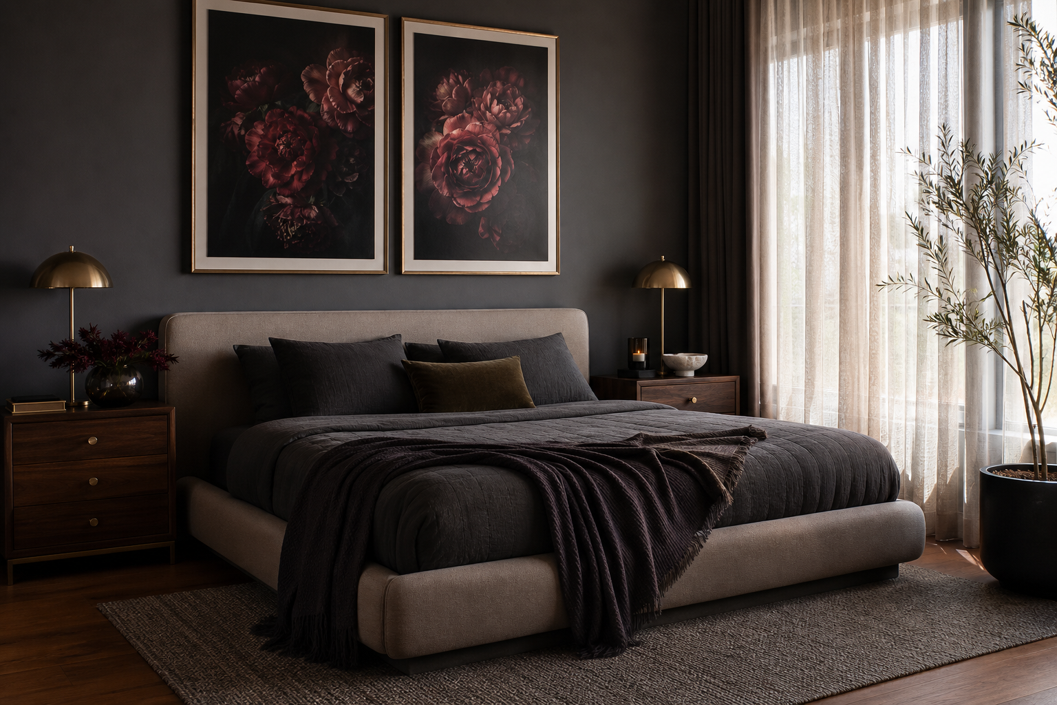
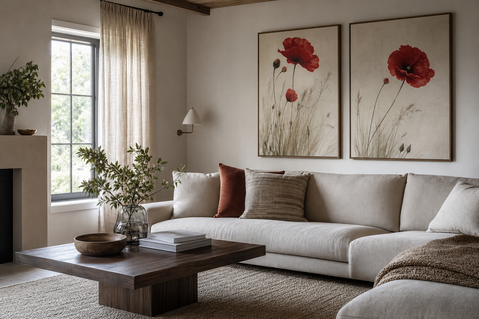
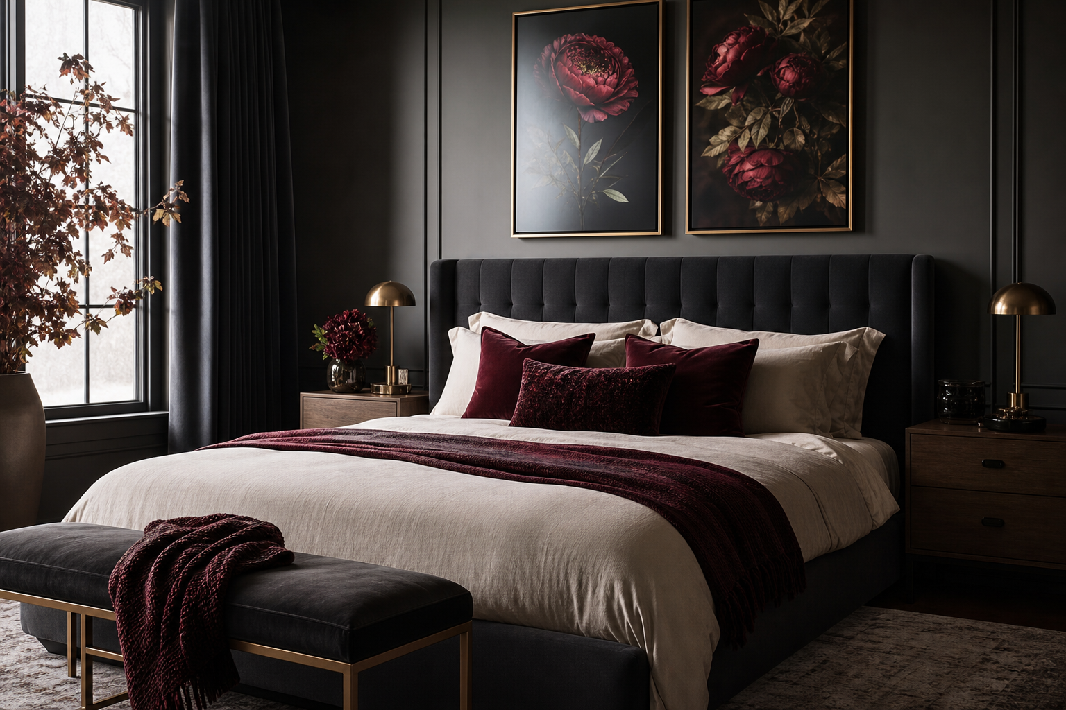
A crimson i poster print works because it does two jobs at once: it adds colour and it adds structure. Crimson has more depth than bright primary red, so it reads as richer and more architectural on a wall. When that colour is paired with a clean, modern composition, the result feels sharper than a floral print and warmer than a strict black-and-white piece.
What Makes a Crimson I Poster Print Stand Out
The strongest appeal of a crimson i poster print is contrast. Crimson sits in a sweet spot between burgundy and scarlet, which means it can hold its own against pale walls, dark furniture, and natural wood without looking flat. In practical terms, this kind of print often becomes the first thing the eye lands on from 2 to 4 metres away — exactly what you want from a focal piece.
Contemporary rooms benefit from artwork with a clear shape language. A crimson-led print tends to feel modern because the colour is assertive while the composition usually stays restrained. That balance is close to what you see in curated abstract wall art collections and selected minimalist art prints: one strong visual statement, enough negative space, and no clutter.
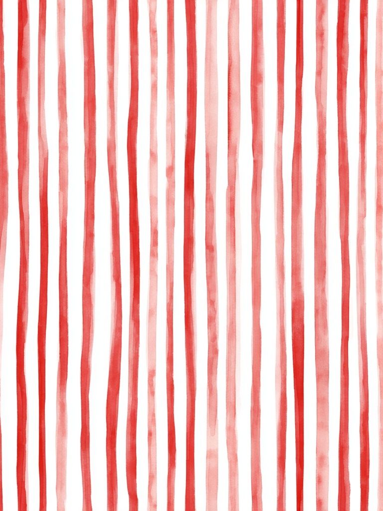
If you want a similarly graphic direction with visible movement, a piece such as the red-toned abstract below shows how stripe-based composition can keep a warm palette feeling clean rather than heavy.
Choosing the Right Room for the Look
A crimson-led print suits rooms that need a defined centre. In a living room, hang it above a sofa that is 180 to 240 cm wide, keeping the artwork at roughly 60 to 75% of the furniture width below it. That ratio makes the wall feel intentional rather than underdressed. Crimson also works especially well with charcoal upholstery, off-white plaster walls, and walnut or oak furniture.

Bedrooms are another strong match, especially if the room already uses warm neutrals. Over a queen bed, choose one large print in 50x70 cm or 70x100 cm rather than two small pieces fighting for attention. In a bedroom, crimson adds warmth without the sweetness of blush tones, making it ideal for more tailored spaces.
Home offices and hallways often benefit even more from this look because they tend to be visually simpler. A narrow corridor with a 50x70 cm crimson piece instantly gains direction. In an office, a bold red-accent artwork behind a desk can sharpen the room's energy, especially alongside modern typography prints or monochrome fine art wall pieces that keep the palette grounded.
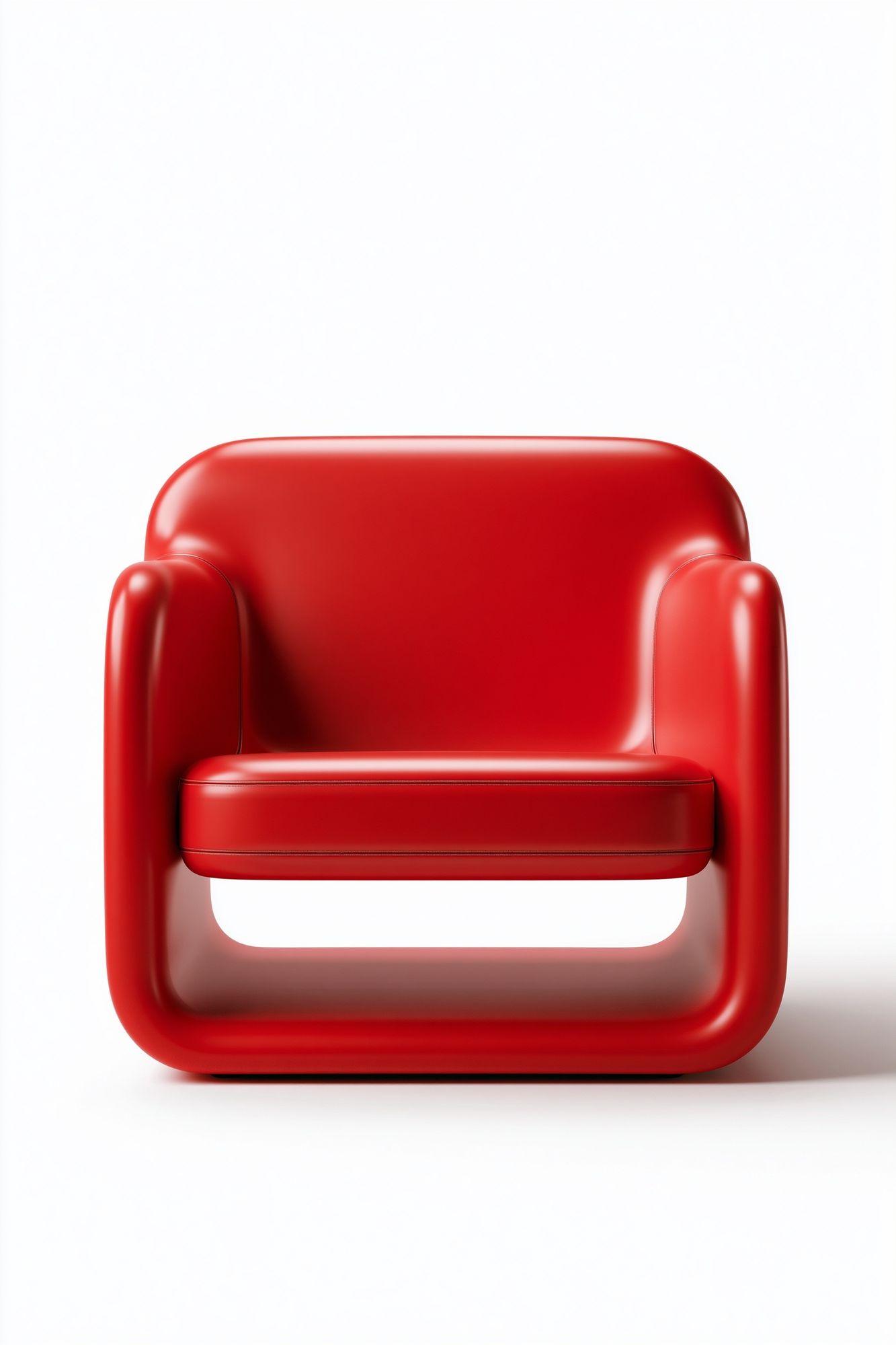
If your room leans retro-modern, a product-led accent like the Red Modern Armchair print can echo crimson tones without repeating the exact same visual language. That mix keeps the room layered.
How to Style Crimson with Your Existing Palette
Crimson looks best when the rest of the palette is edited. Start with three anchors: a neutral base, one dark note, and one warm material. For example, soft white walls, matte black details, and medium walnut wood create enough restraint for crimson to stand out. This formula works in almost any modern room.
For lighter interiors, pair crimson with oatmeal, stone, sand, and warm grey. These shades soften the colour and stop it from feeling aggressive. If your room already includes pale oak, boucle, linen, or travertine, a crimson i poster print introduces needed tension — which is often what makes a neutral room feel finished rather than safe.

Black accents make crimson feel more graphic. Think slim black frames, black table lamps, or iron shelving. This is why red-heavy pieces often sit naturally beside black-and-white geometric abstract art or stricter linear work from our minimalist collection.
If you want a warmer, more layered wall, bring in rust, terracotta, muted plum, or amber rather than adding another bright red. A complementary option from the broader abstract range is Colorful Stained Glass Abstract, which can pull crimson into a fuller jewel-toned palette without losing sophistication.
Sizing, Framing, and Placement Tips
Size matters more than people expect. A crimson piece that is too small will read as a random red spot on the wall. For most living rooms, start at 50x70 cm. If the wall is over 220 cm wide or the ceiling is above 260 cm, 70x100 cm usually looks better. On narrow walls between windows or beside shelving, 30x40 cm or 40x50 cm works if the print is visually strong and hung at eye level — around 145 cm from floor to centre.
Frames change the mood quickly. A black frame gives crimson a gallery-like edge and works well in rooms with metal accents. Oak softens it and makes the print easier to blend into Scandinavian or mid-century interiors. White frames only work when the artwork itself has enough contrast to avoid fading into the wall.
Leave 15 to 25 cm between the top of a sofa or headboard and the bottom of the frame. On a gallery wall, keep spacing tighter — around 5 to 8 cm between frames. That tighter hang makes multiple pieces feel like one composition instead of separate objects.
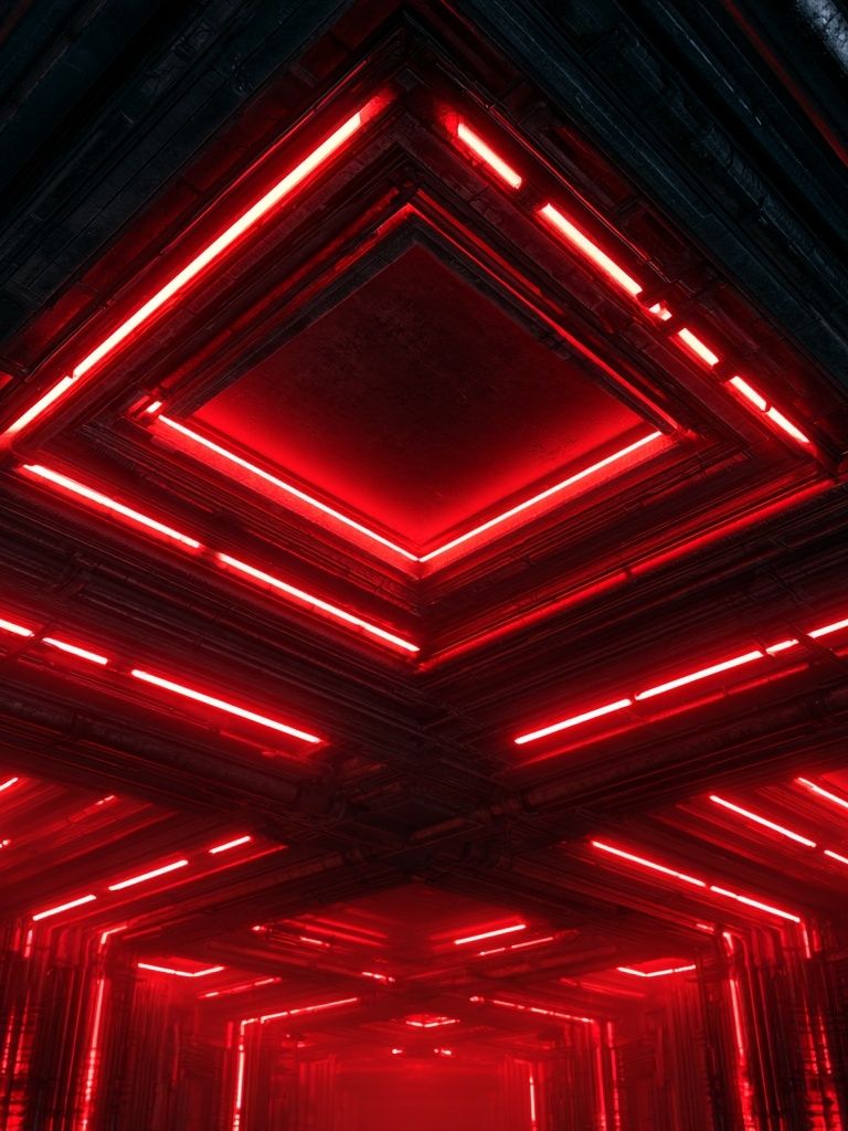
For richer, moodier rooms, deeper reds can be paired with atmospheric works like Red Neon Tunnel Abstract Print. If the rest of your room is quieter, a softer textural option from our abstract print selection may be the better choice.
Building a Gallery Wall Around a Statement Print
The easiest way to build around a crimson statement piece is to treat it as the anchor and let the other three or four works support it. Aim for one dominant print, two quieter companions, and one contrasting accent. A good ratio is 40% bold, 40% calm, 20% unexpected.
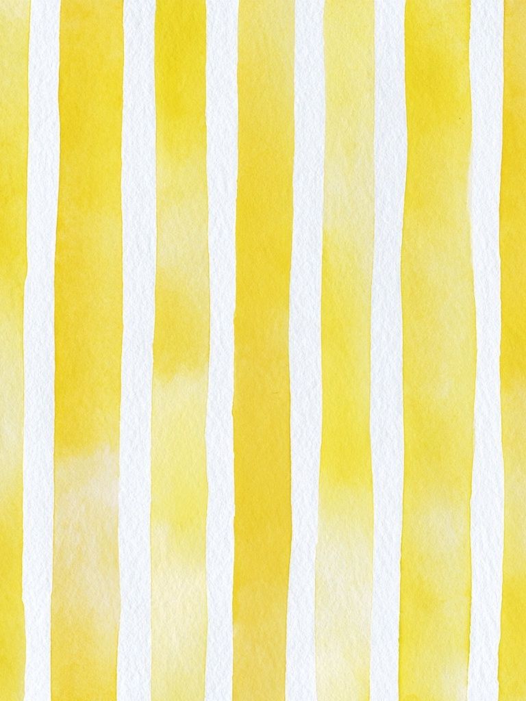
A balanced gallery wall around crimson often combines one red-led abstract, one black-and-white design, one softer neutral piece, and one work with a related warm tone. That approach prevents the wall from becoming too red while keeping it cohesive. You can pull from yellow-toned abstract pieces or subtle light fine art imagery to add breathing room.



If you prefer a more decorative, less graphic mix, borrow warmth from mid-century shapes or painterly work. Mid-Century Abstract Leaves introduces organic forms that stop a crimson wall arrangement from feeling too rigid.
Quick Styling Ideas and Shop-The-Look Tips
A fast room update starts with repetition. If your crimson i poster print is the only red element in the room, repeat that tone two more times in small doses — a book spine, a cushion edge, a ceramic object, or a throw with a rust-red thread. Keep those accents under 10% of the total visible palette so the room still feels designed, not themed.
Texture is the next lever. Crimson looks better when something tactile sits near it: brushed linen, boucle, ribbed glass, dark stained wood, or matte ceramic. These materials absorb some of the intensity and make the wall art feel integrated into the room rather than applied after the fact.
For a more expressive version of the same palette, this piece adds movement while staying close to the same colour family.

If you're shopping the look, start with one bold red-led work, one supportive neutral, and one graphic accent. Browse our abstract collection for the focal piece, then layer in structure from Dark Luxury Typography or warmer retro notes from mid-century modern prints. That combination gives you a room that feels collected, not overmatched.

Final thoughts
A crimson i poster print is effective because it brings both warmth and discipline to a room. It can energise a neutral palette, sharpen a soft interior, or anchor a gallery wall with very little effort — as long as the size, frame, and surrounding colours are chosen with intention.
Use crimson once at full strength, then support it with neutrals, dark lines, and natural textures. That is what makes the look feel modern rather than overpowering.
Frequently Asked Questions
What frame finish works best if my walls are white and my furniture is light oak?
Choose a black or dark walnut frame for contrast. Light oak on light oak can blur the edges unless the artwork has very strong dark detailing.
Can I hang a crimson print in a small room without making it feel smaller?
Yes — use one medium piece instead of several small ones and keep the rest of the palette light. A 40x50 cm or 50x70 cm print usually adds focus without crowding the wall.
Does crimson pair better with cool grey or warm beige?
Both work, but they create different effects. Cool grey makes crimson feel sharper and more graphic, while warm beige makes it feel softer and more inviting.
What kind of glass should I choose for a framed print near a window?
Use acrylic or glazed UV-protective glass if the wall gets direct sun for several hours a day. It helps reduce fading and cuts glare in bright rooms.
What other art styles pair well with a crimson statement piece?
Black-and-white geometry, soft landscape fine art, and restrained typography are reliable matches. They add contrast without competing for the same visual space.