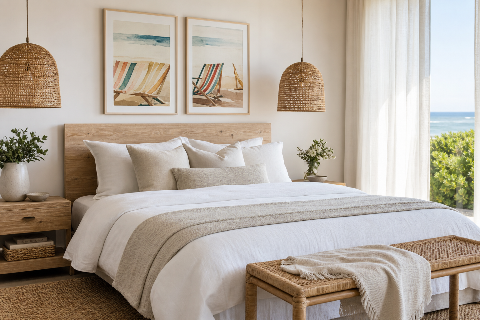
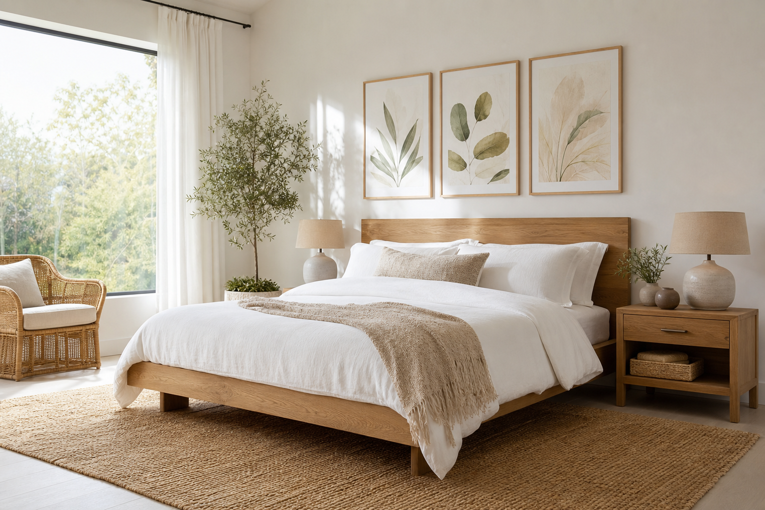
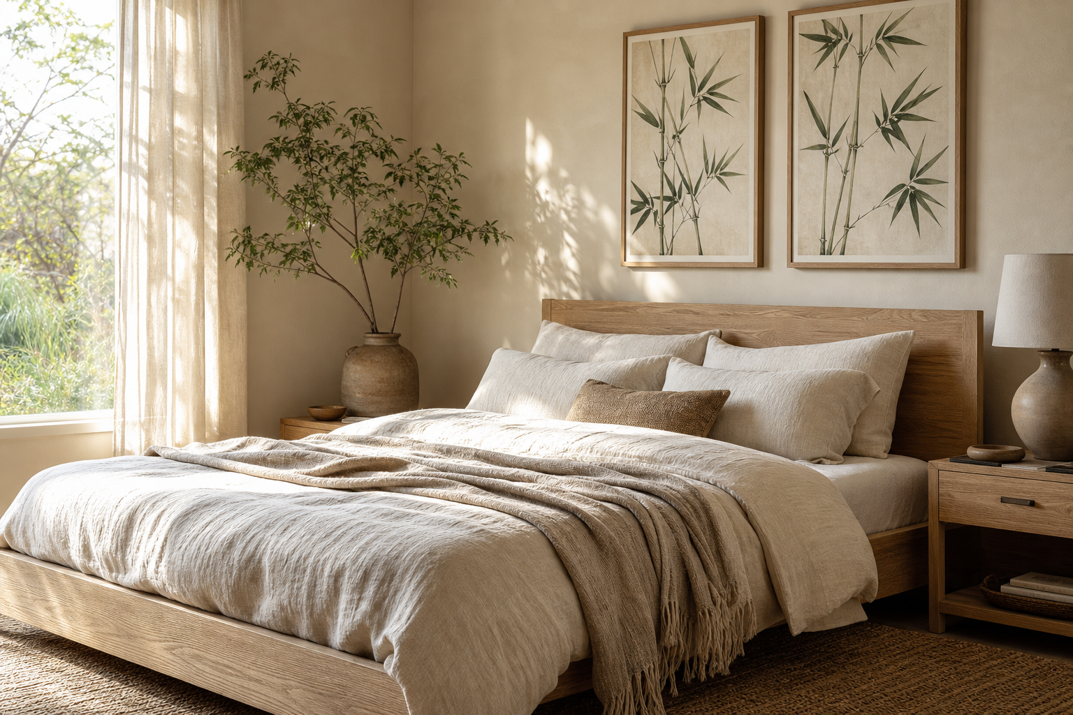
The cabines 2 poster print works because it captures the seaside without relying on obvious nautical clichés. Instead of ropes, anchors, or busy beach scenes, it leans on repetition, clean lines, and a quiet horizon mood. That graphic simplicity gives it a more timeless feel, which is why it sits comfortably in both relaxed coastal homes and cleaner modern interiors.
Its strongest quality is balance. The subject has charm, but the composition stays disciplined — usually a row of beach cabins, spaced evenly, with enough negative space to let the eye rest. If you like the restraint often found in our illustration collection, the cabines 2 poster print delivers that same composed look with a softer, more vacation-led tone.
What Makes the Cabines 2 Poster Print Stand Out
A good coastal print should calm a room, not dominate it. Cabines 2 does that by using familiar seaside architecture as a repeating motif. Repetition makes art feel organised, which is especially useful in rooms that already have texture — linen curtains, slatted wood, boucle upholstery, woven baskets. The print adds structure without adding visual noise.
Another reason it stands out is that it feels classic and contemporary at once. Beach cabins are nostalgic, but when rendered with a simplified layout and limited palette, they take on a more editorial quality. That makes this kind of piece easy to mix with pared-back spaces, especially if you already gravitate toward landscape-led illustration prints with a clean composition or understated pieces from our typography wall art range where spacing and balance matter as much as subject.

The Colour Palette and Mood It Brings Home
Most Cabines 2-style artwork relies on muted blues, off-whites, sandy neutrals, and occasional charcoal or faded red accents. Those colours lower contrast in a room, which makes the wall feel calmer from a distance. In practical terms, that means the print can soften sharper interiors with black metal lighting or angular furniture, or it can reinforce a serene palette in a room already built around beige, oat, ivory, and weathered wood.
If your room needs a focal point without a hard colour break, this is the right kind of art. A high-contrast black-and-white print can pull attention fast, but a coastal composition in 20 to 40 percent desaturated tones settles in more gradually. That is useful in bedrooms and reading corners where you want visual interest that does not feel restless.
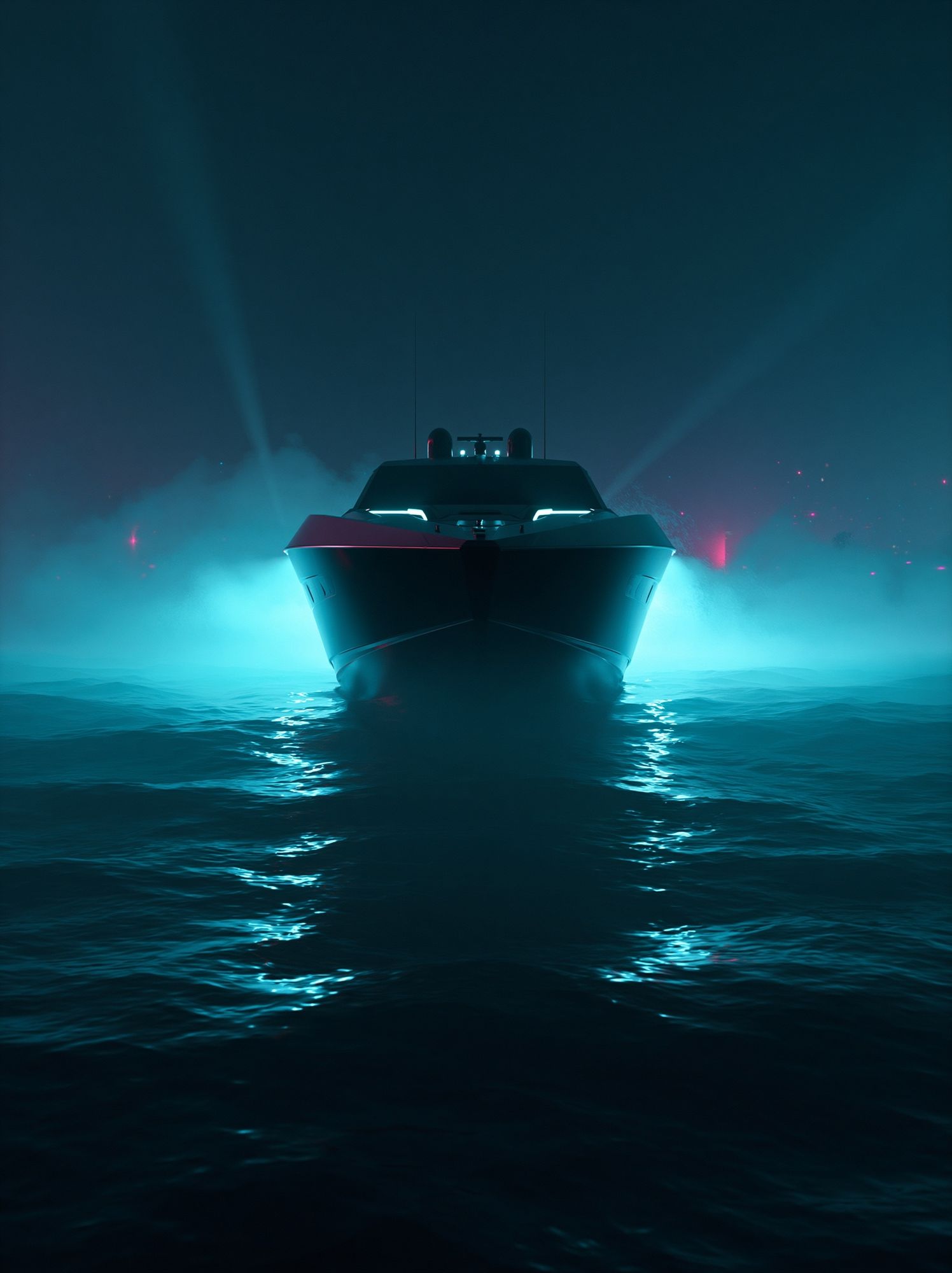
Because your catalog options here are limited and not all are truly coastal, it makes sense to borrow from adjacent moods rather than force a perfect match. Neon Yacht at Sea has a maritime subject, but its brighter treatment suits bolder interiors rather than the calm restraint of Cabines 2. For a quieter visual rhythm, look instead at composition-first pieces in the broader illustration category and keep the palette soft through framing and surrounding décor.
Where to Hang It for the Best Effect
The best placement depends on viewing distance. In a bedroom, hang the print 15 to 25 cm above the headboard so it feels integrated with the bed rather than floating on its own. A 50 x 70 cm size is usually enough above a double bed, while 70 x 100 cm has better presence above a king-size bed at least 160 cm wide.
In a living room, the safest formula is to keep the artwork at roughly 60 to 75 percent of the sofa width. Above a 200 cm sofa, that puts you in the 120 to 150 cm total visual width range — either one larger framed piece or a pair of coordinated works. The cabines 2 poster print is especially effective over a sofa in light linen or cotton because the textile softness echoes the relaxed coastal theme.
Hallways are often overlooked, but they suit this subject well. A narrow corridor with white walls, a slim console, and one 40 x 50 cm framed coastal print can feel more considered immediately. Reading corners also benefit from this piece because the image invites pause rather than action. Place it beside a floor lamp and natural-fibre chair, and the wall starts to feel anchored.

Choosing the Right Size and Framing
Scale changes the mood of this artwork more than people expect. At 30 x 40 cm, Cabines 2 feels intimate and suits smaller walls, layered shelving, or compact entry spaces. At 50 x 70 cm, it becomes a clear feature without overwhelming the room. At 70 x 100 cm, the piece reads more like a statement — best for wide walls, high ceilings, or minimal spaces with fewer competing objects.
Frames matter just as much. Oak gives the print warmth and works well with Scandinavian, coastal, and organic-modern interiors. White frames keep the look airy and are a smart option if your walls are already warm beige or soft greige. Black frames sharpen the composition, but they only work best when the room has another black element — a lamp, side table, or chair leg — so the contrast feels repeated rather than isolated.
A mount can also change the feel. Adding a white border or mat widens the breathing room around the artwork and makes a 50 x 70 cm piece feel more gallery-like. If the image itself has fine lines or a lot of pale space, a 5 to 7 cm mount often gives it more definition on the wall.

Styling Cabines 2 with Other Wall Art
Cabines 2 pairs best with art that shares one of three things: palette, spacing, or subject. You do not need every piece in a gallery wall to be coastal. In fact, a stronger arrangement often mixes one seaside image with abstract illustration, restrained line work, or a light graphic print in the same colour family.
A practical formula is 1 hero piece, 2 supporting prints, and 1 grounding accent. For example, the hero could be Cabines 2 at 50 x 70 cm, with two smaller neutral illustrations at 30 x 40 cm and one typography piece to add structure. Keep spacing consistent — 6 to 8 cm between frames is usually enough for a tight gallery wall, while 10 to 12 cm suits wider, airier arrangements.
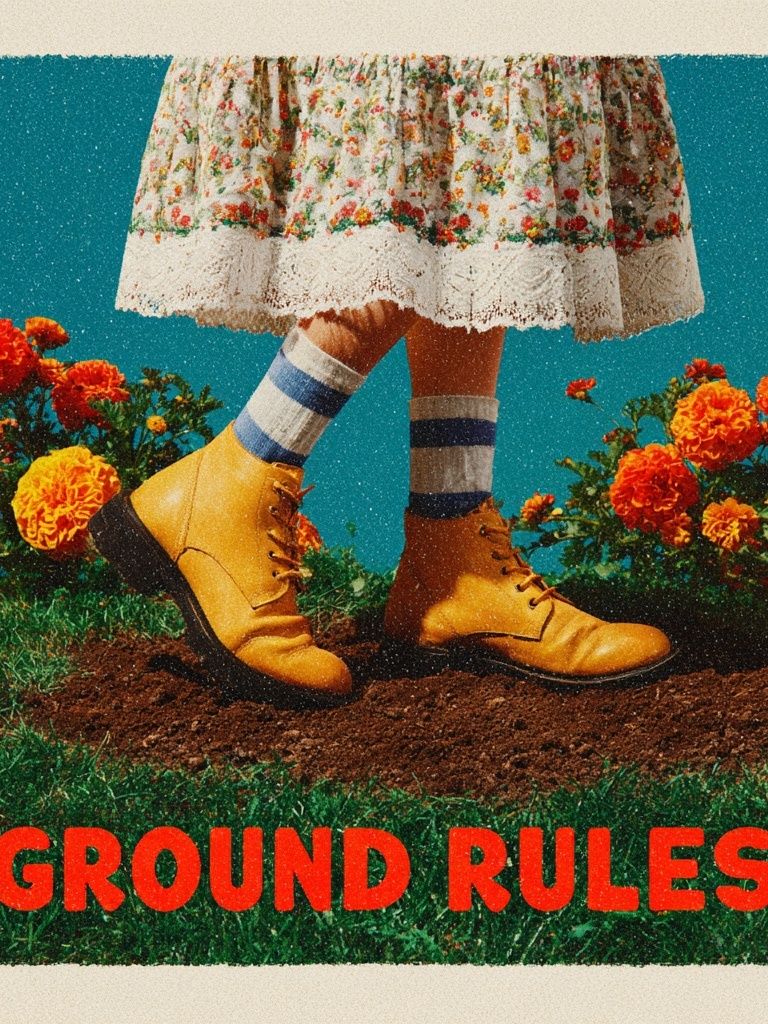
Because the catalog does not include multiple truly coastal companions, the best supporting options are pieces that echo layout or colour restraint rather than subject matter. Browse minimal illustration prints for quieter companions, and use something from Ground Rules — Retro Typography Print only if the room already has a more playful, collected look.


One useful tip: keep at least one repeated finish across every frame. If all four pieces use oak, the wall feels cohesive even when the subjects vary. If you prefer mixed frames, limit the palette to two finishes — for example oak and white, or oak and matte black.

Shop the Look: Simple Tips for a Finished Interior
To make the print feel intentional, repeat its mood in materials rather than in themed objects. Think washed linen, pale timber, boucle, sisal, ceramic, and brushed cotton. Two or three of those textures are enough. You do not need shells, striped cushions, and driftwood on every surface for the coastal reference to land.
Furniture should stay visually open. A slim oak bedside table, a low-profile sofa, or a narrow console allows the art to breathe. If you place the print above a bulky dark cabinet, the composition can feel bottom-heavy. Lighter furniture, open legs, and a little negative space around the frame give the piece the calm it needs.
Lighting helps more than accessories. A wall print with pale blues and sandy neutrals looks best under warm white bulbs around 2700K to 3000K. Cooler light can flatten the soft tones and make the artwork feel less inviting. If possible, position it where daylight reaches the wall indirectly rather than in harsh direct sun, which can create glare on glazing.

If you want the room to feel more curated, add one accent colour pulled from the print — dusty blue, faded coral, or soft grey-green — in a cushion, throw, or ceramic vase. Keep that accent under 15 percent of the room's visible colour so the space stays calm. The aim is a quiet connection, not a themed scheme.

Final thoughts
The cabines 2 poster print succeeds because it brings coastal character through order, softness, and restraint. It gives a room a sense of place without overwhelming the furniture or demanding a full beach-house aesthetic.
Choose the right scale, keep the framing simple, and support it with natural materials and a measured palette. Done well, this kind of print can make a bedroom, hallway, or living space feel lighter, quieter, and more resolved.
Frequently Asked Questions
What frame width works best for a coastal print like Cabines 2?
A slim to medium frame, around 1.5 to 2.5 cm wide, usually looks best. It keeps the artwork crisp without making the final piece feel heavy.
Should I use glass or acrylic for a framed print in a sunny room?
Acrylic is lighter and often easier for larger sizes, while real glass gives a slightly sharper finish. In bright rooms, choose glazing with reduced glare if possible.
Can I hang Cabines 2 in a bathroom?
Yes, if the bathroom is well ventilated and the frame is kept away from direct steam. Use proper wall fixings and avoid placing it immediately above a radiator or towel rail.
What wall colour makes this kind of coastal artwork look strongest?
Soft white, warm sand, pale greige, and muted blue-grey all work well. Very yellow creams can dull cooler sea tones, so keep undertones neutral.
Does this print work better alone or as part of a gallery wall?
Both can work, but a single larger piece creates the calmest effect. Use a gallery wall only if the surrounding prints share a restrained palette and similar spacing.