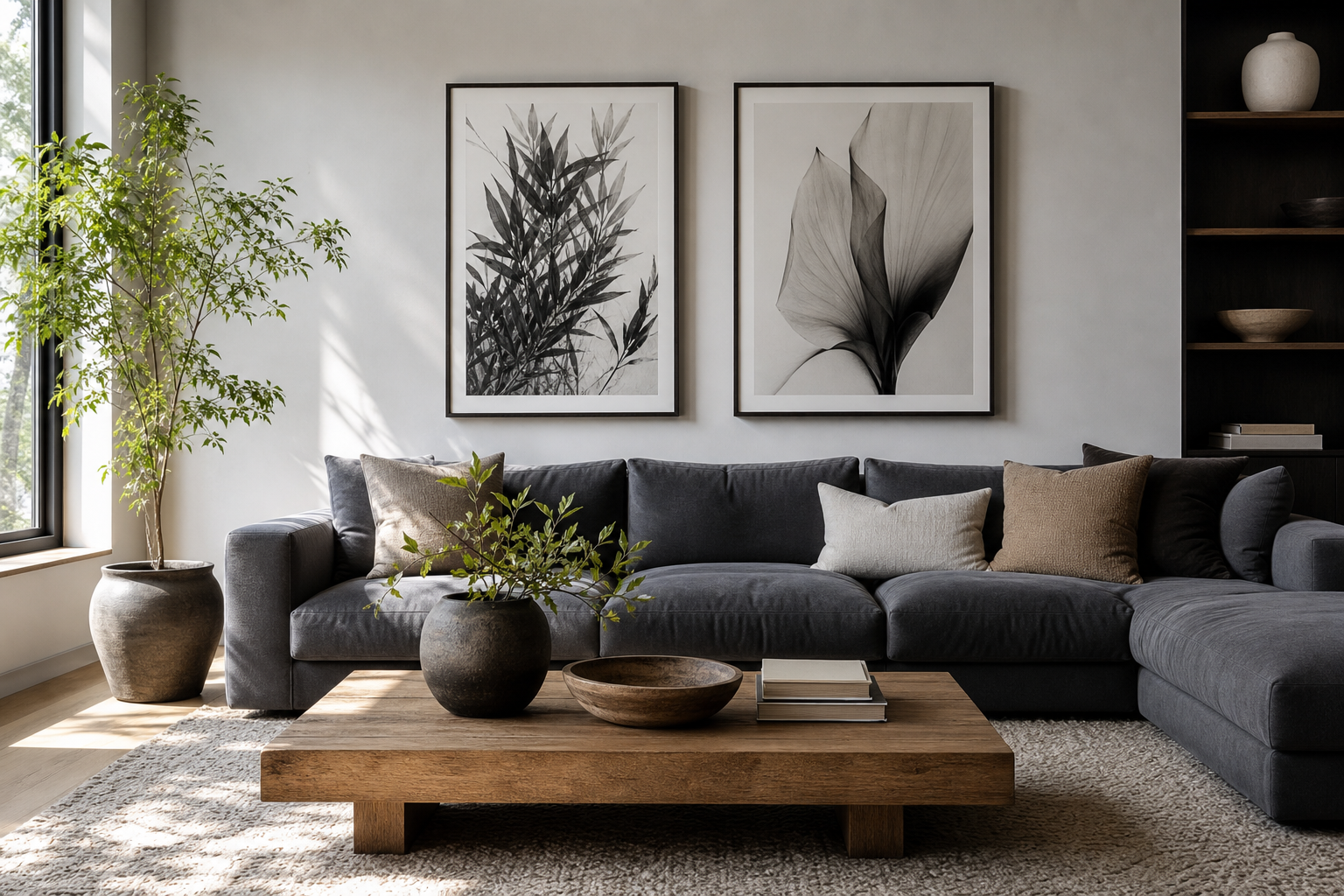
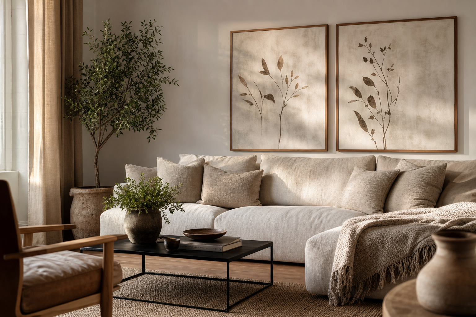
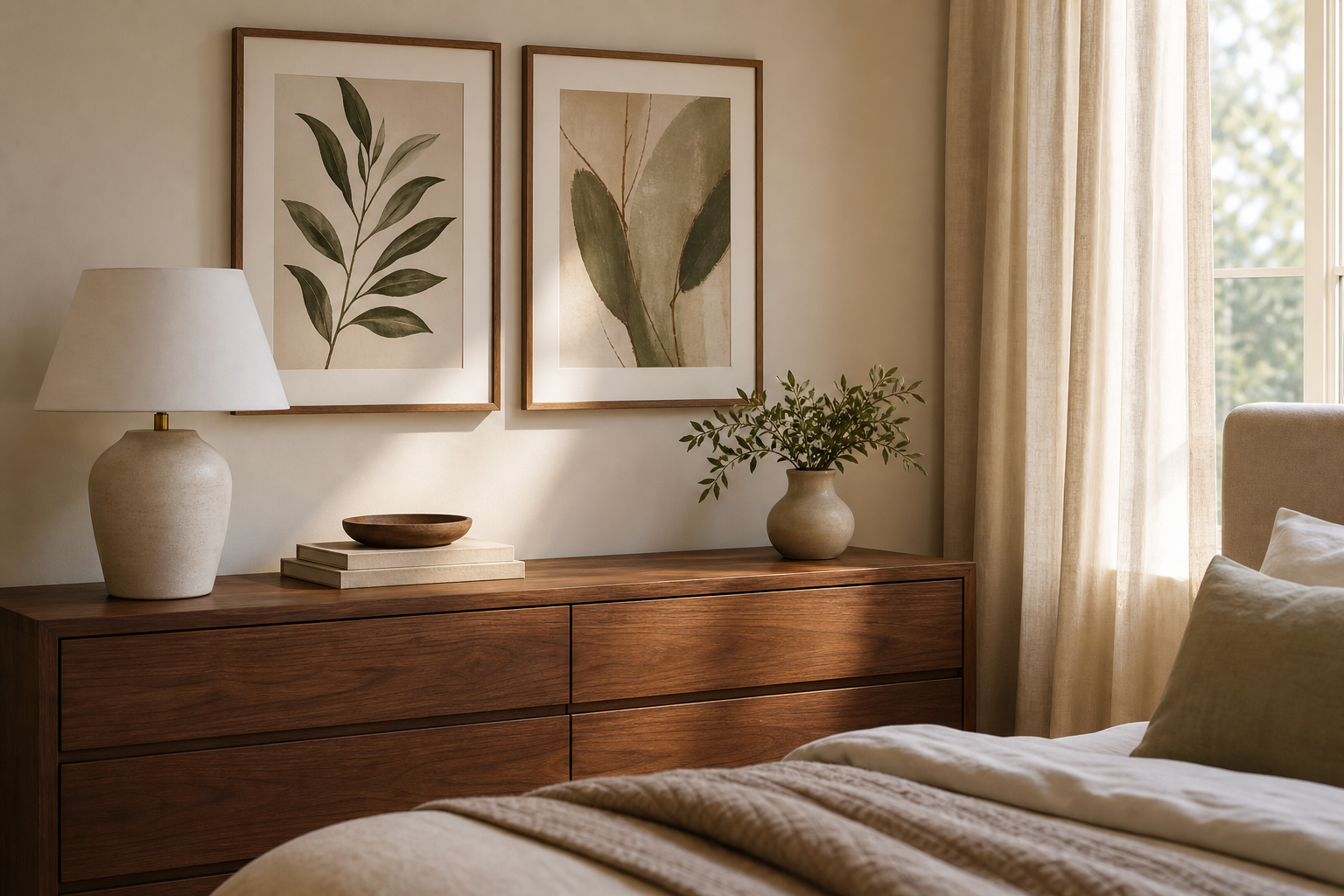
A black dog portrait has a rare balance of warmth and drama. The dark coat creates instant contrast against pale walls, while the familiar expression of a dog keeps the look personal rather than severe. In practical terms, that means a black dog portrait can work in homes that lean modern, classic, rustic, or minimal — as long as the surrounding colours and materials are chosen with intention.
The strongest results come from treating the piece as a focal point, not an afterthought. If you already enjoy animal-led decor, pieces from our Animals collection show how expressive portrait artwork can anchor a room without filling every wall.
Why a Black Dog Portrait Feels So Striking
Dark animal portraiture stands out because it compresses the palette while heightening detail. A black coat picks up subtle undertones — charcoal, blue-black, warm brown — and these nuances become more noticeable when surrounded by light walls, oak wood, linen, or plaster. That contrast is why a black dog portrait often looks stronger from 2 to 3 metres away than a mid-tone image of the same size.
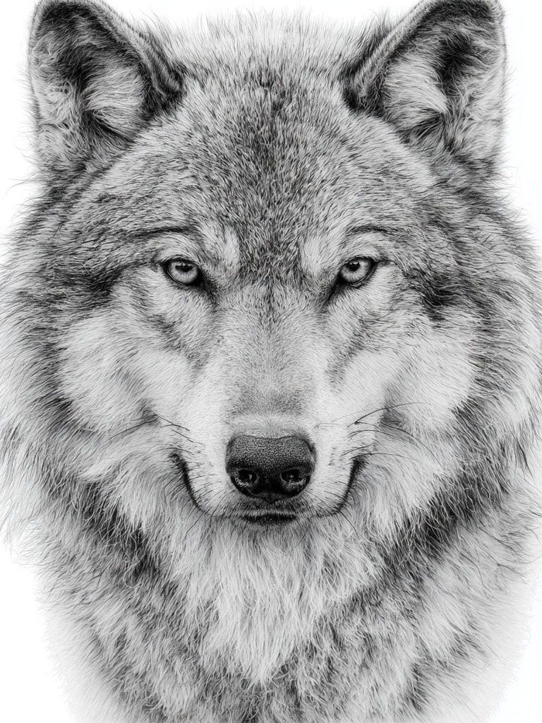
There is also an emotional reason it works. Dog portraits feel direct and familiar, especially when the face is forward-facing or slightly turned. The piece reads as character, not just decoration. If you like the intensity of monochrome wildlife pieces, our Black Wolf Portrait Print and broader Photography wall art are useful references for how dark subjects hold attention in a room.
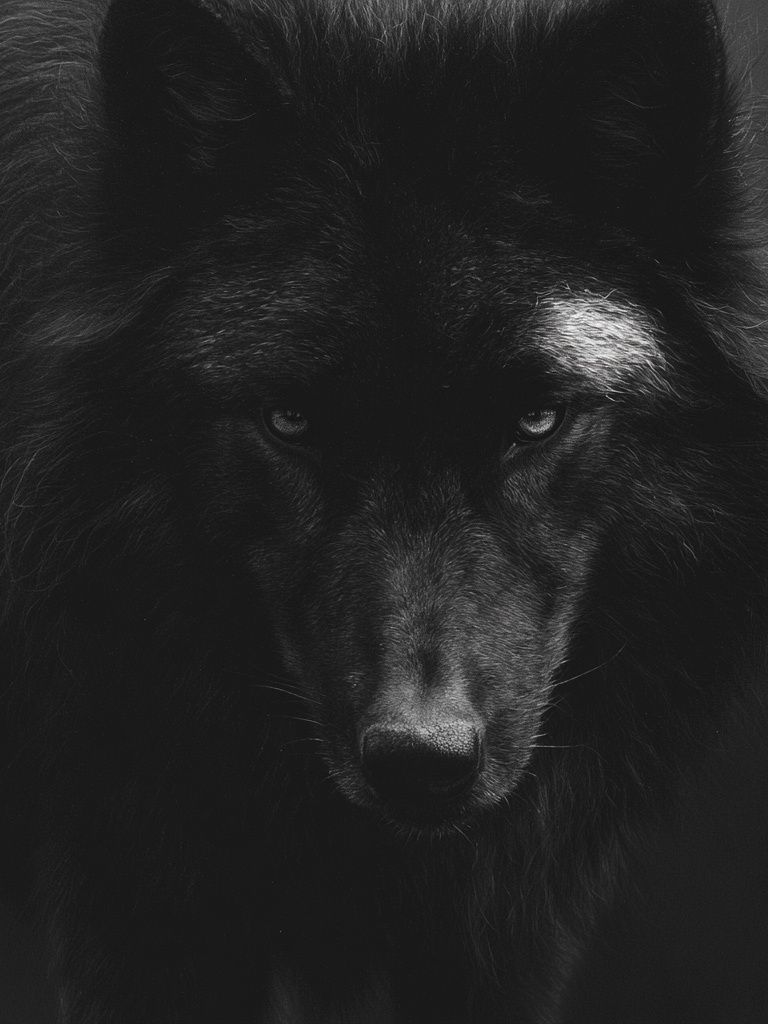
A black subject also gives you more freedom with surrounding decor. Unlike bright, multicolour art that can dictate every accessory choice, a black-based portrait can sit comfortably beside brass, oak, black metal, ivory textiles, or stone. In styling terms, it behaves almost like a neutral — but with much more presence.
Choose the Right Style for the Room
The portrait style should match the room's architecture and furniture lines. In a traditional room with mouldings, deeper paint colours, or vintage wood, a realistic or painterly dog portrait tends to feel settled and elegant. In a cleaner, modern space with straight-edged furniture, a more graphic or high-contrast treatment usually looks sharper.
If your room already contains visible texture — boucle, linen, wool, raw oak — choose a portrait with softer tonal transitions rather than overly crisp outlines. If the room is sleek and minimal, a bold silhouette or black-and-white composition can add definition. This is where browsing Fine Art prints or Minimalist wall art can help you identify whether your interior wants softness or structure.
A useful rule is to match visual density. Busy room, calmer art. Sparse room, stronger art. In a small apartment or home office, one confident image often does more than a cluster of weaker pieces.

Best Colours to Pair with Black Dog Art
Warm neutrals are the easiest partner. Think oatmeal, sand, putty, mushroom, camel, and soft ivory. These shades soften the depth of the black tones and stop the portrait from feeling too stark. A wall in warm white with an LRV around 75 to 85 is especially effective because it keeps the image crisp without the clinical feel of brilliant white.
Deep greens are another strong option. Olive, forest, eucalyptus, and moss all echo the natural quality of animal portraiture. Used on a wall, a dark green can create a cocooning backdrop; used in smaller amounts through cushions or curtains, it helps tie the portrait into the room without overpowering it.
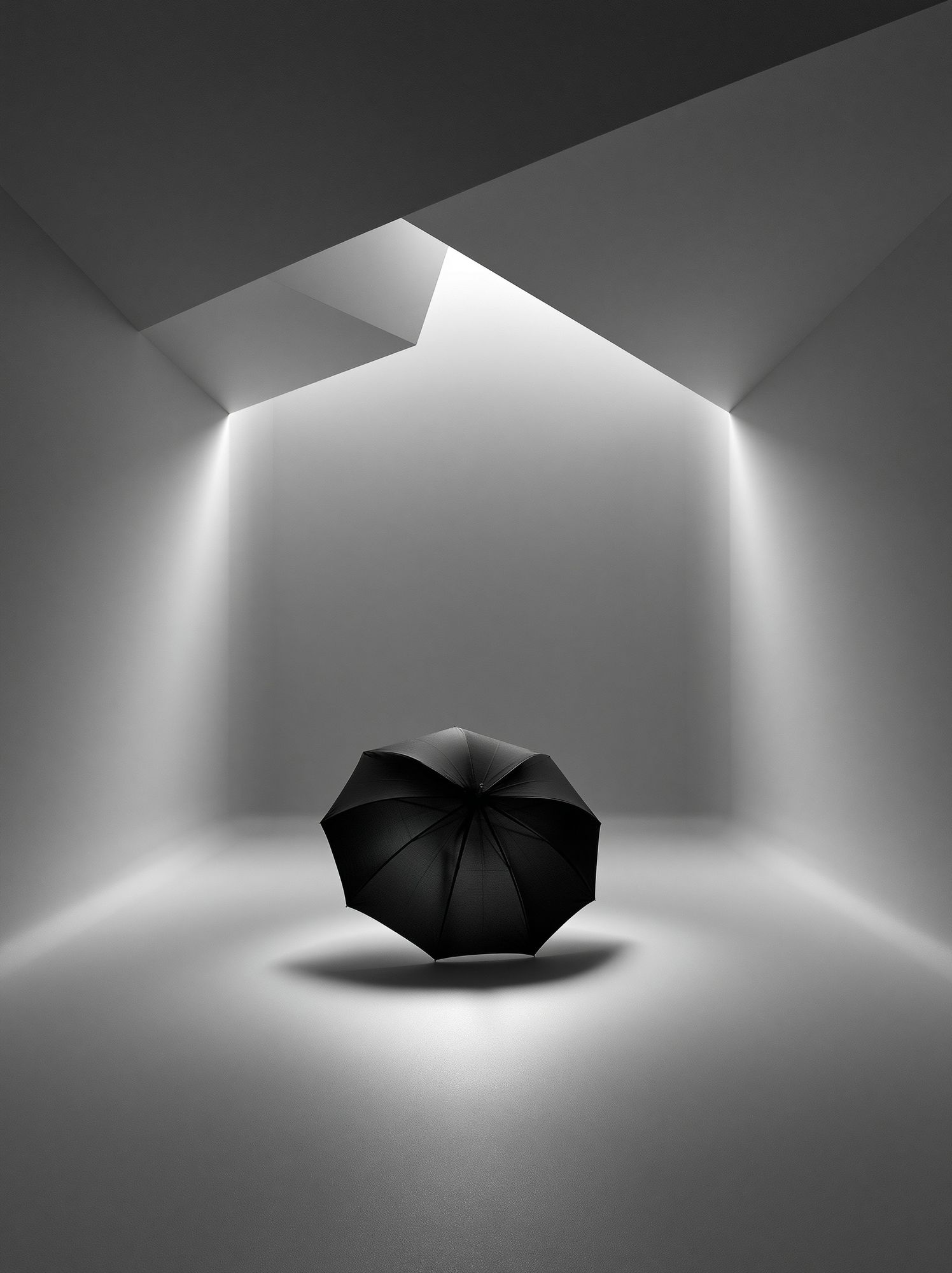
Tonal black, grey, and off-white schemes work well too — but only if you vary texture. Combine matte black frames, nubby fabrics, brushed metal, and pale wood so the room does not flatten. If you want supporting pieces with restrained palettes, this set of monochrome and texture-led works shows how dark tones can be balanced with lighter surfaces.
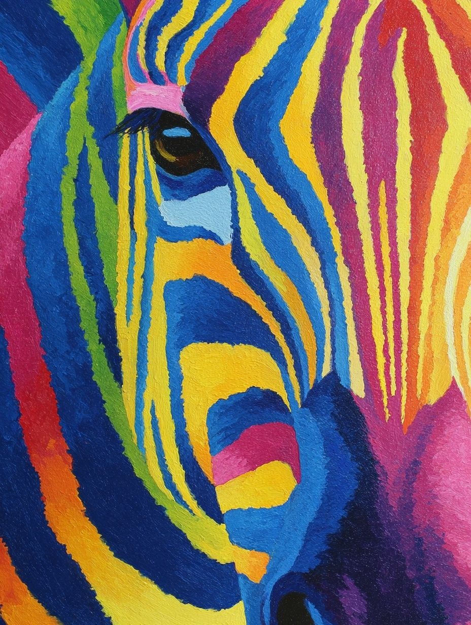
For a softer result, avoid pairing a black dog portrait with too many icy blues or bright primary shades. Those colours can make the image feel disconnected from the room. Earth-led accents — rust, tobacco, muted ochre, aged brass — are usually more forgiving.
How to Pick the Right Size and Placement
As a single statement piece, a black dog portrait should typically span 60 to 75 percent of the width of the furniture below it. Above a 180 cm sofa, aim for art around 110 to 135 cm wide if hanging one large piece, or one substantial portrait around 70 x 100 cm if you want a more contained focal point. Above a console, 50 x 70 cm and 70 x 100 cm are the most reliable sizes.
Eye level still matters. The centre of the frame should usually sit around 145 cm from the floor, adjusting slightly for rooms where art is meant to be viewed seated, such as dining areas or lounges. Hang it 15 to 25 cm above the top of a sofa or headboard so the portrait feels connected to the furniture rather than floating separately.
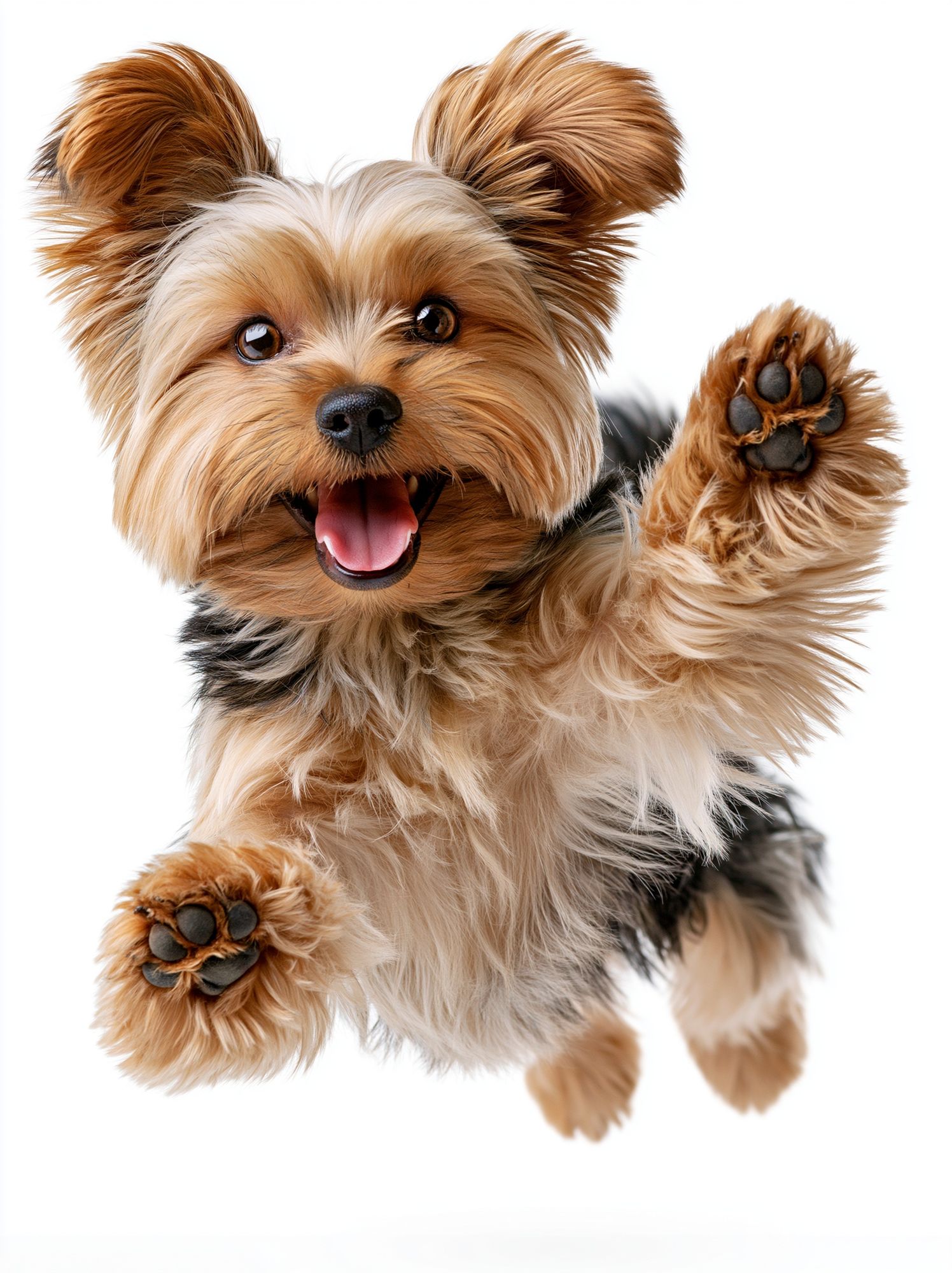
A black dog portrait also works well in a grouped arrangement, but keep the surrounding pieces quieter. Use two to four supporting works in related tones, and leave 5 to 8 cm between frames. If every piece is equally bold, the wall loses hierarchy. Our Illustration prints and Playful Yorkshire Terrier Photography Poster can help when building a pet- or animal-led wall with different levels of intensity.

Framing Ideas That Elevate the Artwork
Frame choice changes the tone more than most people expect. A matte black frame gives the portrait a clean edge and works best in contemporary rooms, especially when the wall colour is off-white, pale taupe, or concrete-toned. A medium walnut or dark oak frame brings in warmth and suits interiors with timber floors, leather, or antique furniture.
Mounts are worth using when the portrait itself is visually dense. A white or soft off-white mount of 5 to 8 cm gives the subject more breathing space and increases perceived importance. This is especially effective for smaller formats like 30 x 40 cm or 50 x 70 cm, where the extra border helps the image feel more considered.
If you like the look of dark artwork paired with strong texture, pieces such as Textured Concrete Wall — Minimalist Print or gray burlap textured background art show how frame-and-surface contrast can add depth even with a limited palette.

Glass finish matters too. In bright rooms with large windows opposite the wall, low-reflection acrylic or anti-glare glazing keeps dark fur detail visible during the day. Standard glass is fine in dimmer spaces, but glare can erase subtle expression in darker portraits.
Styling a Black Dog Portrait in Different Rooms
In living rooms, place the portrait where people naturally pause — above a sofa, sideboard, or fireplace. Add one or two black accents elsewhere in the room, such as a lamp base or picture frame, so the artwork feels integrated. If the portrait is the only black object in sight, it can look isolated.
In bedrooms, a black dog portrait works best when the rest of the scheme is quiet. Think stone bedding, soft cream walls, a wood headboard, and one darker bedside detail. Keep the frame refined rather than ornate. Bedrooms benefit from calm edges and tactile materials more than visual busyness.
In hallways, go slightly bolder. Narrow spaces can handle contrast well because you experience the art at closer range. A 50 x 70 cm portrait above a slim console or at the end of a corridor creates a destination point. Pair it with a mirror, lamp, or runner in warm tones to keep the passage welcoming.
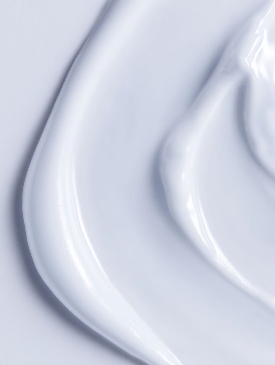
In home offices, the portrait can add personality without becoming distracting. Hang it on the wall visible in your background or to the side of the desk rather than directly behind the monitor. If you want a more graphic, disciplined look around it, support the scheme with pared-back pieces from our White Cream Texture Poster or the wider Minimalist collection.

Shop Tips for a Portrait That Feels Personal
Start with expression before colour. The most successful black dog portrait is usually the one that captures alertness, calm, curiosity, or loyalty in a way that feels familiar to you. A technically perfect image with no emotional pull will not hold up as well in daily life as a simpler one with a stronger presence.
Then assess the room from three distances: 50 cm, 2 metres, and the doorway. Up close, you want enough detail in the face and coat. From 2 metres, the silhouette should stay readable. From the doorway, the frame and surrounding wall colour should still let the portrait register as a focal point. That three-step check prevents you from choosing artwork that disappears at scale.
If you are building a scheme around the piece, stay within one dominant mood. A black dog portrait can lean rustic, tailored, minimal, or classic — but it should not be forced to do all four. Supporting choices from our animal portrait collection or subtle monochrome works from Wolf Spirit Portrait Print can help reinforce the direction without copying it too closely.
Final thoughts
A black dog portrait works best when you let contrast, scale, and material do the heavy lifting. Give it enough wall space, pair it with warm or tonal colours, and choose a frame that matches the room's furniture rather than competing with the subject.
When the styling is right, a black dog portrait becomes more than wall art. It acts as a grounding point in the room — personal, strong, and easy to live with for years.
Frequently Asked Questions
What frame colour works best if my walls are bright white?
Matte black and walnut are the safest choices. Black creates crisp contrast, while walnut warms up stark white walls and makes the portrait feel less severe.
Can I hang a black dog portrait on a dark wall?
Yes — but choose a piece with visible highlights in the face and coat, and use a lighter mount or frame edge for separation. Without that contrast, details can disappear.
What size should I choose for a narrow hallway?
For most hallways, 50 x 70 cm works well as a single piece. If the wall is especially tight, 30 x 40 cm with a generous mount can still look substantial.
Does a black dog portrait pair better with colour art or monochrome art?
Both can work, but monochrome or restrained earthy tones are usually easier. If you mix in colour, repeat that colour at least twice elsewhere in the room for balance.
How do I stop dark animal art from making a room feel heavy?
Use lighter surroundings — cream textiles, pale wood, or soft plaster tones — and keep at least 30 to 40 percent of the nearby visual field light in value. That contrast keeps the room open.