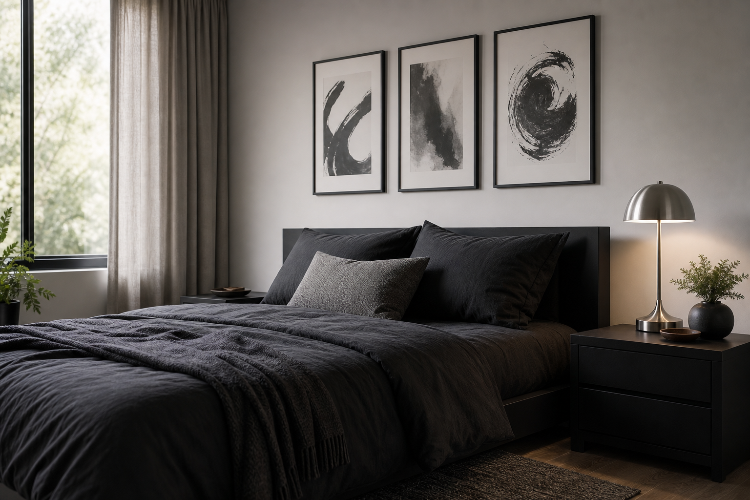
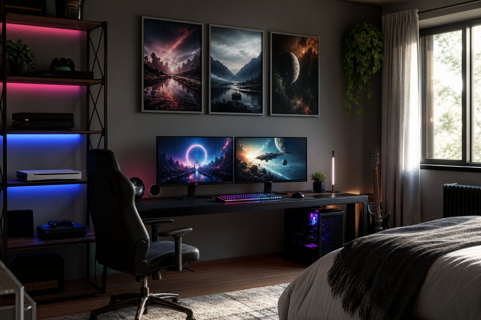
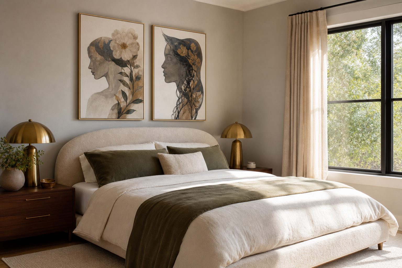
A strong "black cat car" image works because it combines two instantly readable symbols: the sleek mystery of a black cat and the nostalgia of a classic automobile. One element feels mischievous, the other mechanical; together they create wall art that is witty, graphic, and a little cinematic in mood without needing loud colours or busy detail.
What Makes Black Cat Car Art So Distinctive
The appeal starts with contrast. A black cat has curved, fluid lines; a retro car tends to bring chrome, fenders, wheels, and angular structure. That tension gives a "black cat car" print more personality than a standard animal portrait or a straightforward automotive illustration. It can lean collectible, humorous, or slightly gothic depending on the treatment.
A second reason this subject stands out is how well it sits across styles. If you already shop from our Animals collection, you know animal-led wall art often adds energy to a room quickly. Add a motoring reference, and the image becomes more story-driven. It feels less decorative and more like a found piece with character.
For rooms that already have a nostalgic layer, black cat car art fits especially well beside pieces from our Vintage collection. Aged paper tones, faded blacks, and old-ad illustration techniques give the subject a believable retro edge instead of making it feel novelty-led.

Choosing the Right Mood: Retro, Modern, or Minimal
Retro versions usually have the strongest storytelling. Look for sepia, cream, oxblood, petrol blue, or smoky charcoal backgrounds. These shades echo old garage signage and early printmaking, which makes the cat-and-car pairing feel intentionally vintage rather than random. If your furniture includes walnut, cognac leather, or brass, this route is the easiest match.
Modern interpretations work better in sharper palettes. A black silhouette against off-white, slate, or muted rust creates a cleaner image that suits more edited interiors. This is useful in apartments where one statement piece has to do the work of three smaller accents. In a room with simple lines, a single black cat car print can carry enough tension on its own.
If your space is quieter, go minimal. Minimal black-and-white pieces have enough contrast to hold attention but not so much detail that they dominate the wall. That approach pairs naturally with our Minimalist art prints and graphic monochrome decor.
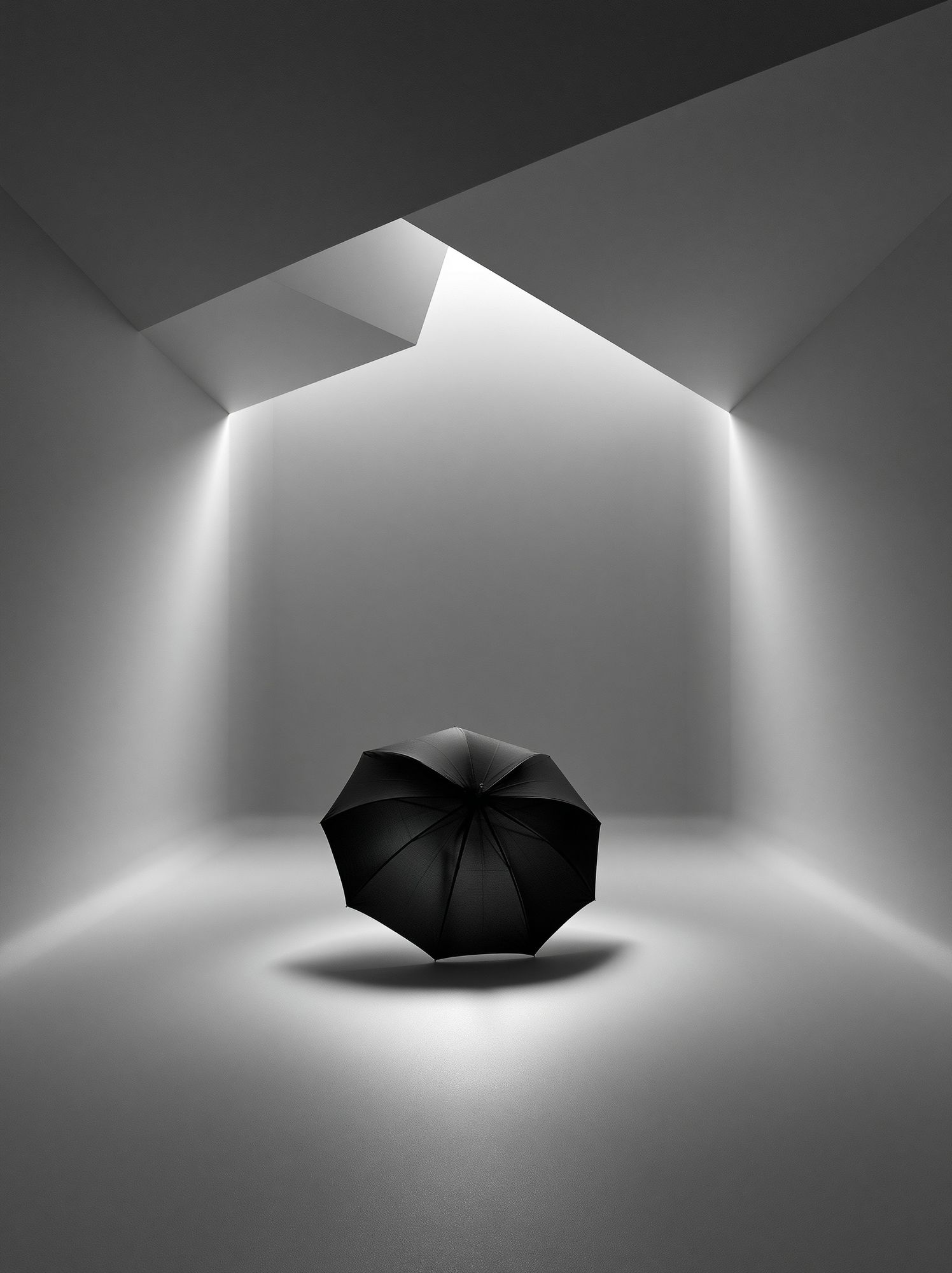
A good example of this mood is Black Umbrella Minimalist Poster. It is not the same subject, but it shows how a dark central form on a restrained background creates elegance instead of heaviness. When choosing black cat car artwork, use that same filter: clear silhouette, space around the subject, and one dominant tone.
Best Colours and Backgrounds for a Stronger Display
The most reliable palette is monochrome with one warm undertone. Black, ivory, and ash grey give the cat definition, while a small amount of tobacco brown, faded burgundy, or muted gold prevents the print from feeling flat. This works particularly well in 30 x 40 cm and 50 x 70 cm sizes, where subtle contrast still reads clearly from 2 to 3 metres away.
Deep reds are the bold option. A wine, brick, or cherry background makes black fur and dark car paint look richer immediately. Use this only if the surrounding room stays disciplined — two or three repeat colours are enough. A red-heavy print above a sofa works best when at least one other object, such as a cushion or rug line, repeats that tone.
Muted neutrals are safer for long-term styling. Stone, oatmeal, parchment, and warm grey backgrounds give the artwork a collector's feel. If you like this softer route, mix your focal piece with texture-led works from our Illustration collection or pared-back monochrome designs.
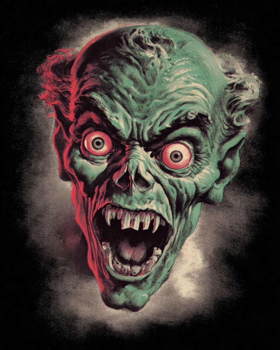

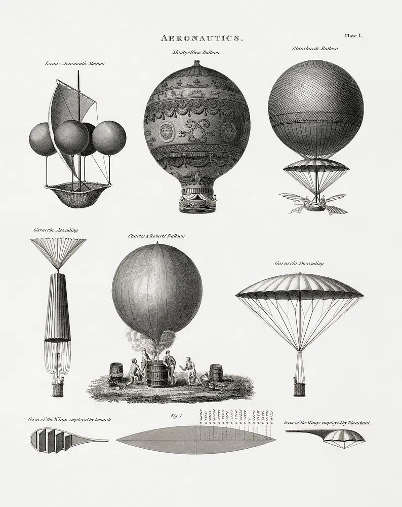
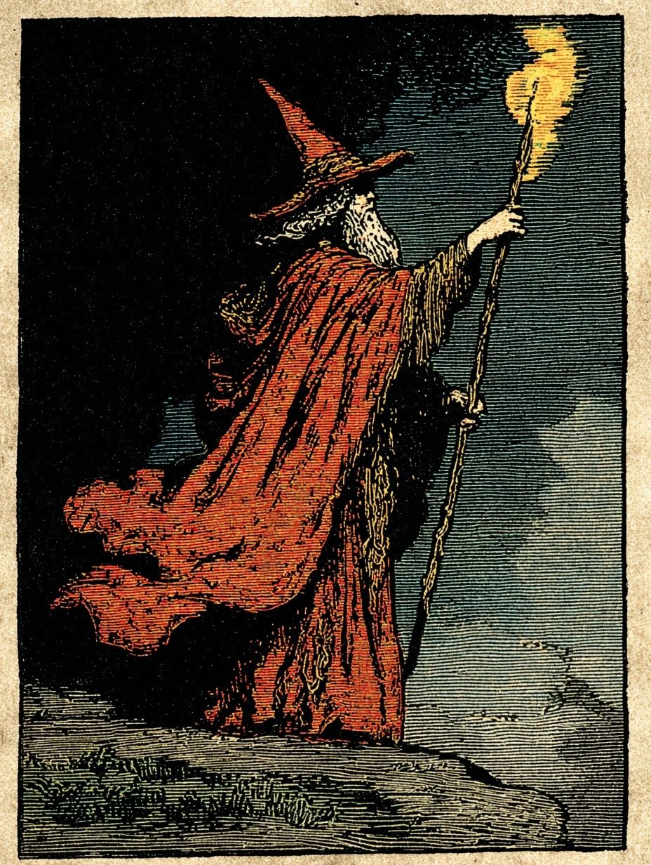
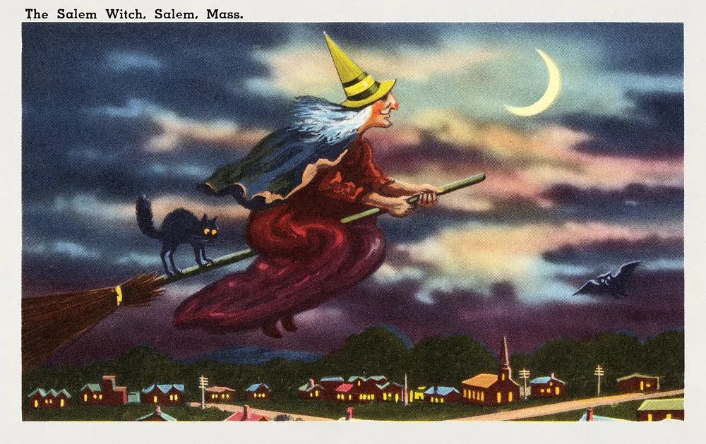
The gallery above shows the visual ingredients that support this subject well: shadowy vintage drama, black-and-white line strength, and aged paper character. For a more haunting old-world backdrop, The Salem Witch — Vintage Print is a useful reference point for tone and atmosphere.

Where a Black Cat Car Poster Fits Best in the Home
Hallways are one of the best placements because the subject reads quickly. In a pass-through space, a print with a strong silhouette is more effective than a highly detailed composition. Hang it at eye level — usually with the centre around 145 cm from the floor — and let it act as a small moment of personality between larger rooms.
A home office is another strong fit, especially if the room already mixes practical and character-driven pieces. A black cat car print adds wit without becoming childish. Place it above a desk, or lean a 40 x 50 cm frame on a shelf beside books and a desk lamp for a more collected look. If you enjoy darker animal imagery, Black Wolf Portrait Print shows how a single dark figure can ground a room.
Eclectic living rooms can carry the subject on a larger scale. Think one 50 x 70 cm hero piece above a sideboard, paired with one or two supporting works that repeat either the black silhouette or the vintage tone. For a slightly offbeat arrangement, mix it with selective pieces from our Funny prints — but keep the humour dry rather than loud.

Sizing, Framing, and Placement Tips
For a single black cat car print, 30 x 40 cm suits compact walls, shelving displays, and narrower hallways. A 50 x 70 cm format has more impact above a console, desk, or armchair. If the wall is wider than 140 cm, a grouped arrangement often looks better than one undersized frame floating alone.
Frame finish changes the entire mood. Matte black gives the sharpest graphic result and works best with monochrome or high-contrast art. Dark walnut warms the subject and makes retro colour palettes feel more established. Thin brass or antique gold can work, but only if the artwork itself includes warm undertones — otherwise the combination can look too ornamental.
Spacing matters more than people think. If you are hanging one piece above furniture, keep 15 to 25 cm between the frame and the top of the furniture. In a gallery grouping, leave 5 to 7 cm between smaller frames or 7 to 10 cm between larger ones. If you want a supporting print with similar dark energy, Black Wolf Among Sheep — Illustration Print is a good reference for how black imagery can still feel composed rather than heavy.
Gift Ideas and Styling Pairings
This subject makes a smart gift because it crosses interests. It works for cat lovers, vintage car enthusiasts, teenagers with a taste for darker decor, and anyone building a home office with more personality. For birthdays, housewarmings, and first-apartment gifts, a framed 30 x 40 cm piece is usually the easiest choice to give and display.
Styling pairings should follow one of three routes. First, lean automotive — old travel motifs, emblem graphics, and machine-adjacent imagery. Second, lean animal — black silhouettes, wolves, ravens, or other dark forms. Third, lean retro oddity — pieces with surreal or slightly theatrical charm. The key is to repeat one trait at a time, not all three at once.

A product like Winged Emblem Black-White Print works well as a companion because it echoes speed, linework, and black-on-light contrast without competing directly with the main subject. If you want the arrangement to feel softer, add one neutral textural piece from the Minimalist collection to break up the darker shapes.
Final thoughts
A black cat car print works best when you treat it as a style anchor, not a novelty accent. Choose one clear mood — retro, modern, or minimal — then repeat that decision in the frame finish, surrounding colours, and supporting art. That keeps the display sharp and intentional.
If you want the easiest formula, start with one statement piece, add one monochrome companion print, and keep the palette to black plus one warm tone. The result feels bold, playful, and collected rather than themed.
Frequently Asked Questions
What frame colour works best for black cat car art?
Matte black is the safest option for crisp contrast, while dark walnut is better if the artwork has sepia, rust, or cream tones. Choose based on the background colour, not just the subject.
Can I hang this type of print in a child's or teen's room?
Yes — choose a less gothic version and keep the size around 30 x 40 cm or 40 x 50 cm. Pair it with simple bedding and one repeated accent colour so the room stays balanced.
Should I style it with other animal art or car-themed prints?
Either works, but mixing both usually looks best when one category stays secondary. Use one hero piece, then 1 to 2 supporting prints that echo either the animal silhouette or the vintage motoring mood.
What wall colour helps dark artwork stand out most?
Soft ivory, warm greige, muted sage, and dusty clay all give dark imagery better definition than pure white. On dark walls, use a lighter mat or thinner frame so the piece does not disappear.