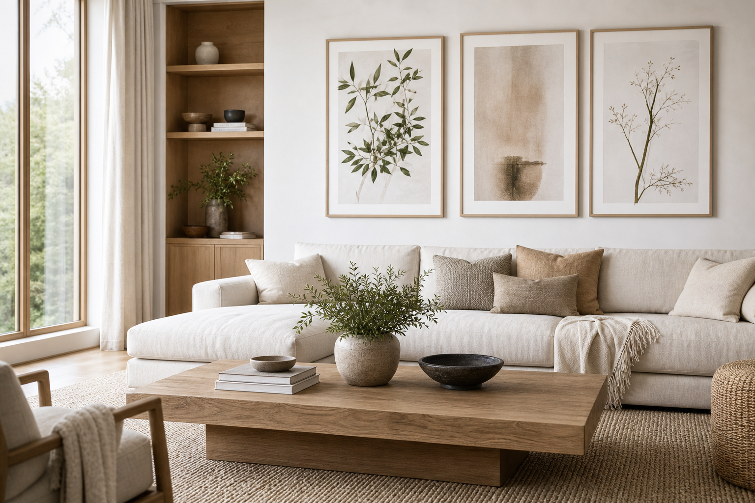
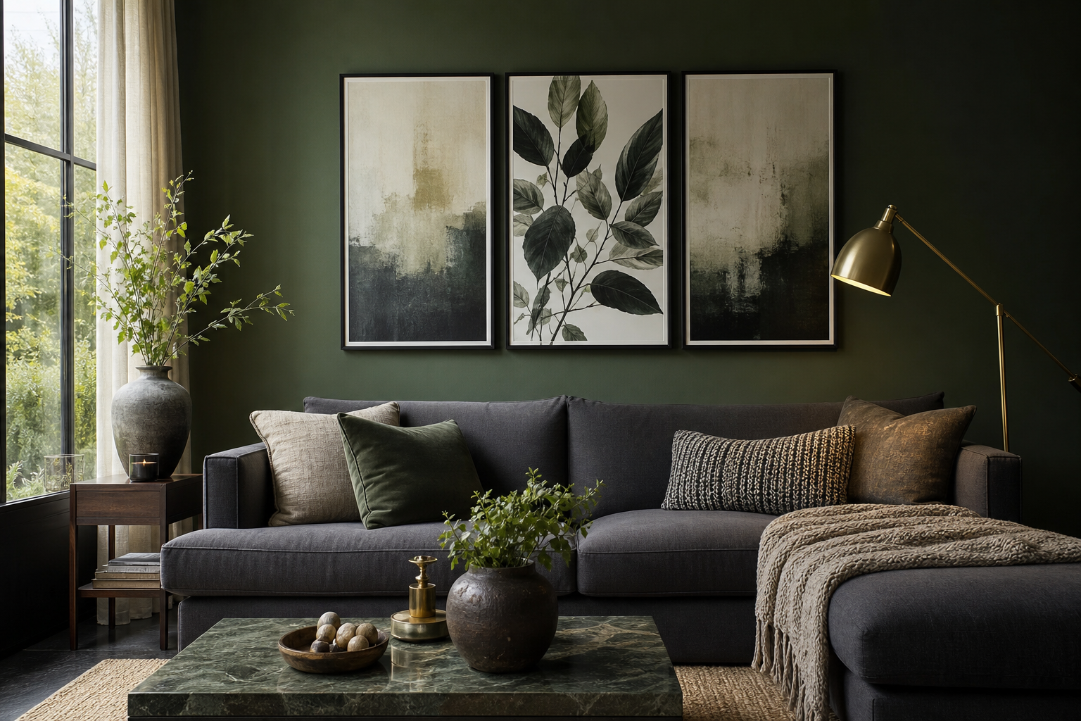
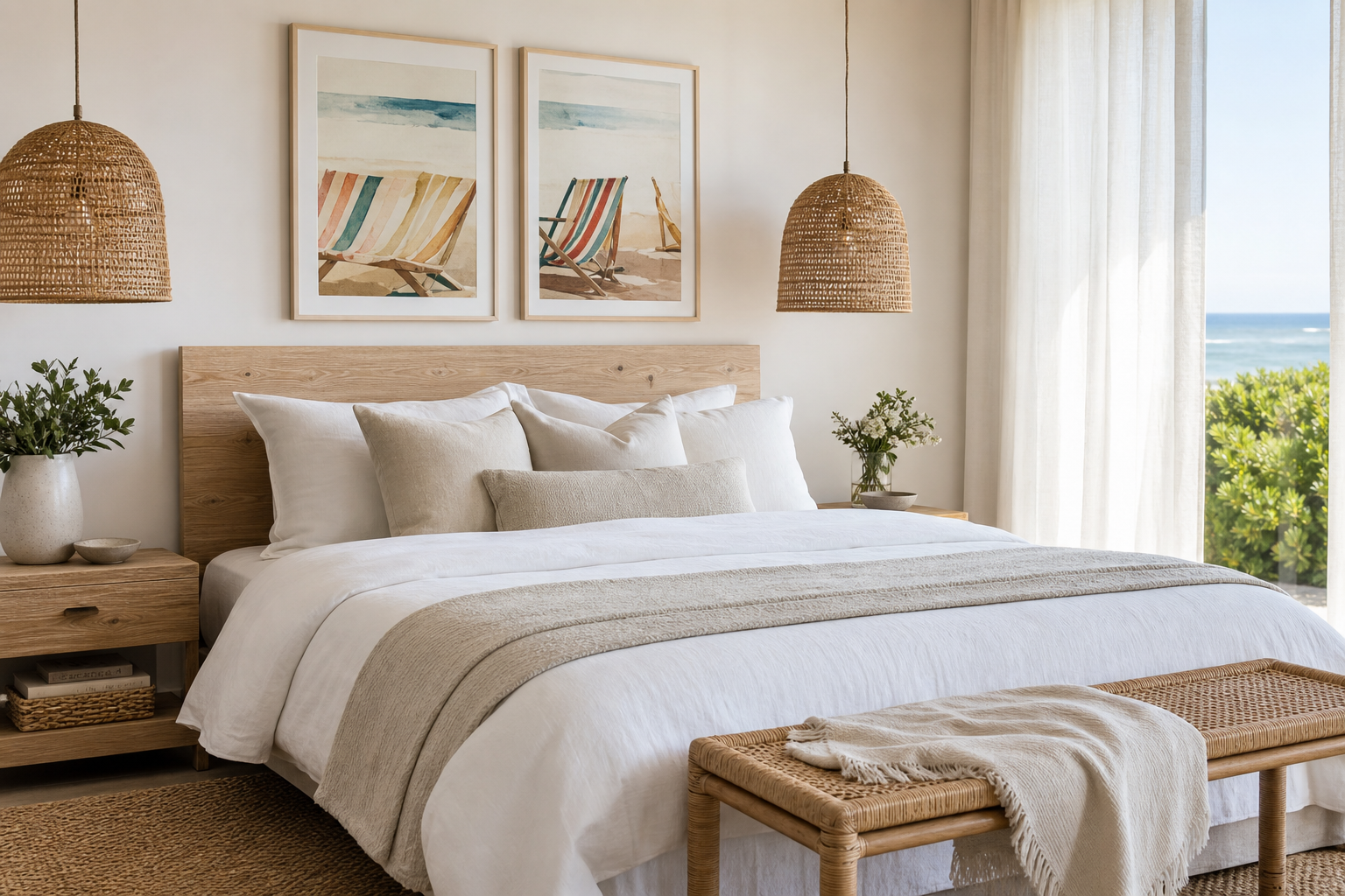
An abstract face print gives a room a focal point without adding visual noise. The human form is familiar, but when reduced to contour, shape or fragmented colour, it reads as art first and portrait second. That balance is what makes it especially effective in modern interiors, where clean lines need one or two expressive elements to avoid feeling flat.
Why Abstract Face Prints Work So Well
An abstract face print works because it combines structure with ambiguity. Eyes, profiles and curved lines create instant recognition, while simplified forms keep the composition open-ended. In practical terms, that means the piece can hold attention from 2 metres away, yet still feel calm enough for everyday spaces like a bedroom or lounge.
Modern rooms often rely on repetition — straight edges, low silhouettes, restrained palettes. Face-based art breaks that rigidity with organic line. If your space already includes sharp furniture profiles, such as a rectangular sideboard or a boxy sofa, a single face composition introduces contrast without competing with the architecture. That is why illustration art prints and minimalist wall art are often paired in homes that need both softness and order.
A face motif also feels more personal than a purely geometric piece. It suggests character and emotion, even when rendered with only two or three sweeping lines. If you prefer modern art that feels less decorative and more intentional, browse our abstract collection alongside fine art prints to find pieces with stronger visual presence.

Choosing the Right Colour Palette
The easiest way to style an abstract face print is to repeat one colour from the artwork at least twice elsewhere in the room. If the print includes black line work on an ivory ground, echo that with a black lamp base and an off-white throw. If it includes terracotta, blush or rust, bring that tone into cushions, a rug border or a small ceramic object. Repetition makes the art feel anchored rather than added on.
For neutral rooms, choose warm neutrals or cool neutrals on purpose. A cream wall with beige upholstery suits artwork with sand, blush, clay or brown undertones. A cooler scheme — white walls, charcoal accents, grey textiles — works better with black, taupe, slate or muted blue. Mixing both can work, but keep the ratio controlled at roughly 70% dominant temperature, 30% contrast.
If your room needs energy, use contrast. An abstract face print in a restrained room can sit beside one stronger colour note — deep red, cobalt, forest green. The key is to limit the accent to 10-15% of the visual field so the room still reads as modern, not chaotic. This is especially effective when paired with bolder pieces from fashion wall art or graphic forms from mid-century modern prints.

Soft, painterly abstraction is useful when you want the facial theme to feel less graphic and more layered. A piece like this can sit near an abstract face print and pull blush, cream and muted coral into the wider scheme, especially in a bedroom or reading corner.
Finding the Best Size and Scale
Size matters more than style in wall art placement. A print that is too small will look hesitant, even if the artwork itself is perfect. Above a sofa, aim for artwork that spans roughly 60-75% of the sofa width. For a 200 cm sofa, that means a total artwork width of about 120-150 cm. One large piece at 70x100 cm can work, but 100x140 cm or a pair of 50x70 cm pieces often feels more balanced.
Above a bed, keep the art narrower than the headboard or mattress width. Over a double bed, one 50x70 cm or 70x100 cm piece usually works well; over a king bed, you can move up to 100x140 cm or a two-piece arrangement. In a hallway, narrower vertical formats are often stronger because they echo the proportions of the passage rather than fighting them.
If you are styling a compact wall — between a window and shelf, beside a desk, above a console — choose a piece that leaves 15-25 cm of breathing room on each side. Modern interiors look better with negative space. An abstract face print does not need a crowded wall to make an impact; in fact, the spare placement usually makes the line work sharper and more elegant.



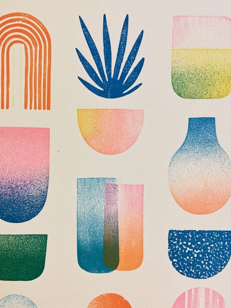
Where to Hang It in the Home
The living room is the most reliable placement because it gives the artwork distance. Face art benefits from a viewing range of at least 1.8 to 2.5 metres, where the full composition can be read before the finer details come into focus. Above a sofa, sideboard or fireplace, centre the frame around 145 cm from the floor to the artwork midpoint as a starting rule, then adjust for furniture height.
In bedrooms, the mood should be quieter. Choose an abstract face print with softer lines, pale ground tones or limited contrast. It should support rest, not dominate the room at 7 am. Over the bed is the obvious location, but a dresser wall or reading nook can feel more refined if you want the bed wall to stay minimal. Pairing with Yin Yang Teal Abstract Poster can introduce a controlled note of colour without making the room busy.

Hallways benefit from portrait-oriented face art because the verticality elongates the wall. A narrow corridor can take one strong piece instead of several small ones. In a home office, place the print where it is visible in your peripheral view rather than directly behind a monitor. It adds personality to the room and reads well on video calls, but should not compete with the work surface.
Framing, Pairing and Gallery Wall Ideas
Frame finish changes the tone of the artwork more than many buyers expect. A thin black frame makes an abstract face print look crisp and architectural. Oak warms it up and makes it easier to blend with Scandinavian or soft-modern rooms. White frames are useful when the wall colour is deeper, because they create a lighter edge and stop the art from disappearing into the background.
If the piece is strong on its own, hang it solo. This is often the best route for oversized face compositions or artwork with high contrast. Leave 20-30 cm above furniture and let the margins around the frame stay clean. Solo placement feels deliberate, especially in modern spaces with fewer objects.
If you want a gallery wall, combine one face-led piece with three supporting works that vary in density. A good formula is one focal print, one textured neutral, one geometric form and one softer colour field. That keeps the wall curated instead of repetitive. You can build around an abstract face print using companions from Blush Watercolor Abstract Poster, White Cream Texture Poster or portrait-led work such as Freckled Portrait Mid-Century Poster.
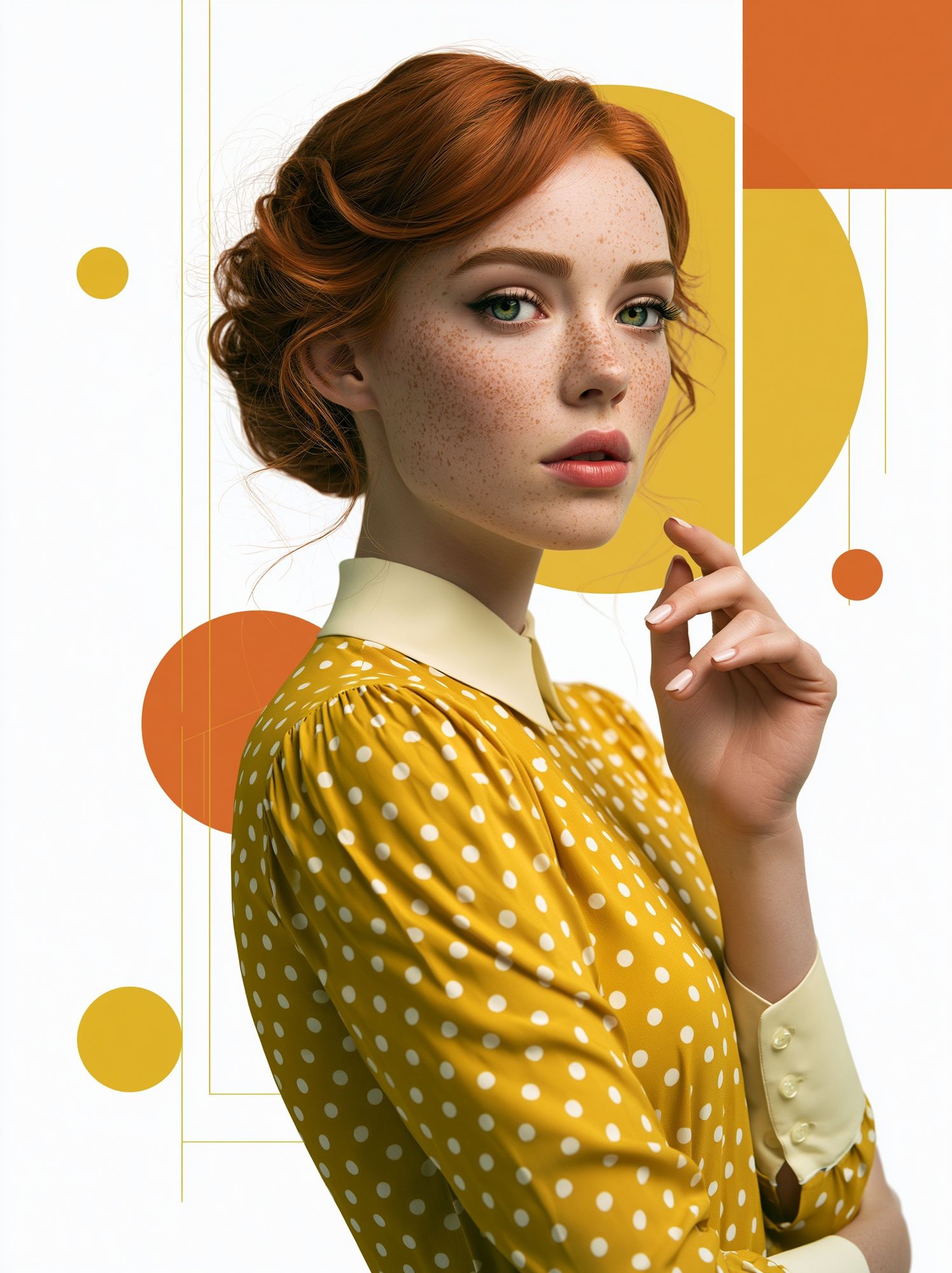
A stylised portrait works well next to face line art because it adds human presence in a different visual language. Use it when you want the wall to feel collected rather than perfectly matched.

For a sharper, more graphic arrangement, add one piece with stronger pattern or contrast. That is where geometric or black-and-white abstraction earns its place, especially in dining rooms, offices and more structured living spaces.

How to Keep the Look Fresh and Balanced
The easiest way to keep an abstract face print feeling current is to change the styling around it, not the art itself. Swap cushion covers seasonally, rotate a table lamp, add a darker vase in winter or lighter linen in summer. Small changes in a 5-10% range of the room's visual content can make the artwork read differently without forcing a full redesign.
Balance matters just as much as freshness. If the artwork has strong black contour lines, soften the room with tactile materials — boucle, wool, linen, brushed oak, plaster. If the print is very pale, add one weightier element nearby, such as a dark side chair or metal floor lamp, to stop the composition from floating. The goal is not perfect matching. It is visual rhythm — line against texture, shape against space, softness against structure.

Final thoughts
An abstract face print is one of the most versatile choices for a modern home because it feels expressive without becoming cluttered. Get the scale right, repeat one or two colours across the room, and choose a frame finish that suits your furniture rather than treating the art as a separate element.
If you want the result to feel polished, give the piece space. Modern styling is usually less about adding more and more about placing the right object in the right proportion. Done well, an abstract face print can carry an entire wall with very little else around it.
Frequently Asked Questions
What frame width works best for an abstract face print?
A slim frame between 1 and 2 cm suits most modern interiors. Go slightly wider for oversized prints above 70x100 cm so the piece feels substantial on the wall.
Should I use a mat border with this style of artwork?
A mat works well for smaller sizes like 30x40 cm or 50x70 cm because it gives the composition more presence. For large contemporary pieces, no mat often looks cleaner and more architectural.
Can I hang an abstract face print on a coloured wall?
Yes — just make sure there is enough contrast between the wall and the artwork background. Off-white art can look excellent on olive, clay, taupe or charcoal walls when framed in oak or black.
What is the safest hanging method for rental homes?
For lightweight frames, removable picture strips can work if the wall finish is smooth and the weight limit is respected. For heavier framed art, a proper wall hook is more secure and reduces the risk of warping or slipping.
What other art styles pair well with an abstract face print?
Textural neutrals, geometric abstracts and restrained portrait pieces pair best. Avoid combining it with too many highly detailed works, or the wall can start to feel crowded.