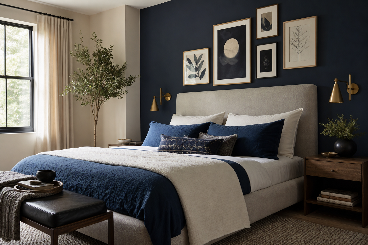
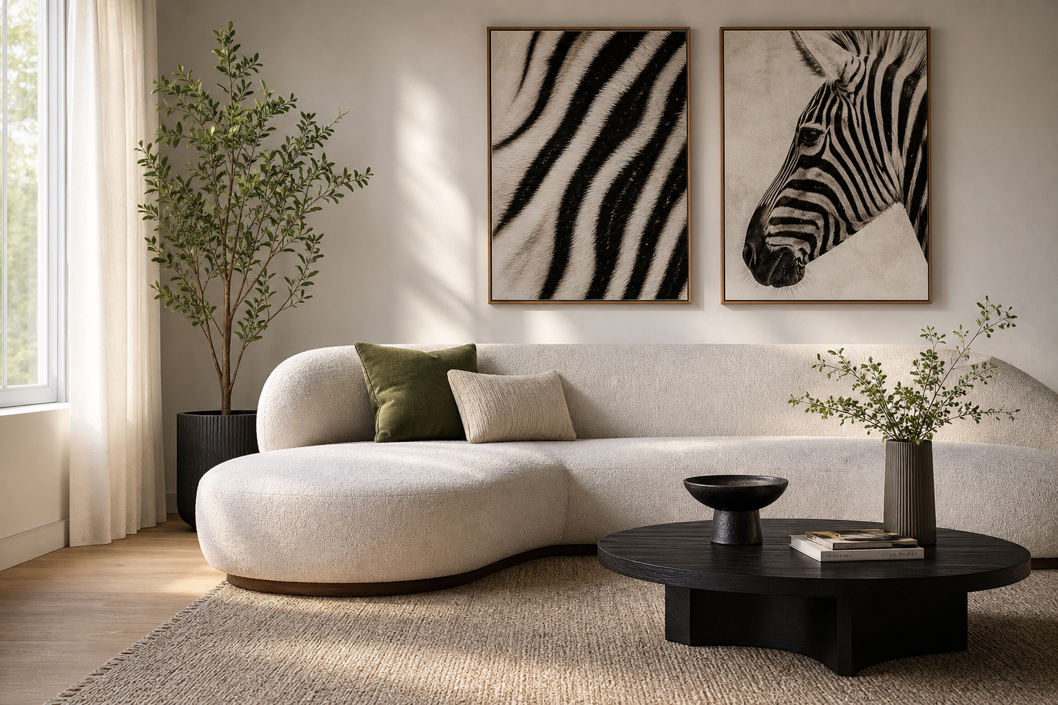
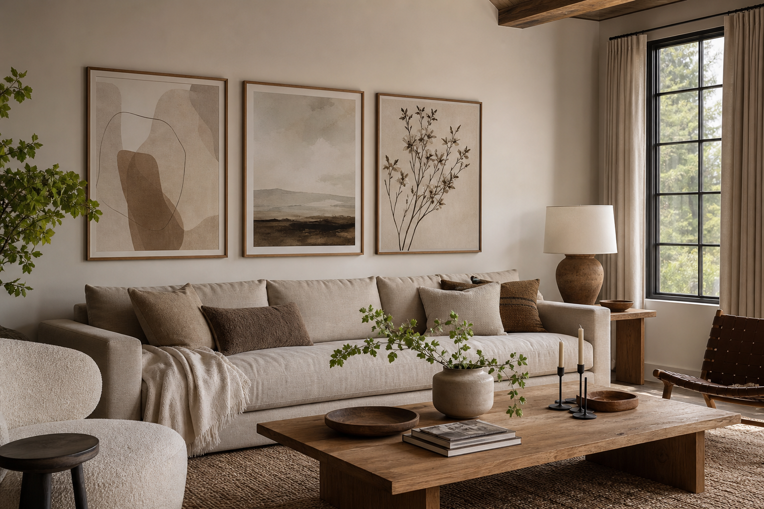
A 16x20 on a wall sits in one of the most useful size ranges for home styling. It is large enough to read from across a room, but compact enough to fit narrow walls, layered shelves, and tighter layouts where a 24x36 would feel heavy. That balance is why this format works in apartments, family homes, dorm rooms, and home offices alike.
Why a 16x20 Size Feels So Versatile
A 16x20 print has a clear presence without demanding an entire wall. On its own, it works best on wall sections roughly 30 to 60 inches wide. Inside a gallery wall, it can act as the visual anchor — the piece that gives smaller 8x10 and 11x14 frames something to organize around. If you are building a flexible arrangement, a 16x20 on a wall is often the easiest place to start.
This size also adapts well across styles. A soft neutral image from our Minimalist collection can keep a bedroom quiet and airy, while a bolder composition from our Abstract wall art selection gives the same dimensions more energy in a living room or entry.

A practical reason for its popularity is proportion. A 16x20 has enough surface area to show texture, brushwork, or photographic detail, but it still leaves room for matting and a substantial frame. That makes it especially effective for restrained pieces like White Flower Silhouette or architectural images with clean lines from our Architecture prints.
Choosing the Right Wall and Viewing Distance
Not every wall gives a 16x20 the same impact. The sweet spot is a wall where the viewer stands or sits 4 to 8 feet away. At that distance, the piece feels intentional and readable. On a very long wall viewed from 10 feet or more, a single 16x20 can start to look undersized unless you add a wider frame, a mat, or companion pieces.
Ceiling height matters too. In rooms with standard 8-foot ceilings, this size usually feels balanced on its own. In spaces with 10-foot ceilings or large uninterrupted walls, you need stronger anchoring below it — a console, headboard, sofa, or bench — so the art does not float.
A good visual test is wall coverage. If the print fills about 50% to 75% of the width of the furniture beneath it, the arrangement usually feels right. If it covers less than 40%, the wall can look underdressed. In those cases, pair the 16x20 with a second frame or choose a substantial mat-and-frame combination.

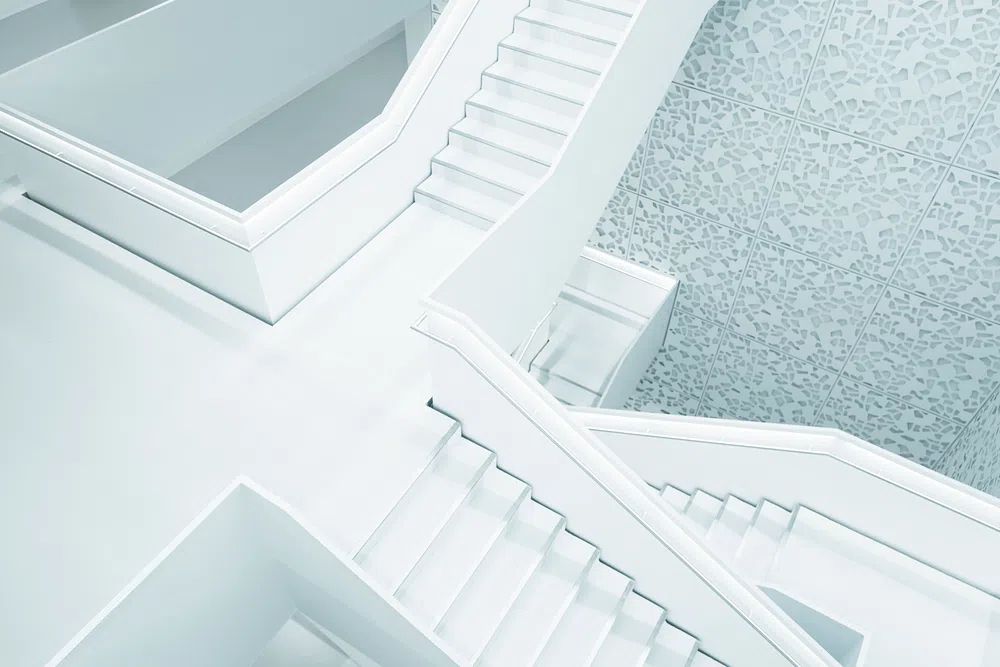
For slim transitional spaces, photography and architecture often perform better than dense compositions because they read quickly in passing. That is where Photography prints and pieces such as Modern White Staircase can be especially effective.
How to Center It Over Furniture
The most common placement mistake is hanging too high. For a 16x20 on a wall above furniture, leave 6 to 10 inches between the bottom of the frame and the top of the furniture. That gap keeps the art visually connected to the piece below it.
Over a sofa, center the print on the sofa itself, not on the wall. A single 16x20 works best above loveseats, apartment-scale sofas, or one side of a sectional where you are styling a zone rather than the entire seating wall. Over a queen bed, one 16x20 can work if it has a wide mat or is paired with sconces. Over a console, it tends to feel naturally balanced because consoles are often narrower — 36 to 48 inches wide — and suit this format well.
Above a desk, hang the center of the artwork roughly 57 to 60 inches from the floor, then adjust by 1 to 2 inches if you mostly view it while seated. In workspaces, calmer compositions usually wear better over time than highly busy ones, which is why understated pieces from our Fine Art collection or tonal neutrals from our minimalist range are reliable choices.


Frames, Mats, and the Illusion of Scale
Framing changes the perceived size more than most people expect. A 16x20 in a thin frame may read exactly as medium-sized. The same print with a 2- to 3-inch mat and a 0.75- to 1.25-inch frame can feel closer to a statement piece because the overall footprint expands to roughly 22x26 or 24x28.
Use matting when the wall is large or the art is subtle. A white or off-white mat gives the image more breathing room and sharpens edges, which works especially well for pieces like Window with Sheer Curtain. Skip the mat when you want a cleaner, more contemporary look, especially with bold geometry or tonal abstraction.

Frame color should echo the room's existing finishes. Black frames give stronger contrast and suit high-definition images or monochrome compositions such as Sacred Geometry Black-White. Oak and ash feel lighter and blend easily with Scandinavian or organic interiors. White frames can nearly disappear on pale walls, which helps the image itself carry more weight.
If you want the piece to feel visually larger without changing the print size, choose a wider mat before you choose a thicker frame. Mats increase presence with less heaviness.
Styling a 16x20 Print by Room
In living rooms, a 16x20 works well on secondary walls — above a side chair, next to a bookcase, or over a narrow console. If you are styling a full sofa wall, one piece in this size is usually better treated as part of a pair or a small grouping. Soft architectural imagery and neutral abstracts tend to integrate well with layered textiles and wood tones.
In bedrooms, this format is ideal when you want something quieter than a large headboard-spanning arrangement. One centered piece above a nightstand, dresser, or narrow bed can feel polished. Look for restful imagery from our Elegant White Fabric or lyrical scenes from our fine art edit.

In hallways, go centered and disciplined. A single 16x20 on a wall can be enough if the corridor is narrow and the art has contrast. In kitchens, it works best on breakfast nooks, pantry walls, or the section above a bar cart — places where moisture and grease are less direct. In home offices, this size lands well above a desk, filing cabinet, or reading chair because it adds personality without dominating a working wall.
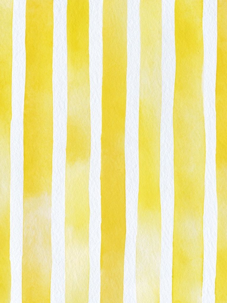
Color choice matters by room. Warm tones like Yellow Watercolor Stripes can lift dim corners. Black-and-white architectural work adds structure in offices and hallways. Soft botanical or fabric-inspired neutrals help bedrooms feel calmer.

Common Mistakes to Avoid
The first mistake is scale mismatch. A 16x20 on a wall can disappear on a huge two-story wall or above an 84-inch sofa if it stands alone in a narrow frame. If the furniture is broad, either build out around the print or expand its footprint with matting.
The second mistake is poor spacing. Hanging the frame more than 12 inches above furniture breaks the connection between object and wall. In gallery walls, leaving random gaps from 1 inch to 6 inches makes a medium piece feel accidental. Keep spacing consistent — usually 2 to 3 inches between frames.
The third mistake is choosing imagery that is too faint for the location. On a wall with glare, distance, or heavy texture around it, very pale art can lose definition. In those spots, stronger forms from our abstract collection or high-contrast city imagery from Black white photo Empire State hold up better.
Quick Tips for a Finished Look
Use two picture hooks or D-rings rather than a single centered hook if you want the frame to stay level. For renters, adhesive strips can work for lighter framed pieces, but check the finished weight first — especially if you are using glass and a wide wood frame.
Add one or two styling elements below the art to anchor it: a lamp, stacked books, a ceramic vase, or a bowl. Keep those objects under two-thirds of the frame height so they support the composition without blocking it.

If you are still unsure, tape out the exact 16x20 dimensions on the wall first. Painter's tape takes 3 minutes to apply and instantly tells you whether the size needs a mat, a partner piece, or a different wall entirely. That small test prevents most placement regret.
Final thoughts
A 16x20 on a wall works best when you treat it as a proportion tool, not just a print size. Match it to viewing distance, connect it clearly to furniture, and use framing to control how substantial it feels.
When the wall is modest, this size can stand confidently on its own. When the wall is larger, build presence with a mat, a stronger frame, or a tighter grouping. The result looks considered rather than improvised.
Frequently Asked Questions
Is a 16x20 print better vertical or horizontal?
It depends on the wall shape and furniture below. Vertical suits narrow wall sections and hallways, while horizontal feels more natural above desks, consoles, and compact sofas.
What frame size do I need for a 16x20 print with a mat?
A common upgrade is a 20x24 or 22x28 frame with a mat opening for 16x20. This gives the art more presence without changing the print itself.
Should I use glass or acrylic for a 16x20 frame?
Acrylic is lighter and safer for high-traffic areas, kids' rooms, and rentals. Glass offers a crisper surface but adds more weight.
Can I lean a 16x20 print instead of hanging it?
Yes — on a shelf, mantel, or console it can look relaxed and polished. Layer it with a smaller frame or object in front, but keep at least one-third of the artwork fully visible.